


 OMV Logo PNG
The OMV logo vividly represents the company, embodying its character and aspirations. It demonstrates evolution and adaptability, conveying stability and progress through concise, meaningful elements. Thus, it symbolizes confidence, growth, and readiness for any challenge.
OMV was founded in Vienna in 1956, following the Austrian State Treaty, and was named Österreichische Mineralölverwaltung Aktiengesellschaft. The company was created to place oil and gas exploration, refining, and marketing under Austrian state control. For postwar Austria, it became the national operator responsible for fuel supply, refinery development, and the rebuilding of a controlled energy sector.
In its early years, OMV focused mainly on the domestic market. Still, the company soon began building the assets needed for a broader role. In 1960, the Schwechat refinery near Vienna entered operation and became one of OMV’s main industrial bases. In 1968, OMV signed a natural gas supply agreement with the former Soviet Union, connecting Austria to cross-border gas flows and giving the company an early international function.
In the 1980s, OMV began a gradual move away from full state ownership. In 1987, Austria listed shares of a state company on the stock exchange for the first time, starting a privatization process that changed OMV’s corporate structure. In 1990, Vienna opened its first compressed natural gas filling station, while the company expanded during the 1990s into foreign markets and plastics.
In 1998, Borealis Plastics received a new shareholder with a 25 percent stake, strengthening OMV’s petrochemical position. In 2004, OMV Petrom entered the privatization process, giving the group a stronger regional platform in Central and Eastern Europe. In 2017, OMV acquired a quarter stake in the Blue Stream pipeline. The company later operated in more than 30 countries across oil, gas, refining, marketing, and petrochemicals.
Meaning and History
What is OMV?
This leading Austrian oil and gas corporation has evolved from a national enterprise into a global energy powerhouse across Central and Eastern Europe. It manages an extensive network of over 2,000 gas stations in ten European countries and operates three major oil refineries in Austria, Germany, and Romania. Its core specialization lies in its strong presence in the natural gas market, including transportation and storage, enabling connections between Eastern suppliers and Western European consumers. In addition to fuel, it is renowned for high-quality products, including various motor oils and premium-grade fuel, which are highly valued in the European market.
1956 – 1970s
1970s – 1985
1985 – 1991
1991 – 1995
1995 – today
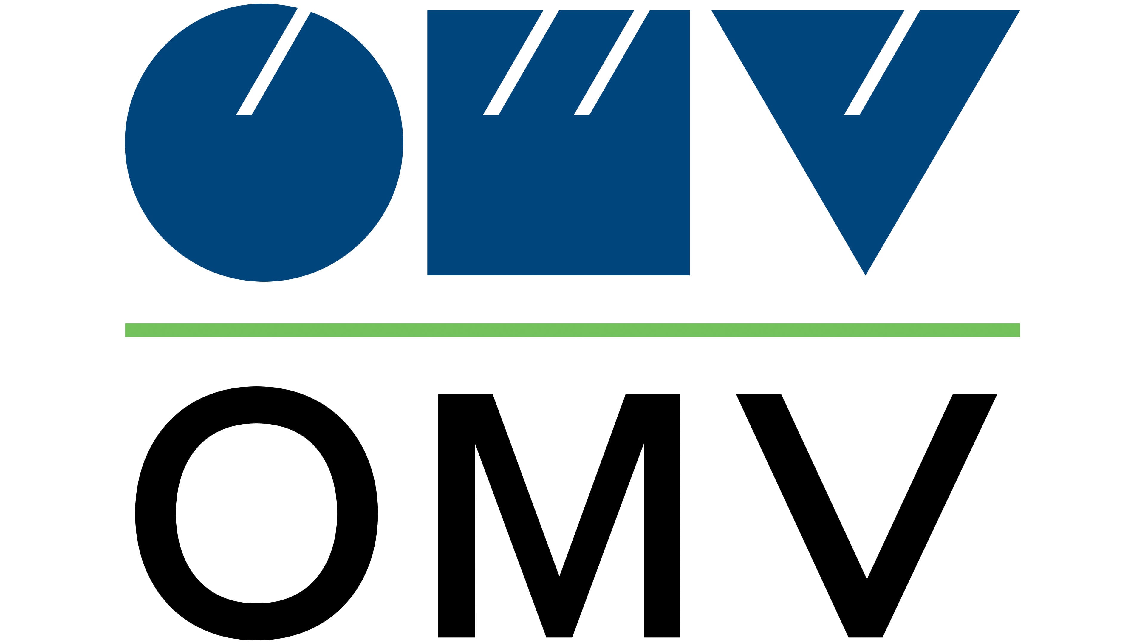
The OMV logo is a minimalist design that combines simplicity with clear geometric shapes. The company’s abbreviation is presented in two versions: graphically at the top and as text at the bottom. This layout gives the visual mark versatility and recognizability.
The upper part features three simple shapes: a circle, a square, and a triangle. They appear ordinary, but thin white slits along their top edge transform the shapes into the letters “O,” “M,” and “V.” These lines are angled, giving the logo a modern and dynamic look. The square representing “M” has two slits, while the circle and triangle each have one, creating rhythm and balance in the composition. The deep blue color of the shapes symbolizes stability and reliability in the energy sector.
The lower part features the text “OMV,” rendered in a strict, sans-serif font. The geometrically precise letters emphasize accuracy and professionalism. The letter “M” is highlighted by its design: its central part is extended, echoing the shape of the letter “V.” This design choice connects the graphic and textual elements, enhancing the emblem’s cohesion. The black text adds seriousness and confidence to the design.
A thin green line runs between the graphic and textual elements. It adds a vibrant accent and links both parts together. The green color refers to the company’s environmental focus and emphasis on sustainable development and innovation.
The name originates from Österreichische Mineralölverwaltung, highlighting the company’s historical roots. The geometric shapes, color palette, and overall emblem design convey reliability, a modern approach, and the brand’s ambitious plans. This design creates a strong, confident impression, underscoring the company’s professionalism.