PEMEX: Brand overview
In 1938, the nationalization of all private oil companies within Mexico resulted in the emergence of Pemex, Mexico’s state-owned oil company. As of December 2019, the company had total assets of $101.8 billion. Pemex was the second-largest company in Latin America in terms of annual revenue in 2009, surpassed only by Brazil’s national oil company Petrobras. Nevertheless, according to The Guardian, Pemex is among the seven most polluting companies in the world.
From the company’s founding in 1938 until the 1970s, there was significant growth in oil and gas production, and outstanding discoveries such as the Cantarell oil field in the Bay of Campeche were turning points in the development of the industry.
The following decades, the 1970s and 1980s, were marked by exceptional growth for Pemex, and high production and revenues placed the company among the world’s leading oil producers.
In the 1990s, however, Pemex experienced a downturn due to declining production, corruption, and mismanagement. Despite these challenges, the company continues to strive to regain its former status.
Pemex plays a key role in the Mexican economy, employing more than 150,000 people, contributing significantly to tax revenues, and playing a key role in generating foreign exchange for Mexico.
In 1938, the Mexican government took an important step by nationalizing private oil companies and creating the state-owned Pemex.
In 1976, a remarkable discovery was made that changed the energy landscape: the Cantarell oil field.
By 1982, Pemex had established itself in the global energy sector, becoming the fifth-largest oil producer in the world.
In 1989, Pemex turned the oil industry upside down by launching unprecedented deepwater exploration operations.
In 2000, the Mexican government made the momentous decision to privatize Pemex while retaining a controlling interest partially.
In 2010, Pemex experienced a historic production decline, signaling a major change in the company’s trajectory.
In 2014, a major corruption scandal involving Pemex broke out, which shocked the entire country.
By 2018, Pemex unveiled a comprehensive restructuring plan to rejuvenate the company.
Meaning and History
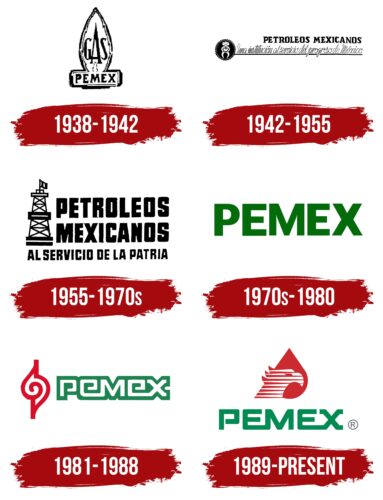
1938 – 1942
1942 – 1955
1955 – 1970s
1970s – 1980
1981 – 1988
1989 – today
The PEMEX logo is an abbreviation of the phrase “PEtróleos MEXicanos,” using the first letters of each word. They are connected in pairs, except for the letter “P,” which stands alone. The curved line forming the top of the letter “P” is not closed; it does not reach the vertical stem. All glyphs are uppercase, bold, and blocky but have angles. The harmonious combination of sharp and smooth forms creates a pleasant feeling of reliability and friendliness. Above the green text is a symbol depicting a red blob and a striped eagle. The white lines on the bird resemble lines of speed, which gives the emblem a dynamic feel.
A single letter, “P,” acts as a leader, standing ahead of the other letters. The eagle looks as if it is rushing to some important place in an accelerated rewind. The red droplet reminds us that the company deals with oil. It is a simple design, but it speaks volumes when looked at closely.
PEMEX color codes
| Sea Green | Hex color: | #008b52 |
|---|---|---|
| RGB: | 0 139 82 | |
| CMYK: | 100 0 41 45 | |
| Pantone: | PMS 340 C |
| Fire Engine Red | Hex color: | #cb2a2f |
|---|---|---|
| RGB: | 203 42 47 | |
| CMYK: | 0 79 77 20 | |
| Pantone: | PMS 1788 C |


