


 Pennzoil Logo PNG
The Pennzoil logo conveys movement, technology, and reliability. Its design reflects a connection to automotive culture and attention to quality, inspiring confidence in drivers. The visual image evokes associations with engine performance and the care required to maintain its flawless condition.
Pennzoil’s history began in 1889 in Oil City, Pennsylvania, where South Penn Oil Company was founded as the American petroleum industry grew. The Pennzoil name later became the company’s flagship motor oil brand. By 1913, Pennzoil had gained a strong position in the motor oil market, giving South Penn Oil Company a distinct product identity within the lubricant sector.
In 1925, South Penn Oil Company merged with Oil City Oil and Grease Company and Pennzoil Refining Company to form Pennzoil. The new company continued to produce and distribute Pennzoil motor oils while expanding into gasoline refining and petroleum product distribution. The merger consolidated production, refining, and distribution under a single business structure, strengthening Pennzoil’s role in the American oil sector.
In the 1960s, Pennzoil expanded outside the United States. Its first overseas office opened in Canada in 1961, marking the beginning of international operations. The company later entered markets including Mexico, Brazil, and Japan, gaining recognition beyond North America. In the 1980s, Pennzoil became involved in the Pennzoil v. Texaco case after claiming Texaco interfered with its attempt to acquire Getty Oil. The dispute became one of the most discussed corporate legal battles of the decade. It ended with Texaco paying Pennzoil $3 billion.
In 1998, Pennzoil changed its business model by separating refining and marketing operations and forming Pennzoil-Quaker State. The new company acquired Quaker State Corporation, adding another major motor oil brand to its portfolio. In 2002, Shell Oil Company, the American division of Royal Dutch/Shell, acquired Pennzoil-Quaker State. Pennzoil and Quaker State were then placed under Shell Lubricants as premium motor oil brands, with Pennzoil headquartered in Houston, Texas, and both brands under Shell plc.
Meaning and History
What is Pennzoil?
This manufacturer of motor oils and lubricants is considered one of the most reliable in the world. Its products are recognizable by their distinctive yellow packaging and unique technology for producing oil from natural gas, ensuring high efficiency and purity. The range includes synthetic oils for professional motorsports and racing vehicles, as well as standard motor oils for everyday use. Through close collaboration with leading automakers and racing teams, the company has gained wide recognition among everyday drivers and motorsport experts.
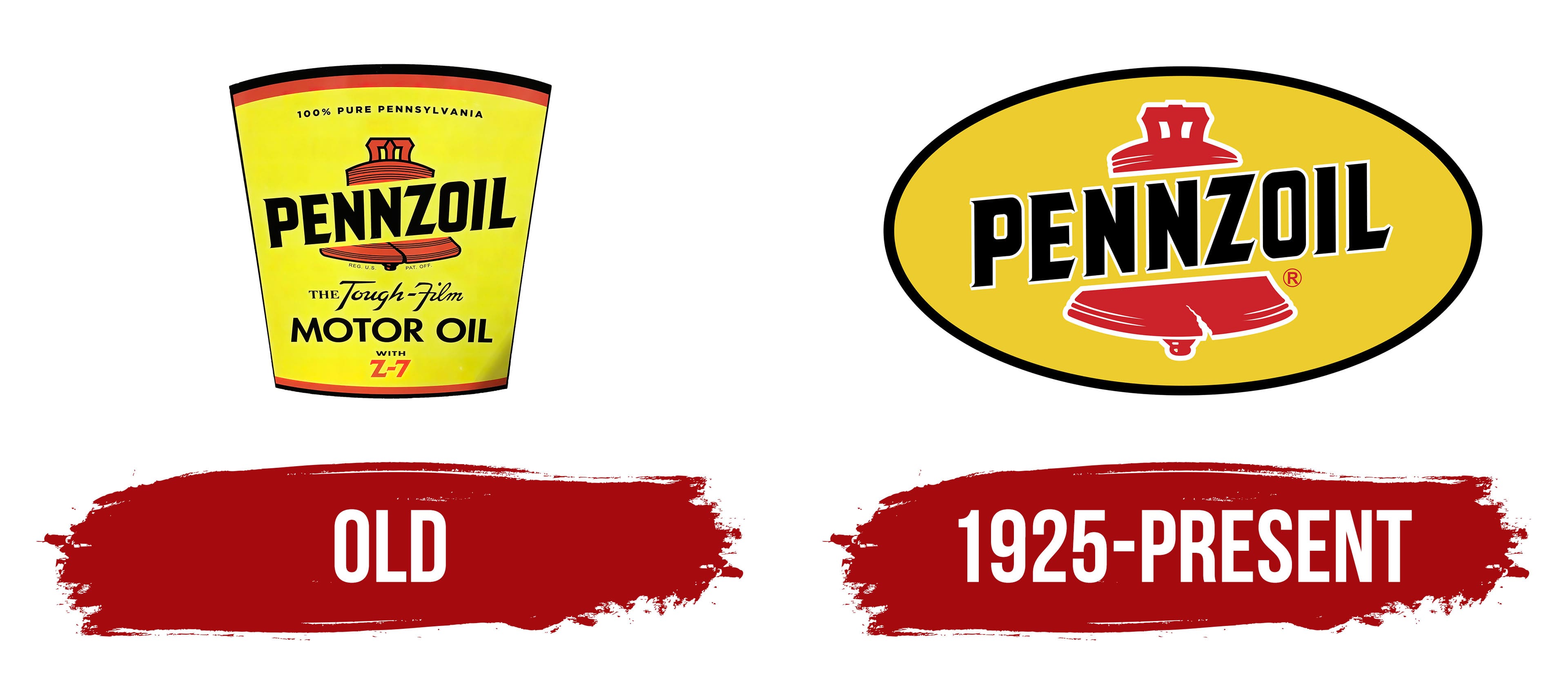
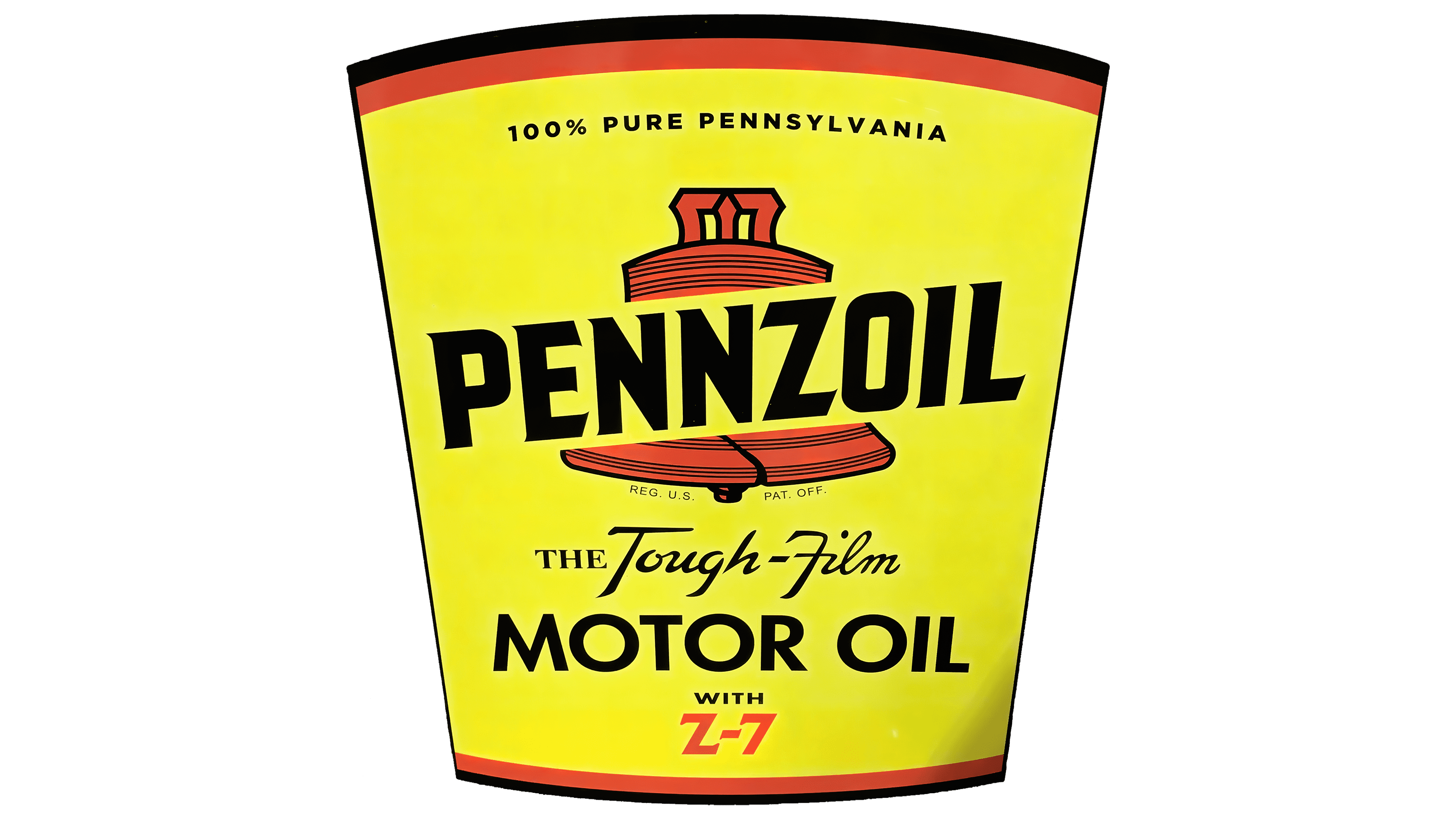
Old
1925 – today
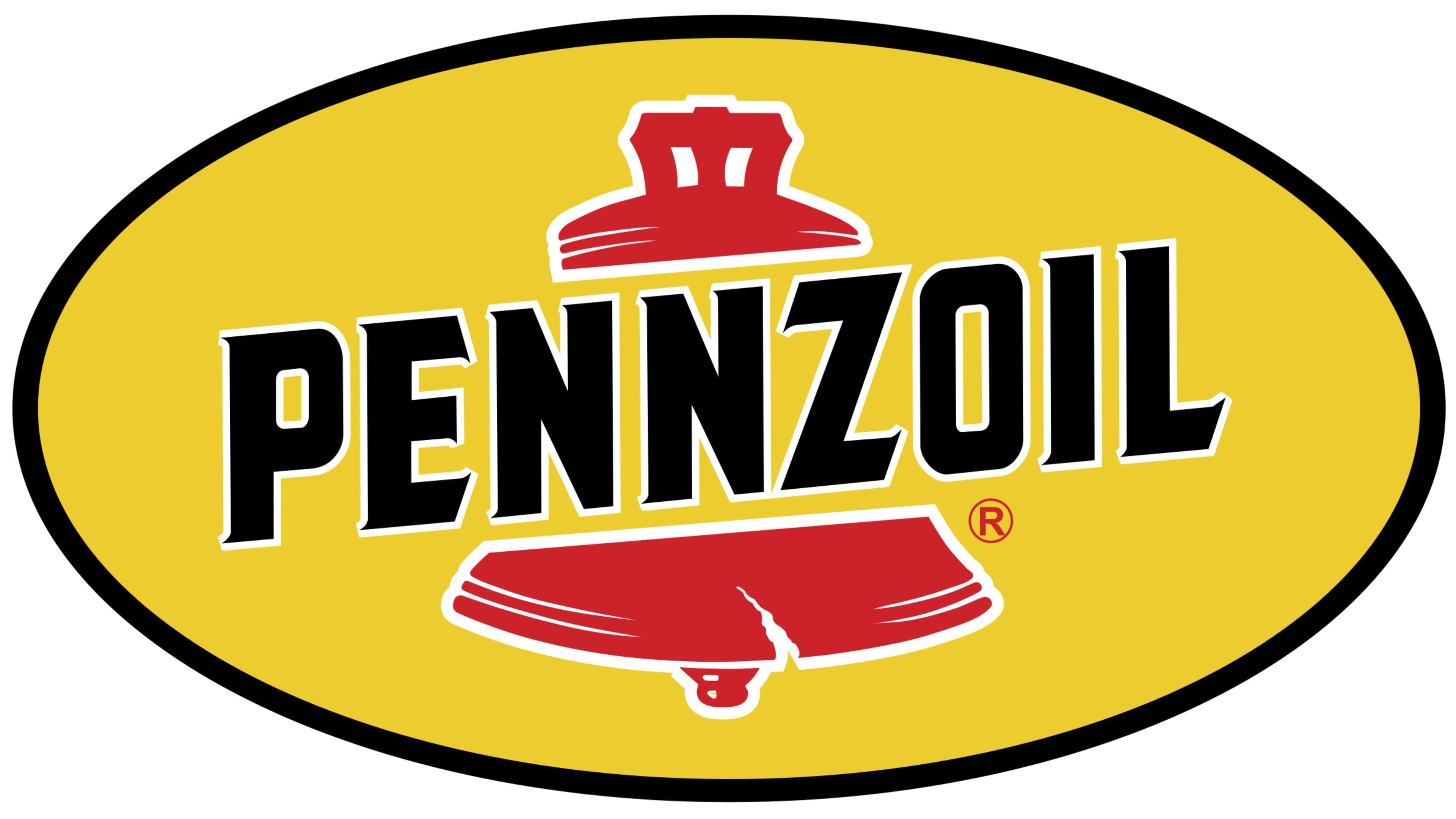
The Pennzoil logo stands out for its vibrant, thoughtful design, closely tied to the company’s history and operations. The name combines “Pennsylvania” and “Oil,” highlighting the brand’s origin and specialization in oil and lubricant production.
At the top of the logo is a red bell, reminiscent of the famous Liberty Bell, a symbol of American history. The crack at the bottom of the bell adds a unique quality and links the image to the historical object. The red color imparts energy, confidence, and dynamism, reflecting the product’s nature.
The name is rendered in bold, with sharp outlines and a white border that emphasizes each letter. The sharp angles and the absence of traditional serifs give the text a modern, assertive look. The black letters symbolize stability and reliability, while the white border adds depth, enhancing readability.
The entire composition of the visual mark is enclosed in an oval frame of rich yellow. This bright shade is associated with energy, warmth, and motor oil, underscoring the company’s primary focus. The black outline completes the design, providing cohesion and visual clarity.
The Pennzoil emblem harmoniously combines historical elements with modern style. It emphasizes the company’s connection to its roots, demonstrates confidence in its product quality, and reflects the brand’s dynamic character.