


 Portland State Vikings Logo PNG
The Portland State Vikings logo centers on a shield. The shape symbolizes strength and protection, reflecting the team’s competitive spirit. The strict geometry presents the team as a disciplined and serious tournament participant focused on strong athletic performance.
Portland State University, founded in Portland, Oregon, in 1946, began its athletics program a year later. In 1947, the teams adopted the name “Vikings,” reflecting the city’s strong Scandinavian roots.
Initially competing at the junior college level in the 1950s, the university joined the NAIA in the 1960s, significantly expanding its sports activities. A critical turning point came in 1971 with Portland State’s transition to NCAA Division II, notably under football coach Mouse Davis, who introduced the innovative “run and shoot” offense.
The athletic infrastructure improved in 1984 with the opening of the Peter W. Stott Center Arena, which became a central hub for campus sports life.
In 1996, Portland State University transitioned again, moving up to NCAA Division I and joining the Big Sky Conference. The football program excelled in the 2000s, regularly qualifying for FCS playoffs and securing multiple Big Sky titles. Basketball achieved prominence during the 2008–2009 season, winning conference championships and competing in the NCAA tournament.
From 2010 to 2019, the university focused on enhancing facilities and expanding women’s sports. The Viking Pavilion underwent significant renovations in 2020–2021, upgrading the experience for athletes and spectators.
In 2022 and 2023, the Vikings continued to compete steadily in the Big Sky Conference, maintained facility investments, and developed Olympic sports.
Meaning and History
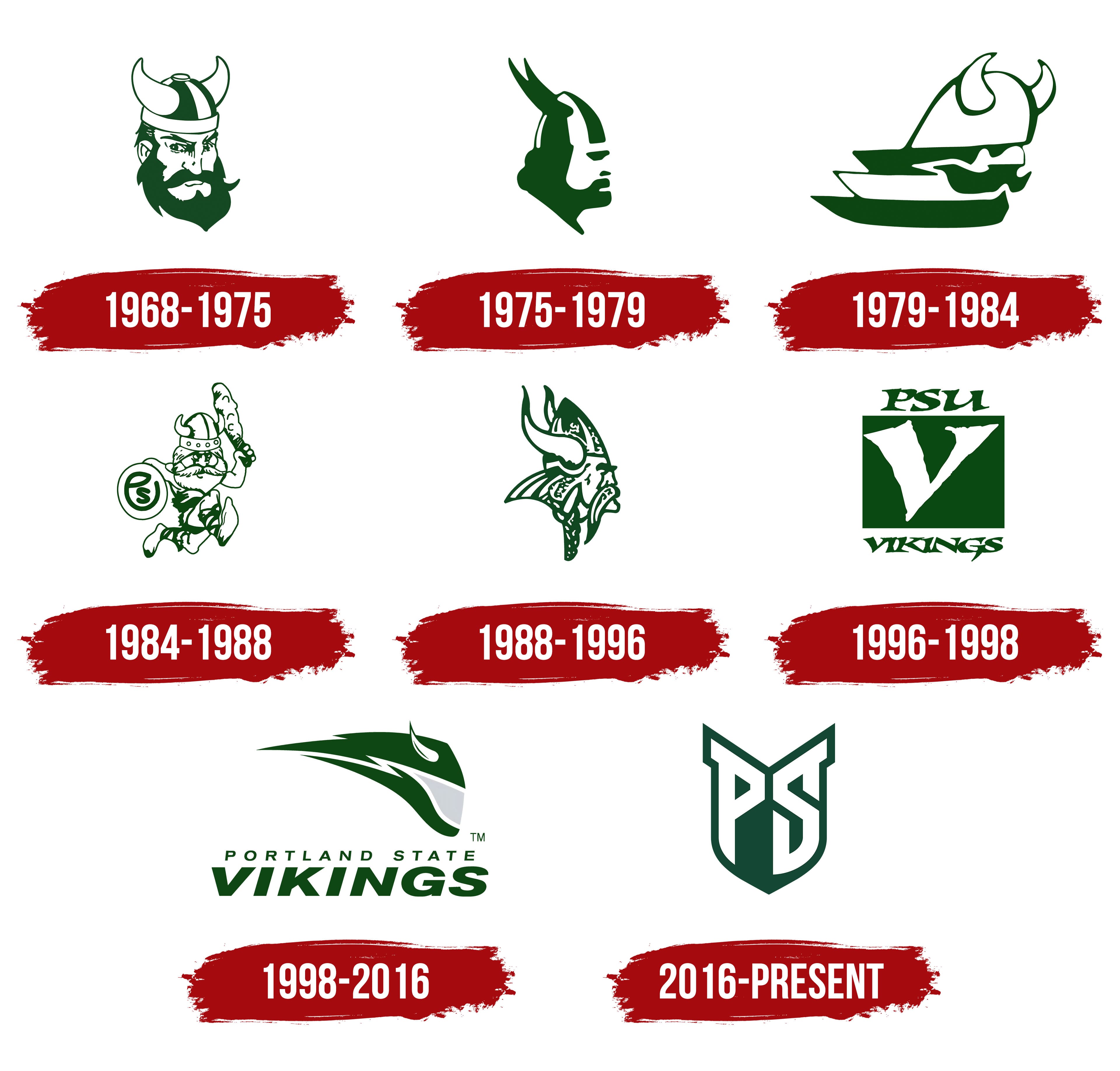
What are the Portland State Vikings?
The Portland State Vikings are the Portland State University teams that compete in NCAA Division I sports in the Big Sky Conference and represent the university in Portland, Oregon. They play soccer at Providence Park, which they share with the city’s professional soccer teams, and often play basketball at the historic Viking Pavilion in downtown Portland. The green and white teams showed strong results in several sports, including athletics and volleyball. With his Nordic spirit, the mascot, Victor E. Viking, always cheers up fans at home games, adding a special flavor to their urban atmosphere.
1986 – 1975
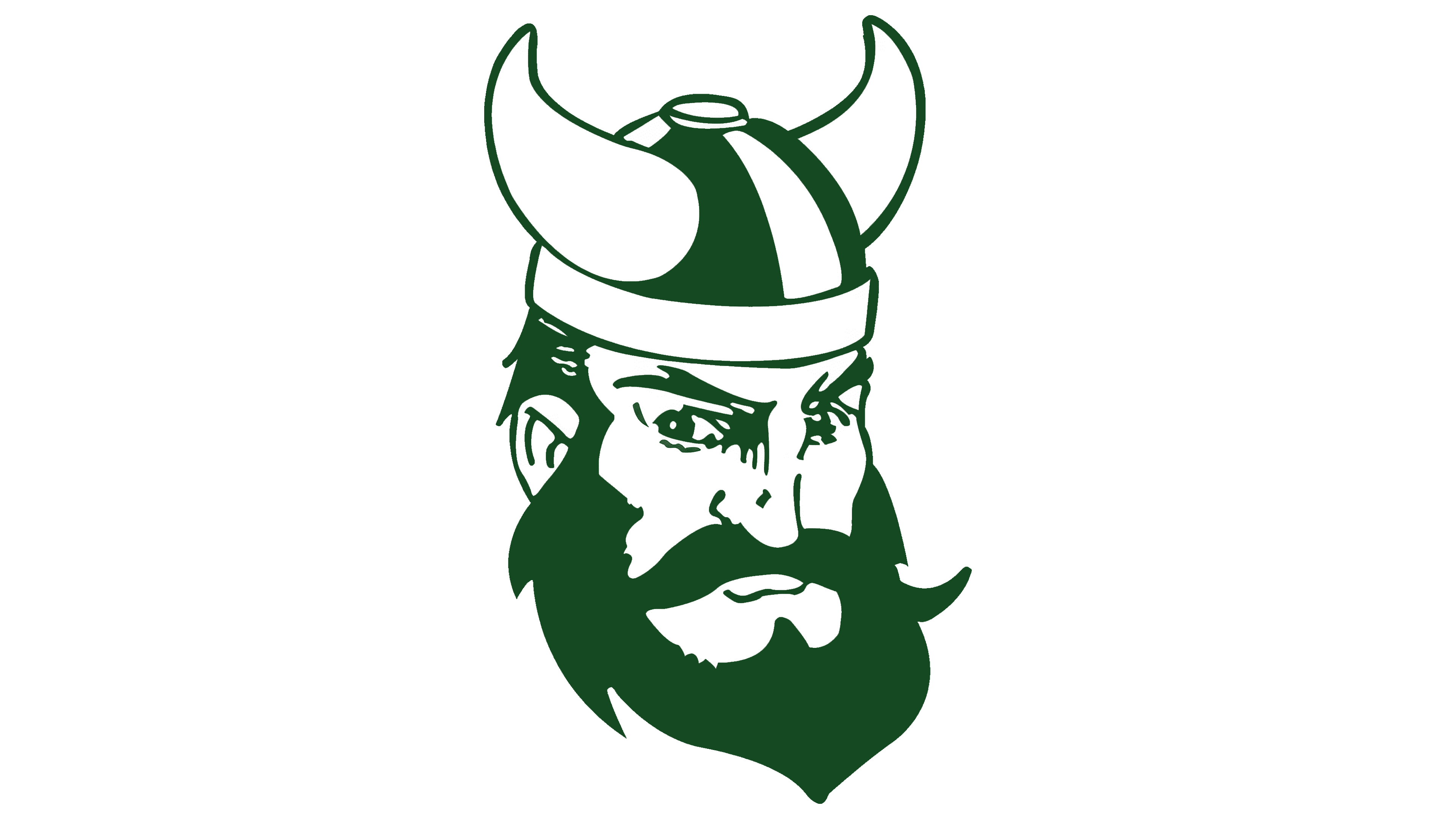
The first version of the Portland State Vikings logo features a northern warrior. At the center is the head of a Viking in a horned helmet. The profile, with a thick beard, appears stern and focused; the gaze looks forward, suggesting inner concentration.
The composition uses dark green and white. Green emphasizes endurance. White highlights the details.
The horned helmet serves as the semantic center. It conveys the character’s cultural foundation, and the historical theme flows smoothly into a sports context. As a result, the symbol expresses strength and character without aggression.
1975 – 1979

In 1975, the Portland State Vikings introduced an updated emblem. The university moved away from the previous detailed graphics and adopted a more compact form. At the center is the profile of a Viking in a horned helmet, depicted as a solid silhouette. Strong cheekbones, a heavy chin, the horns of the helmet, and a profile directed forward.
Dark green adds depth and emphasizes the character’s stern nature, while the white outline defines the face’s features and the helmet’s elements. The overall design conveys strength and inner focus.
1979 – 1984

From 1979 to 1984, the Portland State Vikings used a version of the emblem in which the Viking image received a new, experimental interpretation. The symbol gained a sense of dynamic motion and an association with a ship. The composition centers on a profile of a head in a horned helmet facing right. The silhouette appears to accelerate, and the trailing lines to the left create the effect of airflow.
A stylized white helmet forms the base, outlined in green. It is rendered as the bow of an ancient drakkar, recalling the decorative carvings on ship prows. In front, mustache-like forms shape the face contour without focusing on individual features. The entire image is stylized to enhance the emblem’s metaphorical quality.
The shape is stretched horizontally, creating a sense of speed and directed motion. The lower section is made of stepped lines resembling the sides of a ship or waves through which it moves. The visual structure combines the motifs of man and vessel, turning the emblem into an allegory of the journey and the pursuit of new horizons.
1984 – 1988
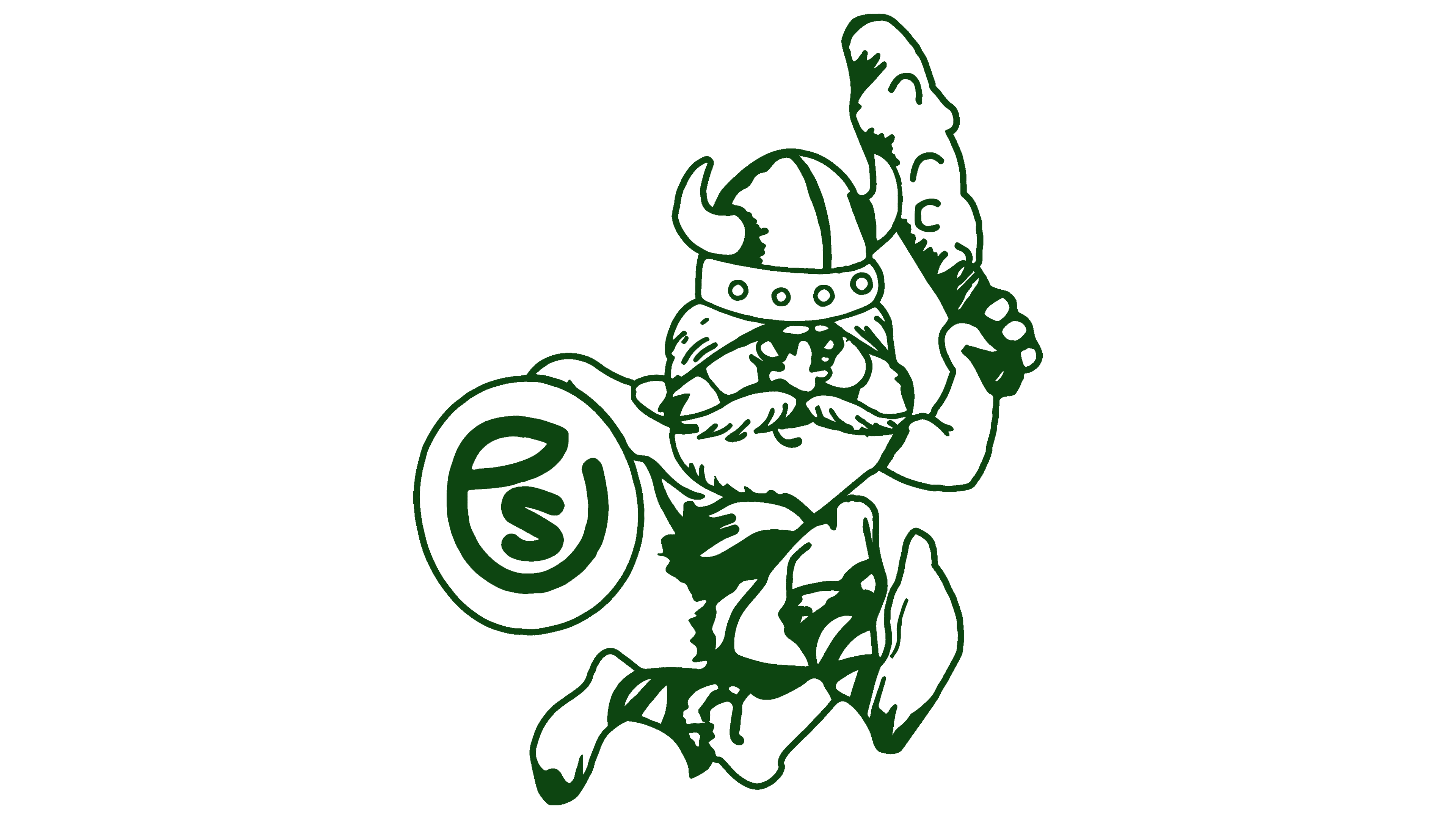
One of the most expressive versions of the Portland State Vikings symbol features a running Viking. The figure wears a horned helmet and holds a club in one hand and a round shield in the other. The shield features the letters PS, an abbreviation for Portland State. The color scheme is green and white.
The proportions are deliberately distorted; the head is large, and the mustache and beard are impressive. The stocky figure seems frozen in a sharp forward lunge, with a bent posture, flexed knees, and the arm holding the club raised high. The whole scene resembles an attack, with a humorous undertone.
The shield with PS serves two roles. On one hand, it is a weapon; on the other, it represents affiliation with the university. The letter P is not immediately noticeable, creating a slightly casual feel and adding liveliness to the drawing. The club has a hint of texture, emphasizing the character’s brute strength and reinforcing the composition’s playful tone.
1988 – 1996
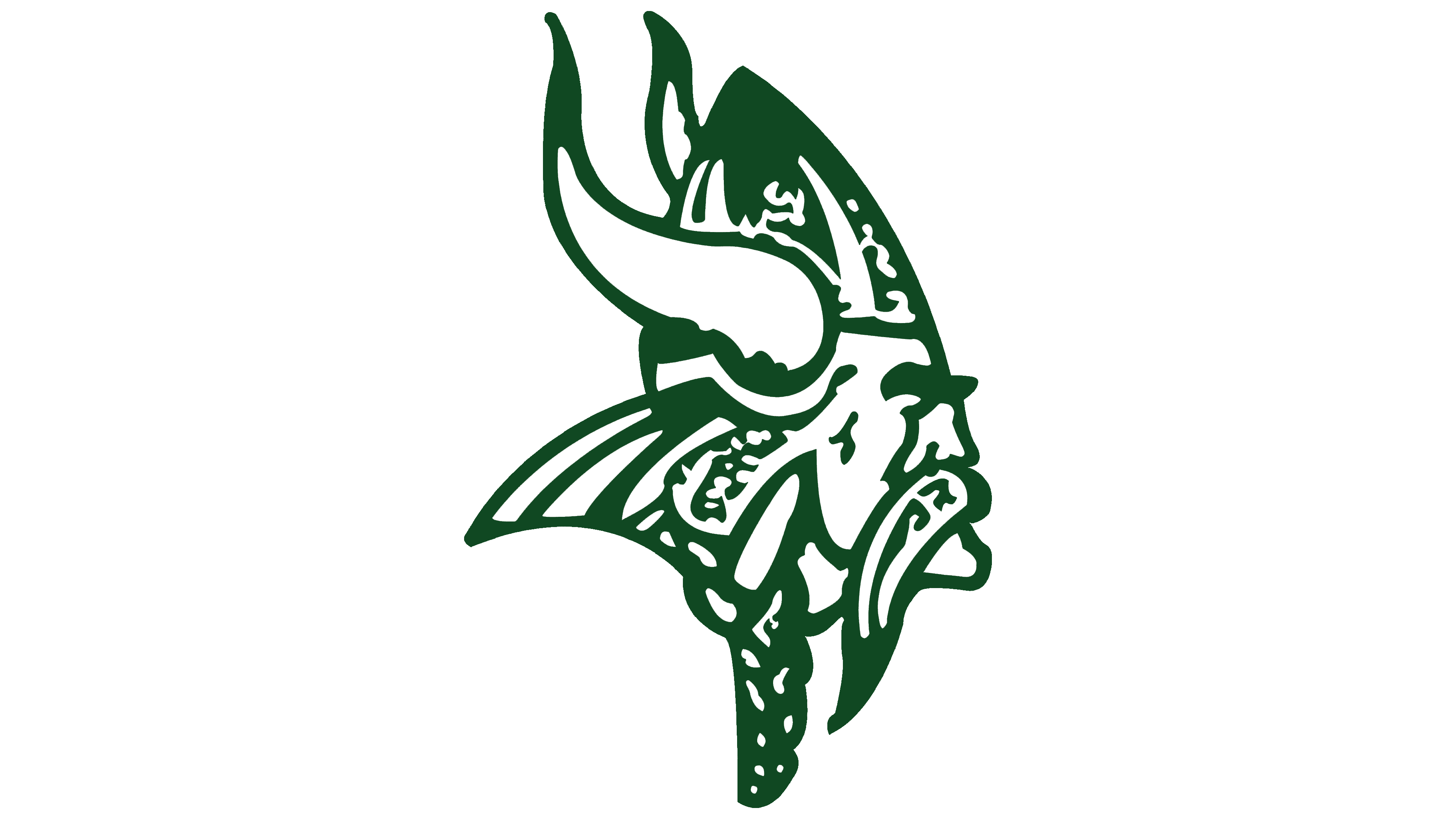
In the new version of the Portland State Vikings emblem, the team returned to an image closer to classical representations of northern warriors. At the center is the profile of a Viking looking to the right. The silhouette is massive, lacking the lightness of the previous cartoon-like interpretation. He wears a horned helmet with decorative lines. The beard and hair are thick and braided, giving the figure a more formidable appearance.
The composition focuses on the face. The mustache is long, the cheekbones are sharp, and the gaze is confident. Every feature emphasizes the character’s personality and heightens the image’s monumentality.
The helmet resembles the metalwork of ancient artifacts. The large horns make the silhouette appear broader.
1996 – 1998
The new version of the Portland State Vikings emblem abandoned the familiar warrior image and moved toward a more austere typography. At the base is a green rectangle with a slanted white V in the center. Above it are the letters PSU in green, and below is the word VIKINGS in the same shade.
The project uses a custom typeface. It features sharp serifs and a slight slant. The white letters on the green background create vivid contrast. The upper and lower text blocks frame the design into a unified graphic column.
This version marked a departure from the illustrative motifs of earlier years. Geometry and the structure of the letterforms convey the energy and connection to the university’s history.
1998 -2016
In 1998, the Portland State Vikings introduced a modern reinterpretation of the familiar Viking image as their emblem. At the center is a stylized helmet shown in profile, facing right. The silhouette is elongated, the lines are sharp, and the rear contours extend backward, creating the impression of a swift forward motion.
The horns remained, although both they and the overall shape resemble a vision of the future more than a reference to the past. The appearance is closer to motorcycle gear with a narrow visor slit. Only light hints of the traditional Viking portrait remain. It is an abstraction made of flat shapes, with no faces but character.
The color scheme is built on dark green, gray, and white. Green remains the foundation of the university’s identity; gray adds depth, and white lines emphasize angles and create a metallic sheen.
Below the symbol is an inscription. PORTLAND STATE is rendered in thin letters, and VIKINGS is shown in wider forms.
2016 – today

In 2016, the University of Portland, together with Nike, introduced a style called Viking Crest. At the center of the composition is a heraldic shield. Inside the shield are the letters P and S designed according to the principles of runic writing. The lines are strict and angular.
The shield’s shape carries multiple layers of meaning. On one hand, it is a warrior’s attribute; on the other, it represents a ship. The lower part resembles the hull of a drakkar, referring to the era of northern voyages. There is also a hint of the rune Dagaz, associated with dawn, renewal, and growth. As a result, the symbol combines protection, forward motion, and development.
The letters P and S are integrated into the outline. The lines form a rhythmic structure. The upper part of the shield includes sharp projections. These elements resemble helmet horns and strengthen the connection to the warrior image.
The color scheme is based on green and white. The project used a custom typeface. Its outlines suggest runic motifs and the distinctive angularity of decorative elements on Scandinavian ships.
The official presentation took place in May 2016. Viking Crest united history and modernity.