


 Radford Highlanders Logo PNG
The Radford Highlanders logo features a shield. This element conveys continuity, the team’s shared identity, and their steady character. The letter R serves as the university’s identifying mark and creates a unified visual identity. The chosen colors evoke Virginia’s regional identity and convey an athletic community.
Radford University, established in 1910 as the State Normal and Industrial School for Women, began offering formal athletics in the 1970s after transitioning to coeducation. The university chose the nickname “Highlanders,” symbolizing the Scots-Irish heritage prevalent in southwest Virginia’s Blue Ridge Mountains. Its mascot portrays a traditional Scottish figure dressed in a kilt, emphasizing local cultural connections.
In 1972, Radford launched its first men’s baseball and basketball teams and built modern athletic facilities to support them. The university joined NCAA Division II in 1978, broadening its athletics by adding tennis, track and field, and volleyball teams.
Radford moved to NCAA Division I in 1984, marking this shift with the opening of the Dedmon Center, its primary sports complex. The Highlanders joined the Big South Conference in 1991, enabling competitive growth. The women’s basketball team gained prominence through multiple conference titles and NCAA tournament appearances during the 1990s.
In 2009, the men’s basketball team won its first Big South Conference Championship, advancing to the NCAA Division I tournament. Further achievements came in 2011 when the women’s softball team secured its first regular-season championship.
From 2016 to 2019, Radford experienced continued athletic growth, with notable successes in women’s tennis, which captured several Big South titles. Facility improvements, including renovations to the Dedmon Center and training spaces, supported these developments.
By 2023, Radford fielded 16 NCAA Division I teams, with the men’s basketball team and women’s track and field setting new performance standards.
Meaning and History
What is Radford Highlanders?
Radford University teams compete at the NCAA Division I level in Virginia’s scenic Blue Ridge Mountains. The teams are active in baseball, basketball, and football. Their mascot, Rowdy Red, excites the public and embodies the university’s fighting and competitive spirit.
1982 – 2007
From 1982 to 2007, Radford athletic teams competed under an emblem that emphasized their academic origin. The design featured two large letters RU in a rich red color. The letters had a white inner outline and a black outer line. The massive shape and serifs reflected a connection to academic tradition and the university’s official symbolism.
Below the monogram was the word Highlanders. A thin, elongated black font balanced the large red letters. The team name reflected the region’s link to Scottish heritage and emphasized the university’s cultural identity.
The red shade of RU conveyed energy and a fighting spirit.
2008 – 2015
Twenty-five years later, Radford University introduced an updated emblem that retained the recognizable foundation while adding a bright, modern accent. The central element remained the same: the massive RU letters rendered in red with a double outline. The inner line was white, the outer blue.
The main update was the lower inscription Highlanders, presented in a new style. Unlike the previous calm version, the new format appeared energetic and modern. The font was italic, with a slant, sharp strokes, and elongated shapes. The letter H was larger than the rest and set the dynamic tone for the entire composition.
2016 – today
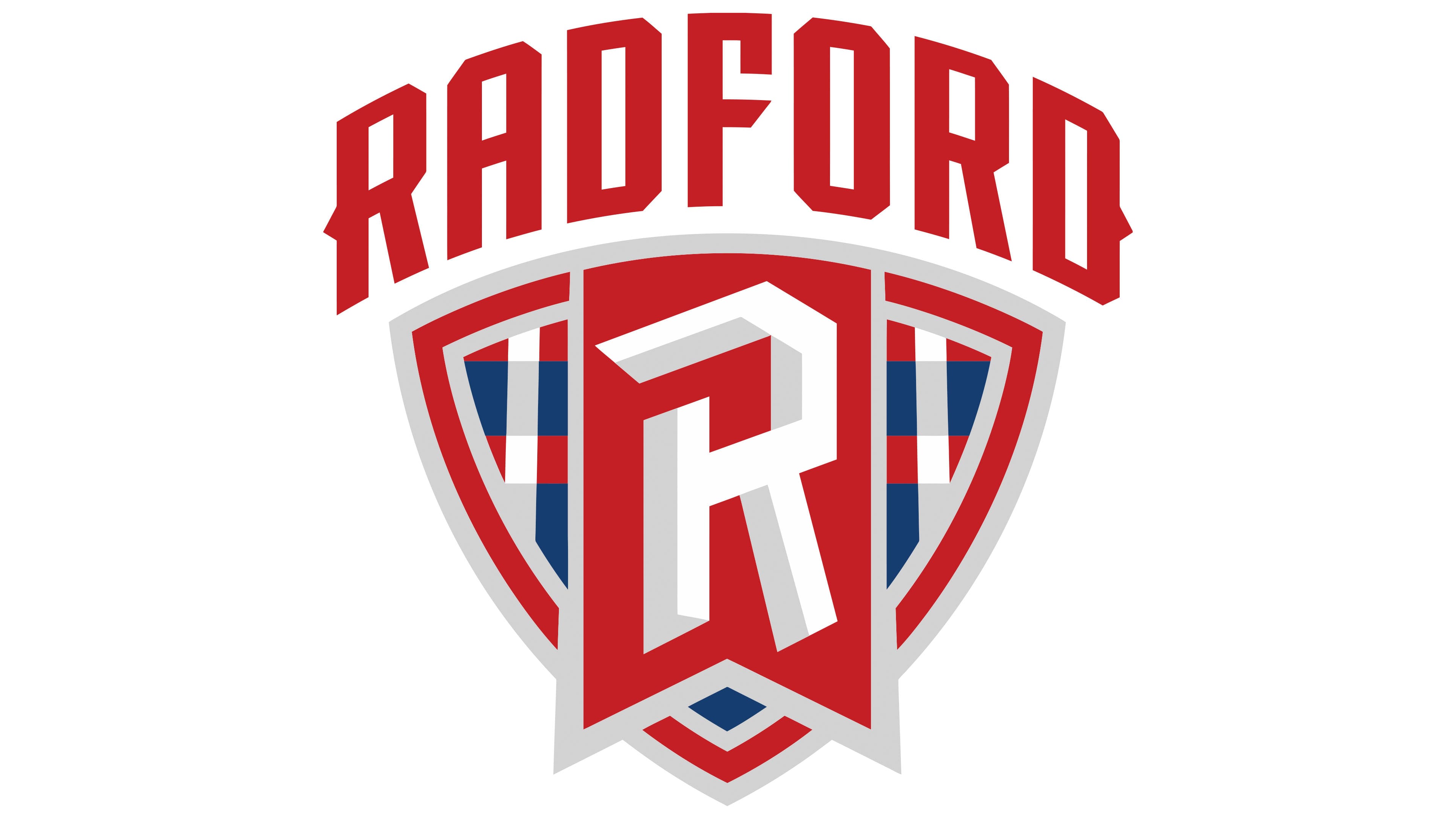
After a year of work on renewing the athletic brand in collaboration with the Pennsylvania agency Joe Bosack & Co., Radford University unveiled a new emblem on October 13, 2016. The process involved the administration, the athletic community, coaches, alumni, and current student-athletes, who discussed the future style of Athletics and approved the overall concept.
The design features a shield shape with a large, stylized letter R. The white letter sits over a red flag draped across the shield. Beneath it, the shield features a geometric pattern made up of intersecting red, white, and blue lines. The interlacing forms a design resembling Scottish tartan fabric.
Above the shield is the name Radford. The large, red font creates a confident, structured appearance. The university’s official font pairings are “Minion” (serif) and “Inter” (sans-serif). The shield’s checkered background evokes the cultural heritage of the Scottish Highlanders, whose name the university’s athletic teams carry.