The main feature of the Bradley Braves logo, which has the form of a chevron, is to be recognizable. This is ensured by bright and striking visualization in a modern minimalist style, reflecting confidence in their victories.
Bradley Braves: Brand overview
| Founded: | 1989 |
| Headquarters: | Peoria, Illinois, U.S. |
| Website: | bradleybraves.com |
Almost immediately after its opening (in 1879), the university formed its first football and baseball teams. This happened in 1898. Four years later, a basketball team appeared, which became the most successful of all. It has won the National Invitation Tournament (NIT) four times and participated in the NCAA and NIT tournaments twice each. Kaboom the Gargoyle is the mascot of Bradley athletes.
Meaning and History
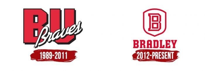
The logo from the late 80s has only one main element – the name of the sports department, divided into two parts. The first is the background, in the form of two large red letters, “BU.” This is the abbreviation of “Bradley University.” The second is the white italic word “Braves,” denoting the teams themselves. They all have black shadows, which create a 3D effect – voluminous and expressive. This logo existed until 2011.
What is Bradley Braves?
Bradley Braves is a sports program uniting 15 student teams from Bradley University. They are located in Peoria, Illinois, are members of the Missouri Valley Conference, and participate in NCAA Division I. They have an unusual mascot – Kaboom the Gargoyle.
1989 – 2011
2012 – today
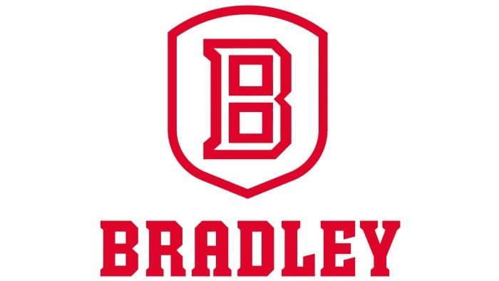
In 2012, a redesign was carried out, resulting in a minimalist red and white logo. It has only two details: the letter “B” in the center of the shield, resembling a chevron, and the word “Bradley” located below. The font is slightly rounded, in uppercase, with serifs.
Bradley Braves: Interesting Facts
The Bradley Braves are a sports team from Bradley University in Peoria, Illinois. They’re good at many sports and play in a big league called the Missouri Valley Conference.
- Basketball Stars: Their men’s basketball team was super good long ago. They almost won the big championship twice in the 1950s.
- Soccer Champs: Their soccer team is awesome, too. They’ve won many games and even played in the big college soccer tournament many times.
- Running Fast: Cross-country runners, both men and women, have done well in big races, showing that they’re great at running.
- Cool Nickname: They’re called the “Braves” because of Lydia Moss Bradley, the amazing woman who started the university. The nickname stands for bravery and strength.
- Volleyball Power: The women’s volleyball team is getting really good and competes hard in their league.
- Big Stadium: They play basketball in Carver Arena, a huge and exciting place to watch games.
- Famous Students: Some people who studied there became famous in sports, like basketball and baseball stars.
- Helping Out: The Braves do a lot to make their city a better place for everyone.
- Many Sports: They don’t just play one or two sports; they play a bunch, like golf, tennis, and track and field.
- Smart Athletes: The school ensures the players do well in their classes, not just sports. They also win awards for being smart.
So, the Bradley Braves are about a lot more than just playing games. They’re good at sports, help their community, and care about doing well in school.
Font and Colors
Bradley Braves color codes
| Dark Candy Apple Red | Hex color: | #a50000 |
|---|---|---|
| RGB: | 165 0 0 | |
| CMYK: | 0 100 100 35 | |
| Pantone: | PMS 485 C |
