 Providence Bruins Logo PNG
The Providence Bruins logo reflects a hockey team that maintains its style and discipline despite being a farm team. The team is known for persistence and stability.
The Providence Bruins franchise began in Portland in 1977 as the Maine Mariners. The new club won the American Hockey League’s (AHL) Calder Cup in its first two seasons, becoming the only team in league history to claim consecutive titles in its first two seasons.
In 1987, the Mariners became the Boston Bruins’ farm club, tying player development to the parent organization. The franchise moved from Portland to Providence, Rhode Island, in 1992 after professional hockey had been absent from the city for 15 years. The new Providence Bruins name reflected the affiliation and the short distance between the two New England cities. In Providence, the franchise continued as the parent club’s development team and regularly sent players to Boston.
Providence reached the playoffs regularly during the 1990s. The 1998-99 season produced the first and only Calder Cup won under the Providence name. In the final, the team defeated the Rochester Americans, an established league opponent. The title came seven years after the relocation and rebranding.
Patrice Bergeron and Brad Marchand developed in Providence before building long NHL careers. Bergeron later served as captain and won multiple individual awards, while Marchand became a leading figure during the 2010s and 2020s. Both later helped the parent club win the Stanley Cup in 2011. Divisional rivalries remained part of the schedule, while Amica Mutual Pavilion became one of the league’s most-attended arenas.
Meaning and History
What is Providence Bruins?
It is a hockey team from Providence competing in the American Hockey League (AHL), affiliated with an NHL club. The team regularly participates in the playoffs and has won the league championship. Home games are held in a modern city arena, and the club serves as an essential training ground for young players preparing for higher leagues.
1987 – 1992
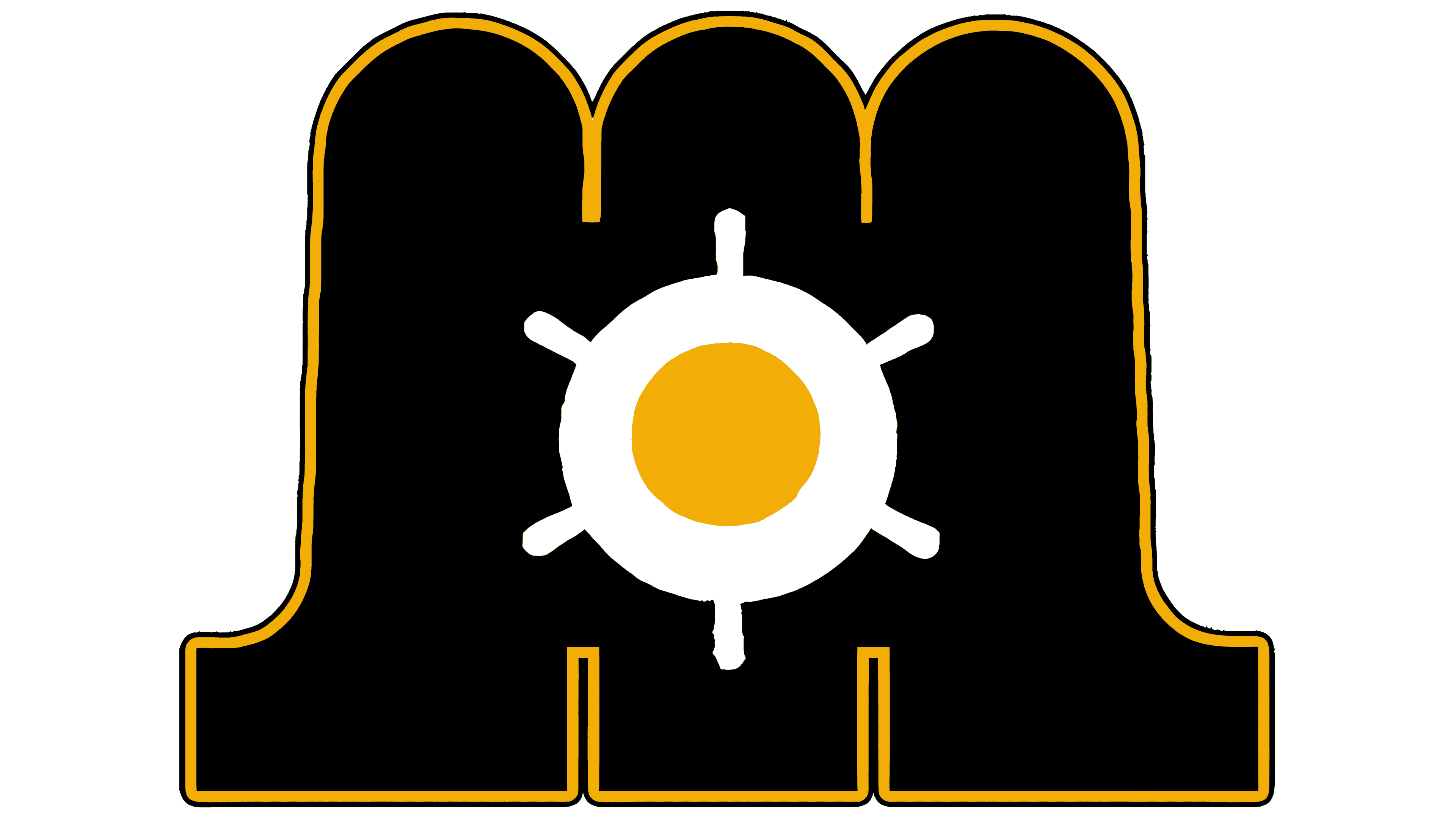
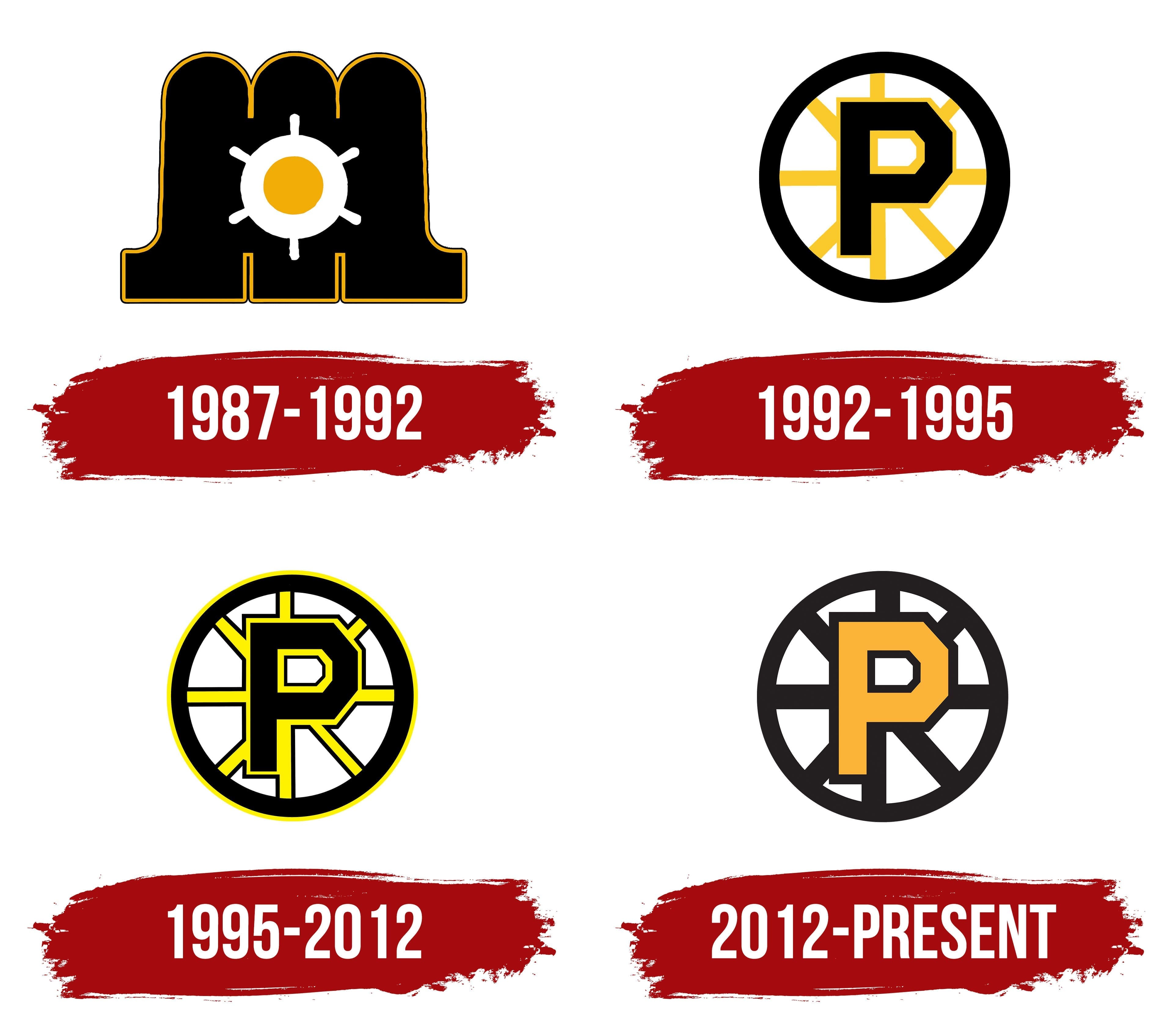
The original logo for the Maine Mariners (1987–1992) featured a design atypical for hockey clubs, based on maritime themes reflecting the club’s location in Maine, a renowned center for shipping and fishing.
Its primary element was the letter “M,” drawn in rounded shapes outlined in yellow. The curves resembled ocean waves or piers, symbolizing the club’s maritime connections. Inside the letter was a white ship’s wheel with a yellow center dot, representing Portland as a significant port and the starting point for sea voyages.
The designers captured the maritime traditions and adventurous spirit of Portland and Maine. The absence of aggressive elements typical of hockey logos distinguishes this emblem from those of other American Hockey League teams.
1992 – 1995
In 1992, the team became the Providence Bruins. The name “Bruins” was adopted from the NHL’s Boston Bruins, with which Providence became affiliated, highlighting their connection.
The centerpiece of the logo was a large geometric “P” representing Providence. Its angular edges and strict lines emphasized team strength.
Surrounding the letter was a spoked wheel, a reference to Providence’s historic nickname, “The Beehive of Industry,” which symbolizes the city’s industrial heritage.
The color scheme mirrored the Boston Bruins’ colors: black representing hockey competition, and yellow highlighting energy and club tradition.
The overall design followed New England hockey traditions, being simple, strong, and instantly recognizable, with no extra details.
1995 – 2012
The updated logo featured minor adjustments to the original concept, mainly adding outlines to the spokes and central letter to give the symbol clear depth.
The color tone changed from saffron to pure yellow, aligning more closely with the Boston Bruins’ colors.
The wheel’s rim gained a yellow outline, creating visual consistency with its NHL affiliate. NHL Creative Services, focusing on the Boston Bruins’ heritage, was responsible for this design.
2012 – today
When the Providence Bruins decided to update their symbol, the Reebok CCM studio took on the project. The logo received a new presentation, although the original concept introduced in 1992 remained unchanged. The design team shifted the main focus to form, proportions, and color treatment.
The logo is now perceived as more monolithic because all lines are uniform in thickness. At the center is a large letter “P,” executed in a sans-serif typeface. Its color was changed to a bright orange-yellow shade called “diamond.”
Around the letter is a circle divided into eight equal sectors by black lines. They resemble spokes on a wheel and support the image of Providence’s industrial tradition. The thickness of the outer ring and the lines within it is consistent.
In its new execution, the symbol became visually stronger. The logo emphasizes the club’s local identity and its connection to the Boston Bruins, whose emblem uses the letter “P” in place of “B” to represent the first letter of the city name, Providence.