


![]() Anaheim Ducks Logo PNG
Anaheim Ducks Logo PNG
At first glance, the Anaheim Ducks hockey club’s emblem might seem abstract and unclear. But in reality, this is not the case: the emblem is hyper-realistic. It features a duck’s foot imprint. Subconsciously, this can be associated with the team’s desire to leave its mark in sports history.
The Anaheim Ducks franchise was created in 1993 by Michael Eisner, then head of Walt Disney, in connection with plans to build a new $103 million arena in Anaheim. Following talks with Los Angeles Kings owner Bruce McNall, the league approved expansion, with commissioner Gary Bettman setting a $50 million entry fee, including compensation for territorial rights.
The original name, Mighty Ducks of Anaheim, was inspired by the 1992 film about a youth hockey team. The movie’s success, with over $50 million at the US box office, directly shaped the club’s identity. Eisner, influenced by the film and his sons’ involvement in hockey, built the team around that concept.
Early branding leaned into entertainment. The logo featured a duck mask inspired by the film, and the color scheme included purple, jade, silver, and white after initial ideas of green and gold were rejected. The image drew a young audience, with a large share of early fans being children.
In 2005, the franchise changed ownership, and in 2006, the team was renamed Anaheim Ducks. The visual identity shifted away from the film link toward a simplified mark. The new logo used a stylized duck foot to form the letter D, replacing the original cartoon imagery associated with the Disney era.
Meaning and History
![]()
Each logo has a quirk that, if not quickly recognizable, at least makes it unique. Walt Disney laid the foundation for the franchise at the suggestion of its first owner, Jack Ferreira. He discussed everything with the animation master, from the color of the hockey sweaters to the elements of the franchise’s logo. As a result, a cartoonish image was created that attracted fans’ attention.
What are Anaheim Ducks?
It is a professional hockey team representing the Pacific Division in the National Hockey League. It is also a member of the Western Conference. The Walt Disney Company founded it in 1993, naming it after the movie “The Mighty Ducks.” In 2005, the franchise came under the control of Henry and Susan Samueli.
1993 – 2006
![]()
The team’s first logo, “Anaheim Ducks,” based in Anaheim and called “The Mighty Ducks of Anaheim,” was an inverted turquoise triangle with a black circle inside. The central element of the emblem was a goalie mask shaped like a duck, above two crossed yellow sticks.
2006 – 2010
![]()
In 2006, the franchise shortened its name to Anaheim Ducks and changed its logo. Although it was formally just a wordmark, it looked unique because of the peculiar shapes of each letter. The text became golden, outlined in orange and black. The shape of the letter “D” differed significantly from the others. The slightly elongated uppercase letter resembled a webbed foot. Above the team’s name, the wordmark “Anaheim” was placed in black lettering.
2010 – 2013
![]()
More muted colors compared to the 2006 emblem, and all the changes in the new emblem.
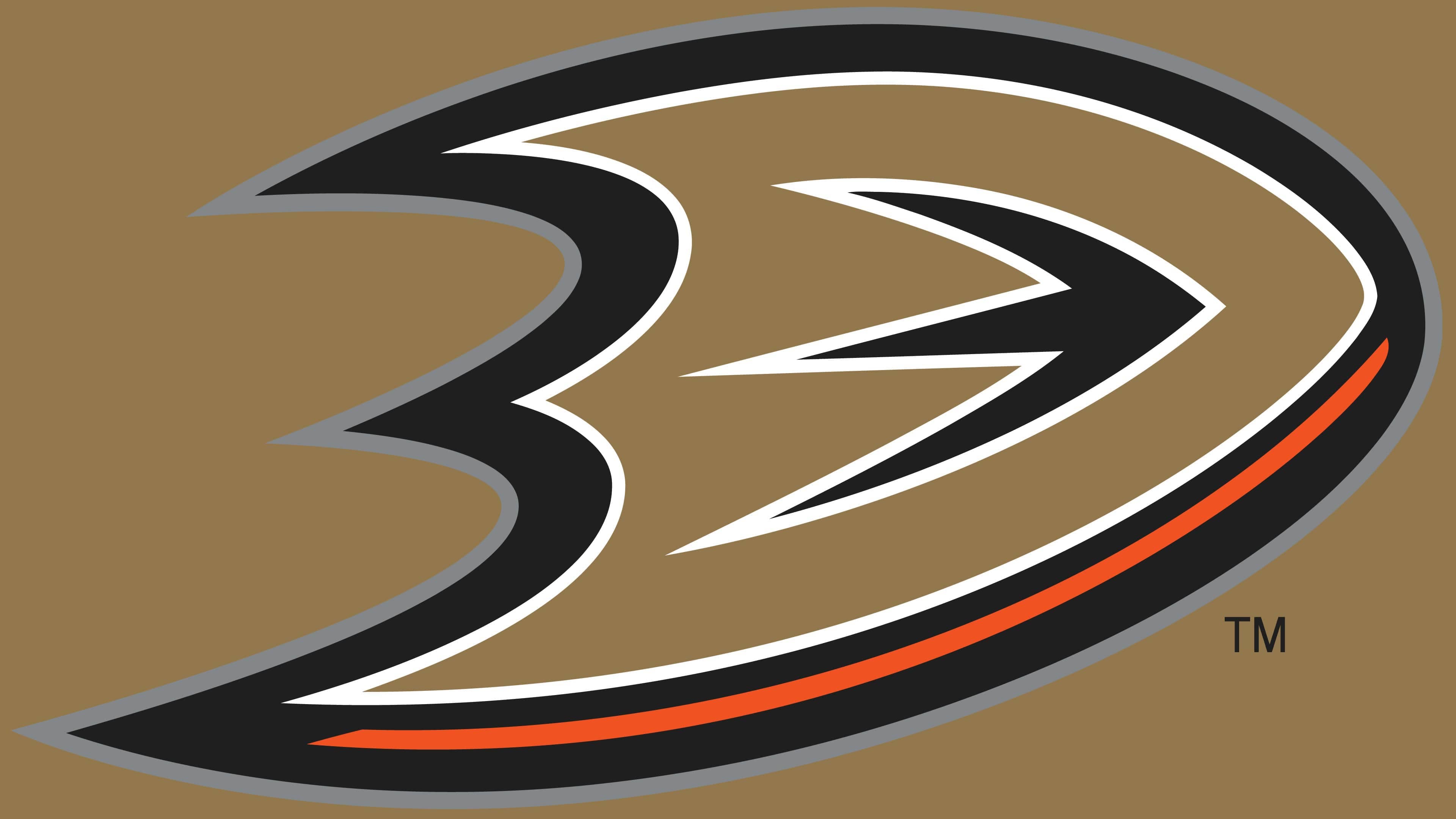
2013 – today
![]()
After several transformations, the designers left only the webbed duck foot on the official symbolism flat, resembling an imprint. However, since the modern version is based on the previous emblem, this is not just a “trace,” but the initial letter of the team’s name. The visual connection of the duck’s foot with the letter “D” is very well stylized. A white stripe neatly outlines each inner part, the outer one in gray.
Three small strokes in the logo’s center perform a dual role: they represent the natural pattern on the membranes and the inter-letter space. Instead of the usual side foot of “D,” sharp protrusions combine two completely different elements, the letter and the foot.
Font and Colors
If the initial version is full of details, all subsequent ones, by contrast, are minimalistic. They contain only the large word “Ducks” (2006 version) and one letter (2013 logo). The first emblem indicates the corporate palette, type of sport, and team name. To do this, the developers used a goalie mask shaped like a duck’s beak. It is against the background of two crossed sticks, a black circle, and an inverted triangle.

The second and third versions of the logo place the most emphasis on textual elements. The stylized letter “D” signifies both the picture and the name. This sign replaced the previous emblem, which used a custom font. All symbols in the word “Ducks” are in uppercase and have separate serifs in the form of sharp spikes. The inscription “Anaheim” is made in a blocky font.
The current version of the logo contains the baseball team’s corporate palette: black, dark silver, orange, and golden metallic. White is also present, although it is not on the official list.
FAQ
Why did the Anaheim Ducks change their logo?
The Samueli family, who bought the team in 2005, decided to make it more serious and rebranded it. Therefore, it got a new name (Anaheim Ducks) and a new logo that was concise and precisely matched the name.
How did the Anaheim Ducks get their logo?
Creating the original Anaheim Ducks logo took a lot of time because it emerged from 700 concepts. A cartoonish style was adopted since the team belonged to the Walt Disney Company. Two animators, Tony Cipriano and Fred Tio, designed the logo.
What happened to the “Mighty Ducks” logo?
Like the old team name, the “Mighty Ducks” logo was replaced by new versions. Designers removed the mask, sticks, and puck and added a duck foot imprint, the trace that “Anaheim Ducks” will leave in hockey. The color scheme was also changed to include silver and orange.
Is the “Mighty Ducks” logo a trademark?
The Mighty Ducks logo is a trademark with registration number 1995934 and belongs to ANAHEIM DUCKS HOCKEY CLUB.