The club’s leadership chose the expressive version of the Carolina Hurricanes logo. It encapsulates everything – emotions, power, and professionalism. The emblem represents the epicenter of passions revolving around the spinning puck. At the same time, the whirlwind resembles the Yin and Yang symbol, where everything is harmoniously balanced despite apparent opposites.
Carolina Hurricanes: Brand overview
| Founded: | 1972 |
| Founder: | Thomas Dundon |
| Headquarters: | Raleigh, North Carolina, U.S. |
| Website: | nhl.com |
The early 1970s were the most memorable era in Boston’s sports history. This was the time of a great hockey boom. In the 1969-70 and 1971-72 seasons, the Boston Bruins won their fourth and fifth Stanley Cups. Bobby Orr and Phil Esposito were idols of the city. At the Boston Garden, where the home games of the Boston Celtics from the NBA and the Boston Bruins from the NHL were held, there was no room to swing a cat. In 1972, the World Hockey Association decided to establish a new franchise called the New England Whalers. They said, “Let the Boston Bruins be the kings of Boston, and we will be the kings of New England.” The team joined the NHL before the 1979-80 season. Under pressure from the NHL, the current Hurricanes club was forced to rename itself to the Hartford Whalers, using this name for 18 seasons.
In 1994, the club was acquired by Peter Karmanos, the owner of a software company. Despite previous assurances that the Whalers would remain in Connecticut, in 1997, the team moved to North Carolina. This move was caused by Karmanos’s inability to agree with the Governor of Connecticut on building a new arena and selling the necessary number of tickets for matches. Shortly after arriving in Raleigh, North Carolina, the team changed its name to the “Carolina Hurricanes.” By that time, a new magnificent arena had been built for the University of North Carolina’s basketball team.
Interestingly, the new owner did not hold a contest for the team’s name, as many of his colleagues did. Karmanos himself came up with and chose the new name, explaining that North Carolina is certainly not unfamiliar with hurricanes. Therefore, this name is perfect for the club. Meanwhile, since the state has many pig farms, he also considered the name Carolina Ice Hogs. Thus, the current “Hurricanes” could have been called the “Ice Pigs.” However, the pig allusion can be noticed in the mascot of the “Carolina Hurricanes” – the ice pig Stormy.
Moreover, Karmanos chose red, black, white, and silver colors for the jerseys and a controversial logo. It was a red and black circle, reminiscent of a hurricane. In the naval signal alphabet, a flag warning of a hurricane is red and black. This flag is depicted on the team’s alternate emblem, along with a triangle.
By the way, not everyone appreciated Karmanos’s ideas. Shortly before the hockey team’s arrival in North Carolina, a hurricane of enormous destructive power had occurred, and the local population found his humor inappropriate. However, this was quickly forgotten, and now Hurricanes fans drive around in their trucks with hurricane flags attached to the bed.
Meaning and History
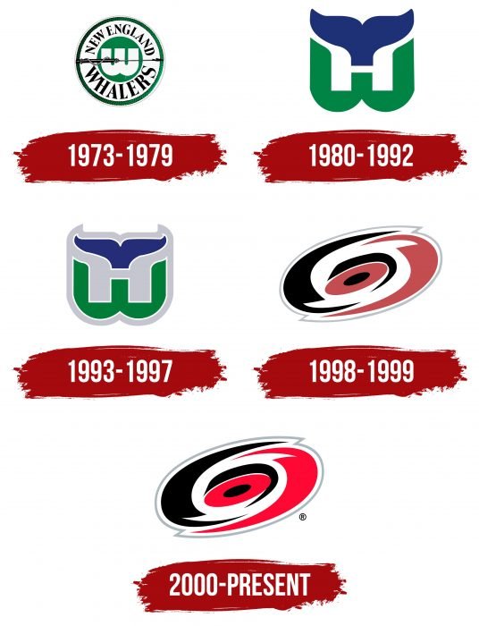
The “Carolina Hurricanes” team was founded in 1973. The Carolina Hurricanes sports club, formed in 1973 as the New England Whalers, has changed five logos in its history. The first emblem stands apart from the rest, as it is distinctly different from them. In the search for visual identity, the team went through several stages, achieving balance thanks to a harmonious combination of geometric shapes and zigzag lines. Moreover, all existing versions form two independent categories if, of course, the debut logo is not excluded.
What are Carolina Hurricanes?
“Carolina Hurricanes” is a team competing in the Metropolitan Division of the Eastern Conference. Based in Raleigh, North Carolina. After 1979, the club was admitted to the NHL when it was still called the “Hartford Whalers.” After the end of the 1996-1997 season, the franchise moved to its current location, changing its name.
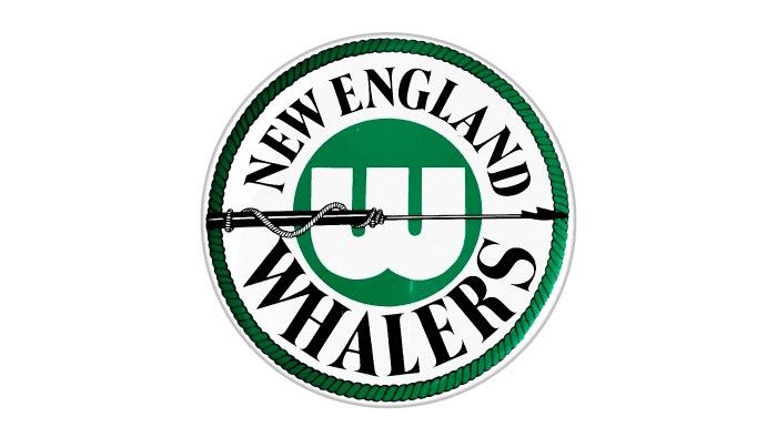
1973 – 1979
In 1973, a hockey team based in Boston was still called the “New England Whalers.” Its logo was completely different from the subsequent ones. It featured a white circle, bordered in green, in which the words New England Whalers, written in black, were arranged in a semicircle. Inside this circle was a smaller green circle with the white letter “W,” the initial letter of “Whalers,” in the center. This circle was “pierced” by a black harpoon – a long spear used in whaling.
1980 – 1992
For the next 12 years, the team played under a different name and with a completely different logo. In it, the green letter “W” combined with the tail of a blue whale, forming the letter “H” in the white space in the center of the logo between the two figures. The letter “W” stands for “Whalers,” and “H” for “Hartford.”
1993 – 1997
The third emblem of the “Carolina Hurricanes” differed little from the previous one. However, it was slightly modified. A white outline was added to the whale tail, and the letter “W” was added to make them more voluminous. The white space was replaced with gray, thus creating a thick outline for the entire emblem.
1998 – 1999
In 1998, the team moved to North Carolina, directly in the path of numerous hurricanes. Therefore, it was decided to change the main colors of the logo. Now they were black and red. The logo represents a schematic image of the so-called eye of the hurricane, that is, its central part. It was a red and black circle, reminiscent of both a hurricane and a puck. The entire logo was outlined with a thin silver line.
2000 – today
The modern visual identifier was adopted in 2000. Since then, it has been used without changes: it includes three clear diagonal ovals – central, intermediate, and outer. Also, the emblem contains evenly spaced sharp edges and uneven stripes. The chaotic elements do not merge, as they are painted in different colors and separated by white lines. The outer edge has a gray border.
According to the developers’ idea, such a concentration of geometric figures represents a whirlwind formed by the rapid rotation of the puck and stick. Essentially, this is the very hurricane after which the team is named. Entering the game, it sweeps away everything, leaving no one a chance for victory. This is the concept of the logo.
Carolina Hurricanes: Interesting Facts
The Carolina Hurricanes are a hockey team from Raleigh, North Carolina. They play in the NHL and have had some big moments and cool traditions.
- Moving: They started as the New England Whalers in 1972, then joined the NHL as the Hartford Whalers in 1979. In 1997, they moved to North Carolina and became the Hurricanes.
- Winning the Stanley Cup: In the 2005-2006 season, they beat the Edmonton Oilers. It was their first win and a huge deal.
- Storm Surge: Since 2018, after winning home games, they celebrate on the ice with fun skits, like pretending to be human dominoes or doing a mock home run derby. Some people love it, and some don’t.
- PNC Arena: The team plays games at the PNC Arena in Raleigh, which it shares with the NC State Wolfpack basketball team. The fans there are passionate, especially during the playoffs.
- 2002 Finals: Before winning in 2006, they reached the finals in 2002 but lost to the Detroit Red Wings. This loss showed that they were becoming a strong team.
- Ron Francis: He’s a big part of their history, having played for them and then been their General Manager. He’s also one of the top scorers in the NHL.
- Remembering the Whalers: Even though they moved, they sometimes remember their past by wearing Hartford Whalers jerseys.
- Breaking a Drought: Their 2006 win was the first big pro sports championship for North Carolina.
- Rod Brind’Amour: He was a star when they won in 2006 and later became the team’s coach. He’s known for being hard-working and has helped shape the team’s way of doing things.
- Helping Out: The Hurricanes do a lot for their community, like helping grow hockey locally, supporting charities, and connecting with fans all over North Carolina.
The Carolina Hurricanes have a rich history, from their start in New England to their life in Raleigh, which is full of big wins, fun celebrations, and strong ties to their community.
Font and Colors
Dividing the logos into two groups brought them wide recognition because fans had time to get used to their design. The first category is based on the whale tail, which seems to have just dived into the water. This refers to the whalers: their harpoon was depicted on the debut emblem when the club was called the New England Whalers. Under the wide tail is a white letter “H,” and below that, a green “W.” They denote the franchise’s name at the time – Hartford Whalers.
The second group of logos consists of modern adaptations of team symbols. This is the twisted stick and puck. This is how the word “Hurricanes” is visualized. That’s why fans nicknamed the emblem the “Eye of the Hurricane.”
If we talk about the textual content of the symbolism, there is none: there is only an image on the corporate badge. However, the color palette is diverse. It includes white, black Pantone Black, gray PMS: 429, and red in two shades – Pantone Color Matching System: 186 and PMS: 188.
Carolina Hurricanes color codes
| Red | Hex color: | #cc0000 |
|---|---|---|
| RGB: | 204 0 0 | |
| CMYK: | 2 100 85 6 | |
| Pantone: | PMS 186 C |
| Black | Hex color: | #000000 |
|---|---|---|
| RGB: | 0 0 0 | |
| CMYK: | 0 0 0 100 | |
| Pantone: | PMS Process Black C |
| Flat Grey | Hex color: | #a2a9af |
|---|---|---|
| RGB: | 162 169 175 | |
| CMYK: | 21 11 9 23 | |
| Pantone: | PMS 429 C |
| Dark Red | Hex color: | #76232F |
|---|---|---|
| RGB: | 118 35 47 | |
| CMYK: | 16 100 65 58 | |
| Pantone: | PMS 188 C |
| Storm Grey | Hex color: | #333F48 |
|---|---|---|
| RGB: | 51 63 72 | |
| CMYK: | 65 43 26 78 | |
| Pantone: | PMS 432 C |
FAQ
What does the “Carolina Hurricanes” logo mean?
The logo, in the form of a spinning puck from which uneven amplitudes radiate in different directions, signifies powerful momentum, passion, and striving for the goal. But allegorically, it represents the epicenter of a hurricane, as evidenced by its colors.
Has the “Carolina Hurricanes” logo changed?
The “Carolina Hurricanes” club adopted a new logo after moving to Raleigh and changing the old name from “Hartford Whalers.” Now, instead of a whale tail, the emblem featured a rotating puck. This happened in the 1998-1999 season. The last change occurred in 2000.
What is the “Carolina Hurricanes” alternate emblem?
The “Carolina Hurricanes” team’s alternate emblem is a warning to opponents about an impending hurricane. It represents a signal sign in the form of two red and black flags flying on the handle of an upside-down hockey stick. This corresponds to the team’s name and symbolizes a threat to opponents.
What is the new “hurricanes” logo?
The “Carolina Hurricanes” emblem features a puck. It is located in the center of the rotating element, which symbolizes a hurricane. From it, semi-oval lines of three colors – red, white, and black – radiate in different directions.

