


 Purdue Fort Wayne Mastodons Logo PNG
The Purdue Fort Wayne Mastodons logo features a mastodon. The figure represents the players’ power, endurance, and perseverance. The mastodon reflects Indiana’s regional history, where it was found.
The Purdue Fort Wayne Mastodons originated in 1964 with the founding of Indiana University-Purdue University Fort Wayne (IPFW). Athletic activities began formally in 1968 when the institution named its sports teams the “Mastodons,” inspired by local mastodon fossil discoveries. Initial competition took place within the NAIA throughout the 1970s.
In 1984, Gates Sports Center opened as the primary basketball arena, marking a major infrastructure upgrade. In 1994, IPFW moved to NCAA Division II, enhancing athletic opportunities and visibility. A significant transition occurred in 2001, when the university moved to NCAA Division I, culminating in full Summit League membership in 2007.
From 2010 to 2015, Purdue Fort Wayne improved competitively across sports, culminating in notable achievements in volleyball during the 2016–2017 season. Institutional restructuring in 2018 led to a rebranding as Purdue University Fort Wayne, which more clearly aligned the athletic identities.
In 2019, Purdue Fort Wayne announced its move to the Horizon League, officially joining in 2020, and subsequently undertook facility expansions and program enhancements. By 2022 and 2023, Mastodon teams consistently competed at a high level in the Horizon League, supported by ongoing investments in athletic infrastructure.
Meaning and History
What is Purdue Fort Wayne Mastodons?
The Purdue University Fort Wayne Mastodons are NCAA Division I sports teams based in Indiana that compete in the Horizon League. Their blue-and-white colors stand out at Gates Sports Arena, where home games draw loyal fans from across Fort Wayne. Named after ancient mammals whose fossils have been discovered in the region, the teams compete in basketball, volleyball, football, and other sports.
2016 – 2017
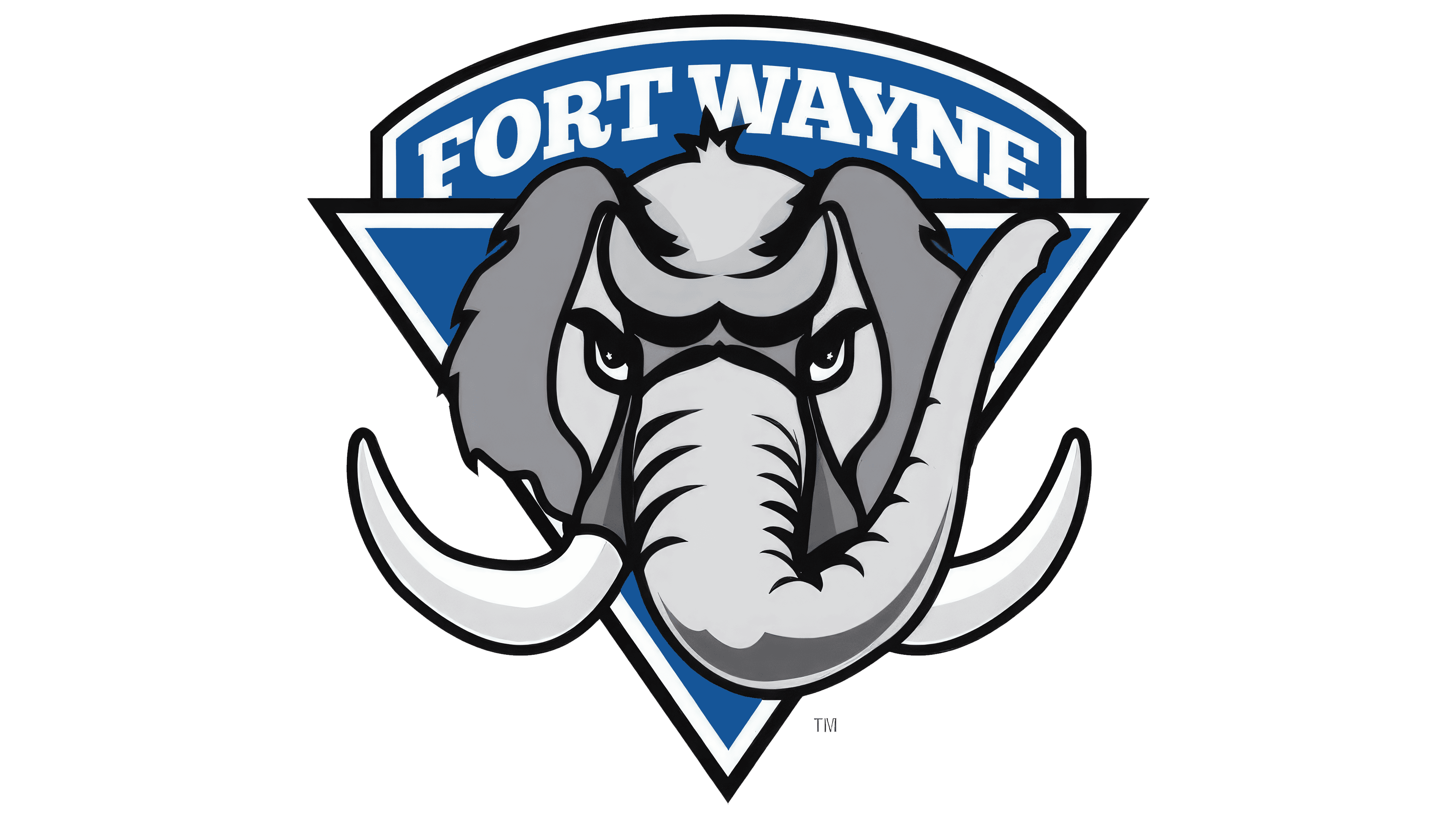
In August 2016, IPFW University’s athletic teams introduced a refreshed brand, now known as the Fort Wayne Mastodons. Along with the new name came a new emblem that reflects the group’s confident athletic spirit. At the center is a stylized mammoth head facing the viewer.
Wide, slightly curved tusks extend forward, setting an energetic tone for the entire composition. The face is depicted with aggression, and sharp lines strengthen the gaze. The gray skin tone emphasizes massiveness, while black contour strokes convey depth and shape.
A blue triangular shield with a rounded top line supports the figure. It serves as a background and creates a sense of a solid foundation. In the upper part of the shield, the inscription FORT WAYNE appears in large white serif letters, emphasizing the connection to the region. The color scheme combines blue, gray, black, and white tones that appear harmonious.
2018 – today
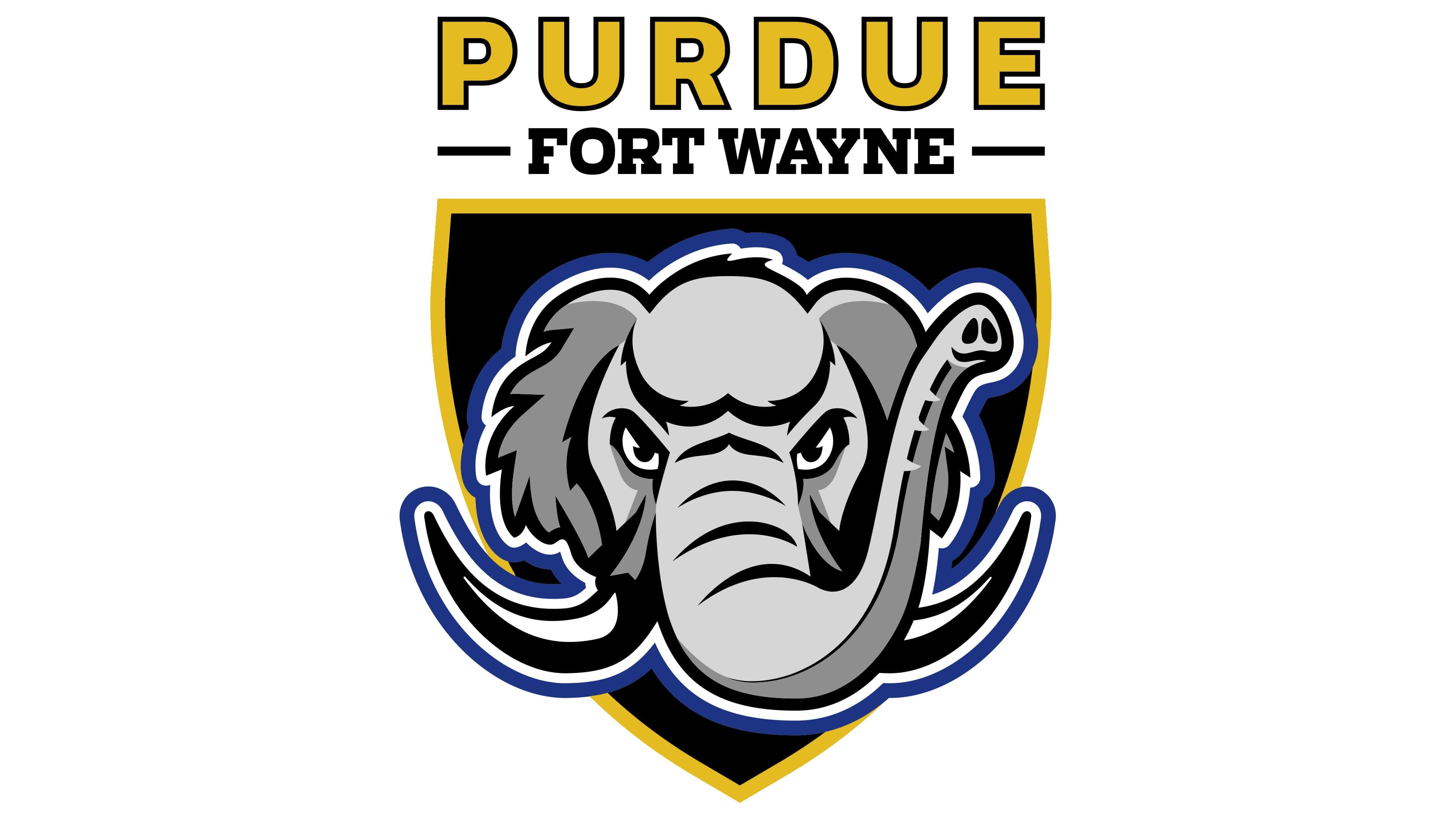
In the summer of 2018, IPFW’s athletic program entered a new era as the Purdue Fort Wayne Mastodons. Along with the updated name, the team introduced a new logo, which premiered on June 18, a few weeks before the official brand launch. The New York agency SME developed the design.
The logo retained the team’s familiar mascot, the mastodon named Tusky, but gave his image a modern treatment. The mammoth’s head is presented frontally. The tusks are shown powerfully, extending beyond the shield and forming a striking silhouette. Black and gray tones highlight the facial features, skin, eyelids, and the snout’s curves.
The background is a black shield outlined in gold. Above the shield is the word PURDUE in large, gold, sans-serif letters, built on strict geometry. Below it is the inscription FORT WAYNE in smaller type.
Gold and black tones replaced the previous color system. Blue, which played an important role in earlier versions, became a supporting element. Tusky remained the key figure and maintained continuity, while the updated composition gave the visual a solid, modern, and expressive athletic energy.