


![]() Syracuse Orange Logo PNG
Syracuse Orange Logo PNG
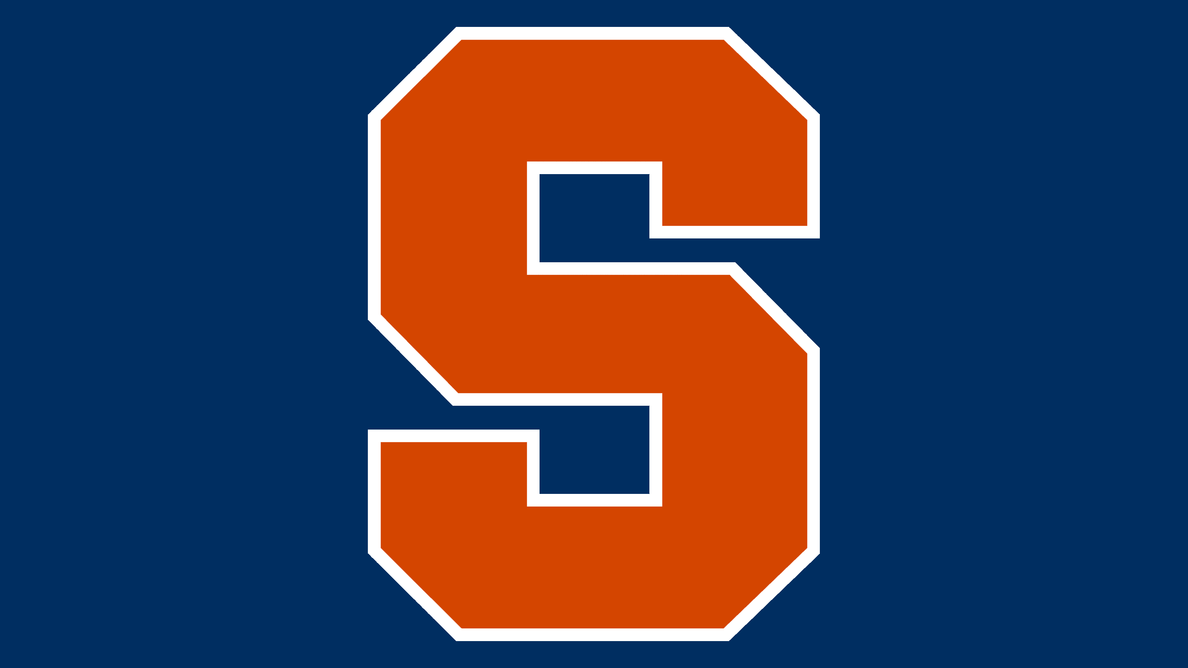
The Syracuse logo is classic, like many other college teams’. It is a giant geometric letter “S” with diagonal corners, which makes the symbol look like a polyhedron.
Syracuse University athletics began in 1889, when the football team played its first intercollegiate game against Hamilton College, losing 36-0 while wearing pink and blue. In 1890, orange became the official university color, and the teams later adopted the Orange identity. From 1889 to 1978, Syracuse competed as an independent program before becoming a founding member of the Big East Conference in 1979.
Football reached its defining peak in 1959 under coach Ben Schwartzwalder. The team finished 11-0 and won the national championship. Ernie Davis became the program’s most important figure from that period. In 1961, he became the first African American player to win the Heisman Trophy, placing Syracuse in both athletic and social history.
Men’s basketball began in the 1898-1899 season with early games against Cornell, Colgate, and Hamilton. Under Jim Boeheim, Syracuse became a regular NCAA contender and reached several Final Fours. In 2003, the team won the national title in New Orleans, beating the Kansas Jayhawks 81-78 behind freshman Carmelo Anthony. The rivalry with Georgetown became one of the Big East’s strongest stories.
Lacrosse became the school’s deepest championship tradition, with NCAA titles in 1983, 1988, 1989, 1993, 1995, 2000, 2002, 2004, 2008, and 2009. The 1990 title was later vacated. In July 2013, Syracuse moved to the Atlantic Coast Conference, joining programs such as Duke and North Carolina. In the same season, football won the Texas Bowl. In 2022, men’s soccer won its first NCAA title by beating Indiana on penalties.
Meaning and History
![]()
Teams at this university have an anthropomorphic orange as their mascot, so the athletic department’s full name is Syracuse Orange. Naturally, it is also considered their primary color; thus, representatives of all local teams compete in colorful orange uniforms. The same color is present in the overall identity.
Members of this athletic department are well recognized by the orange S on their uniforms. But it has not always been their logo. The mark has only been a full-fledged visual identity since 2006, though its prototype was first used two years earlier, in 2004. Syracuse teams have seven different logos.
What is Syracuse?
Syracuse, or more specifically, Syracuse Orange, is the athletic department of Syracuse University in New York State. It has 20 men’s and women’s teams: basketball, boxing, lacrosse, track and field, field hockey, soccer, rowing, and many other sports. They represent the Atlantic Coast Conference and compete in NCAA Division I.
1967 – 1988
![]()
The Syracuse Orange logo, introduced in 1967, featured a white Indian with a black outline. This sign was the most unconventional in the history of SU athletes’ identities and the funniest one ever created for that university chapter. The Native American representative was depicted in a cartoonish style. He had white moccasins, an orange-bladed tomahawk, the same-colored pants, and two long feathers sticking out of his black hair.
The man was positioned sideways. With one foot, he stepped on a text block that contained the names of the intercollegiate teams. The capital letters stood out clearly against the light background because they were dark orange as well. The shadows on the lettering and the clothes were done in dark blue. The Indian’s gaze was menacing, and his mouth was open in a battle cry.
1988 – 1998
![]()
For the next ten years, the logo was very serious. The reason was that the athletic department abandoned the cartoon image and chose a radically different style. The mark became practical, graphic, and strict. To emphasize this, designers used a vertical rectangle, in which they placed all the important information: the university’s full name (one line at the top, another at the bottom), the year of its founding, and the team’s personal emblem. It consisted of two wide ribbons folded together, resembling the letter “S” from a distance, with a square in the center. A miniature dot separated each digit in the date. The base colors were orange and white. Blue was removed from the palette.
1998 – 2004
![]()
Experiments with iconography led to the appearance of an unusual emblem. The authors wanted to play with the sports program’s name nicely and translated the word “Orange” into a graphic format. They drew the top of the orange without its peel, evoking the globe’s top, crossed by meridians. This was the effect of the global significance of SU’s intercollegiate teams. Below was the university’s full name, regrouped into two lines: “Syracuse” was written in large antique, “University” in small grotesque. All letters were capitalized and in blue.
2004 – 2006
![]()
This logo ushered in a new era in Syracuse athletes’ visual identity, driven by a dramatic shift in graphics. The result was the intertwined “SU” sign. And it was no accident, as the teams were named Orange in 2004. To achieve a stylish symbolism, the university’s management turned to Nike for help. She is the author of this version. Specialists combined the “S” and the “U” into a monogram, so the second letter was split in two: only a small segment of the “U” was visible within the “S.” The other half of the symbol looked more like a capital “J.” The logo’s primary color was orange.
2006 – 2009
![]()
In 2006, the block “S” appeared. The large letter had a geometric shape with cut corners, which increased its number of faces. A thin band of dark blue encircled it at the edges. Above it, the word “Syracuse” was placed in an arch. It had the same design as the single glyph: strict geometry and a contrasting border.
2009 – 2015
![]()
The designers updated the visual identity of the Syracuse athletes, retaining only the single “S.” The letter was enlarged.
2015 – today
![]()
The current version of the logo is a replica of the previous version. The only change concerned the color: orange became several tones darker. Otherwise, the design remains the same.
Font and Colors
Almost all of Syracuse University’s visual identity is color-related. Orange is used in most elements, both graphic and textual. It especially resonates with the athletic department’s identity, as it is part of the full name of the athletic teams. At first, the style was cartoonish and artistic. Then came the characteristics of geometric design, which became predominant.
The block “S” is in custom lettering and is more about the pattern than the alphabet. The first three logos used grotesque, though the third already used antiqua. It was close to fonts like Garamond Nova Pro Condensed Regular and Garamond Modern FS Regular. Grotesque has similarities to Limerick, Serial Xbold, and Futura Classical Bold. Syracuse’s signature logo palette consists of three base colors, including orange #F76900, white #FFFFFFFF, and blue #000E54.