


 Renew Life Logo PNG
The Renew Life logo is associated with digestive health, offering simple, effective solutions to maintain the body’s natural balance. The brand gained recognition for its probiotics and cleansing products, promoting overall well-being and a harmonious approach to nutrition.
Renew Life was founded in Florida in 1997 by Brenda and Stan Watson, motivated by Brenda’s personal experiences with digestive health issues. The company’s first successful product, CleanseMore, introduced that year, established the brand’s reputation in the cleansing supplement category.
By 2000, Renew Life had expanded its product range to include high-quality probiotics, launching the Ultimate Flora series. In 2005, production capacity was significantly increased with the opening of a modern manufacturing facility in Florida, which improved quality control and enabled the introduction of digestive enzyme supplements.
In 2008, Renew Life launched educational programs and seminars focused on digestive wellness to enhance public awareness. By 2012, distribution expanded across major pharmacy chains and health stores throughout the United States, followed by international sales.
In 2016, The Clorox Company acquired Renew Life for $290 million, further increasing investment in research and market distribution. The brand introduced specialized probiotic formulations in 2017 and 2018 to address diverse dietary needs and age groups.
Between 2020 and 2021, Renew Life prioritized innovation in product stability and delivery systems, enhancing packaging for better consumer convenience. From 2022 to 2023, the company introduced personalized digestive health solutions to the market and expanded its global digital sales presence.
In 2024, Renew Life remains a prominent player in the digestive health sector, continually developing supplements that align with contemporary consumer needs.
Meaning and History
What is Renew Life?
This manufacturer produces probiotics and dietary supplements to support gut health and overall well-being. The product lineup includes solutions designed to strengthen the immune system, promote detoxification, and maintain digestive balance. The company prioritizes natural ingredients without artificial additives and employs advanced technologies to preserve the beneficial properties of bacteria. Quality control is ensured at every stage of production, and formulations are developed based on scientific research to maximize health benefits.
1997 – 2014
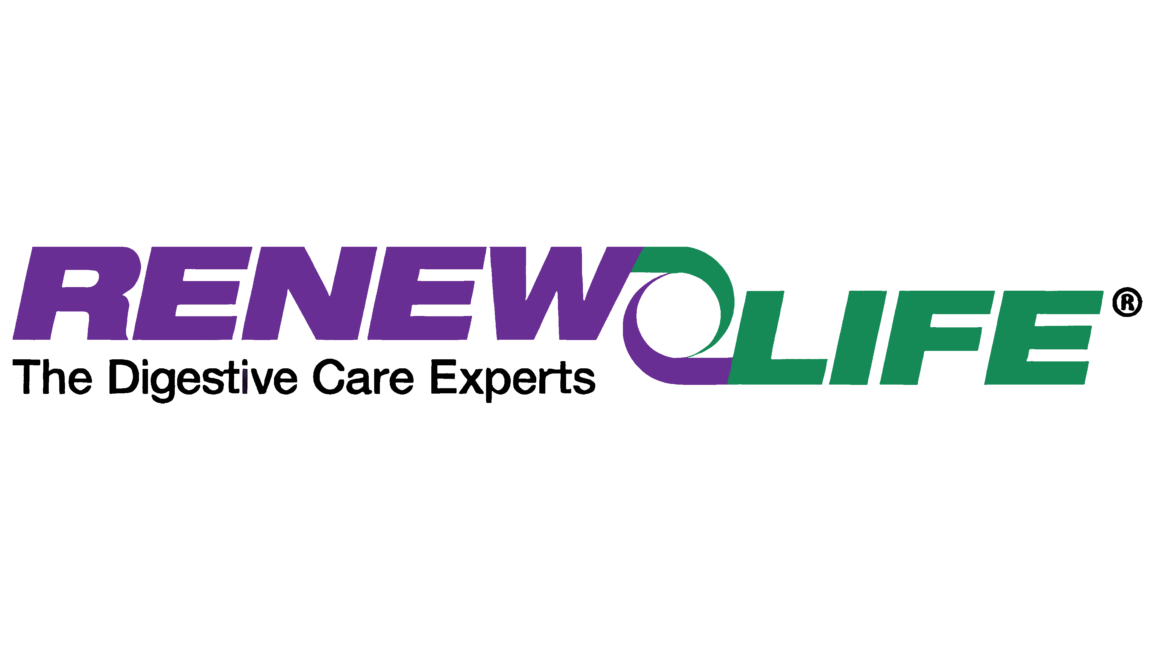
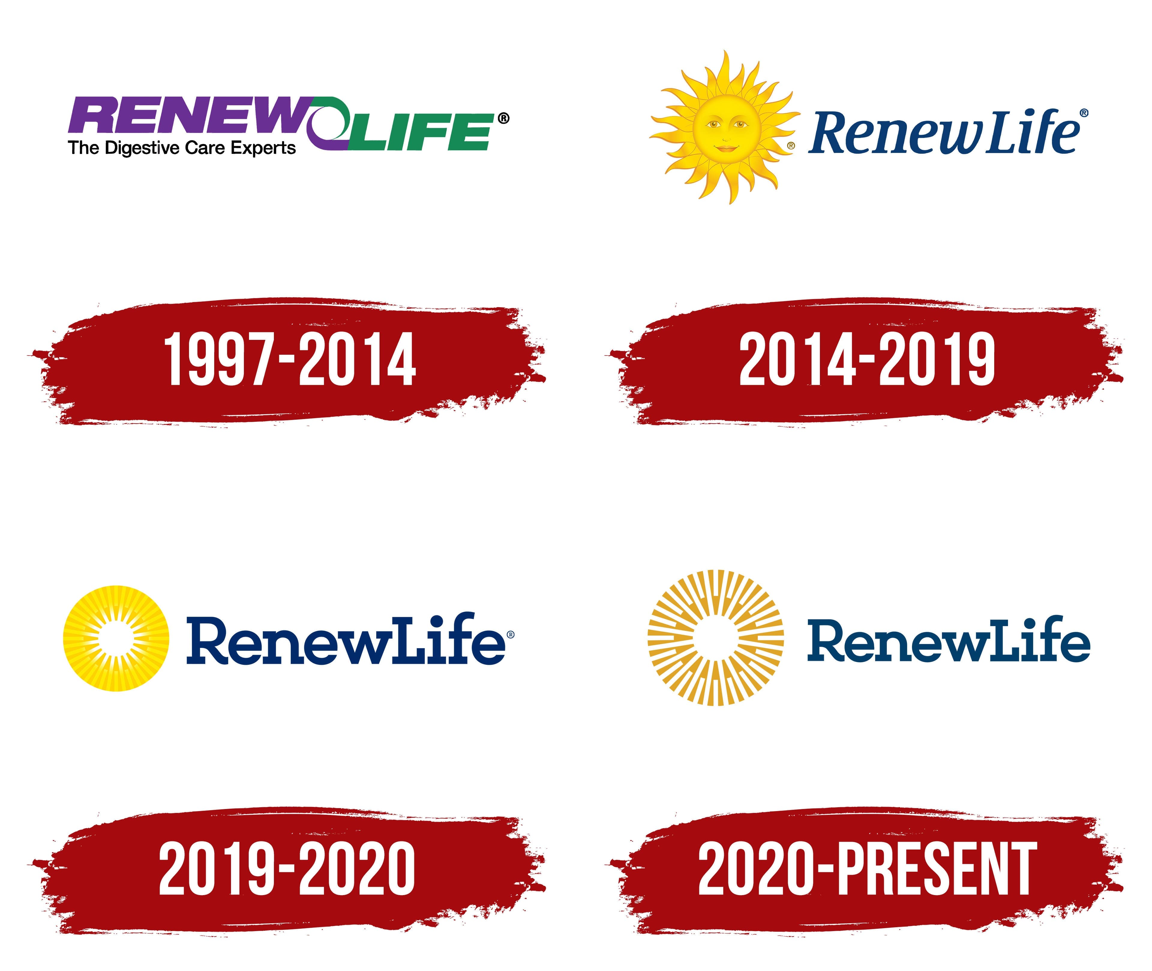
The appearance of the Renew Life logo in 1997 was accompanied by the task of conveying the company’s primary focus: producing probiotics and dietary supplements that strengthen gut health and improve digestion. The foundation of the visual image was the metaphor of circulation and the body’s internal balance.
The construction consists of the main line, named “RENEW LIFE,” and the tagline beneath it, “The Digestive Care Experts.” Between the words is a circular spiral that became the key accent of the entire emblem. Its form conveys the idea of a closed cycle and harmonious metabolism. The designers used a method of symmetrical division. The lower part of the spiral is colored purple, matching the color of the word “RENEW,” and the upper part is colored green, identical to the word “LIFE.” This creates the impression of connecting the two semantic parts of the name.
The main text is set in a geometric sans-serif font, semi-bold, with a slight slant. The letters feature smooth curves. The lower line, “The Digestive Care Experts,” is highlighted in black and set in a simple, upright font, with capital letters appearing only at the beginning of words.
The color system is built on purple and green. The first is associated with harmony and tranquility, while the second is linked to life and health. Their combination aligns with the brand’s mission to emphasize digestive health and restore the body’s natural functions.
The Renew Life logo stands out for its combination of simple forms and a symbolic spiral that became the company’s visual code. It unites the name and the field of activity into a single image, shaping the idea of harmony and recovery through products created to support the digestive system.
2014 – 2019

The change in Renew Life’s visual identity was connected to a revision of the brand’s positioning. The company sought to move away from medical perception and present itself as more emotional and closer to everyday life. For this task, the New York agency Beardwood & Co. was tasked with developing a new identity system.
The main symbol became an image of a smiling sun. It conveyed the ideas of bodily purity, lightness, morning freshness, and life energy. The facial features are drawn with restraint. The eyes are soft and attentive, the eyebrows outlined with thin lines, and the lips form a slight smile. Rays radiate around the face. They differ in form, alternating smooth, rounded shapes with elongated, pointed elements. The inner lines resemble natural energy flows, reinforcing the association with harmonious bodily function.
The text is placed to the right of the sun. The name “Renew Life” is set in a semi-bold serif, similar to a transitional serif. The first letter of each word is capitalized; the rest are lowercase. A slight slant toward an italic style creates a sense of gentle dynamism, lending the inscription a natural feel.
The sun symbol is rendered in warm, yellow tones with smooth shading that transitions from the center to the edges. It represents sunrise, health, and renewal. The typographic part, by contrast, is executed in rich dark blue. Warm and cool shades together create expressiveness and harmony, combining trust and cheerfulness.
The updated mark became the brand’s visual code, linking the company’s activities in cleansing and digestive health support to a positive, emotionally charged image.
2019 – 2020

After the change of ownership and the transition to Clorox management, the emblem received a new interpretation. The new version was designed to simplify and align with the aesthetic standards of the pharmaceutical and nutraceutical segments. In 2019, the company introduced a logo in which the sun lost its decorative details, becoming an orderly symbol of purity and functional clarity.
The key image is a circle with evenly distributed yellow rays radiating from a white central core. The structured order emphasizes the brand’s new focus on a scientific approach and trust, in contrast to the previous emotional imagery. The white inner area is interpreted as a metaphor for inner radiance and is associated with body-cleansing and detox programs, which are specialties of Renew Life.
The company’s name is placed next to the symbol. It is typed in a sans-serif font with a geometric basis, closely resembling Museo Slab. The letters are dense with even proportions. The dark blue of the inscription retains continuity with the previous version but now serves as a stabilizing element, contrasting with the energetic sun circle.
The entire palette is based on a combination of warm yellow gradients and blue. The yellow range evokes vitality and renewal, associated with morning light and a fresh start. Blue adds a sense of seriousness to the image and inspires trust.
The logo marked the company’s transition to a more modern visual language. Through this image, the company declared the brand’s role in combining emotional appeal with a scientific approach to digestive health products.
2020 – today
Following Renew Life’s 2020 style update, the company’s visual identity was restructured to emphasize strict geometry and restrained form. The agency Beardwood&Co. developed a concentric structure with clearly arranged segments. The transition reflected Clorox’s task of presenting Renew Life in a more modern way, aligning more closely with the aesthetics of pharmaceuticals and nutraceuticals.
The sun symbol became organized and rhythmic. It is formed by radial segments of yellow-orange shades radiating from a white core. Gaps are left between the segments, making the mark appear as an orderly mechanism. The outlines suggest an association with a turbine or a circulation device. This interpretation aligns with Renew Life’s mission, which involves supporting digestive function and developing internal cleansing programs. The white core symbolizes inner radiance, serving as a metaphor for restoration and healthy balance.

The brand inscription “RenewLife” is placed next to the sun symbol. In the new version, it remained unchanged.
Previously, the emphasis was on bright yellow; now, the main tone has shifted to a calmer, orange hue. The muted shade evokes associations with naturalness and warm energy, making the mark more in line with the image of a natural cycle. The dark blue font color maintains continuity and creates an expressive contrast with the updated sun symbol. Together, they create a balanced image that unites emotional undertones with pharmaceutical rigor.
The rebranding led to the emergence of an emblem that conveys the themes of cleansing and restoration, aligning with current trends in the dietary supplement and nutraceutical markets, where clarity and consistency in visual language signal quality.
