The Engineering Council updated its mark at an important moment for the public image of the engineering profession in the United Kingdom. The organization manages the professional registration of 220,000 engineers, works with dozens of engineering institutions, and sets requirements for competence, ethics, and practice.
The new identity was prepared by rbl. The rebrand was introduced in April 2026. Previously, the Council was often perceived in terms of its register and formal procedures. The focus has now shifted to the organization’s role in the profession. The Engineering Council is responsible for standards, trust in engineering, and the quality of specialists’ work in a field where technology and safety are increasingly part of public discussion.
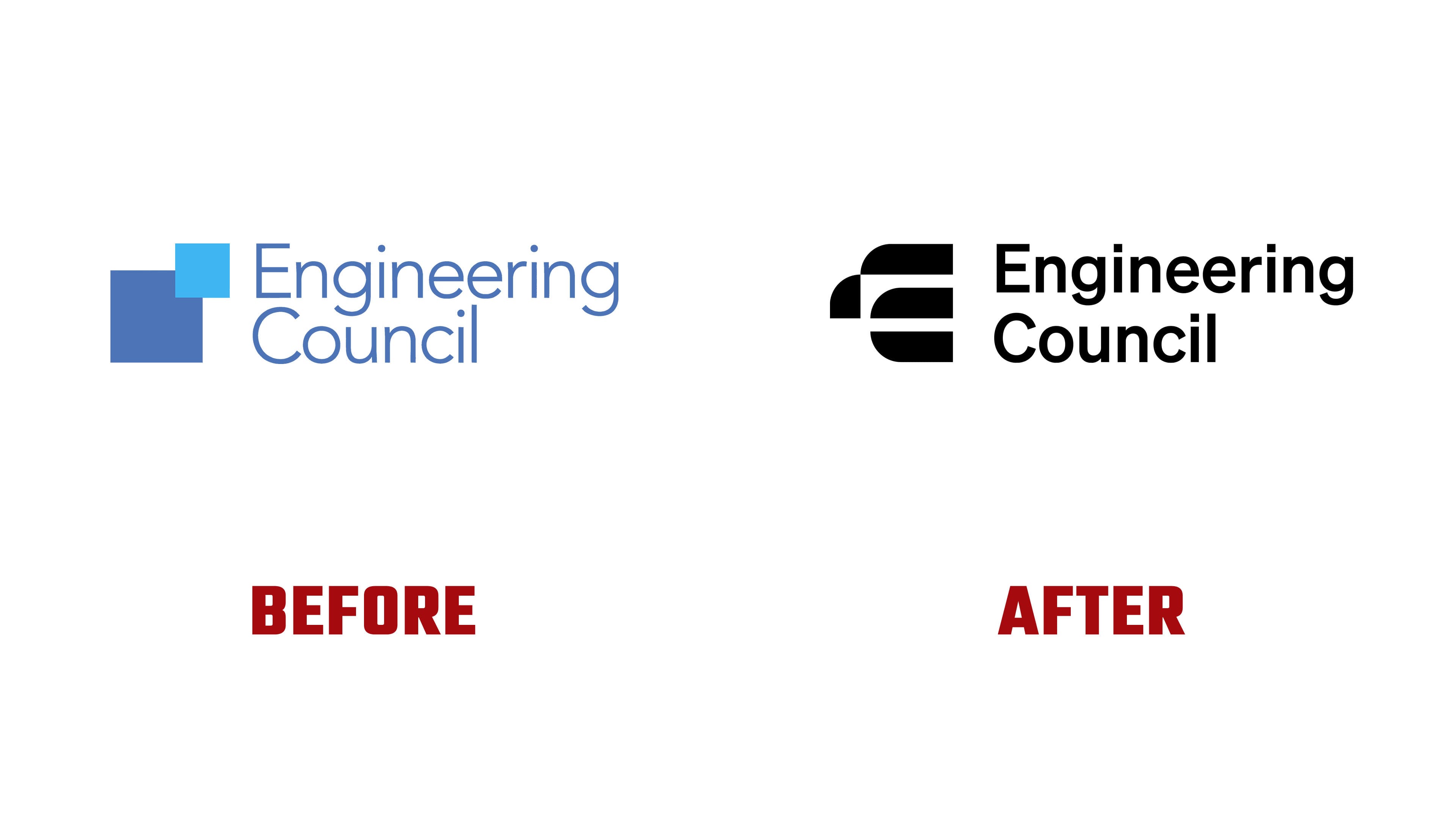
The main change is visible in the logo. The previous mark with intersecting squares looked familiar as a professional association mark. It conveyed order and collaboration, but the image remained fairly generic. The new monogram made from the letters “E” and “C” looks denser and more current. It suggests a diagram, a junction of parts, a structure, and a digital interface.
The symbol is built from large blocks. Its form brings the mark closer to the field of engineering. The logo maintains the organization’s official status while conveying a look of structure, control, and professional standards.
The name next to the symbol became heavier in tone. A light academic presentation was replaced by dense sans-serif typography. It makes the brand stricter and works well for public materials, the website, reports, and partner communications.

The color system changed the brand’s feel. A black mark is paired with a bright copper-inspired shade. The color pairing moves the Engineering Council away from standard blue institutional formality. Copper is connected with engineering history, from architecture to energy and scientific facilities.
The phrase “Standards don’t raise themselves.” conveys the idea of standards as the result of people, institutions, review, and continuous work. Another line, “The promise of responsible engineering made real,” strengthens the theme of the profession’s responsibility to society.
The new mark helps the Engineering Council appear more open and up to date. The monogram reinterprets the engineering theme through ideas of construction, precision, connection, and professional level. For engineers, institutions, partners, and the public, the logo conveys the Council’s main role: making professional standards visible and essential to trust in engineering.