Innovation, progress, development – all this is embedded in the logo of Merck Group. It symbolizes an unconventional approach to solving complex issues because this is exactly what the scientific and technological company does. The logo also embodies innovation and the amazing discoveries made by scientists.
Merck Group: Brand overview
| Founded: | 1668 |
| Founder: | Friedrich Jacob Merck |
| Headquarters: | Darmstadt, Germany |
| Website: | merckgroup.com |
Meaning and History
The Merck brand dates back to 1668 when Friedrich Jacob Merck (the company is named after him) bought Engel-Apotheke, located in Darmstadt. All these years, she worked successfully because, by the time of her succession to Emanuel Merck, she had an excellent base for scientific discoveries. A descendant of the founder took advantage of the chance and made several innovative discoveries in the chemical field: he invented several drugs and created and characterized some alkaloids. This happened in 1816.
A few years later (in 1827), a young pharmacist launched the production of medicines. Then, with the support of his relatives, he built a factory where he began to produce raw materials for medicines and many chemical ingredients. In 1891, one of the founder’s descendants (Georg Merck) opened a company branch in the United States, eventually becoming the subject of long legal disputes. The fact is that after the end of the First World War, its subsidiary in New York was confiscated and turned into an independent company. Then the areas of work of the parent company expanded: in addition to the chemical and pharmacological industries, they included the biomedical and electronic industries.
The change in the visual identity of the Merck Group is associated not only with the company’s success but also with problems. The current logo updates are driven by lawsuits and legal disputes with a New York-based firm that was formerly its US subsidiary and was subsequently forcibly spun off. As a result, in the centuries-old history of the pharmaceutical plant, there are eight different types of emblems. Some of them are completely different from each other as if they do not have a single platform among themselves. Many logos (existing in the 17th and 18th centuries) are unknown, so their countdown goes back to the 19th century.
What is Merck Group?
Merck Group is an international organization that brings together about 250 divisions of the chemical, pharmaceutical, electronics, medical and biological industries. It is the oldest pharmacy in the field and was originally a pharmacy in the city of Darmstadt (Germany), where its headquarters is still located. The company was founded in 1668. Founder: Friedrich Jacob Merck. Now she works in 66 countries of the world.
1838 – 1850
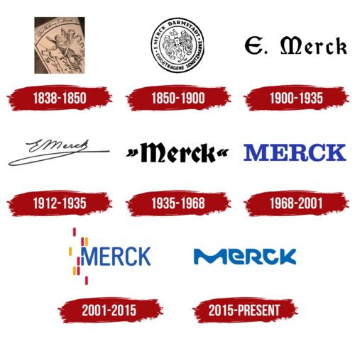
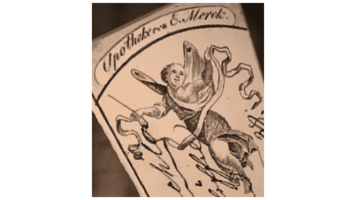
Seriously engaged in pharmacy began Emanuel Merck, who had a scientific education. Therefore, his name is indicated on the logo. The inscription is in handwriting and is located at the top in a long half-oval with the bottom cut off. Below it is a collective image of a certain deity associated with medicine, science, biology, and pharmacology. The character is depicted in full growth; he has wings and light clothes fluttering in the wind. In his hands, he holds a curly ribbon.
1850 – 1900
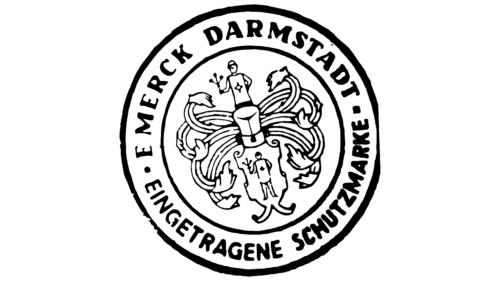
The logo of this period is made in the form of a round seal. It consists of two zones surrounded by thin rings. The central part is occupied by a multi-component construction, which includes a shield, eight plants on long stems, and two human figures with branches in their hands. They are combined into a common composition. Further in a circle are the words “Merck” and “Darmstadt,” “Eingetragene,” and “Schutzmarke.” Dots separate the top and bottom parts.
1900 – 1935
In 1900, the era of the Merck text emblem began. Therefore, it flaunts the inscription “E. Merck. It is typed in a very elegant grotesque: the letters resemble the signs of the Old English alphabet. And due to the extensions at the ends of the “M,” it looks like the Greek “Ω.” The remaining symbols are Gothic, with triangular elements at the top.
1912 – 1935
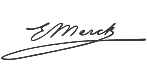
In parallel with the printed version of the logo, there was a handwritten version. The personal signature of Emanuel Merck, the head of the company, was taken as the basis. It is a cursory semi-connected type, as there is a small space between “M” and “e.” From the letter “k,” a long loop goes to the left.
1935 – 1968
After the design update, the letter “E” disappeared from the Merck logo: only the name of the founding dynasty was preserved. The writing style used is the same – 1900-1935. These are black Gothic letters with triangular protrusions at the top. The “M” has only the right curved element left: the left one is absolutely even. The first and last characters have serifs; the rest do not.
1968 – 2001
In 1968, the visual identity was redesigned, after which the style of the name became more modern. Now the text is typed not in Gothic characters but in the usual Romanesque font. The inscription is converted to upper case and painted in neon blue. The “R” has an upward curved leg, which makes the logo look sophisticated.
2001 – 2015
During this period, designers turned the simple “Merck” lettering into a unique element. To do this, they added colors and graphics to the logo—their work results in an emblem with chopped letters, complemented by red and yellow dashes. The vertical strokes almost merge with the “M,” the left leg of which is also made of short lines (two). The blue color has become a bit muted. Ian Brignell suggested the concept for this emblem.
2015 – today
Although the current logo consists of text, it looks like a graphic image. Letters of an unusual shape are pushing to this conclusion. They look more like stone sculptures or vague figures than typical symbols from the alphabet. They were made so by the FutureBrand studio, which Merck entrusted with updating the identity.
Font and Colors
Pharmaceutical, biological and chemical processes inspire Merck’s visual identity. This is seen in several versions of the logo dating back to the 20th and 21st centuries because the company logo is very ancient. In the early versions, ancient images of gods, heraldry, curly ribbons, and seals predominated. But gradually, they were replaced by thematic aspects – for example, an ecosystem of elements, transmitted in the form of empirical microbes, energy flows, distinct cells, and bright colors. In fact, the identity reflects the harmonious balance of science and technology.
The key element is the non-standard “M,” played in numerous variations. It is through her that dynamics and technological innovations are transmitted. It unites all departments of Merck. In addition, the designers dressed the letters in various “biochemical” textures and gave them an unusual shape. This they were able to achieve thanks to a custom typeface that resembles You Blockhead Regular. The logos contain Lato, Clarendon 816 Regular, and Clarendon FS Bold fonts, as well as an analog of Dosis SemiBold.
At first, the corporate palette scheme was monochrome and consisted of a combination of black and white. In later versions, bright colors appeared: red, yellow, and blue in several shades (from neon to pastel spectrum).
Merck Group color codes
| Medium Persian Blue | Hex color: | #0066b3 |
|---|---|---|
| RGB: | 0 102 179 | |
| CMYK: | 100 43 0 30 | |
| Pantone: | PMS 285 C |
