


AP Racing introduced its new logo on June 8, 2026, at the 24 Hours of Le Mans. The launch venue matched the brand’s role in motorsports. At the race, AP Racing components were used on 47 of the 62 cars on the starting grid across the Hypercar, LMP2, and LMGT3 classes.
AP Racing has worked in motorsports for more than 50 years. The brand makes braking systems and clutches for racing, the performance segment, automakers, and special projects. As part of Brembo Group, the company keeps its engineering role and its focus on high-performance applications.
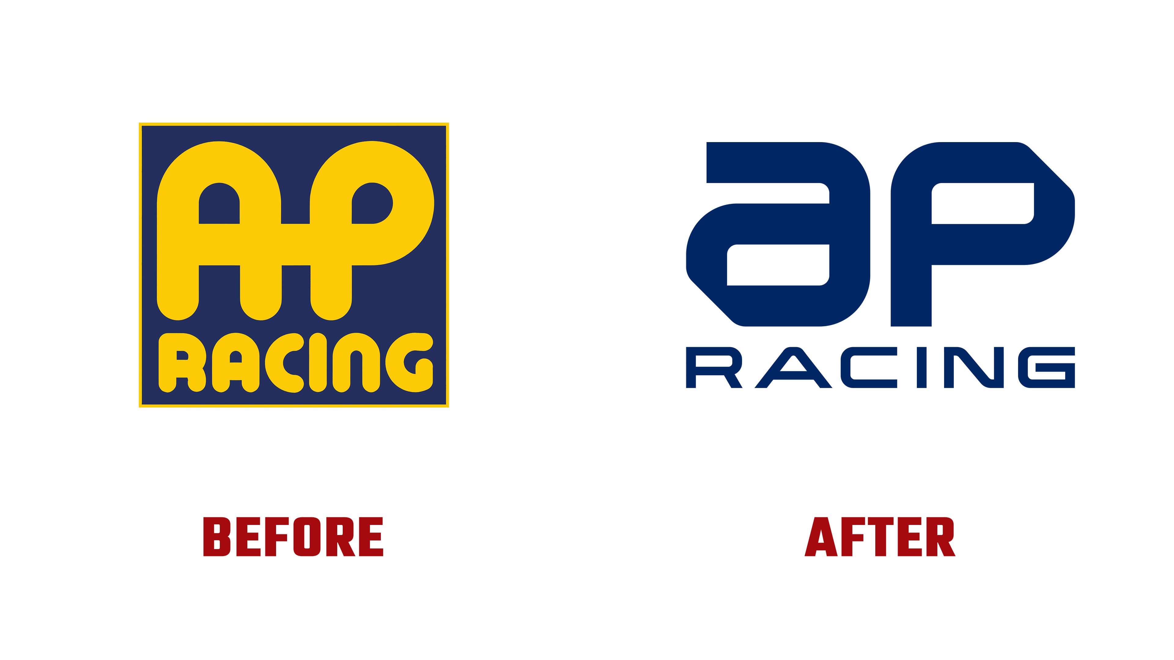
The previous logo referred to the 1970s and 1980s. Rounded AP letters, yellow-and-blue color contrast, and a square frame created the image of a racing workshop with a retro mood. In the new version, the frame is gone, yellow has been replaced by dark blue, and the forms gained a more rigid structure.
The AP letters are built from angular lines. They recall bodywork details, aerodynamic elements, and technical drawings. The mark became more restrained, stricter, and closer to modern racing engineering.
The word RACING changed along with the symbol. A narrow sans serif with cuts moves the brand away from an archival mood and toward modern racing, sim racing, and digital broadcasts. The single dark blue color makes the logo feel more mature and more composed.
The new mark is connected with what teams and drivers value AP Racing for. The focus is control, quick response, performance under heavy load, and a precise connection between the car and the driver. The logo is designed for different applications, from the race car and broadcast graphics to mobile screens, the website, social media, and technical materials.
Le Mans gave the rebrand a strong backdrop. AP Racing showcased its new image alongside its products and at a race where the brand was represented on most of the starting grid. The logo keeps its connection to motorsports and looks like the mark of an engineering company working at the next level of performance technology.