


![]()
Bolthouse Fresh, a leading name in fresh produce, has introduced a new logo as part of its rebranding following its transition from Bolthouse Farms. This refreshed identity reflects the company’s commitment to freshness, innovation, and heritage as a top supplier of North America’s fresh carrots.
The previous logo paid homage to the brand’s traditional roots and farm-based origins with its calligraphic script. While nostalgic, its ornate design no longer aligned with the company’s evolving image. The new logo adopts a bold, modern aesthetic, emphasizing energy and a renewed focus on delivering fresh produce.
![]()
The wordmark now features a clean, sans-serif font with sharp, angular lines that convey confidence and clarity. This contemporary typography enhances visibility and adaptability across various platforms. The transition from “Farms” to “Fresh” highlights the company’s focus on fresh offerings and a more consumer-centric approach.
A standout element of the redesign is the creative use of the letter “O,” which incorporates a stylized carrot in its negative space. This detail represents the company’s core product and acknowledges its agricultural heritage. The design includes asymmetrical leaves on the carrot, adding a touch of whimsy and an approachable, organic feel.
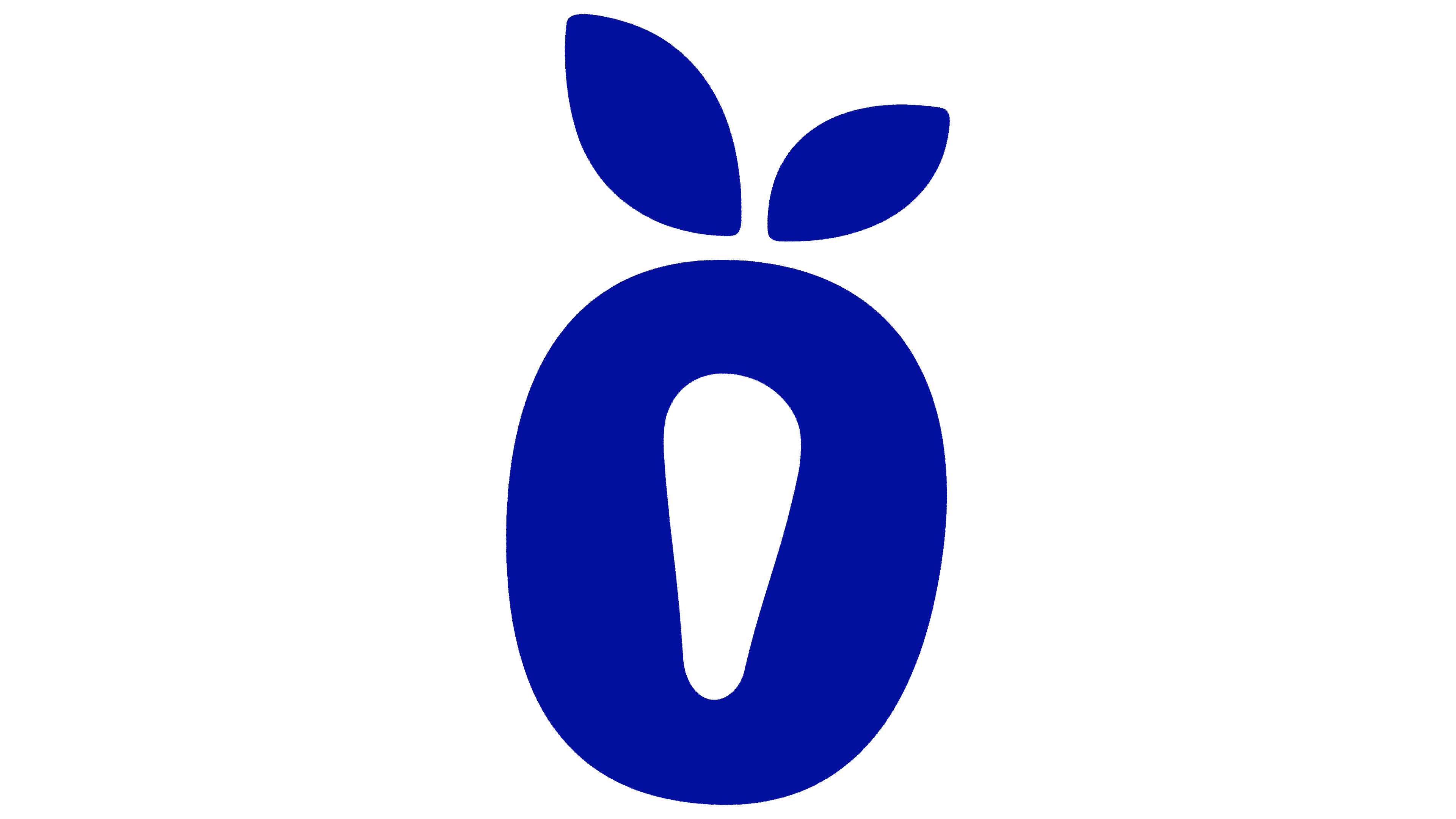
The updated color palette centers on a vibrant blue, representing trust, reliability, and professionalism. This striking hue complements the typography, creating a versatile and impactful visual identity suitable for various applications, including packaging and marketing materials.
The overall design achieves a balance between boldness and simplicity. Subtle curves and balanced proportions suggest vitality and movement, embodying the company’s dedication to delivering high-quality produce while honoring its century-long legacy.
![]()
With this rebranding, the company signals its readiness to meet the challenges of today’s competitive market while remaining true to its roots. The new logo encapsulates freshness, quality, and trust, reinforcing its position as a leader in the produce industry. This modernized identity is poised to strengthen its connection with consumers and broaden its presence in the fresh produce market.