It turns out that the financial business can also be interesting and fun. American fintech company Network Capital, founded in Irvine, California, in 2002, proved that. In its 20 years of existence, the brand has provided mortgage lending, financing to homeowners and homebuyers across 37 states, including Columbia County. As it grows, the brand is spreading its services further and further to reach the entire US. An interesting feature of the company is to create the best places to work in such structures. The original employee program makes working for the company fun and varied. The applied technology of individual service and the presence of products, the application of which is determined for each client, makes the brand’s offers especially unique. As a result, the processes of lending, receiving finance as much as possible simplified, become part of the overall original system.
Putting at the head of the convenience and reflection of their client’s interests brand creates a completely new approach to each of them. Becoming not just financially obliged, responsible for compliance with conditions and requirements, each of the participants in the financing becomes a member of a single-family under the caring wing of Network Capital. They acquire finances, expand opportunities, and discover new ways to achieve their goals with a caring financial organization. Today, the brand is already represented by three headquarters located in major city centers in New York City, Miami, Los Angeles, and Irvine, CA.
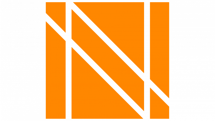
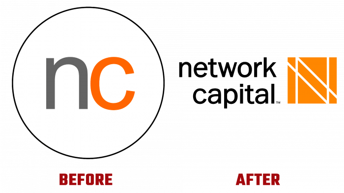
The new logo features a bold design approach. The main emblem was developed under the influence of the unique work of Malevich. The used inner space of the square was filled with an attractive bright orange color, against which the main brand symbol – the letter N, made in contrasting white color, was formed by white parallel lines. This execution ensured the creation of a thoroughly monolithic effect, echoing the inimitable elegance. The composition provides the emblem with weight and ease of recall. Its brevity only enhances the required perception of the logo—the visual identity created as a successful basis for a stronger and more productive brand in the future.


