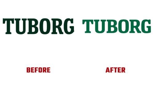
In order to unite its products, arouse the interest of young people, and simultaneously not lose old customers, Tuborg began a soft rebranding. The first results appeared on August 24, although the implementation of the updated design started in early 2022. This is the first holistic rebranding in decades.
Such slowness and caution are explained by the love of Danish consumers for the classics, that is, for the familiar. Novelty is not always perceived positively, so the agency Robot Food, which the beer brand entrusted with modernizing the identity, tried not to “throw the baby out with the water,” as the creative director noted. Instead, the design team polished the existing variant. In particular, typographer Rob Clarke introduced a fresh look while respecting the old emblem.
As a result, the feeling of classicism remained. And some of the changes that have been made may seem insignificant at all. But existing resources have helped set the beer maker up for a progressive future and capture the eye of the younger generation. The inscription has become smoother: it has disappeared sharp corners and unjustified protrusions – such as were the “T” and “G.” Now, these are even letters with perfect edges and straight sides.
Other signs have also undergone modernization: “R” has a straightened bend, “U” has lost the imbalance between the right and left parts, “O” has received a rectangular shape, and “B” has a lower element that has become larger than the upper one. Taken as a whole, the letters are now wider than before. In general, not a single character was left without a soft adjustment. The color has also changed: from dark green, the logo turned into emerald green.
Of particular value to this brand is the Urmager brand name. Designers have combined it with the text on the packages so that buyers understand that all Tuborg sub-brands are part of a single family. The new visual concept is that any introduced beers will now easily integrate into the company, as the logo Tuborg will take on the hard work of adapting them.


