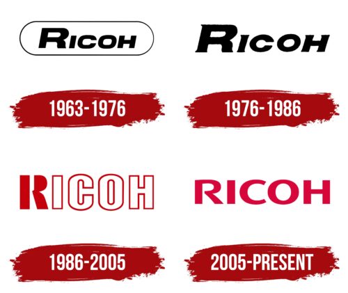
The Ricoh logo is bright and fiery. The emblem represents a flash of light and laser beams, reflecting the company’s core business. It demonstrates progress, innovation, leadership, and active growth and expansion.
Ricoh: Brand overview
| Founded: | February 6, 1936 |
| Founder: | Riken |
| Headquarters: | Ota, Tokyo, Japan |
| Website: | ricoh.com |
Ricoh is a Japanese giant in the production of office equipment and digital electronics, with a net profit of more than $15 billion. Production facilities are located in the United States, Japan, Europe, and Asia. The company employs 95,000 workers.
Meaning and History
The basis of the corporation’s logos has always been the word. Attention was focused on the name and the characteristics of the manufacturer, and the diversity of the assortment was conveyed using color and font. The change of emblems was caused by major events in the company’s life: renaming and progressive technological innovations released to the market. In recent years, Ricoh has associated itself with bright colors, demonstrating a resurgence, a leap in growth and development.
What is Ricoh?
A Japanese corporation that produces faxes, printers, scanners, photo and video cameras, and software. The most famous brands are Pentax, Theta, Lanier, and Ricoh. The headquarters is located in Tokyo.
1963 – 1976
In 1963, the company, which previously existed as Riken Sensitized Paper Co, was renamed Ricoh. The main goal was to show the expansion of the product range (from paper to electronics). Due to the renaming, a change of logo was required.
The new sign was a concise name placed in a capsule.
The word Ricoh is formed by combining two parts from Riken and Cohesion. It conveys cohesion, creating a corporation, each branch of which is engaged in a specific direction of technology.
The name Riken consists of the first syllables from the phrase: Rikagaku Kenkyūjyo, denoting a physicochemical laboratory. In the previous name, it indicated the chemical production of photosensitive paper. In the new one, together with Cohesion, it shows expansion, including other subsidiaries in the organization—the addition of a whole range of other products to paper production.
The capsule shape connects the company with scanners, printers, and cameras, as it increases the association with chemical processes, which are the basis for transferring images to paper, film development, etc.
The oval shape speaks of completeness, a full cycle of services from copiers and fax machines to the paper for them.
1976 – 1986
1986 – 2005
2005 – today
The company spreads its name everywhere. It acquires and renames other companies (Ricoh Printing Systems, Ltd.). It acquires naming rights (Ricoh Arena). To demonstrate development, growth, and ambition, the logo changed in 2005.
The new emblem is a red Ricoh inscription. In the word, there is an open glyph, “R,” which symbolizes openness to innovations, research, and new projects. The tapered ends of the C resemble a horseshoe, a symbol of luck.
Font and Colors
The red shades in the logo’s base tell of rapid development and expansion. They demonstrate dedication, selflessness, and love for their work. The color reflects the particular diligence of the Japanese, distinguishing their nation.
Red symbolizes success, leading positions, and worldwide fame.
The font of the inscription is Aeonis Pro Extended Heavy, but with a modified R. Even solid glyphs represent the corporation as strong and confident.
Ricoh color codes
| Rich Carmine | Hex color: | #d7063b |
|---|---|---|
| RGB: | 215 6 59 | |
| CMYK: | 0 97 73 16 | |
| Pantone: | PMS 206 C |
