


 Sacred Heart Pioneers Logo PNG
The Sacred Heart Pioneers logo is based on the letters in Sacred Heart University. The graphic conveys the team’s athletic attitude and demonstrates the program’s working character. The style is simple and consistent with the institution’s academic tradition.
Sacred Heart University, founded in Fairfield, Connecticut, in 1963, introduced organized athletics in 1965 with men’s baseball and basketball. The institution adopted “Pioneers” as its nickname, reflecting the university’s innovative spirit as the first Catholic university in the U.S. managed by laypeople.
In 1973, Sacred Heart joined NCAA Division III and added several women’s teams during a period of athletic growth. The opening of Sacred Heart Gymnasium in 1986 improved training conditions and coincided with a move to NCAA Division II. Athletic Director Don Cook arrived in 1991 and began the transition to Division I.
Sacred Heart officially joined NCAA Division I and the Northeast Conference (NEC) in 1999, marking a major expansion of its athletics program. In 2004, the William H. Pitt Health and Recreation Center opened, modernizing facilities for multiple teams. The football team won its first NEC championship in 2008, a major milestone in its growing success.
Men’s and women’s hockey programs began competing in 2013, further diversifying the university’s athletic offerings. The Campus Field football stadium opened in 2016, improving outdoor sports infrastructure.
By 2023, Sacred Heart supported 32 NCAA Division I teams, including a notably strong women’s basketball program. Celebrating its 60th anniversary that year, the university invested in upgraded athletic facilities, training areas, and enhanced sports medicine programs.
Meaning and History
What are the Sacred Heart Pioneers?
These Sacred Heart University teams compete in NCAA Division I in the Northeast Conference, with the men’s hockey team playing in Atlantic Hockey. Based in Fairfield, Connecticut, the teams compete in basketball, soccer, and hockey, showcasing their reds and whites at the William H. Pitt Center and Total Mortgage Arena. The Big Red mascot brings sporting events to life, and the university is proud to be the first Catholic institution in the U.S. to become independent of a religious order, as reflected in its name and mission.
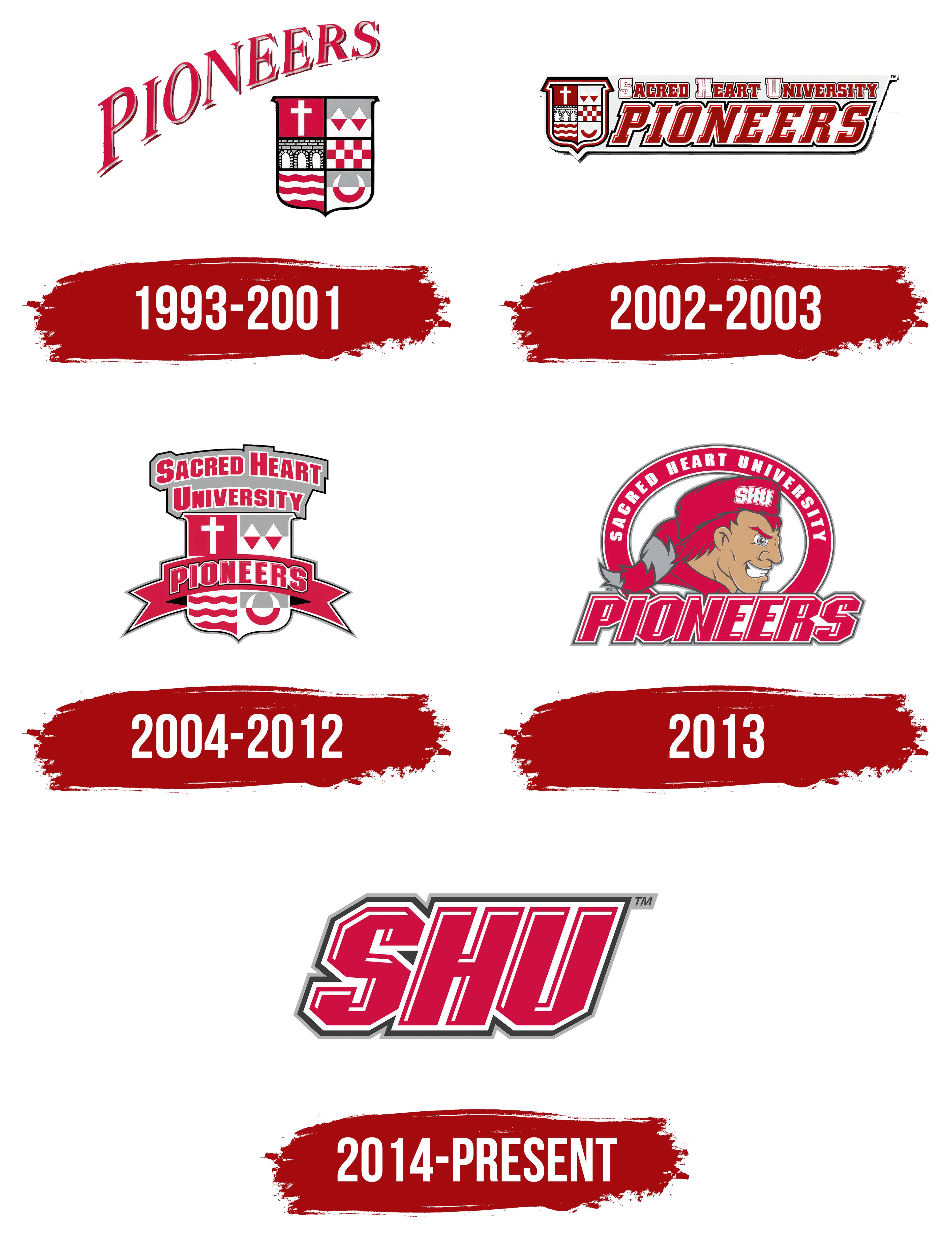
1993 – 2001
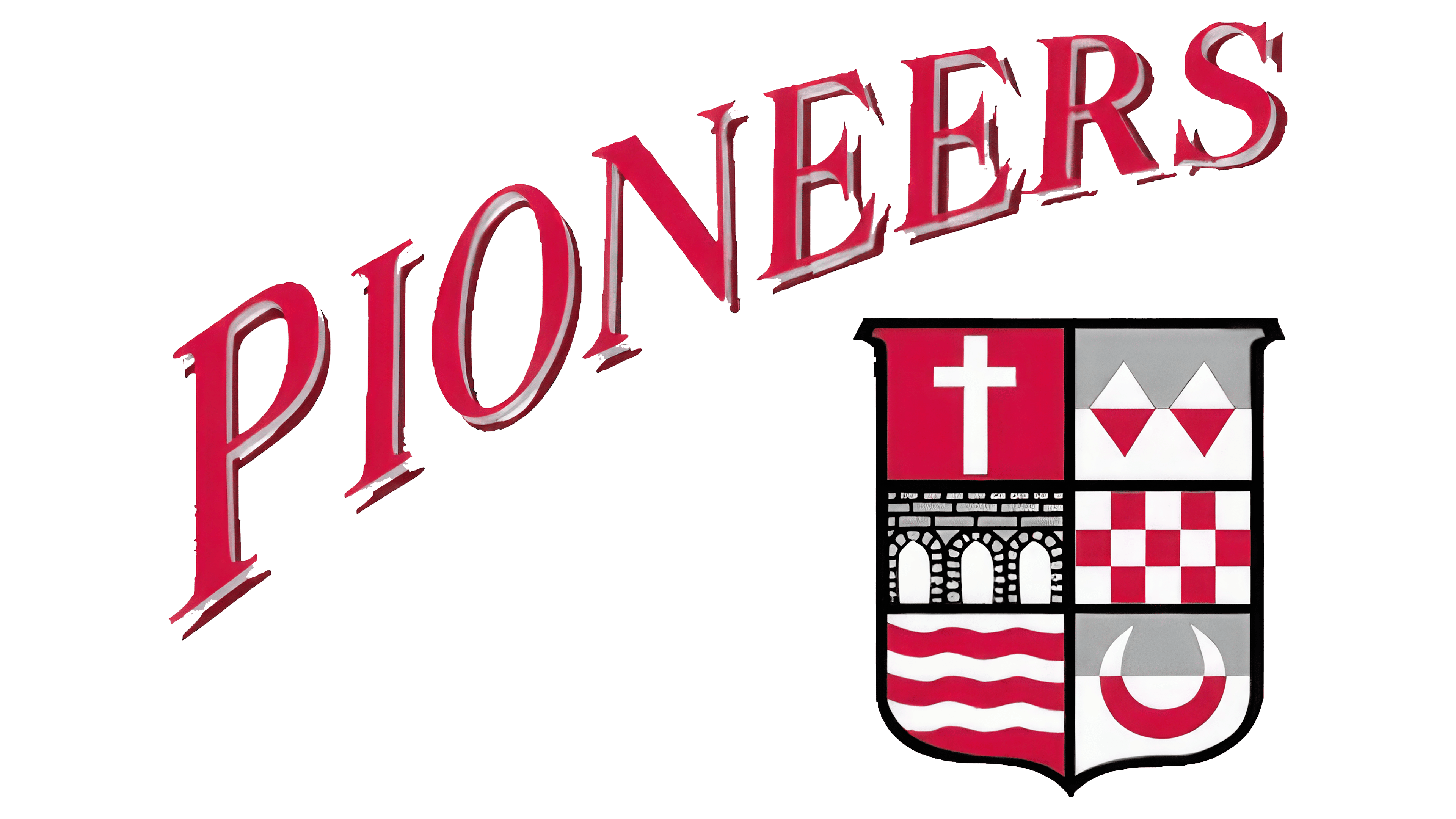
The original Sacred Heart Pioneers logo combined a heraldic shield with a dynamic “PIONEERS” inscription. The word was set on a diagonal, rising from the lower-left edge. The red letters featured a gray shadow, creating depth and perspective. The text shrank toward the end.
To the right of the inscription, a shield divided into six segments bore a symbol reflecting the university’s history in each. The upper left sector featured a white cross on a red background, symbolizing the institution’s spiritual and Christian roots. Next to it was a figure made of red-and-white triangles forming a diamond shape, reminiscent of mountain peaks.
The middle tier on the left showed a black silhouette of an arched bridge, emphasizing the foundation of knowledge and historical connection. The right side featured a red-and-white checkered pattern, referencing classic European heraldry.
The lower left segment featured red wavy lines on a white background, symbolizing growth and vitality. The neighboring section showed a white-and-red semicircle on a gray-and-white background resembling a horseshoe or horn, a traditional symbol of good luck.
2002 – 2003

In the new Sacred Heart Pioneers logo, the coat of arms is placed on the left and remains divided into six parts, each representing the institution’s values and history.
To the right of the emblem, the full university name, “Sacred Heart University,” appears in a uniform, strict red typeface with white and black outlines. The lower part of the composition features a large “PIONEERS” inscription in massive, square-serif letters that emphasize the team’s athletic style. White inner lines accent the red letters, adding volume. The composition is horizontal, with no rounded shapes.
2004 – 2012
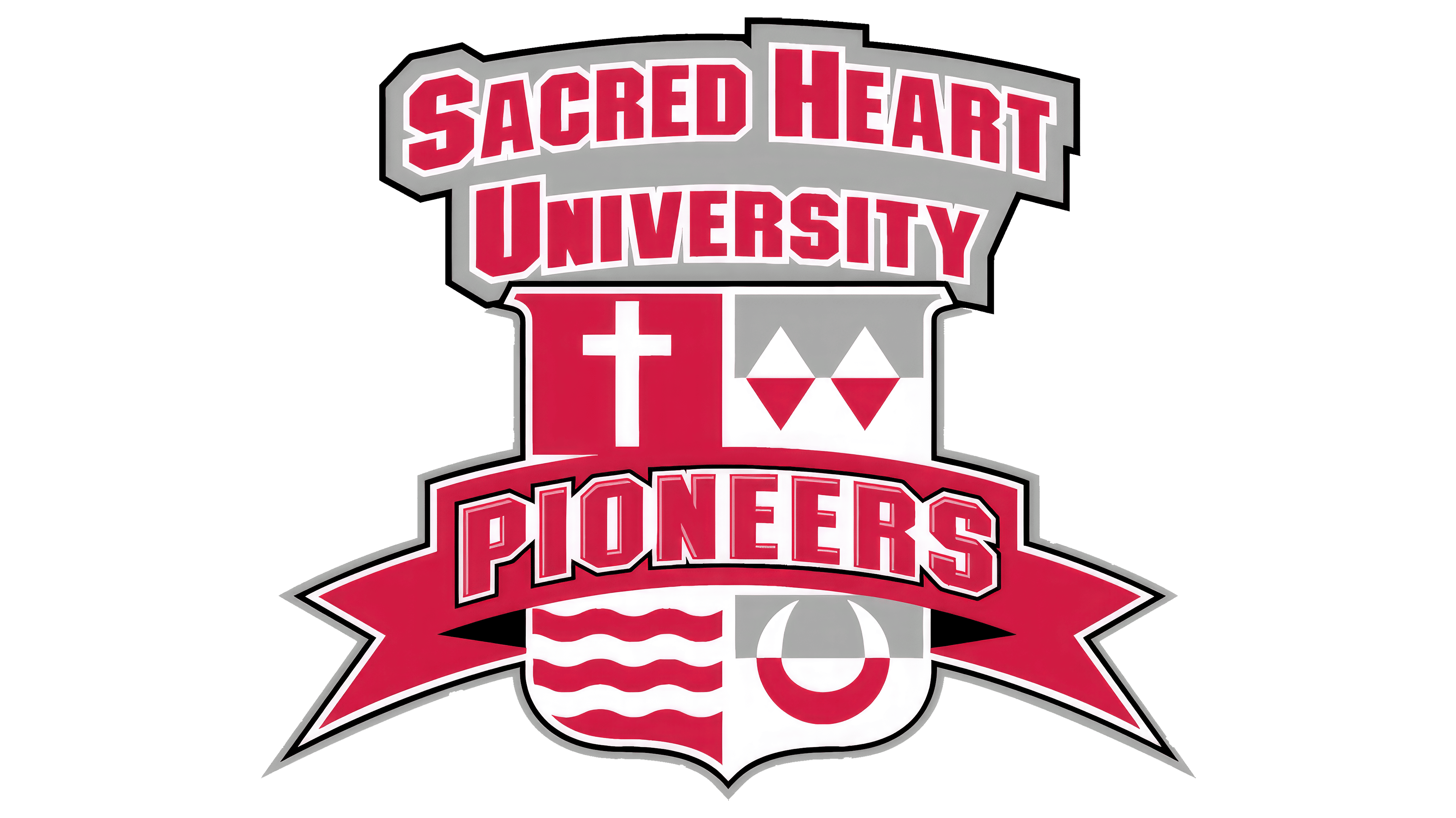
The next logo is a shield divided into four equal sections in red, gray, and white. The upper-left corner contains a white cross on a red background. Next to it is a segment with abstract shapes resembling mountains or architectural elements. The lower part features wavy lines, and on the right side is a figure resembling a horseshoe or horn.
The university name, “Sacred Heart University,” sits above the shield in large red letters, outlined in white, on a solid gray background. The strict geometric font, with its straight lines, creates a solid, clean look.
A wide red ribbon runs across the center of the shield with the word “PIONEERS” written in red and outlined in white and black. The ribbon visually widens toward the sides, adding volume and energy to the logo.
2013

The new Sacred Heart Pioneers team logo focuses on an image inspired by early American settlers and hunters. Instead of the strict heraldic style of previous versions, it offers a vivid, emotional design.
The central figure depicts a man wearing a red hunting cap and a gray-and-red fox tail. This detail recalls past hunting traditions. The white SHU abbreviation on the headgear directly connects to the university. The figure looks confident, with stern eyebrows and a determined gaze.
The figure sits within a red circular outline containing the white inscription “Sacred Heart University.” The strong, formal font conveys the institution’s prestige. Below the figure, the team name “PIONEERS” appears in large red athletic letters with a multi-layered white outline that adds volume.
The logo uses red, white, and gray. The result is a striking sports emblem that unites historical context with the university’s modern team spirit.
2014 – today
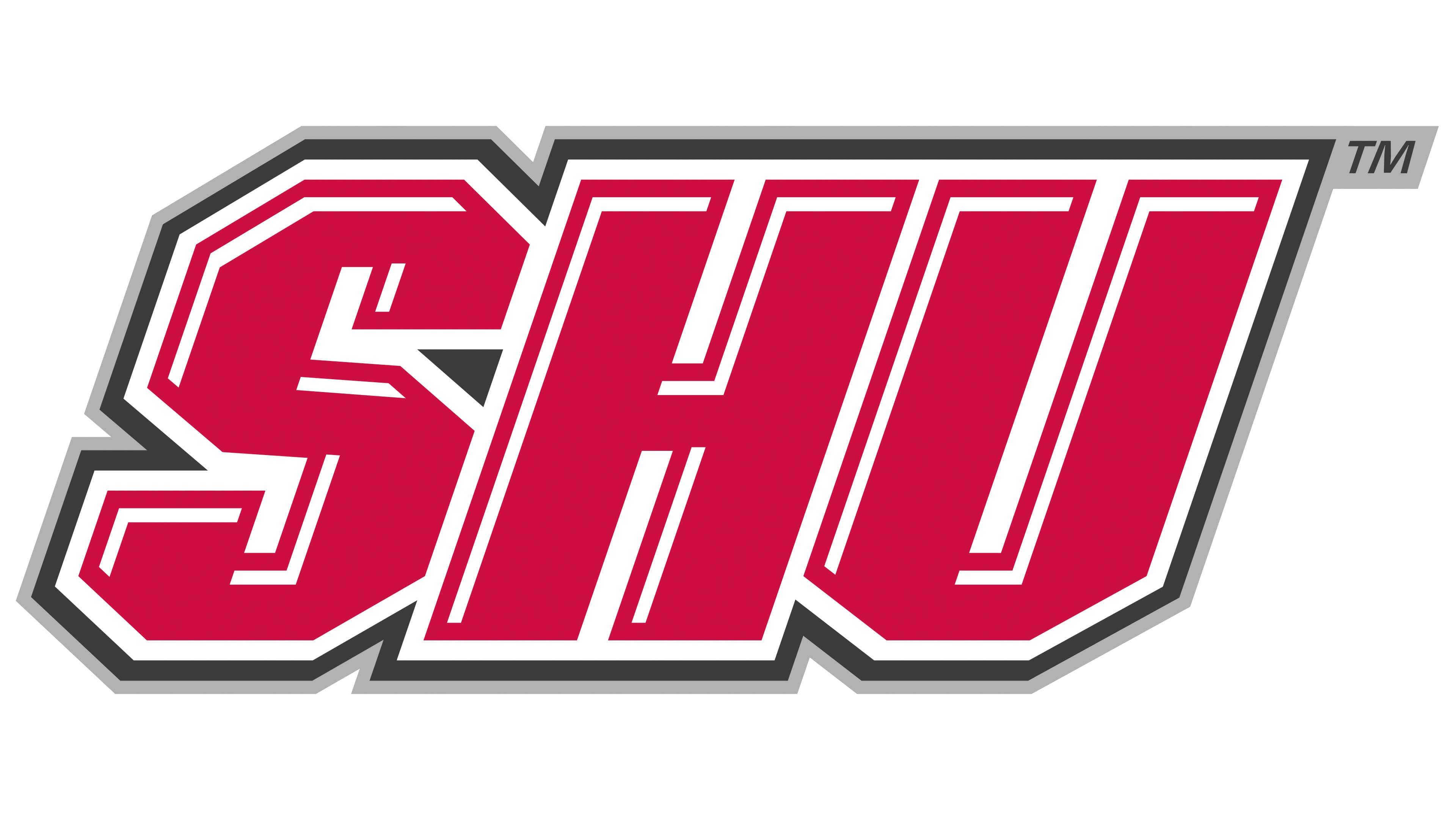
Since 2014, the Sacred Heart Pioneers’ athletic teams have used an updated logo centered on the SHU abbreviation. Instead of previous complex compositions, the focus is on three large red letters in a bold athletic font.
The abbreviation is slanted to the right, creating an impression of speed and energy. White inner lines accent the red base, forming a double outline that adds depth. The outer gray-black outline further enhances the visual effect.
The letters have straight lines and sharp angles. Although the pioneer figure and full team name are absent, the powerful lettering style reflects the university team’s identity.