


 Saint Mary’s Gaels Logo PNG
The Saint Mary’s Gaels logo features interlaced letters that reflect the college’s name. The style symbolizes unity and a close connection between students, athletes, and the institution. The “G” symbol emphasizes the team nickname “Gaels” and underscores the college’s connection to Irish traditions.
Saint Mary’s College of California, founded in Moraga in 1863, established its athletic identity with the nickname “Gaels,” honoring its founders’ Irish heritage. The Gaels began competing in organized sports in 1907, initially forming football and basketball teams.
In the 1920s, athletics expanded notably when the college opened its first Gymnasium in 1927, providing a dedicated home for basketball. Football gained national recognition in the 1930s through appearances in prominent bowl games, while basketball rose in prominence toward the decade’s end.
After World War II, the college made significant shifts, discontinuing football and elevating basketball as the primary sport. Infrastructure developed further with the opening of McKeon Pavilion in 1961, solidifying the college’s commitment to athletics.
Title IX in the 1970s led to the creation of women’s sports programs, broadening the Gaels’ athletic profile. Joining the West Coast Conference (WCC) in the 1980s provided consistent competition and helped stabilize sports development.
Basketball saw notable achievements in the 1990s, including multiple NCAA Tournament appearances. This success intensified in the 2000s, highlighted by a return to the NCAA Tournament in 2005 and a Sweet Sixteen appearance in 2010.
In 2019, the university renovated McKeon Pavilion and reopened it as the University Credit Union Pavilion. By 2023, the Gaels had 16 NCAA Division I teams, marking their 160th anniversary with events celebrating athletic accomplishments and the unveiling of upgraded training facilities.
Meaning and History
What is Saint Mary’s Gaels?
These teams from St. Mary’s College in California compete at the NCAA Division I level in the West Coast Conference, bringing their distinctive navy blues and reds to the University Credit Union Pavilion and other athletic venues on the Moragh campus. Basketball and rugby teams, in particular, regularly succeed on the national stage, producing strong results and developing professional athletes. The team’s unique nickname pays homage to the college’s Irish Catholic roots, and its mascot, “Gael Force One,” inspires fans by creating a vibrant, supportive atmosphere on the San Francisco Bay Area campus.
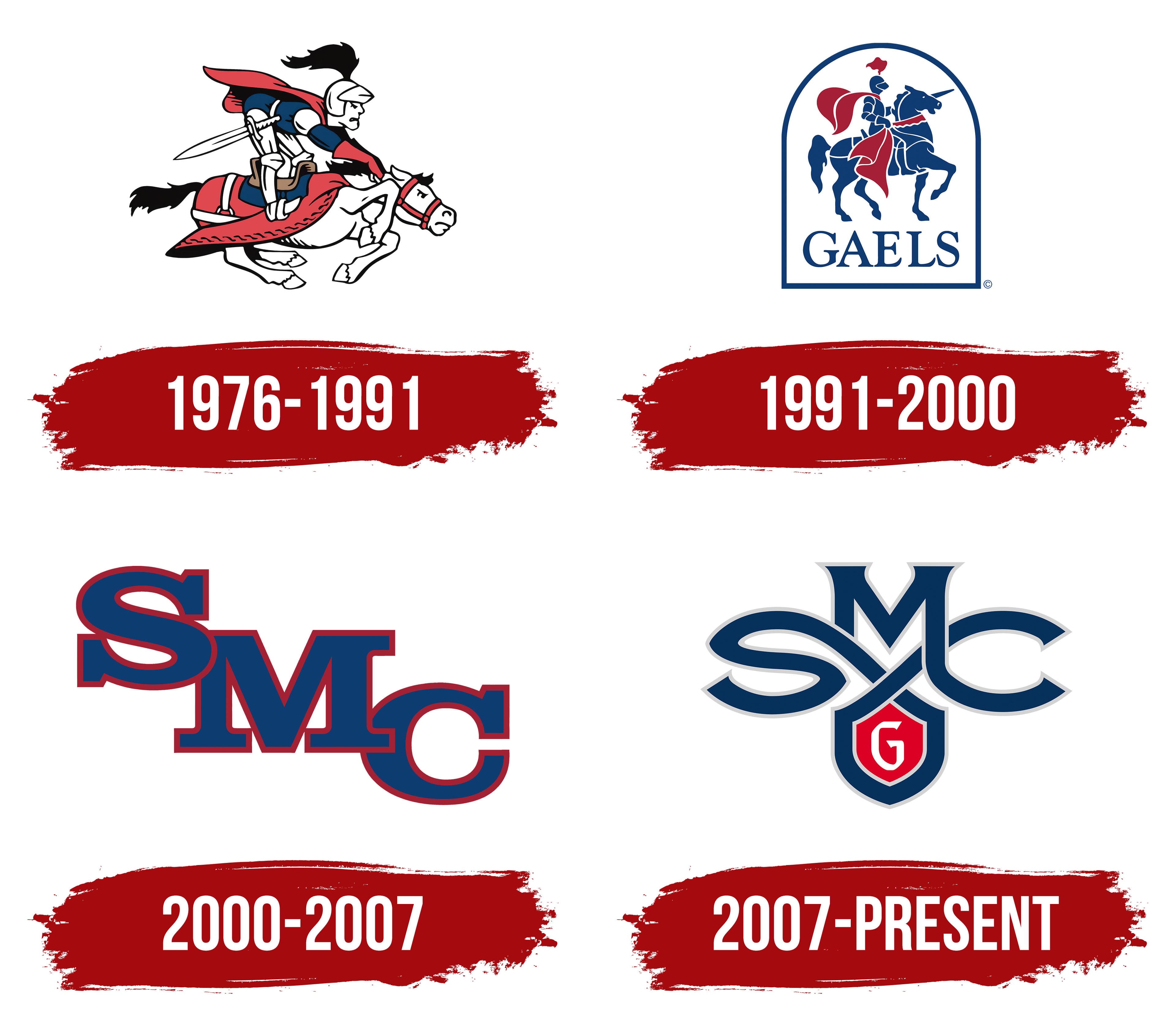
1976 – 1991
The logo of Saint Mary’s College of California, introduced in 1976, features a knight on horseback in motion, with a fighting spirit.
At the center, a knight stands with a sword, wearing blue armor and a helmet with a decorative plume. The rider’s face is simplified and stylized, without detail, but the posture, the torso’s tilt, and the sword at the waist create an impression of tension and readiness for battle.
The white horse gallops in an active pose. The red bridle and saddlecloth accent the horse’s white color and enhance the sense of energy. The red cloak behind the knight and the horse’s lifted tail add to the feeling of drive and speed.
The color palette includes red, white, blue, and black. Red adds brightness and emphasizes the fighting nature, blue reinforces the college identity, while white and black provide visual expressiveness.
1991 – 2000
In 1991, Saint Mary’s College sports teams received a redesigned logo featuring a knight on horseback within an arch. The new style moved away from the previous aggression and dynamic poses, becoming more reserved and balanced.
The rider is depicted in a simplified, concise form. The face and body are not detailed; only a general outline indicates the silhouette and armor. The horse stands calmly, lifting its front leg. Its posture conveys dignity and composure. The color scheme includes dark blue and bright red.
At the bottom of the arch, the inscription GAELS appears in a serif typeface that conveys solidity and respect for the college’s history.
2000 – 2007
In 2000, Saint Mary’s College of California sports teams began using a new style: an SMC monogram. They removed the previously used knight and Celtic elements, leaving a simple, clear letter combination.
The monogram consists of three large letters, closely connected and arranged diagonally. The font is strict and solid, with serifs that emphasize the college’s academic character.
The color scheme is minimalist. It features a dark blue fill and a red outline that highlights the letters’ shapes.
The letters are placed one after another with slight overlap. The upper “S” overlaps part of the middle “M,” and the middle “M” slightly overlaps the lower “C.”
2007 – today
In July 2007, Saint Mary’s College of California’s athletic teams introduced a new logo designed by Osaki Creative Studio in Emeryville. The presentation took place during the annual Reunion Weekend, after extensive discussion and coordination with faculty, students, administrators, and alumni.
At the center of the composition are three interwoven letters, S, M, and C, forming a unified monogram. The letter M stands in the middle, connecting the other elements. The lines are intertwined in the style of a Celtic knot.
At the bottom of the composition is a red shield with a white letter G, symbolizing the team name, Gaels. The traditional college colors are used. Dark blue is the primary color, with red for the shield and silver-gray for the monogram’s contours. A custom typeface was created for the logo, with a unique style and proportion. The result is a harmonious, clear symbol that reflects Saint Mary’s College of California’s history and athletic spirit.