


![]() Denver Pioneers Logo PNG
Denver Pioneers Logo PNG
The traditional textual minimalism that has become customary in college sports team identities is evident in the Denver Pioneers’ logo, a letter monogram. It emphasizes the brand name, symbolizing consistency in the pursuit of victory, strength, and resilience.
The University of Denver, founded in 1864 as Colorado Seminary, held its first recorded game in 1867. Early teams had no fixed name and were called “Ministers” or “Fighting Parsons”. In 1925, students chose “Pioneers,” referencing westward expansion, and the name remained.
Hockey became the core program after its 1949 debut. An early loss to Saskatchewan was followed by rapid progress. In 1958, Denver won its first NCAA title against North Dakota. Additional championships came in 1960, 1961, 1968, and 1969, establishing national prominence. Alumni included Glenn Anderson and Bill Masterton.
The program returned to the top in 2004 and 2005 under George Gwozdecky. Later titles followed in 2017, 2022, 2024, and 2026, bringing the total to eleven and placing Denver among the most decorated teams in college hockey.
Skiing, added in 1948, built a record of NCAA titles and remained one of the nation’s strongest programs. Lacrosse reached its peak in 2015 under Bill Tierney, when Denver defeated Maryland 10:5 in the NCAA final. Wesley Berg was named tournament MVP.
Lacrosse teams compete in the Big East Conference, while women’s gymnastics is part of the Big 12 Conference. In 2013, Denver joined the founding group of the National Collegiate Hockey Conference alongside North Dakota, Miami (OH), and others.
Across sports, Denver remained nationally competitive, with soccer reaching the NCAA Elite Eight and gymnastics advancing to the national finals.
Meaning and History
![]()
One of the first logos of the Denver Pioneers department corresponded to its name. It featured the image of a pioneer: a bearded man in a raccoon hat with a tail. Artists “dressed” the drawn character in a sports uniform with the letter “D” on the chest. This version was used for 30 years, from 1968 to 1998. Then it was replaced by an emblem featuring a stylized bird, resembling a crab claw. The image was accompanied by the “Denver Pioneers” inscription, divided into two lines.
The emblem featuring the flying bird was in use until 2006. After the redesign, the teams received a new distinctive mark: a monogram of dark red letters “D” and “U.” They are positioned to perfectly complement each other. Short perpendicular serifs and the absence of rounded elements characterize the font.
What is Denver Pioneers?
The Denver Pioneers is an athletic association of 17 student teams from the University of Denver in Colorado. They compete in NCAA Division I and are members of the Summit League. Representatives of this department also participate in RMISA (skiing), NCHC (hockey), Big East (lacrosse), and the Big 12 Conference (gymnastics).
1968 – 1985
![]()
In 1968, the Denver Pioneers needed a new sports mascot. Stan Albeck, who was the basketball coach at the time, contacted an artist from the Disney studio. As a result of their creative collaboration, Denver Boone was created as a cheerful, bearded cartoon man with sideburns and thick eyebrows. This image served as the basis for the logo.
The funny character, dressed in a sports uniform with the letters “DU” (there is a version with one “D”), embodies the American pioneer. This person resettled in the western US in the 18th and 19th centuries. His raccoon skin hat indicates this. American colonists previously wore such headgear: they essentially “stole” the hat from the Native Americans, as it was originally traditional clothing for the Indians.
1985 – 1999
![]()
This logo symbolizes speed, as the letters “D” and “U” are tilted to the right, creating a sense of rapid movement. The so-called speed lines are to the left – six horizontal bars of varying lengths. The abbreviation is painted in dark maroon and outlined with a wide white border.
1999 – 2007
![]()
From 1998 to 1999, the University of Denver updated its sports mascot again. Chancellor Dan Ritchie did not like the cheerful and friendly Denver Boone, so he ordered the creation of a fierce Ruckus, the red-tailed hawk.
Meanwhile, a local design firm developed the Red Hawk emblem, which puzzled DU fans. Many didn’t even understand what was depicted, giving the emblem the nickname “jelly donut.” The artist portrayed a flying bird with dark gray wings, a black head, and a red tail. Apparently, that’s what the sports fans took for jelly. Underneath the hawk is the word “PIONEERS,” curved upwards, and below it – “DENVER” with long, thin serifs.
2007 – 2018
![]()
The logo, known as Arched Denver, was inspired by the basketball uniforms of the 1940s and the hockey jerseys of the 1950s. It shows the connection between the sports teams and the city and university names. It’s a matter of pride and a geographical identifier. In this case, the word “DENVER” is supplemented with the black inscription “UNIVERSITY OF.” All letters are typed in a block font with rectangular serifs.
2018 – 2022
![]()
Here, the logo shows only the city’s name. It has a traditional arched shape and is colored in dark maroon. Each letter is outlined with a double contour: gold and black. This is a tribute to the inscriptions that adorned the chest of the “Denver Pioneers” uniforms for 70-80 years.
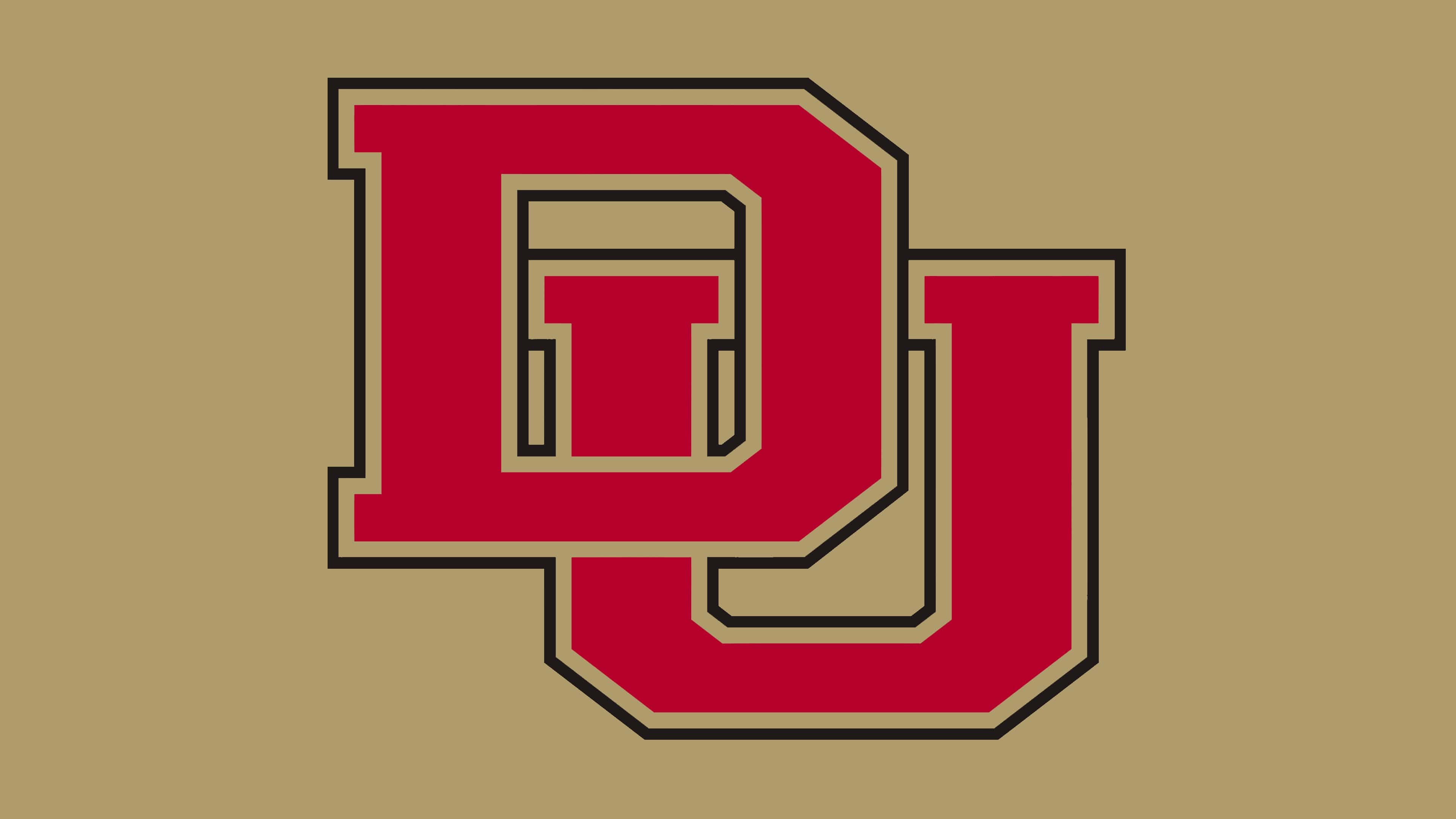
2022 – today
![]()
In 2022, the University of Denver adopted a symbol consisting of intertwined letters “D” and “U.” It has since become the sole official logo of the institution and its sports teams. Perhaps this is due to the university’s desire to move from elitism to inclusivity, increase brand recognition, and reduce advertising costs.
The “DU” monogram did not appear out of nowhere. History shows that the intertwined letters first appeared on baseball uniforms in 1910 and newspapers in 1935. Since then, the sign has changed repeatedly.
The modern version is smoother and softer. In the background is a gold letter “U,” and in the foreground – a dark maroon “D.” At the same time, the left part of “U” occupies almost all the intra-letter space of “D.” Both glyphs have short trapezoidal serifs and are outlined with white lines. To ensure the emblem displays well on a light background, designers outlined it with a thin gold contour.
Fans criticize the Denver Pioneers’ monogram as too generic, as it can be associated with the University of Delaware, the University of Dayton, Duke University, and many other educational institutions. In public opinion, the sports teams should more openly declare their affiliation with Denver.
Font and Colors
The Denver Pioneers logo traditionally uses a block font with large rectangular serifs. However, after the logo’s redesign in 2022, the serifs were reduced, shortened, and angled to form a trapezoid. Thus, the monogram now consists of custom-designed glyphs.
As indicated on the sports team’s website, their official palette consists of two colors:
- gold (#A89968) – symbolizing future success;
- dark maroon (#BA0C2F) – embodying the passion and the pursuit of victory.
Over the years, the Denver Pioneers logo has used the same colors. Only the shades may differ.
The University of Denver began sponsoring basketball in 1904. Initially, its team participated in regional competitions, then became a non-conference member of the NCAA Division I. From 1979 to 1992, it was part of NAIA. It belongs to the Summit League, which it joined in 2013. That same year, the men’s team won the Western Athletic Conference championship and advanced to the second round of the NIT, where it lost to Maryland.

The “Denver Pioneers” hockey team played its first season in 1949-50. Now, they compete in the NCHC under the guidance of coach David Carle, participate in the NCAA, and hold second place in eight national championships.