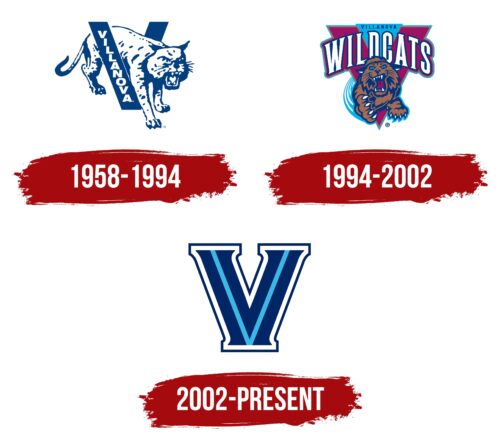
The geometrically accurate Villanova Wildcats logo symbolizes confidence, steadfastness, and determination – the qualities that athletes possess. Smooth and clear lines show that Villanova University teams always work together and succeed. And the sharp edges denote aggression because it is she who gives rise to sports excitement.
Villanova Wildcats: Brand overview
| Founded: | 1842 |
| Headquarters: | Villanova, Pennsylvania, U.S. |
| Website: | villanova.com |
Meaning and History
The mascot of the teams is a certain collective image because anyone can be attributed to the category of wild cats – from a manul to a caracal. And yet, the red lynx, an animal that lives in North America, is considered preferable. It was she who was depicted on many emblems of Villanova Wildcats. She was chosen for her incredible vitality, made possible by qualities such as attentiveness, resourcefulness, speed, and fury.
What is Villanova Wildcats?
The Villanova Wildcats are sports teams that play for Villanova University and represent the institution in the Big East Conference and the Colonial Athletic Association. The most successful sports are basketball, football, men’s lacrosse, track and field, cross-country, swimming, and diving.
1958 – 1994
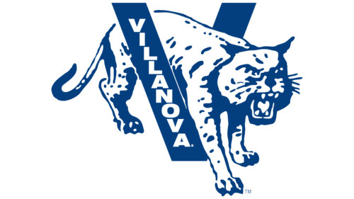
Until 1994, a large blue “V” logo was used. The word “VILLANOVA” was written on the left diagonal. To make it fit there, the designers had to arrange the letters on a ladder. Between the two parts of the “V” was the same wild cat from the names of sports teams. Moreover, the front half of her body was on one side and the back on the other. The artists depicted the animal schematically, without detail. It was possible to recognize a lynx in it only by general features: for example, by the shape of the ears or by the aggressive grin. The base of the silhouette was white, and all the shadows, contours, and a few stripes were dark blue.
1994 – 2002
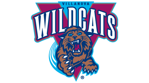
After slightly reworking the Villanova Wildcats logo, the letter “V” became purple (an eggplant shade) and appeared in the background. An inverted light blue triangle with a dark blue inscription “VILLANOVA” appeared between the two diagonals. Beneath it was the white word “WILDCATS,” in which the letters were arranged in an arch. In both cases, bold font with short, sharp serifs was used. Both the “V” and the protruding part of the text were double outlined, first in gold and then in light blue.
Under the impromptu arch, the artists depicted a jumping lynx in the full face – so that it seemed as if it was about to attack the beholder. This time, the animal looked more like a lynx than on the previous emblem. But it still didn’t look very realistic because its fur was dark brown, its eyes were blue, its tongue was eggplant, and the insides of its ears were white. Designers specially detailed sharp claws and teeth to show the danger of Villanova Wildcats.
2002 – today
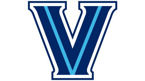
The modern symbol for sports teams contains only a “V.” The logo’s creators removed the lynx image, focusing on the first letter of the word “Villanova.” It has a multi-layer structure in which two light blue diagonals diverge in different directions. The next layer is a dark blue “V” with sharp serifs at the ends. It is surrounded by a white stripe that forms large rectangular serifs. And the final part is a dark blue outline.
Font and Colors
Until 2002, the Villanova Wildcats logo represented the name of these teams. Then there was only one letter, “V,” which the designers presented in the university’s official colors.
The symbol for Villanova Wildcats – a large “V” – was created from scratch using a bold, rectangular serif typeface. Moreover, the inner part of the “V” has short sharp serifs. The logo palette contains not only the university colors – dark blue (#002664) and white – but also light blue.
Villanova Wildcats color codes
| Royal Blue | Hex color: | #00205b |
|---|---|---|
| RGB: | 0 32 91 | |
| CMYK: | 100 65 0 64 | |
| Pantone: | PMS 2758 C |
| Picton Blue | Hex color: | #13b5ea |
|---|---|---|
| RGB: | 19 181 234 | |
| CMYK: | 92 23 0 8 | |
| Pantone: | PMS 312 C |

