


 Saint Peter’s Peacocks Logo PNG
The Saint Peter’s Peacocks logo features a stylized peacock. It symbolizes pride, dignity, and confidence. The bird emphasizes the team’s unique image and individuality, conveying its ambition and determination.
Saint Peter’s University, established in Jersey City in 1872, adopted the unique nickname “Peacocks” in honor of peacocks that historically roamed its campus, distinguishing it among NCAA Division I programs. Athletics began formally in the 1920s with the creation of its first basketball team.
The 1930s saw an expansion in athletic offerings, including baseball and track. Despite World War II, sports activities continued to develop, leading to the basketball team’s debut in the prestigious National Invitation Tournament (NIT) in 1951.
In the 1960s, the basketball teams relocated to the Yanitelli Center, later renamed Run Baby Run Arena, which significantly enhanced the athletic facilities. The introduction of women’s sports in the 1970s, following the passage of Title IX, broadened the university’s athletic profile.
In 1982, Saint Peter’s joined the Metro Atlantic Athletic Conference (MAAC), which provided structured competition and elevated the program’s standing. A milestone was achieved in 1995 with the men’s basketball team’s first appearance in the NCAA tournament, further boosting recognition.
The most notable success came in 2022, when the men’s basketball team reached the NCAA tournament’s Elite Eight as a 15th seed, drawing national attention. In 2023, marking its 150th anniversary, the university completed renovations to Run Baby Run Arena and expanded sports medicine and student-athlete support services, reaffirming its commitment to athletics.
Meaning and History
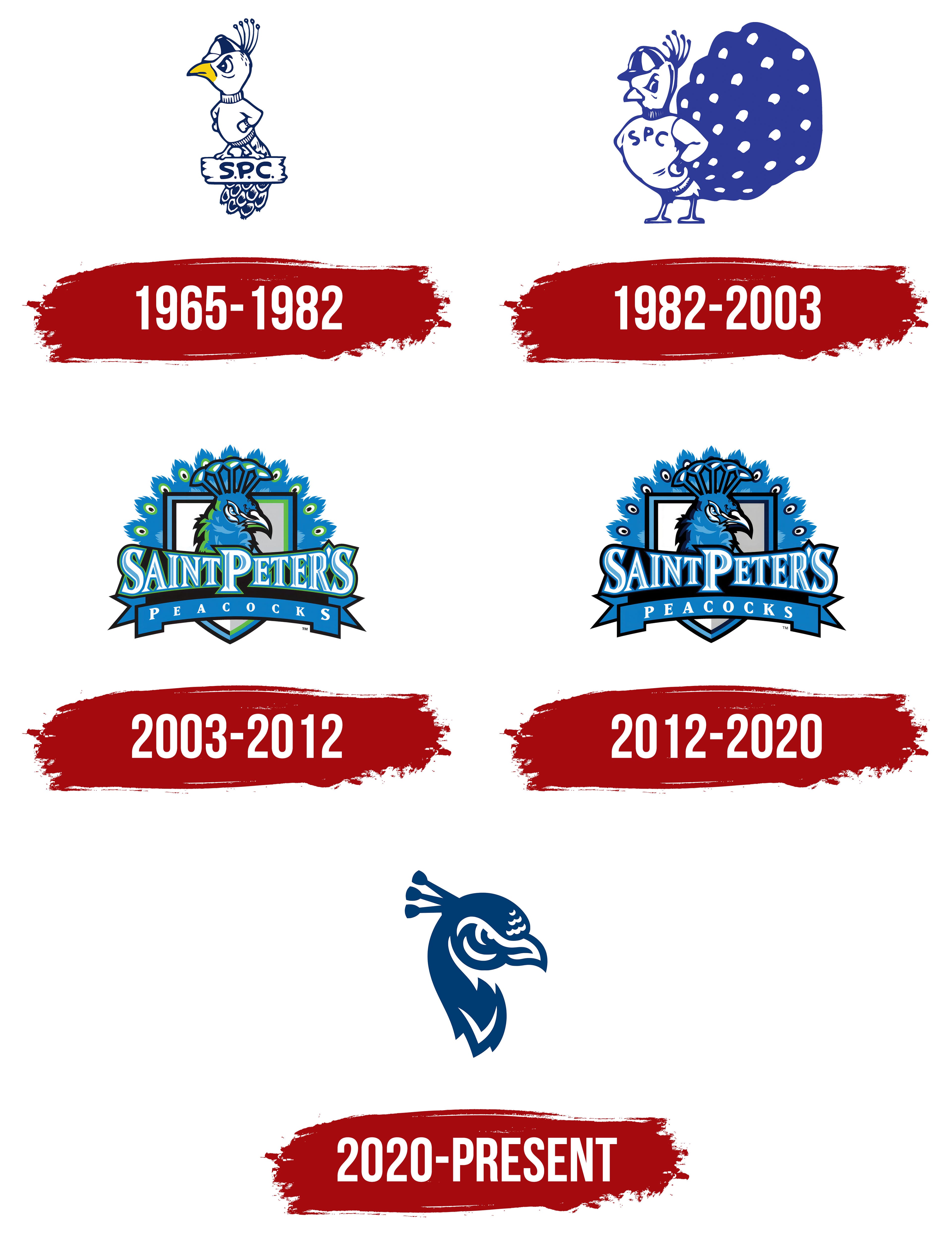
What is Saint Peter’s Peacocks?
These teams compete at the NCAA Division I level in the Metro Atlantic Athletic (MAAC) Conference, representing St. Peter’s University in Jersey City, New Jersey. Competing in sports such as basketball, football, and athletics, these teams stand out in their vibrant blue-and-white colors at the Run Baby Run Arena and Yanitelli Center. Their basketball teams are especially famous and have earned national recognition by competing successfully against the strongest opponents. A unique mascot with proud symbolism adds special character to the university’s sporting events, attracting students and fans in the New York metropolitan area.
1965 – 1982
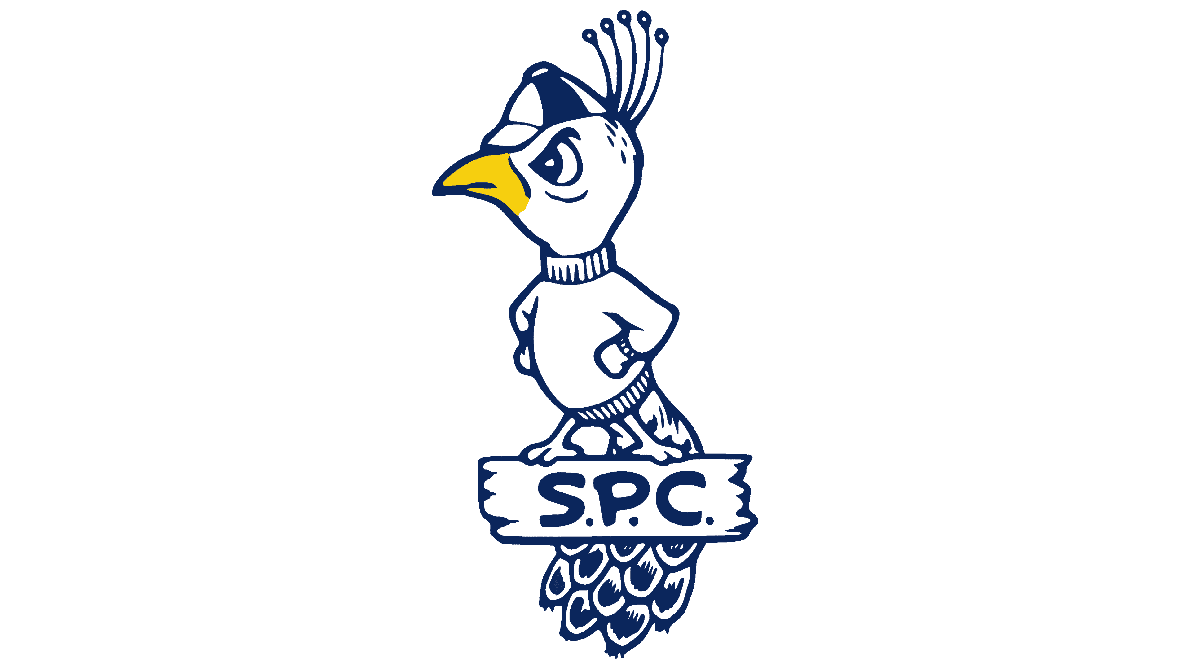
In 1965, Saint Peter’s College athletic teams began using a peacock mascot, reviving the “Peacocks” nickname from the 1930s. This logo remained official until 1982 and became a recognizable element of the college’s identity.
The peacock has a cartoon-like, slightly humorous character. The figure has a large head and a serious expression, suggesting a confident, somewhat bold personality. The arms are placed on the hips, emphasizing determination and an athletic attitude.
The peacock wears a high-collar sweater and a cap, matching the era’s sports fashion. The visual design is simple, with no unnecessary details. The tail is shown schematically with rounded lines to keep the focus on the figure and the character’s face.
The color palette consists of blue, white, and a small yellow accent on the beak. The peacock stands on a wooden plank bearing the inscription SPC in capital letters, indicating the name Saint Peter’s College.
1982 – 2003

In 1982, the logo of the Saint Peter’s Peacocks athletic teams was updated to adopt a more athletic style. The peacock appeared confident and striking, facing forward with a straight posture and hands on its hips, showing strength and a focus on victory.
The peacock wears a sports jersey with the inscription SPC, the abbreviation of the college name. The figure’s outline is highlighted in deep blue, while the chest, head, and beak are white. The tail spreads wide, decorated with white elements that resemble real peacock feather patterns.
A sports beanie sits on the mascot’s head, adding a modern, youthful touch characteristic of the period’s athletic fashion. The bird’s face looks serious, conveying a competitive spirit and respect for athletic rivalry.
2003 – 2012
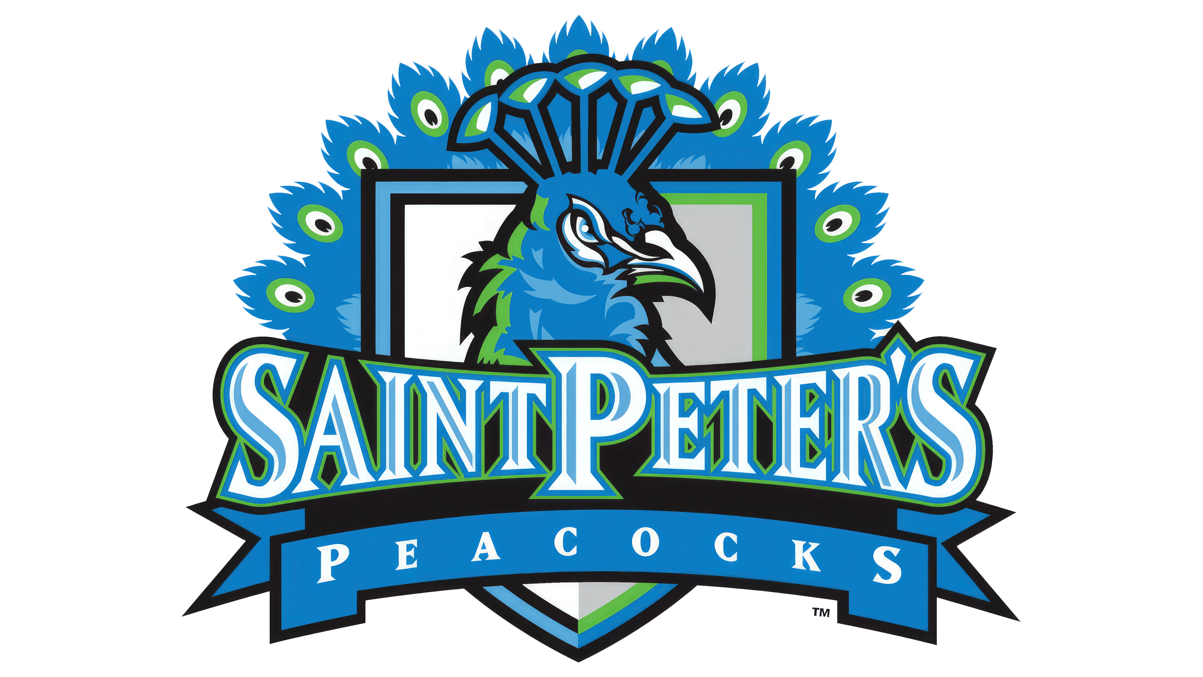
In September 2003, Saint Peter’s College introduced an updated logo featuring a more realistic peacock than previous versions. Phoenix Design Works, based in New York, created the design.
At the center of the composition is the profile of a peacock with a tall, elegant crest and an attentive gaze. The bird is placed inside a shield outlined with a contrasting border. Behind the head is a spread peacock tail, its feathers stylized in bright green and blue to form a decorative pattern.
At the bottom of the shield runs a wide blue ribbon with the word “Peacocks” in bold white typeface. Above the ribbon is the college name, Saint Peter’s, in white and light blue letters outlined in green.
The color palette includes rich shades of blue, green, and white, complemented by silver and black lines. The primary blue establishes the emotional foundation, while green emphasizes the peacock’s natural character.
The logo adopted a vivid style that accurately conveys the energy of the college’s athletic teams.
2012 – 2020
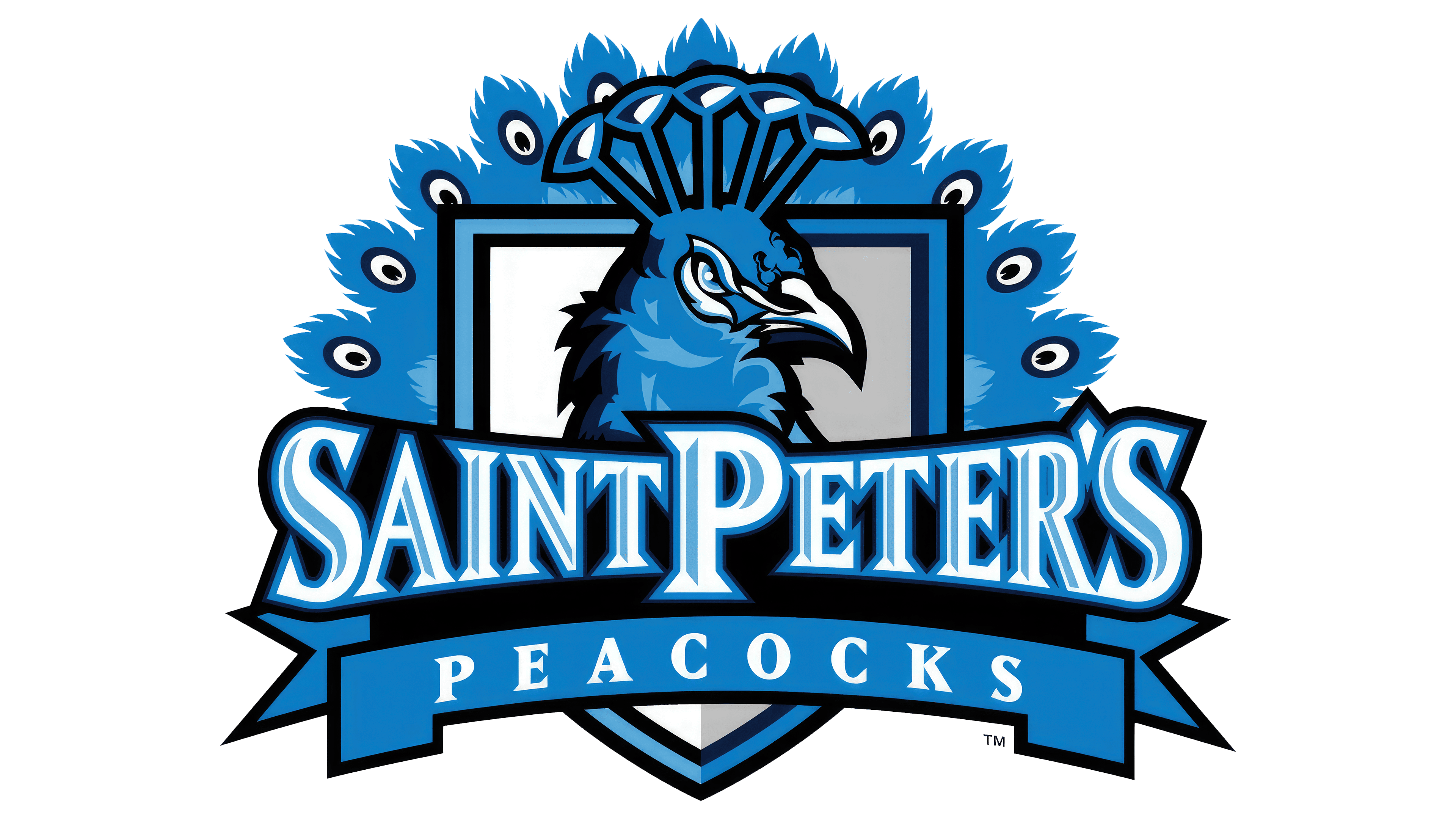
In 2012, Saint Peter’s College became a university, adopting the name Saint Peter’s University, and simultaneously introduced an updated athletic logo for the Peacocks. Phoenix Design Works, which had previously collaborated with the university, developed the project again. The peacock remained recognizable but was reinterpreted in a new color scheme.
The main distinction of the new version was replacing the green with dark blue, giving the image a sense of solidity appropriate for a university-level image. Combined with shades of light blue, white, and gray, this emphasized a refined yet modern, renewed style for the university’s athletic team.
2020 – today

In August 2020, Saint Peter’s University introduced a new logo for the Peacocks team, created by the North Carolina design agency Varsity Partners. The updated style features a peacock profile rendered in simple, minimalist lines, in the spirit of modern sports emblems.
The focus is on the bird’s head, with a tense, attentive expression. The tail is no longer present. The peacock’s gaze is serious, the eyes are narrowed, and the beak’s outline is sharply defined.
A distinctive detail is the three feathers on the head forming a crest, represented as geometric elements on thin stems. Their number symbolizes the Holy Trinity, thus highlighting the university’s connection to Jesuit traditions.
The logo’s main and only color remains dark blue, consistent with Saint Peter’s historical color scheme.