


 San Diego Toreros Logo PNG
The San Diego Toreros logo reflects athletic identity through two initial letters. The design suggests motion that resonates with the spirit of athletic competition. The blue color scheme evokes San Diego and its ocean surroundings, creating a visual connection to the university’s location.
The University of San Diego established its athletic identity in 1949, adopting the unique nickname “Toreros” to reflect San Diego’s Spanish heritage. It remains the sole NCAA school using this mascot.
Athletic activities began with basketball in the early 1950s, followed by football in 1955. By 1962, the university had constructed its first athletic complex and introduced baseball and tennis. The implementation of Title IX in 1972 accelerated the growth of women’s sports programs, and by 1979, the Sports Center had become a basketball hub.
In 1979, the university transitioned to NCAA Division I and joined the West Coast Conference (WCC) in 1984. The athletic department matured in the 1990s, with improved facilities and stronger support for student-athletes.
The 2000s brought notable achievements, including the men’s basketball team’s first NCAA Tournament appearance in 2003 and the opening of the Jenny Craig Pavilion arena in 2007. Fowler Park, a modern baseball stadium, was completed in 2013, followed by significant upgrades to Torero Stadium in 2015.
By its 75th anniversary in 2023, the university’s athletic program had grown to 17 NCAA Division I teams. Volleyball and basketball programs stood out, reflecting ongoing investments in training facilities, athlete support, and sports medicine.
Meaning and History
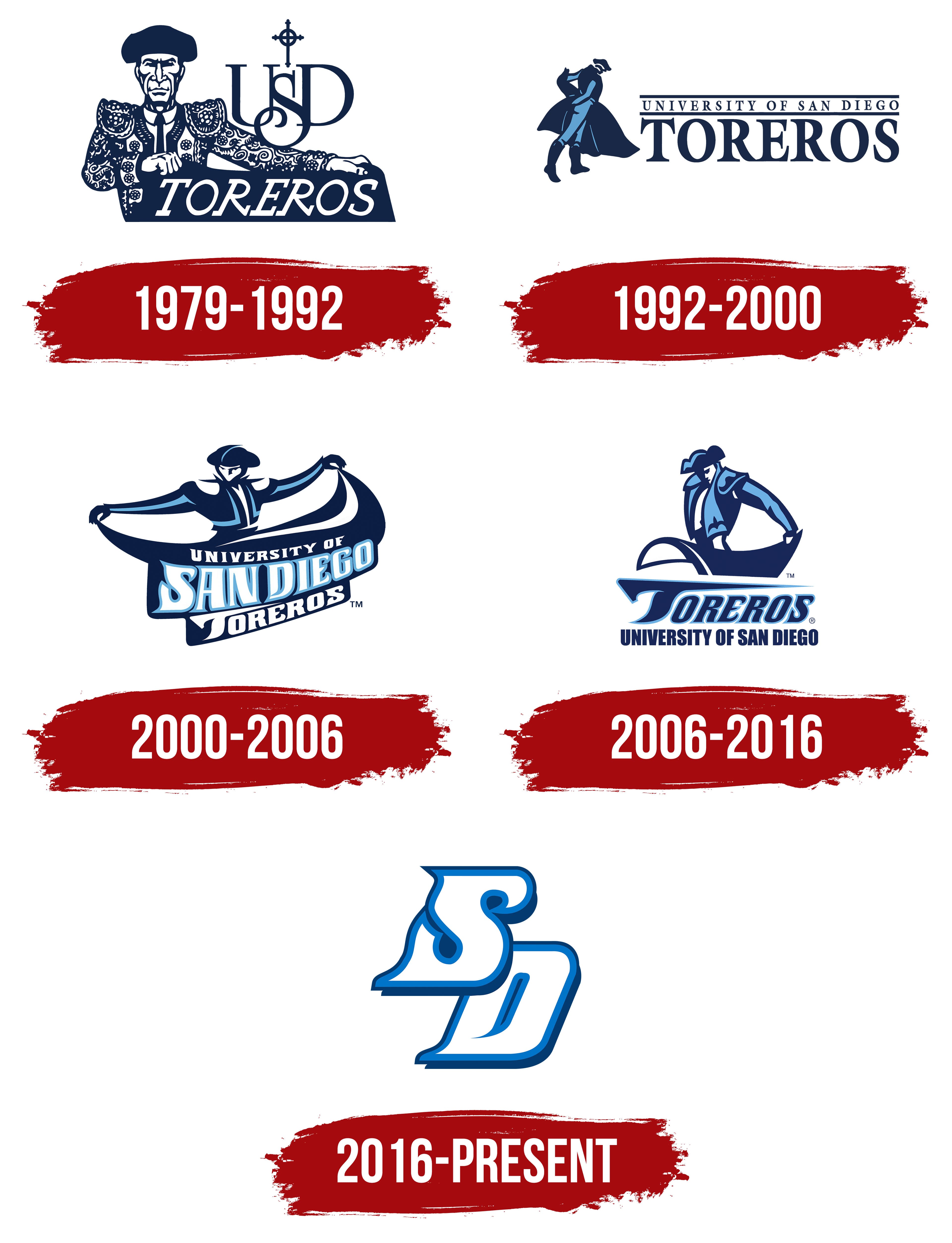
What is San Diego Toreros?
The University of San Diego teams are known as the Toreros, a name that reflects the region’s Spanish-speaking cultural history. These athletes compete in the West Coast Conference at the NCAA Division I level. They make the picturesque Jenny Craig Pavilion their home, where their blue and white uniforms symbolize their competitive spirit. The team’s special presence is felt in baseball and basketball, where their drive to win creates a vibrant Southern California sporting atmosphere. Known for his courage and grace, the team’s mascot epitomizes the determination and passion of their performances at all levels of competition.
1979 – 1992
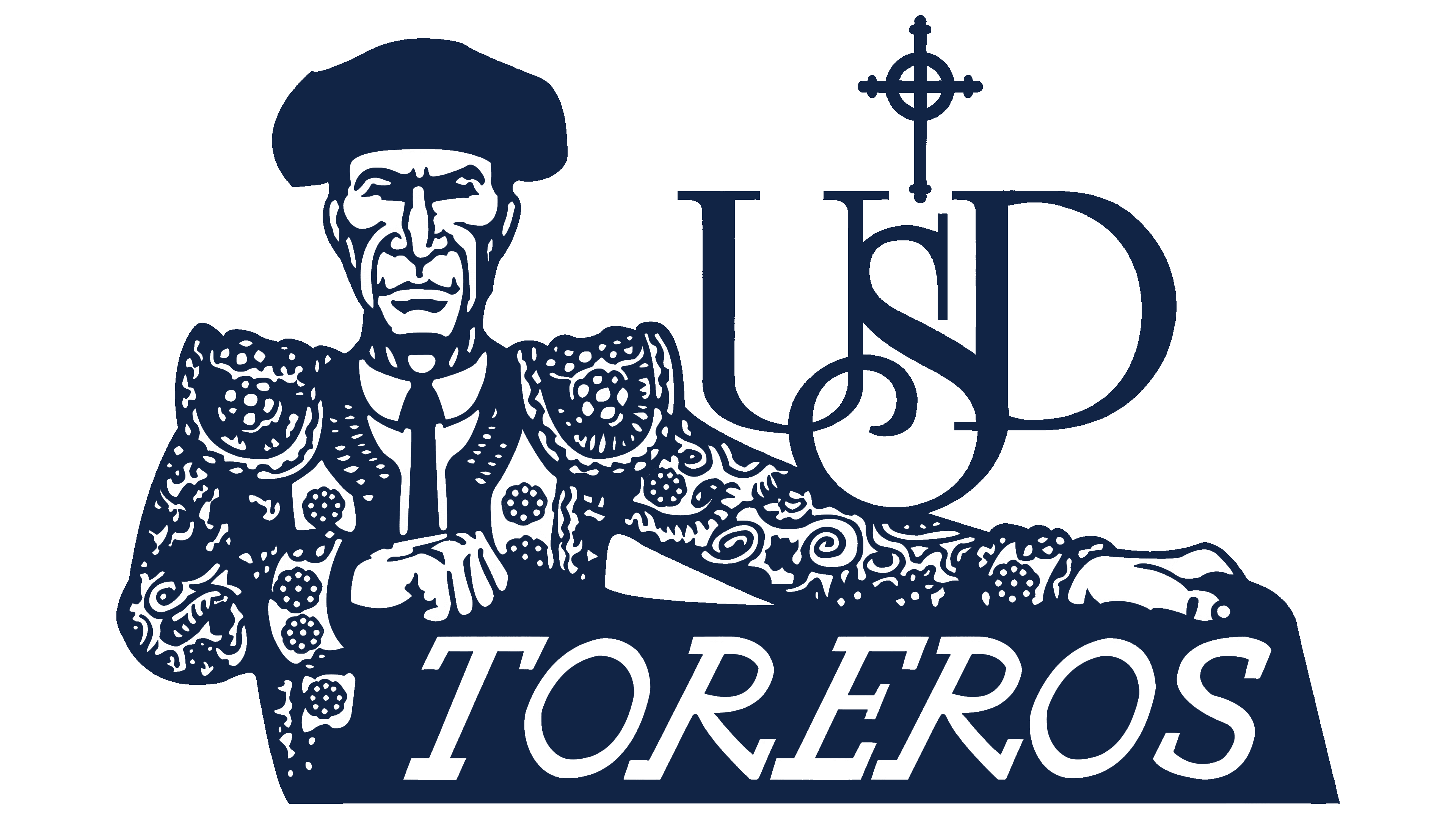
The first San Diego Toreros logo featured a torero figure in a Spanish style, using a dark blue-and-white color combination. The suit featured a flat ornament resembling traditional Spanish embroidery. The face was drawn with sharp lines, creating a calm and confident appearance.
The matador held a capote with the team name “TOREROS” in an italic serif font that conveyed a Spanish character. The emblem combined Spanish cultural heritage with the university’s identity, reflecting the region’s strong historical ties to Spanish culture.
In the background, the composition included an interlaced “USD” monogram complemented by a Catholic cross, symbolizing the University of San Diego’s connection to Catholic traditions and its spiritual values.
1992 – 2000

The next San Diego Toreros logo used the image of a full-length torero in a typical bullfighting pose. The silhouette of the matador was shown with a capote draped over his arm, in the moment of dodging a bull’s attack. The emblem’s color palette was limited to calm blue tones, making the image easy to perceive.
The name of the educational institution, University of San Diego, was placed next to the torero figure. The capital letters were set in a classic serif font, separated by lines at the top and bottom.
Below the university name was the inscription TOREROS, designed in the same style but larger and more saturated. It highlighted the athletic aspect and emphasized the team’s Spanish roots.
2000 – 2006
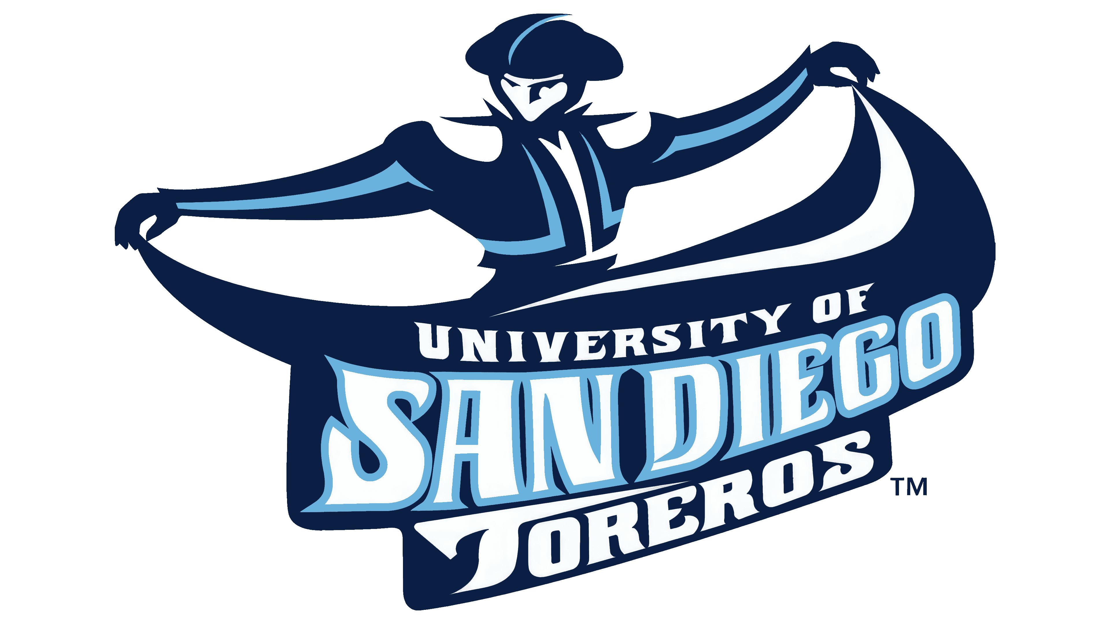
The 2000 version of the logo featured a matador figure with arms spread wide, holding a dark blue capote that opened into a semicircle and served as the background for the text. The face lacked detailed features and was rendered as a simplified, mask-like silhouette.
The text was naturally integrated into the capote’s shape and divided into three levels, following the fabric’s curve. The top line contained the short inscription University of. The main text, San Diego, was centered in large letters, with decorative elements and smooth, thickened strokes. The bottom line was completed by the word Toreros, written in a strict font with some extended lines.
The color scheme used the university’s official shades: dark blue (Founders Blue) and light blue (Torero Blue). White served as the base color for the letters, while blue outlines highlighted the form and added volume.
2006 – 2016
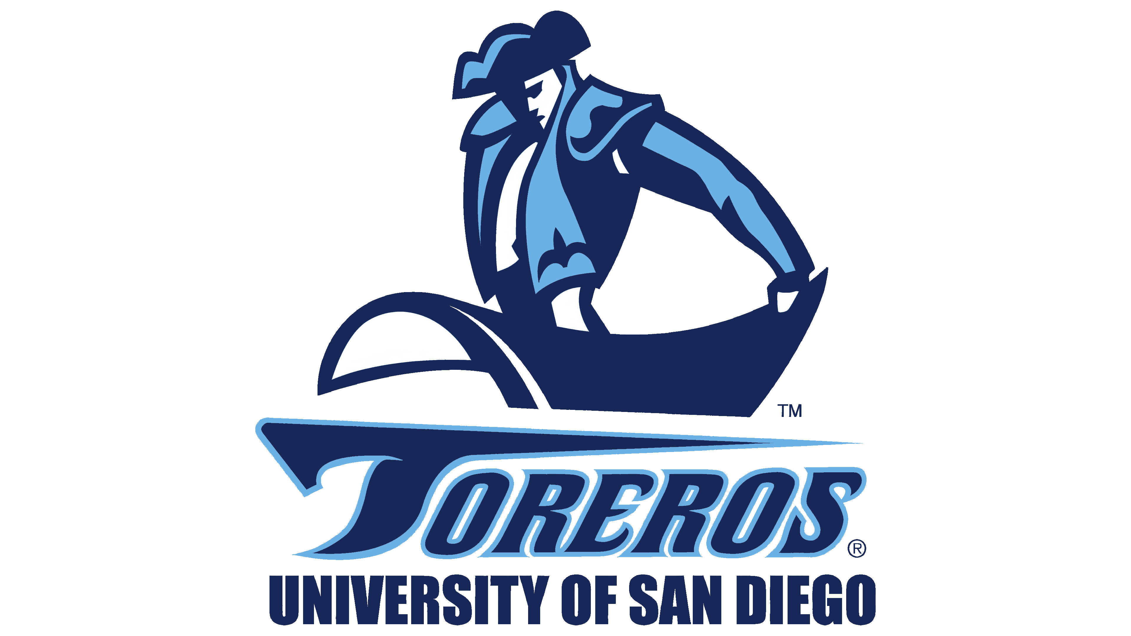
The updated San Diego Toreros logo featured a new pose of the torero figure, creating a sense of athletic tension. The matador was depicted slightly leaning forward, with the cape directed to the side and smoothly complementing the composition. The head was slightly lowered, emphasizing the character’s focus and inner energy. The face was shown as a silhouette without detailed features.
Below the figure, the team name “Toreros” appeared in a decorative font with elongated shapes and curls. The light blue outline enhanced the contrast and gave the text a three-dimensional look. Beneath it was a more restrained and formal inscription, “University of San Diego,” emphasizing the team’s academic affiliation.
2016 – today

In 2016, the University of San Diego Toreros introduced a renewed logo that moved away from the traditional torero image. The new emblem is based on a monogram of the letters “SD,” referring to the city of San Diego and uniting the university community around local traditions.
The monogram features specially designed letters that transition smoothly from narrow lines to expanding contours.
The white letters are outlined with a double border in shades of blue. It adds depth, brightness, and volume to the composition, helping the symbol stand out on any surface.