


 Quinnipiac Bobcats Logo PNG
The Quinnipiac Bobcats logo features a lynx. The shape conveys speed, agility, and aggression, characteristic of the university teams’ playing style. The dynamic composition reflects a competitive spirit and the pursuit of victory.
Quinnipiac University’s athletic history dates back to its founding as the Connecticut College of Commerce in 1929. Initially limited to men, formal athletics began in 1948 with the establishment of men’s baseball and basketball teams. In 1951, the school adopted the “Bobcats” as its official mascot, reflecting traits of strength and independence.
The university relocated to Hamden, Connecticut, in 1969 and significantly expanded its athletic facilities throughout the 1970s. Quinnipiac joined the Northeast Conference at the NCAA Division II level in 1987, simultaneously expanding its athletic programs to include women’s sports.
In 1998, Quinnipiac began transitioning to NCAA Division I and completed the move by 2001. The opening of the TD Bank Sports Center (now M&T Bank Arena) in 2007 provided a dedicated home for basketball and hockey teams.
Joining the Metro Atlantic Athletic Conference (MAAC) in 2013 further elevated Quinnipiac’s athletic presence. The women’s hockey team notably reached the NCAA National Championship Finals in 2016. Additionally, the women’s rugby team captured the university’s first-ever national title in 2017.
By 2023, Quinnipiac fielded 21 NCAA Division I teams. That year, the men’s hockey team won its first NCAA National Championship, marking a milestone in the university’s athletic legacy.
Meaning and History
What is Quinnipiac Bobcats?
The Quinnipiac Bobcats are the sports teams of Quinnipiac University in Hamden, Connecticut, representing the university at the NCAA Division I level in the MAAC conference. The ECAC Hockey League team, widely known for its outstanding achievements, has gained national recognition and competes in sports such as basketball and football. Athletes have access to state-of-the-art sports facilities, including the People’s United Center and TD Bank’s dedicated complex on the York Hill campus. Their mascot, the lynx, and the blue-and-gold colors have become symbols of the team’s competitive spirit.
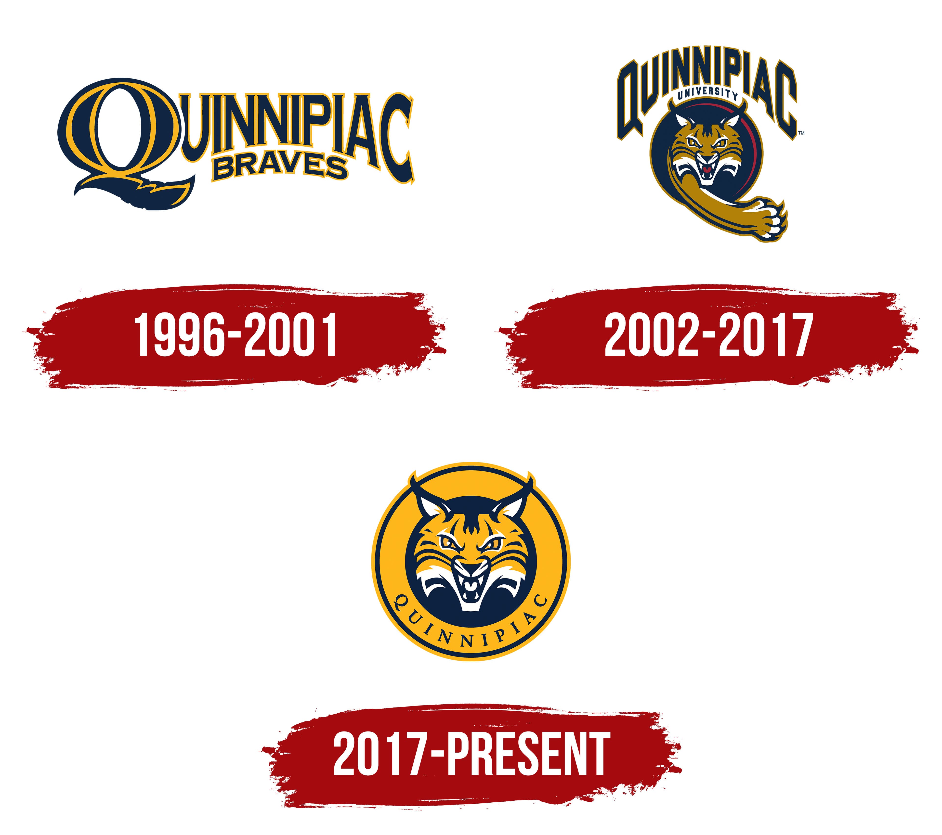
1996 – 2001
The Quinnipiac Braves logo, first introduced in 1996, is a stylized text composition dominated by the university name rendered in large type. The initial letter Q is highlighted in size and form, with its lower element transforming into an elegant feather that links athletic spirit to the school’s historical heritage.
The dark blue primary text harmonizes with the gold letter outline, creating a formal, academic presentation. The second element, the word “Braves,” is placed below on a curved line that repeats the arc of the upper inscription. The smaller font supports the overall style and color scheme, adding depth and completeness.
2002 – 2017

In August 2002, Quinnipiac University introduced a new symbol for its athletic teams, the Bobcat. The name “Bobcats” was adopted after extensive discussions among students, the administration, and specialists from the New York agency SME Branding. Along with the new name came an updated emblem that replaced the former nickname, Braves, which the university discontinued in December 2001.
The central symbol is a bobcat’s head. Within a circular medallion placed beneath the text, the predator looks straight ahead. The ears are raised, the teeth are bared in a snarl, and the eyes shine with a yellow tint outlined in dark. The paw extends beyond the circle, as if the lynx is trying to grab something. Red appears in the details, mainly around the mouth, intensifying the emotional effect.
Above the circle, the arched inscription QUINNIPIAC appears in large gold letters. Below, in smaller type, the word UNIVERSITY appears, emphasizing the emblem’s academic identity. The main color scheme combines dark blue and gold, the university’s standard colors, while the red accent adds liveliness to the composition.
2017 – today

In mid-2017, Quinnipiac University completed a major renewal program of its athletic brand. One key result was a new version of the Bobcats’ emblem. It became part of the university’s broader visual project, which coincided with the start of a seven-year partnership with Adidas. The collaboration covered team uniforms and joint efforts in promoting the university’s image. Pentagram’s design team developed the overall style, including the type system and the Quinnipiac Plaid pattern.
The new emblem features a yellow-and-blue lynx head. Compared to earlier versions, the red color was removed, and the gold became brighter, closer to a rich yellow.
The lynx looks forward. Narrow eyes convey aggression, and an open mouth with visible teeth strengthens the image’s emotional impact. The color scheme uses yellow, dark blue, and white. The background outline is golden, with the word QUINNIPIAC along its lower arc. The serif font is restrained.