Speed, quick reflexes, and efficiency in making the right tactical decisions are traits inherent to the “Hartford Hawks,” fully reflected in the logo. The mascot, adopted in 1984, accompanies the University of Hartford teams even in its new concise design.
Hartford Hawks: Brand overview
| Founded: | 1984 |
| Headquarters: | West Hartford, Connecticut, U.S. |
| Website: | hartfordhawks.com |
Meaning and History
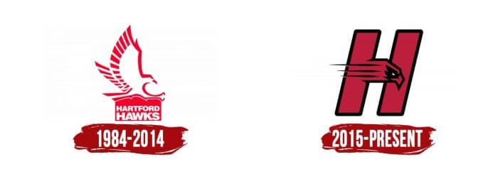
The image of a hawk is a unifying element of all sports logos. The 1984-2014 version contains an abstract image of the bird. Jagged red lines form its silhouette. At the bottom is a filled rectangle with the white two-line inscription Hartford Hawks. The new team emblem was introduced in 2015. The emblem consists of two elements: the capital letter “H” and a hawk.
“H” is red with a black outline, which corresponds to the official colors of the university. The horizontal bar is stylized as a bird’s head with a white eye and a large beak. Four stripes of varying lengths extend from it, creating a visual illusion of movement.
What is Hartford Hawks?
Hartford Hawks is a sports department that unites 17 student teams from the University of Hartford. Located in West Hartford, Connecticut, it participates in NCAA Division I competitions. The athletes are part of the Commonwealth Coast Conference.
1984 – 2014
2015 – today
Hartford Hawks Soccer
One of the main achievements of the women’s team was participating in the 1992 College Cup. The team has been thrice regular-season champions of America East, seven times champions of the America East Tournament, and thirteen times champions of the NCAA Tournament. The men’s team twice attained the status of regular-season champions of America East and four times champions of both the America East Tournament and NCAA Tournament.
Hartford Hawks: Interesting Facts
The Hartford Hawks are the sports teams for the University of Hartford in Connecticut. They play in Division I, but in 2021, they decided to move to Division III. This change is to focus more on school and being good at sports without spending too much money.
- Moving to Division III: Hartford is changing from Division I to III to better balance school and sports.
- Many Sports: They had 17 sports, including basketball, soccer, and baseball, showing that they care about giving students many sports choices.
- Men’s Basketball: In 2021, the men’s basketball team made it to the NCAA Tournament for the first time, which was a big deal for them.
- Women’s Basketball: The women’s team has been to the NCAA Tournament several times, proving they’re strong competitors.
- Baseball Success: Their baseball team has had players go on to play in the big leagues, showing they’re good at developing baseball talent.
- Soccer: Both men’s and women’s soccer teams have won championships and played in the NCAA Tournament, highlighting their strong soccer programs.
- Famous Alumni: One of their well-known former students is Jeff Bagwell, who played baseball in college before becoming a major league star.
- Caring for the Planet: Hartford works on being green by saving energy and reducing waste in their sports programs.
- Helping the Community: Their athletes help out, showing they learn about being good neighbors and helping others.
- Better Facilities: The university has been improving its sports facilities for athletes and fans, showing its commitment to providing good sports experiences.
Even though Hartford is moving to Division III, they’re still all about doing well in sports and helping their students and community.
Font and Colors
Hartford Hawks color codes
| Fire Engine Red | Hex color: | #c02427 |
|---|---|---|
| RGB: | 192 36 39 | |
| CMYK: | 0 81 80 25 | |
| Pantone: | PMS 485 C |
| Black | Hex color: | #000000 |
|---|---|---|
| RGB: | 0 0 0 | |
| CMYK: | 0 0 0 100 | |
| Pantone: | PMS Process Black C |
