


 Schlumberger Logo PNG
The Schlumberger logo embodies precision and high technological standards. The simplicity of its forms conveys clarity and the thoughtfulness of the company’s processes. The image reflects a harmonious combination of innovative methods and tasks for developing natural resources, revealing their potential.
Schlumberger was founded in 1926 by French geophysicists Conrad and Marcel Schlumberger, whose surname became the company name. Headquartered in Houston, Texas, the company developed as an oilfield services provider, with work spanning geophysical exploration, subsurface mapping, drilling support, and technologies used in oil and gas production.
In the 1930s, Schlumberger introduced the first electrical resistivity measurement method for mapping underground formations. In the 1940s, the company expanded into the Middle East, Africa, and Latin America, bringing its services to new oil-producing regions. During the same decade, it developed acoustic logging and nitrogen logging, adding technical tools for well evaluation and reservoir analysis.
In the 1950s, Schlumberger became the first oilfield services company to list its shares on a stock exchange, listing on the New York Stock Exchange. The company also moved into drilling and well services. In the 1960s, it continued to expand into related business areas. In the 1970s, Schlumberger introduced the first directional drilling system, which transformed drilling by enabling wells to be guided more precisely.
In the 1980s, the company developed the first horizontal drilling system, changing access to oil and gas deposits. In the 1990s, it presented the first intelligent well-drilling system. In the early 2000s, Schlumberger created the first digital oilfield, linking field operations with digital tools and production data. In the 2010s, it introduced the first autonomous drilling system. Today, Schlumberger operates in more than 85 countries, employs about 90,000 specialists, and provides geophysical exploration, drilling, well maintenance, and production optimization services.
Meaning and History
What is Schlumberger?
This is the world’s largest provider of oilfield services and is known for its advanced technologies in the oil and gas sector. Its core activities include seismic exploration, well drilling, and hydrocarbon reserve evaluation to explore and develop oil and gas fields. The organization operates in over 120 countries, offering services to small independent enterprises and major national oil companies. It possesses a vast fleet of specialized machinery and high-tech equipment, with its experts successfully working in challenging environments such as the deserts of the Middle East and the Arctic seas.
1926 – 1998
1998 – 2022
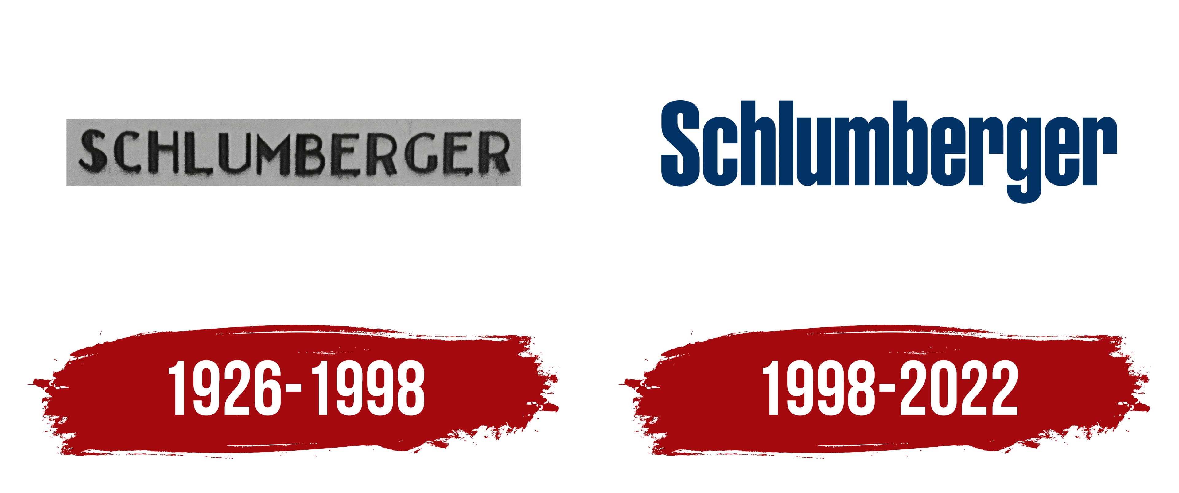
The Schlumberger logo stood out for its concise design, which focuses solely on the company name. The composition centered on a single word, arranged horizontally, with no distracting graphic elements. This minimalist concept ensured the logo’s memorability and emphasized the brand’s weight.
The letters in the logo appeared bold but not harsh. Their slightly rounded edges softened the overall look, balancing severity and friendliness. The uppercase “S” set the tone for the composition, remaining prominent without overwhelming the design. The remaining lowercase letters created a sense of neatness and coherence. The font looked dense and confident but not aggressive. There were no serifs, and the font focused on clarity and precision.
The color palette featured a dark blue shade associated with reliability, professionalism, and stability. This color emphasized the company’s reputation for solving complex problems and taking responsibility for its actions. Blue symbolizes confidence and accountability.
The company name carried the legacy of its founders, reflecting traditions that blended with innovation and progress. It was both a nod to the company’s roots and a demonstration of a modern approach, uniting the past and the future.
Each letter played its role. For instance, the rounded bottom of the “g” added softness, the vertical “b” emphasized stability, and the curved “r” brought a touch of dynamism. The letters formed a harmonious composition, resembling a well-coordinated team working toward a single goal.
The Schlumberger emblem demonstrated that simplicity is strength. It was not a simplification but a carefully considered decision that conveyed the company’s core values. The font’s clarity, the color’s richness, and the overall impression reflected confidence, professionalism, and a focus on what matters most.