The Singer Corporation logo symbolizes the automation of routine processes, such as sewing, which, thanks to Singer, have become a matter of pressing a single button. The logo is associated with needles and precise stitches on fabric.
Singer Corporation: Brand overview
| Founded: | 1851 |
| Founder: | Isaac M. Singer, Edward C. Clark |
| Headquarters: | La Vergne, Tennessee, United States |
| Website: | singer.com |
Singer Corporation is an American sewing machine manufacturing company employing 1,000 people. The headquarters are located in Tennessee, but there are branches in Europe, Latin America, and Asia. Products are sold in 150 countries and generate revenues of $200 million. Twenty-five thousand service centers service the company’s sold machines. Singer has been owned by investment company SVP Worldwide since 2004.
Meaning and History
The singer grew rapidly until it faced bankruptcy at the turn of the 21st century (1999). However, the company’s logo remained constant and unchanged for both the first 100 years of existence and the last 60 years. Stability in the first century indicated the development and improvement of a single product – sewing machines. The logo chosen in 1870 successfully reflected all the product’s features.
The attempt to expand beyond its traditional manufacturing and broaden the product range in the 1960s prompted the company to change its visual logo. However, the attempt was unsuccessful, and by 1999, Singer gradually reduced its market presence and filed for bankruptcy. Subsequent owners were more interested in the brand’s renown in the sewing machine industry, so the logo remained unchanged to maintain and strengthen customer loyalty.
What is Singer Corporation?
A company founded by American businessman and inventor Isaac Singer in 1851. The main product is sewing machines. Singer also produces computers and scooters.
1870 – 1961
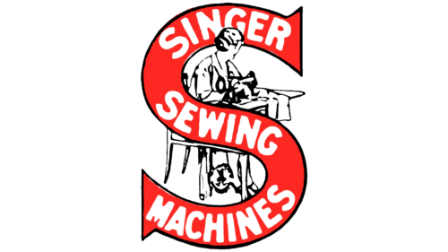
The first logo featured a large letter S, representing the word Singer (the founder’s last name, which became the company’s name). The ends of the character are sharp, resembling needles. The glyph of the letter features the inscription “Singer sewing machines,” indicating the company’s product offerings. The curving ribbon of the S resembles a thread, and the inscriptions on it look like machine stitches.
In the background, there is a black-and-white silhouette of a woman sitting at a table and sewing on a branded machine. Singer’s advertising campaigns emphasized easing women’s sewing work, which is also reflected in the logo.
1961 – today
The latest logo was created during the company’s prosperity. It was designed to mark the acquisition of other companies (Friden Calculator and General Precision Equipment Corporation) and expand the product line.
The red circle with the letter S in the center and silver trim resembles a button. It symbolized the most modern machines of that time – Singer Touch & Sew, which appeared in the 1960s. They operated automatically and were activated by a button.
The inscription “Singer” is made in red capital letters with serifs. The size indicated the company’s scale and the addition of new directions. In addition to sewing machines, vacuums, air conditioners, and more became available for sale.
Font and Colors
Red is the leading color in the logos. It conveys the brand’s top position and the joy brought by the machines, which ease the sewing work. White is the second most common color in logos. It is the primary color of sewing threads and signifies new items sewn with the help of the machine.
The font is confident and strong, reminiscent of Universal Serif. It embodies a company standing firmly on its feet. The sharp serifs on each letter are associated with needles – the main components of sewing machines.
Singer Corporation color codes
| Amaranth | Hex color: | #ec154f |
|---|---|---|
| RGB: | 236 21 79 | |
| CMYK: | 0 91 67 7 | |
| Pantone: | PMS 1925 C |


