


 St. Francis Terriers Logo PNG
The St. Francis Terriers logo draws on the Terriers’ name used by the athletic teams at St. Francis College in Brooklyn. Rocky, the mascot, and the rallying cry “Terrier Pride” carry the theme into campus life. The Terriers’ name extends beyond traditional sports, appearing in student news and the name of the college’s esports team.
St. Francis College, founded in Brooklyn by the Franciscan Brothers in 1859, began its athletic history in the early 1900s and selected the terrier as its mascot, reflecting the school’s character. Basketball emerged prominently in the 1920s, with St. Francis among New York’s early collegiate competitors. By 1933, the team was playing home games in the St. Francis College Gym.
In 1941, the basketball team participated in its first National Catholic Invitational Tournament. Following World War II, athletics expanded significantly as veterans returned. The college’s basketball profile continued to rise with an invitation to the National Invitation Tournament (NIT) in 1956, further establishing its reputation against strong New York opponents.
St. Francis joined the Metropolitan Collegiate Athletic Conference in 1963, providing structured local competition. The introduction of Title IX in the 1970s led to the expansion of women’s sports programs. A pivotal moment came in 1973 when the basketball program transitioned to NCAA Division I.
Membership in the Northeast Conference (NEC) from the 1980s ensured stable schedules and consistent competition. The 2001 NEC men’s basketball regular-season title highlighted athletic growth. In 2015, the men’s team reached the NEC tournament final for the first time.
From 2020 to 2023, facility upgrades further boosted athletics, helping St. Francis maintain its competitive presence in the NEC despite its relatively small size.
Meaning and History
What is St. Francis Terriers?
These teams represent St. Francis College in Brooklyn and compete in the NCAA Division I Northeast Conference, calling the Pope Center for Physical Education, known as “Dad,” home in downtown New York City. They compete in 21 sports, attracting ardent fans with their blue-and-red colors. Particular attention is paid to swimming, water polo, and men’s basketball, where the atmosphere in the home arena is always fierce. As one of the few Division I teams in New York City, they attract a unique urban audience, and their mascot, the Frankie Terrier, inspires fans to support the teams at every competition.
2001 – 2010

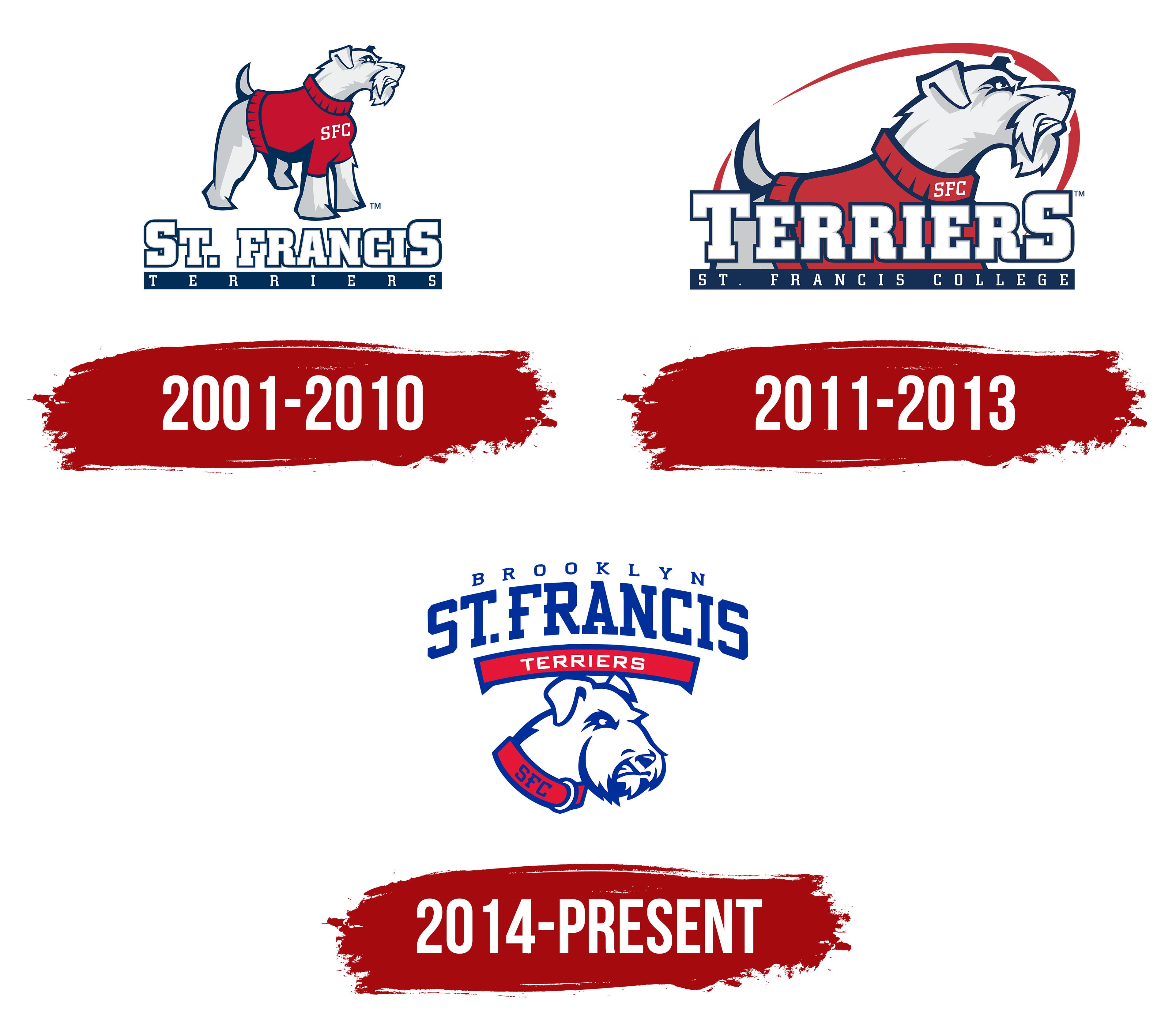
From 2001 to 2010, the logo for St. Francis College’s NCAA teams in Brooklyn featured a terrier in a red sweater with the initials SFC on its chest. Over the years, fans came to recognize the dog as a symbol of the teams. The name St. Francis Terriers paired the college’s namesake, St. Francis of Assisi, with the teams’ canine nickname.
The saint’s name reflects the college’s ties to its founders, the Franciscan Brothers. They arrived in Brooklyn from Ireland in 1858. A year later, they opened St. Francis Academy for boys from the local Catholic community. The academy became St. Francis College in 1884. The initials of the new name, SFC, later appeared on the college’s athletic logos.
In 1933, the college’s athletic association adopted the terrier as its mascot. One surviving illustration shows the dog as a boxer wearing a cap and gloves. It stands on its hind legs with its front paws raised in a boxing stance. Long fur frames its muzzle. The illustration uses white and reddish-brown, and the words “ST. FRANCIS TERRIERS” run across the sweater. The team later introduced a costumed mascot, Rocky the Terrier.
The 2001 primary logo had three tiers, with the terrier above two lines of lettering. At the base, “TERRIERS” appeared in white on a narrow blue band. Wide spacing between the letters stretched the short nickname across the band. Above it, “ST. FRANCIS” appeared in large white capitals with heavy rectangular serifs, gray trim, and a dark blue outer outline. The “S” at either end stood taller than the letters beside it.
The full-length terrier stood on all fours above the name, its head turned to the right and its muzzle slightly raised. Its short tail pointed up, and the ear closest to the viewer folded down. A bushy brow hung over the eye, and the beard parted beneath long whiskers. Dark blue lines defined the dog’s silhouette and picked out individual tufts of white and light gray fur. The eye and nose were also dark blue. The terrier’s muscular build, sharply defined muzzle, and narrowed eye gave it the look of a fighter. A sleeveless red sweater covered its back and chest, with the initials SFC in white across the chest. Short strokes along the blue trim suggested the texture of a knitted edge.
A secondary logo introduced in 2001 paired the SFC initials with the terrier’s head. The teams used the full-body logo through 2010. The initials and terrier head remained in use for three more years, through 2013. A shield-shaped logo later joined the college’s athletic marks.
2011 – 2013

The logo St. Francis College used from 2011 to 2013 brought the word “TERRIERS” to the foreground. In the earlier design, the dog stood above the name. In the new version, a larger terrier stood behind the lettering, which concealed its lower body. Together, the mascot and nickname formed a compact horizontal logo. It appeared in Northeast Conference materials in 2012.
The terrier’s head, back, raised tail, and the top of its red sweater are visible above “TERRIERS.” Its paws are out of view, and the white SFC initials sit near the neckline. The terrier still faces right, with the same muzzle shape, gray shading on its white fur, and blue outline. The closer view brings out the tension in its face, giving it a fiercer look. A red arc traces an open oval behind the dog. It begins at a fine point on the left, curves above the head, and gradually thickens toward the right.
The large white letters in “TERRIERS” retained their heavy rectangular serifs, with blue and red outlines along the edges. All four colors carried over from the earlier logo. The lettering fit snugly against the dog’s silhouette, giving the design a tougher, more contemporary look. A blue band at the base carried the full college name, “ST. FRANCIS COLLEGE,” in small capitals. Tournament materials also identified the teams by location.
From the time St. Francis College joined the Northeast Conference in 1981, its teams competed as St. Francis (NY). The state abbreviation distinguished the Brooklyn teams from their Pennsylvania rivals, who represented another St. Francis in the same conference. On November 27, 2012, the athletic program adopted the name St. Francis Brooklyn, replacing “NY” with the name of the teams’ home borough. The school kept its official name, St. Francis College.
2014 – today
“BROOKLYN” appeared on St. Francis athletic logos before the college introduced its new terrier portrait. During the 2013–14 season, the borough name appeared in small type above a much larger “ST. FRANCIS,” with a curved red ribbon below. The ribbon read “BASKETBALL” for the basketball teams, “SOCCER” for the soccer teams, and “ATHLETICS” for the department as a whole. The college name, the Brooklyn lettering, and the red ribbon gave the teams’ logos a consistent look, including versions that used lettering alone.
On August 21, 2014, St. Francis College Athletics unveiled a primary logo with a new terrier portrait beneath the lettering. That fall, Terrier magazine explained the reasons for the redesign ahead of the 2014–15 season. The college wanted its primary logo to include Brooklyn by name, reflect St. Francis athletic traditions, and express pride in its teams.
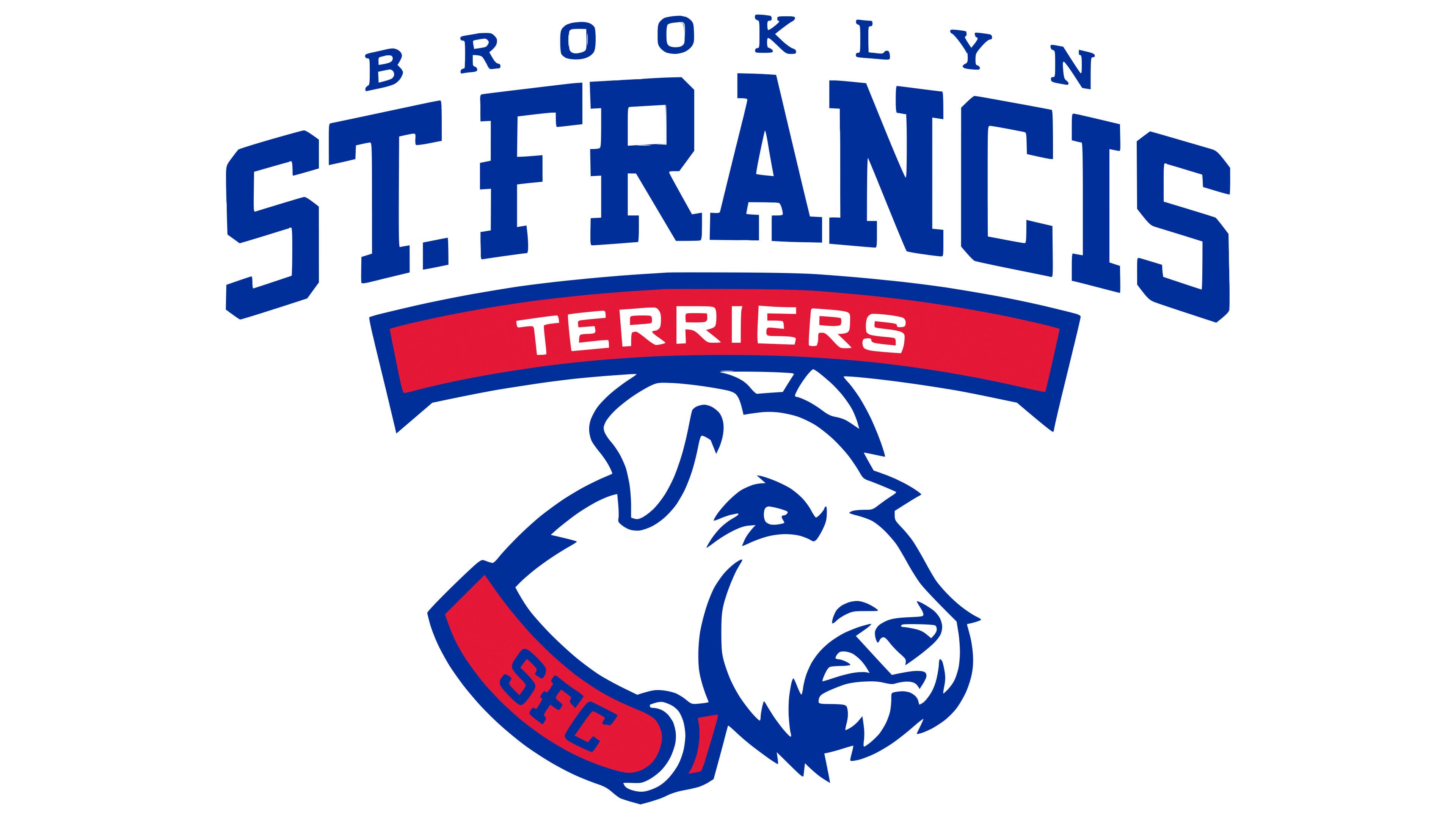
“BROOKLYN” occupied the top line in small, widely spaced blue capitals. Below it, “ST. FRANCIS” formed an arch. The letters retained their heavy rectangular serifs but were now solid blue, replacing the white fill and layered outlines. A red ribbon edged in blue followed the curve of the college name. It carried the word “TERRIERS” in white sans serif capitals. The college name was once again the largest lettering in the logo, followed by the team nickname.
Below the ribbon, the terrier’s head appeared in profile. It retained the earlier dog’s right-facing pose, folded ear, and long facial hair. Blue lines divided the white fur into broad sections and defined the brow, eye, nose, mouth, and lower edge of the beard. A red collar replaced the sweater. The collar bore the initials SFC in blue and had a curved white detail near the clasp. The early 2000s logos had used gray to shade the fur. The new portrait rendered it in white and blue. A brighter blue, Pantone 286 C, replaced the dark blue outline and appeared throughout the illustration and lettering. The collar and ribbon used Pantone 186 C red.