


![]() Maryland Terrapins Logo PNG
Maryland Terrapins Logo PNG
Like the emblems of most varsity sports teams, the Maryland Terrapins logo reflects the institution’s official colors. At the same time, it looks impressive, thanks to massive elements with protruding corners. This is a symbol of determination, steadfastness, and self-confidence conveyed in a well-aimed graphic sign.
Maryland Terrapins trace their roots to the University of Maryland in College Park, founded in 1856 as Maryland Agricultural College. Baseball and football appeared on campus during the Civil War era, but the teams lacked a fixed athletic identity. For decades, they were known as the Farmers, Aggies, and later the Old Liners, after Maryland’s nickname, the Old Line State.
The modern football program began in 1892. In 1902, John Markey became Maryland’s first professional coach. The Terrapins’ name was adopted in 1932, when football and baseball coach Harry “Curley” Byrd proposed the diamondback terrapin as the official mascot after a call from the student newspaper, The Diamondback. Byrd came from Crisfield, Maryland, a region associated with terrapins. In 1933, the bronze Testudo statue was installed outside Ritchie Coliseum.
Football brought Maryland its first NCAA national title in 1953 under Jim Tatum, with a 10-1 season. That same year, Maryland left the Southern Conference with six other schools. It became a founding member of the Atlantic Coast Conference. The program also built a major lacrosse record. The men’s team began as a club in 1895. It became a varsity in 1924, while the women’s team later won 15 NCAA national titles, including seven straight from 1995 to 2001.
Basketball reached its peak on April 1, 2002, when Gary Williams led Maryland to its first NCAA men’s title, beating Indiana 64-52. Juan Dixon was named Final Four MVP. In 2014, Maryland left the ACC for the Big Ten Conference. By that point, the athletic program had collected 47 NCAA team titles and 16 individual national championships.
Meaning and History
![]()
Until a certain point, the Maryland Terrapins were known as the Old Liners because Maryland was informally called “The Old Line State.” But the independent student newspaper The Diamondback, which began publishing in 1910, decided to give the sports teams a different name. Harry Clifton “Curley” Byrd, a football coach who later rose to the rank of university president, put an end to this issue. It was he who proposed the Terrapins’ option. What is the reason for this choice?
The fact is that tuberous turtles (diamondback terrapin) live in the Chesapeake Bay region near Maryland and are the official reptiles of the state. They differ from their relatives in that they have a diamond-shaped pattern on the shell. So, in 1932, H. C. Byrd suggested using this freshwater animal as a mascot for sports teams. With the consent, he arranged for a monument to be built on campus across from the McKeldin Library. The huge bronze turtle is still there, a reminder that the 1933 graduates saved at their graduation party to pay for the statue.
The real tortoise Testudo opened the monument, which became its prototype. She died two days after the solemn occasion, partly due to stress and partly because two holes were drilled into her shell. Ribbons tied to a large sheet were threaded through the holes. The cloth covering the statue slipped off as soon as the turtle crawled away. At that moment, everyone present burst into loud applause. And after death, the reptile ended up in the archive: it was stuffed and mounted on a board.
She was depicted on most of the old Maryland Terrapins logos. Until 1996, she was presented as a gambling fan, until she was turned into an aggressive ninja warrior. It wasn’t until 2012 that sports teams began using the emblem with a single “M” and incorporating elements from the state flag.
What is Maryland Terrapins?
Maryland Terrapins is the common name for all sports teams at the University of Maryland in College Park. He has an abbreviated version of Terps. This nickname was derived from the mascot, which was adopted in 1932 at the suggestion of the former president of the school, H. C. Byrd. Now UMD has two dozen teams, and they all compete in the Big Ten Conference.
1967 – 1970
![]()
The first logo with Testudo was black and white. The artists drew the turtle in a cartoonish style, highlighting only the outlines, as in a children’s coloring book. She was running to the left, and clouds of dust were rising behind her. And under her feet were drawn lines, the so-called speed lines, which emphasized the energy of movement at high speed. At the same time, the freshwater animal looked friendly and smiled.
1970 – 1983
![]()
In 1970, the creators of the Maryland Terrapins logo humanized the turtle, presenting it as a gambling fan. She was leaning on a large red “M” with rectangular serifs. Interestingly, the forward paw was very muscular, like a bodybuilder’s. It symbolized the strength and power of sports teams. The artists decorated the carapace with a red-and-black diamond pattern so that no one would doubt the reptile’s species identity. Another red element was the tongue, which was visible in the open mouth.
The letter seemed voluminous because of the black outline. The lines, uneven in thickness, expanded on the right side and, in those places, looked like side faces. This illusion of three-dimensionality made it possible to visually highlight the “M,” making it the dominant part of the drawing.
1983 – 1988
![]()
In 1983, the Maryland Terrapins introduced a turtle-less logo. Its main element, judging by the size ratio, was the letter “M.” It consisted of many short horizontal lines in red. On the left side, the stripes were very thin. Then they gradually expanded, reaching their maximum thickness on the right side of the letter.
At the bottom was the red word “MARYLAND.” The font of the inscription corresponded to the proportions of the lines in the “M” composition: the first “MA” was the thinnest, and the last “ND” was the boldest. The gradual increase in stroke thickness and a pronounced tilt to the right side created the illusion of movement, which the designers intended.
1988 – 1996
![]()
In the second half of the 1980s, the teams began using the Testudo logo again. It looked the same as in the 1970 version and was based on the same letter. But the artists corrected the drawing, removing the extra lines and raising the “M” slightly. They also added a new element, the state flag, which the turtle held in an outstretched paw. The name Maryland Terrapins was written at the bottom. The designers divided it into two lines, aligned in the center. All letters were capital, bold, black, and had rectangular serifs.
1996 – 2005
![]()
In 1996, the first logo appeared with a warlike turtle standing on its hind legs. Her forelimbs became powerful, muscular arms, bent at the elbows and resting on her hips. According to body language, this posture subconsciously conveys superiority and aggression.
An anthropomorphic animal towered against the background of a black triangular shield with a bright red outline. At the very top was a white lettering “UNIVERSITY OF,” and below it was a huge word “MARYLAND” in red letters surrounded by white lines. There was an additional black outline where the state name protruded beyond the shield. The designers deliberately enlarged the first “M” and the last “D” to emphasize the text’s arched shape.
The turtle’s skin turned yellow-brown, and the nails and the edge of the shell took on a bright yellow tint. On the animal’s chest was a large red “M,” similar to a superhero’s emblem.
2005 – 2006
![]()
After the redesign, the “M” was enlarged to make it appear as if the turtle were holding it in front of him. The black shield and inscriptions disappeared, so the sports teams’ mascot was on a blank white background.
2006 – 2012
![]()
In 2006, only the logo’s palette changed. Black became more saturated, and red took on a pale crimson hue. For the turtle skin, one of the coffee-with-milk color options was used.
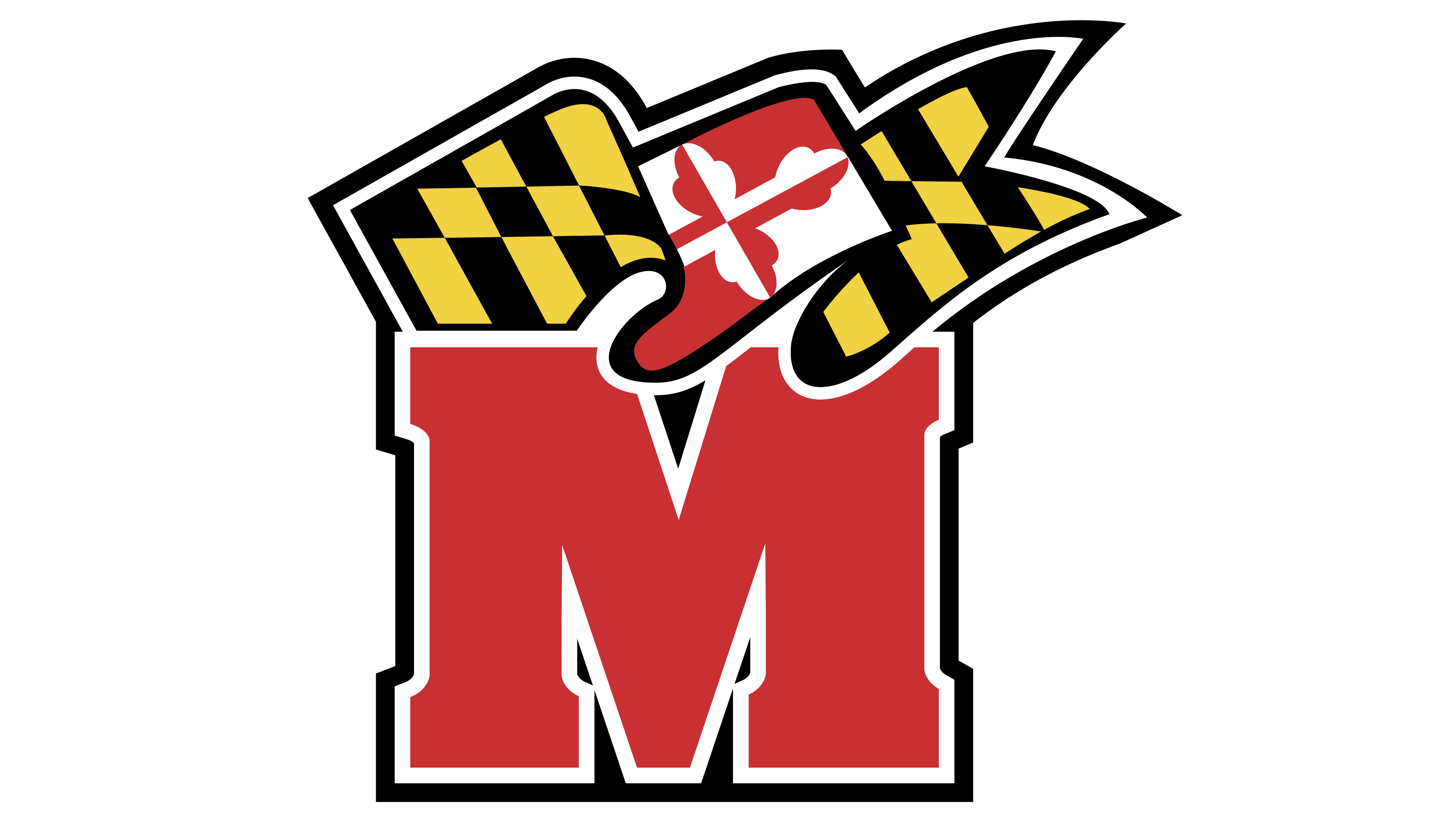
2012 – today
![]()
In 2012, the anthropomorphic animal disappeared, replaced by a large “M.” It is also raspberry-colored, like in the previous version, but now in a brighter shade. She also has two contours: yellow (internal) and black (external). On both sides, the “M” is decorated with symmetrical triangular serifs, depicted in pairs above and below.
Beneath the letter is a long horizontal stripe in the colors of the Maryland state flag. It is divided into three parts. On the left and right are black-and-gold polygon patterns. A red-and-white ornament separates them.
Font and Colors
The Maryland Terrapins logo is patriotic because it incorporates elements of the state flag. Two patterns, black and gold and red and white, originate from the family symbols of Lord George Calvert. And the big red letter “M,” which complements the picture, indicates the territorial affiliation of sports teams.
The stylized “M” refers to a special Terrafont typeface created for the Maryland Terrapins. It is a bold serif with huge triangular serifs. The colors match the Maryland flag’s palette: gold (#FFD200), white (#FFFFFF), red (#E21833), and black (#000000).