Statoil: Brand overview
The genesis of Statoil dates back to 1972 when it was known as the Norwegian state-owned oil and hydrocarbon company. This Norwegian multinational energy company, whose main operations are located in the oil-rich city of Stavanger, was established by the country’s government to manage vital oil and gas resources. During its existence, Statoil has gained a prominent place in the international energy landscape.
Statoil’s main activities were focused on oil and gas exploration and production in the Norwegian North Sea. The 1980s marked a turning point when the company took the progressive step of expanding its operations globally, entering regions such as the Middle East, Africa, and the Americas. This strategic move positioned Statoil as a global energy supplier.
In the 1990s, Statoil took the bold step of diversifying into downstream oil, petrochemicals, and power generation. The company has also committed to investing in renewable energy sources such as wind and solar power, underscoring its environmental awareness and vision.
In 2007, a significant merger between Statoil and Norsk Hydro took place, creating a powerful Norwegian oil and gas conglomerate. The newly formed company was named StatoilHydro, ushering in a new era in energy production.
In 2018, there was a significant rebranding of StatoilHydro to become Equinor. This new name, which combines the terms “equi” (equal) and “nor” (Norway), vividly reflects the corporation’s commitment to equality and its Norwegian heritage.
Equinor’s journey from humble beginnings to a globally recognized energy company is noteworthy. Covering more than 30 countries and employing over 20,000 professionals, Equinor’s operations span the full spectrum of the energy sector, including upstream, midstream, downstream, petrochemicals, power generation, and renewable energy.
Looking back at the company’s history, in 1972, the Norwegian government established Statoil, a company that has become a critical component of the country’s economy.
In the 1980s, Statoil began to expand its operations to globalize and spread its technical expertise to different parts of the world.
In the 1990s, Statoil expanded its horizons beyond its core business by diversifying into new and innovative areas.
The landmark merger between Statoil and Norsk Hydro in 2007 changed the dynamics of the Norwegian energy sector forever.
In 2018, StatoilHydro underwent a radical modernization, rebranding as Equinor to reflect a more modern and inclusive corporate identity.
Meaning and History
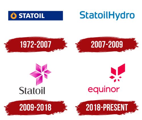
1972 – 2007
2007 – 2009
2009 – 2018
2018 – today
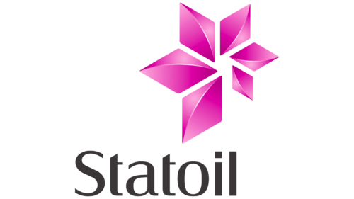
Statoil, which changed its name to Equinor in 2018, had a stylized flower in its logo. The flower consisted of six diamonds of different sizes, forming petals similar to the design. They became smaller as they progressed from the lower left corner to the lower right corner. There was a slight glow in the center of each diamond, giving it a three-dimensional appearance. Underneath them, the name of the company was written in large letters. The letters “S,” “a,” and “o” were rounded, while “t,” “i,” and “l” were blocky and angular. Most of the letters were lowercase.
The different sizes of the diamonds gave the impression that the flower was moving or turning, which is very dynamic. The 3D effect with a glow in the center gave the flower an expressive feel as if it were not just a flat picture. The combination of rounded and angular letters in the name made it interesting to perceive, not just a boring company name.
Statoil color codes
| Jet Black | Hex color: | #3a3536 |
|---|---|---|
| RGB: | 58 53 54 | |
| CMYK: | 0 9 7 77 | |
| Pantone: | PMS 412 C |
| Hollywood Cerise | Hex color: | #e021ac |
|---|---|---|
| RGB: | 224 33 172 | |
| CMYK: | 0 85 23 12 | |
| Pantone: | PMS 806 C |
