


 USC Trojans Logo PNG
The USC Trojans logo symbolizes resilience, strength, and confidence in victory. Every element of the logo highlights the continuous development of athletes on their path to success. The University of Southern California’s sports teams have long been regarded as among the toughest competitors. Facing them offers many chances for recognition, but more likely not for victory.
Countless victories have made the USC Trojans legendary athletes. Being a part of this team means belonging to a league of true professionals, confirming their title as “one of the strongest.” The modern identity vividly demonstrates the strength of metal. Like links in a reliable chain, the letters interlock, signaling to everyone around that the team is united and unbeatable.
This is only part of the symbolism of the modern logo, as it reflects the team’s strengths in a multifaceted way. The team spirit, resilience, and absolute unity are conveyed. The original color scheme was chosen to make the logo elegant and regal.
The University of Southern California (USC) began its athletic history after the school was founded in 1888. The first football team appeared in 1889, and the name “Trojans” was adopted in 1912, when Los Angeles Times sports editor Owen Bird used it to refer to USC athletes. All university teams later adopted the name.
In 1923, the Los Angeles Memorial Coliseum became the home of the football program, giving the team one of college football’s major venues. Under Howard Jones, USC won national championships in 1931 and 1932. The program built another strong identity in the 1960s with running backs Mike Garrett and O.J. Simpson, who won the Heisman Trophy in 1965 and 1968.
The 1970s brought another major period under John McKay, with national titles in 1972 and 1974. In the 2000s, Pete Carroll led USC to national titles in 2003 and 2004. Matt Leinart and Reggie Bush became key figures of that era. However, Bush was later stripped of his Heisman Trophy after NCAA rule violations. In 2010, sanctions led to scholarship reductions and a two-year bowl ban.
The program returned to major bowl attention in the 2016 Rose Bowl, beating Penn State with Sam Darnold at quarterback. In 2017, USC won the Pac-12 conference and reached the Cotton Bowl, where it lost to Ohio State. The 2018 and 2019 seasons brought instability, and Clay Helton was dismissed in 2021. Later that year, Lincoln Riley was announced as head coach. USC basketball, swimming, water polo, track, and Olympic athletes remained part of the wider Trojans sports record.
Meaning and History
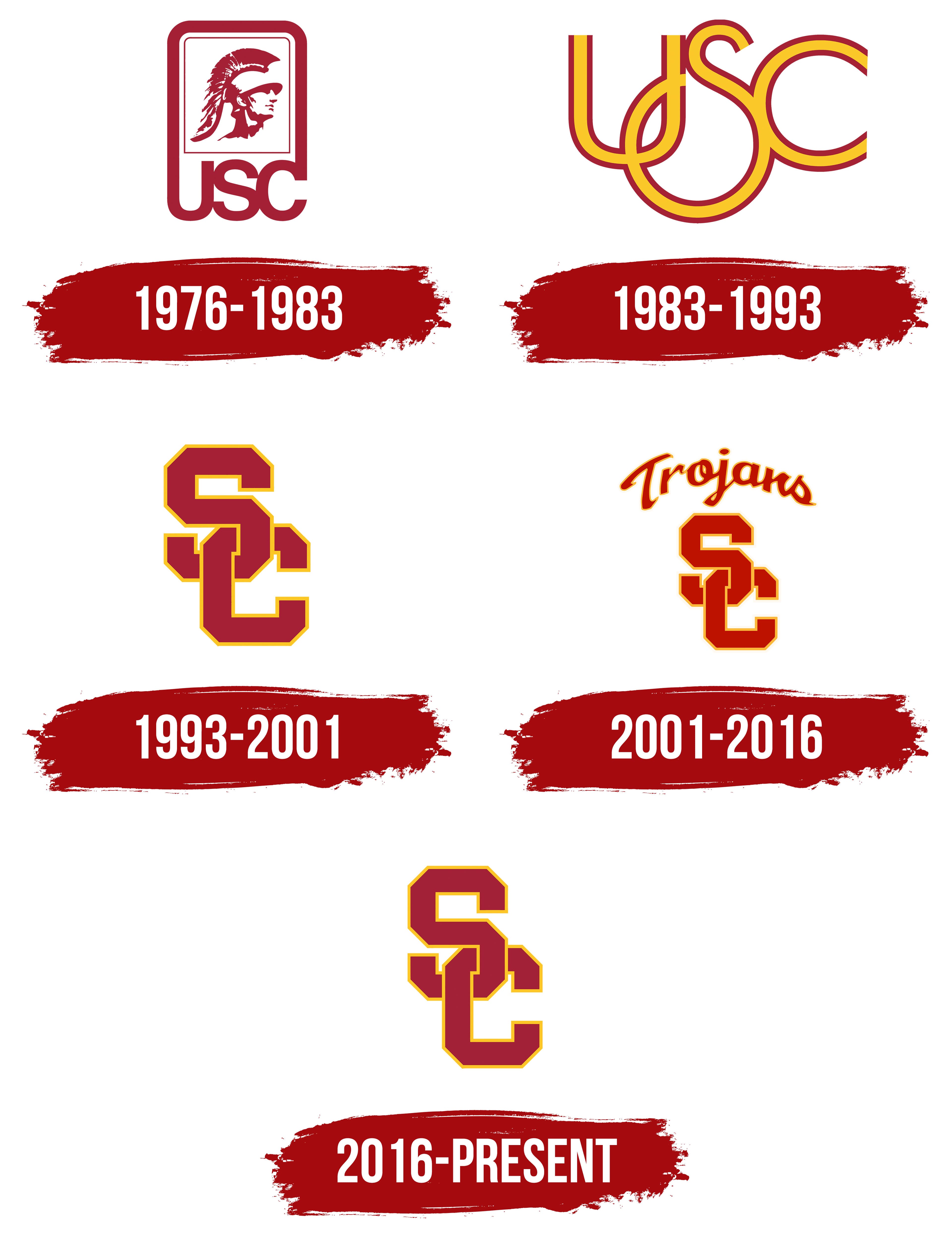
The University of Southern California athletic teams are considered the most successful in the NCAA Division I. They have won over 300 Olympic medals, most of which are gold, and 130 national championships. The program covers men’s and women’s sports, including football, baseball, water polo, and tennis. The branch is named after the ancient warriors, the Trojans. Rumor has it that the Los Angeles Times sports columnist coined the nickname to describe the athletes’ stamina and courage. It is reflected in the team’s symbols.
What is USC Trojans?
This athletic team represents the University of Southern California in Los Angeles, California. The university, a member of the Pac-12 conference, is known for its successful multi-sport program and rich athletic heritage. The Trojans’ soccer program is well-known and has produced several NFL players and Heisman Trophy winners. In addition, other sports such as volleyball, water polo, track and field, and swimming are well-established at the university. The university’s mascot, the Trojan Warrior, and the Cardinal Gold colors are well-known icons in college athletics. One of the most famous college athletic facilities is the Los Angeles Memorial Coliseum, a complex of the University’s athletic facilities.
1976 – 1983
The original logo was quite simple but an associative and powerful symbol. Against a white background, a vividly depicted Trojan, a fearless Greek warrior, whose gaze and attire indicated his excellent prospects for victory. Three capital letters were placed below the warrior’s portrait, signifying who had unbeatable chances for triumph.
Although the logo seemed simple at first glance, its creators added depth. The warrior was placed within a frame symbolizing a shield, representing absolute security and eliminating the possibility of competitors’ superiority. A second element was added to increase the significance and presentability of another geometric shape. If the first frame was a square, the second element was part of the first and last letters, reinforcing the team’s invincibility.
Capital letters were used to enhance importance and served as a protective element. The red color increased the logo’s brightness, creating an original and expressive contrast against the white background.
1983 – 1993

The image of the Trojan, a Greek warrior, could not remain on the logo forever. The identity required more individuality and precise identification. It was unacceptable that the symbol for 21 university sports teams was ambiguous. Therefore, the warrior’s portrait permanently disappeared from the logo. The new logo became more concise, accurately reflecting the sports theme. Even those not connected to sports can easily see that the logo is associated with the Olympic Games. The interconnected rings predetermine this association, but their presentation is somewhat different, making the logo unique.
Against a white background, three capital letters are beautifully positioned. They are large, rounded, and enclosed in a frame. The central part of the letters is filled with a rich orange, and the frame is wide and red. The main emphasis is on the “S” in the center of the logo. The two other letters are in the background. The logo’s individuality is highlighted by the elongated lower part of the letter “S,” reminiscent of an Olympic ring.
1993 – 2001
Time demanded a unique logo. The creators set a goal to design an original symbol. As a result, all roundness disappeared. Now, the letters were arranged vertically instead of horizontally. The total number of letters was reduced by one, leaving only “S” and “C.” They existed as a single, inseparable unit. The logo reflected the Trojans’ excellent performance, the arduous path to victory, the collective effort, and the hard work of each participant. The identity emphasizes that only together can rivals be surpassed, and only by uniting can love and respect from the audience be earned.
2001 – 2016
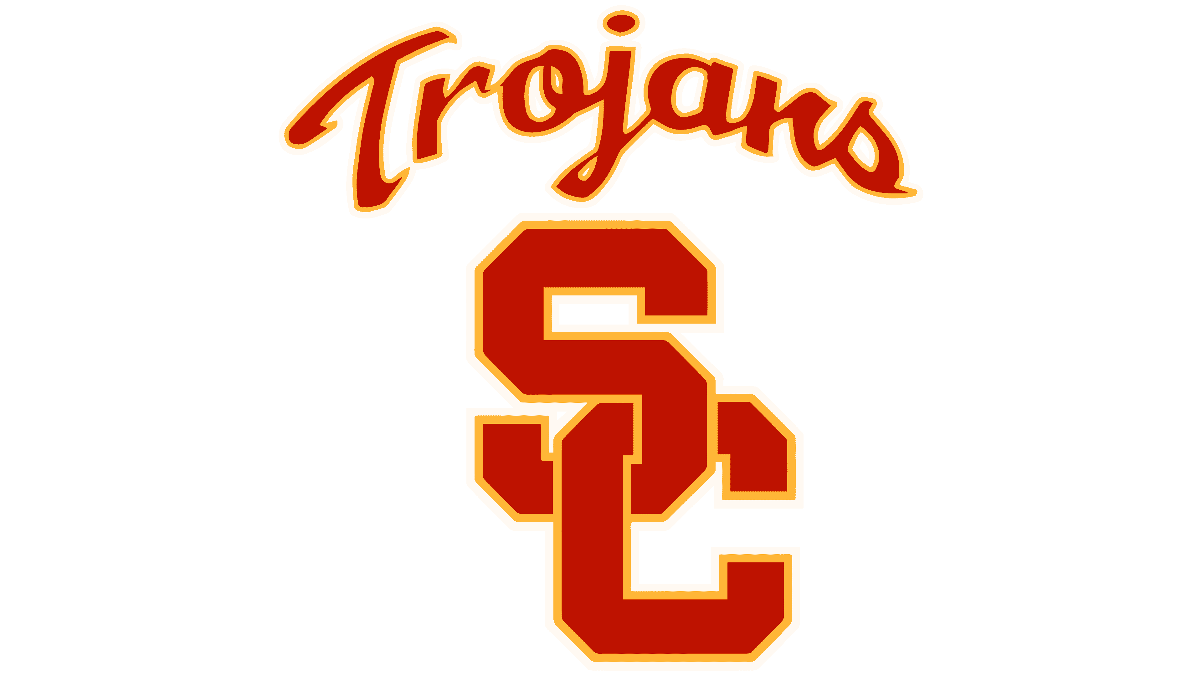
If you study each element of the new identity, you can see that a significant part has been preserved from previous years. The lettering has not lost its scale or changed the overall color scheme. Only a few additions transformed the logo. The sizes of the letters “S” and “C” were adjusted, and their placement was slightly lowered. They, as before, symbolized teamwork and the players’ unification for better results. At the top of the logo, as if handwritten, the word “Trojans” now shone. It reminded us of victories, achievements, and the most important battles in the world of sports competitions. The main red color and the orange stroke used for the frame of each letter added originality.
2016 – today
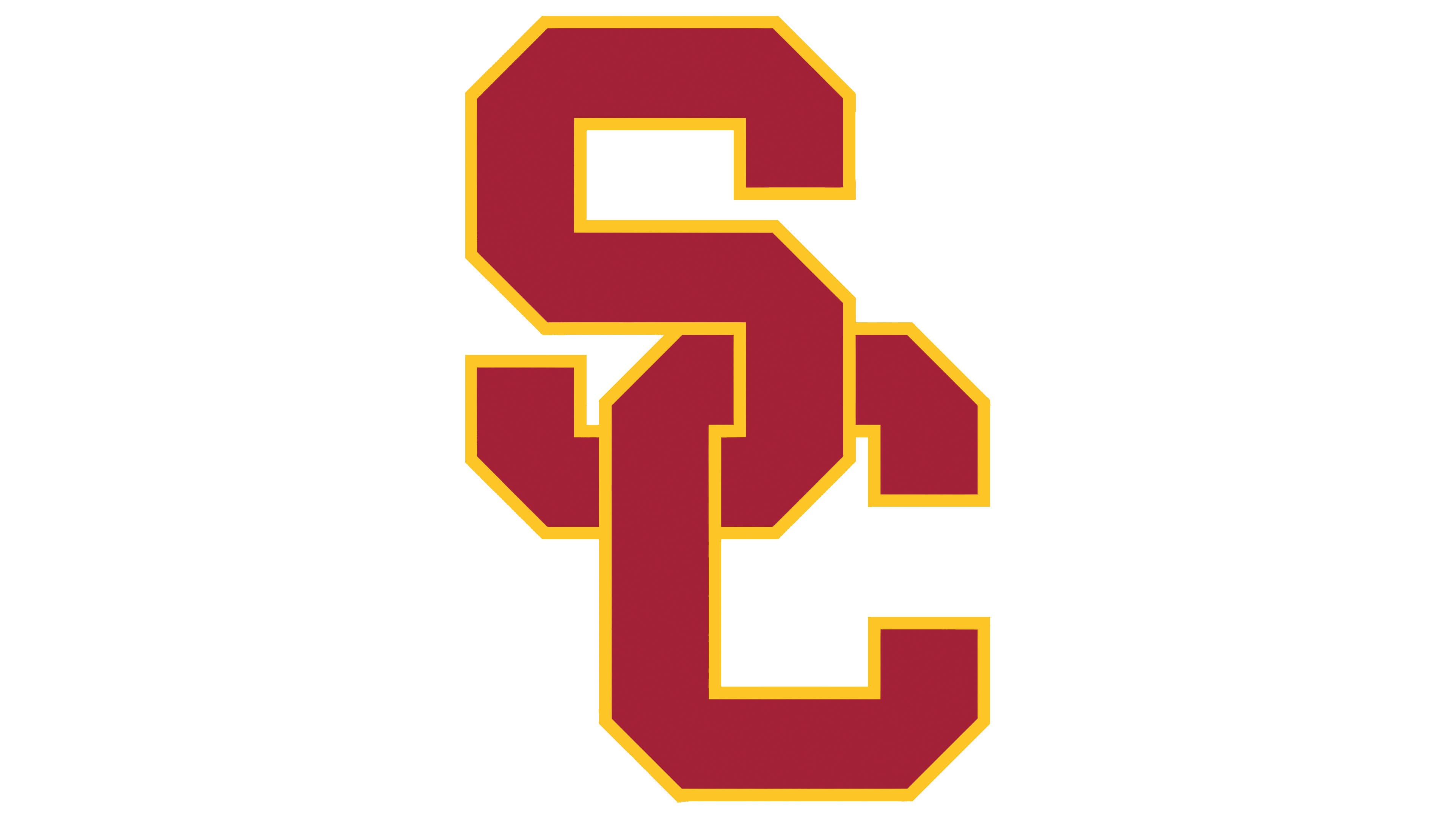
The modern logo precisely replicates its predecessor, created in 1993. This return to the past was not chosen by chance, as that period was one of the most successful in the team’s history. However, this was not the only reason for returning to the roots of the identity. In today’s world, simplicity and detail have come to the forefront. As a result, images and text have become irrelevant. A sports team’s logo should emphasize unity and the challenging path to victory.
The letters of the modern logo are arranged vertically, symbolizing a strong connection and reliability. The lower part of the “S” is firmly connected to the upper element of the “C,” forming a single structure. Both letters are in red, with a slight gradient, and outlined with a bright orange border. The logo’s background remains white, creating a vivid, high-contrast image.