


 Sam Houston State Bearkats Logo PNG
The Sam Houston State Bearkats logo features a stylized combination of letters representing the university’s name and an animal paw print reflecting the team’s nickname. The paw embodies strength, athletic aggression, and competitiveness typical of the team.
Sam Houston State University, founded in Huntsville, Texas, in 1879, introduced its distinctive “Bearkats” mascot in the 1920s, symbolizing the state’s independent character through a mythical hybrid of a bear and a cat. Organized athletics began in 1912 with football, soon followed by basketball.
In 1924, the university built its first dedicated football stadium, strengthening its regional presence. Football success became notable in the 1930s, laying the foundation for enduring athletic traditions. After World War II, investment in sports facilities resumed, leading to further development, including a new basketball facility built in 1952.
Joining the Lone Star Conference in 1964 provided structured competition, while Title IX in the 1970s helped expand women’s sports. Transitioning to NCAA Division I-AA (now FCS) in 1987 marked a significant advancement, followed by membership in the Southland Conference in the 1990s.
In 2001, the Bearkats won their first Southland Conference football championship, and they eventually captured the FCS National Championship in 2020. A major institutional move occurred in 2021 when Sam Houston joined Conference USA, thereby elevating the football program to NCAA Division I FBS status.
By 2023, the Bearkats fielded 17 FBS teams, supported by upgraded facilities and enhanced athlete support services, marking their first official season competing at the highest collegiate level.
Meaning and History
What is Sam Houston State Bearkats?
These teams represent Sam Houston State University and compete at the NCAA Division I level in Conference USA. Based in Huntsville, Texas, these teams compete in sports including baseball, basketball, and soccer, and stand out in vibrant orange and white at venues like Bowers Stadium and Johnson Coliseum. Throughout history, teams have gained a reputation as strong contenders, especially in baseball and football. Their unique name, with the letter “k,” and the mascot, Sammy, add character to sporting events, inspiring loyal fans and strengthening Texas’s competitive culture.
1950 – 1955
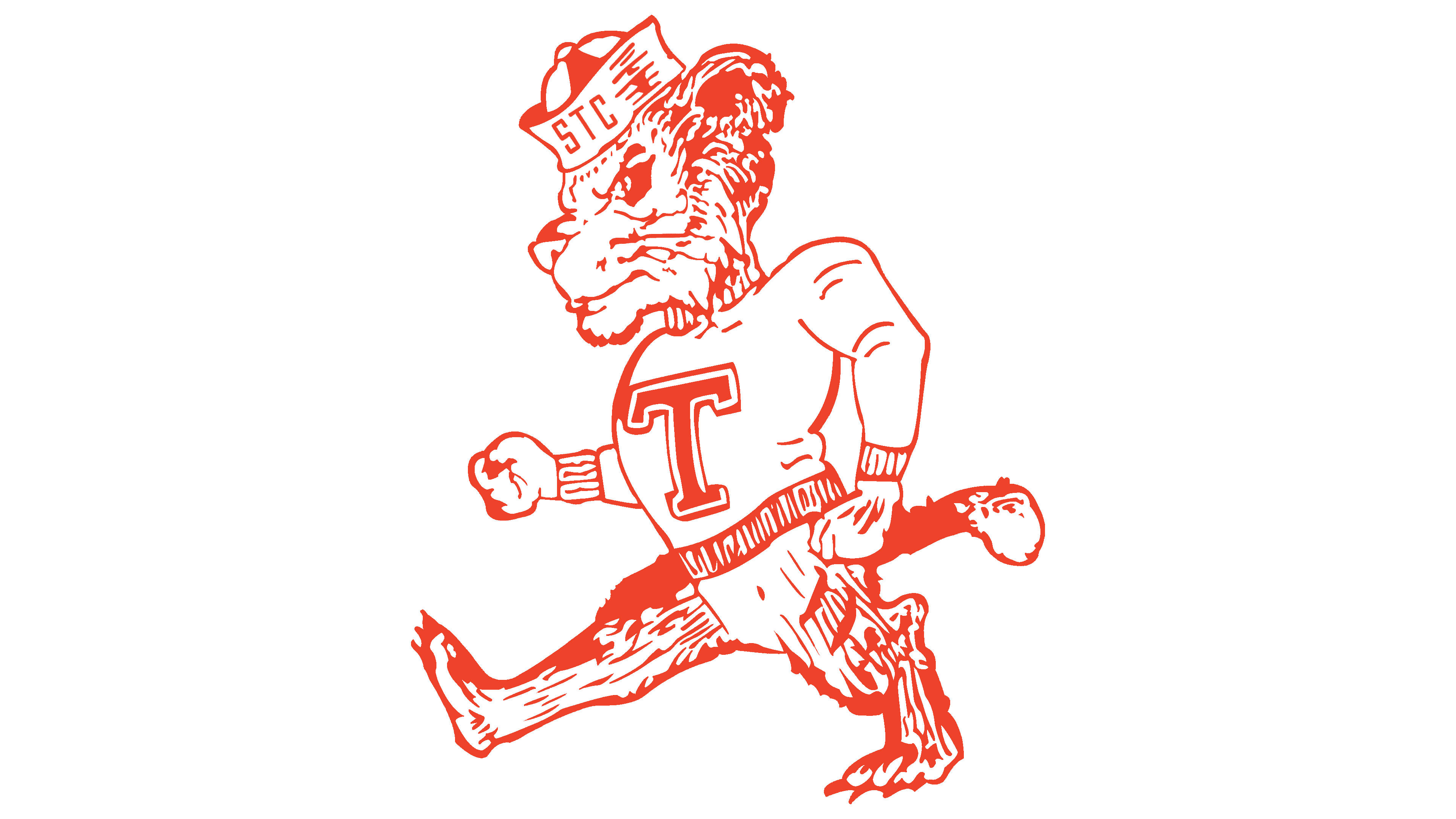
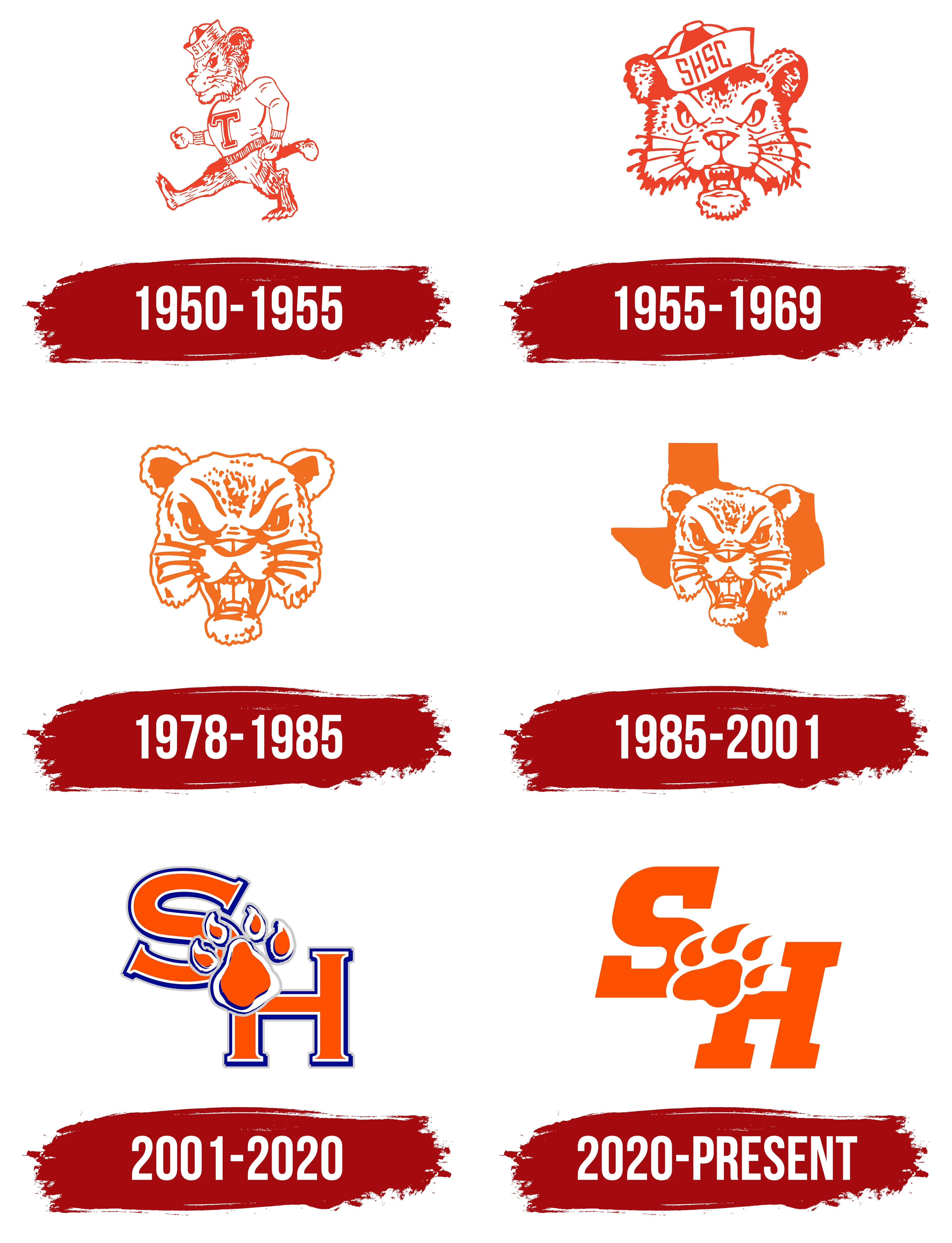
The original Sam Houston State Bearkats logo featured a character nicknamed Walking Sammy, created in the classic post–World War II style of American university mascots. The design was based on an anthropomorphic animal combining traits of both felines and bears, walking forward.
The character is depicted simply, with contour lines emphasizing an active pose. He wears a university sweater with a large letter T on the chest, symbolizing affiliation with the college community, and a cap with the abbreviation STC. These letters refer to the university’s former name, Sam Houston State Teachers College.
The color scheme uses the university colors: bright orange and white. The graphic technique uses fine strokes to convey the fur’s texture and the figure’s shape.
The cap is stylistically similar to naval headwear, symbolizing discipline and patriotism, themes popular among American colleges at the time. The inscriptions T and STC are rendered in a solid block typeface without serifs.
Walking Sammy is shown in a confident stance, taking a wide step and fists clenched, creating an energetic, expressive image. These details made the character popular among students and fans, becoming an informal symbol of the university’s athletic community.
1955 – 1969
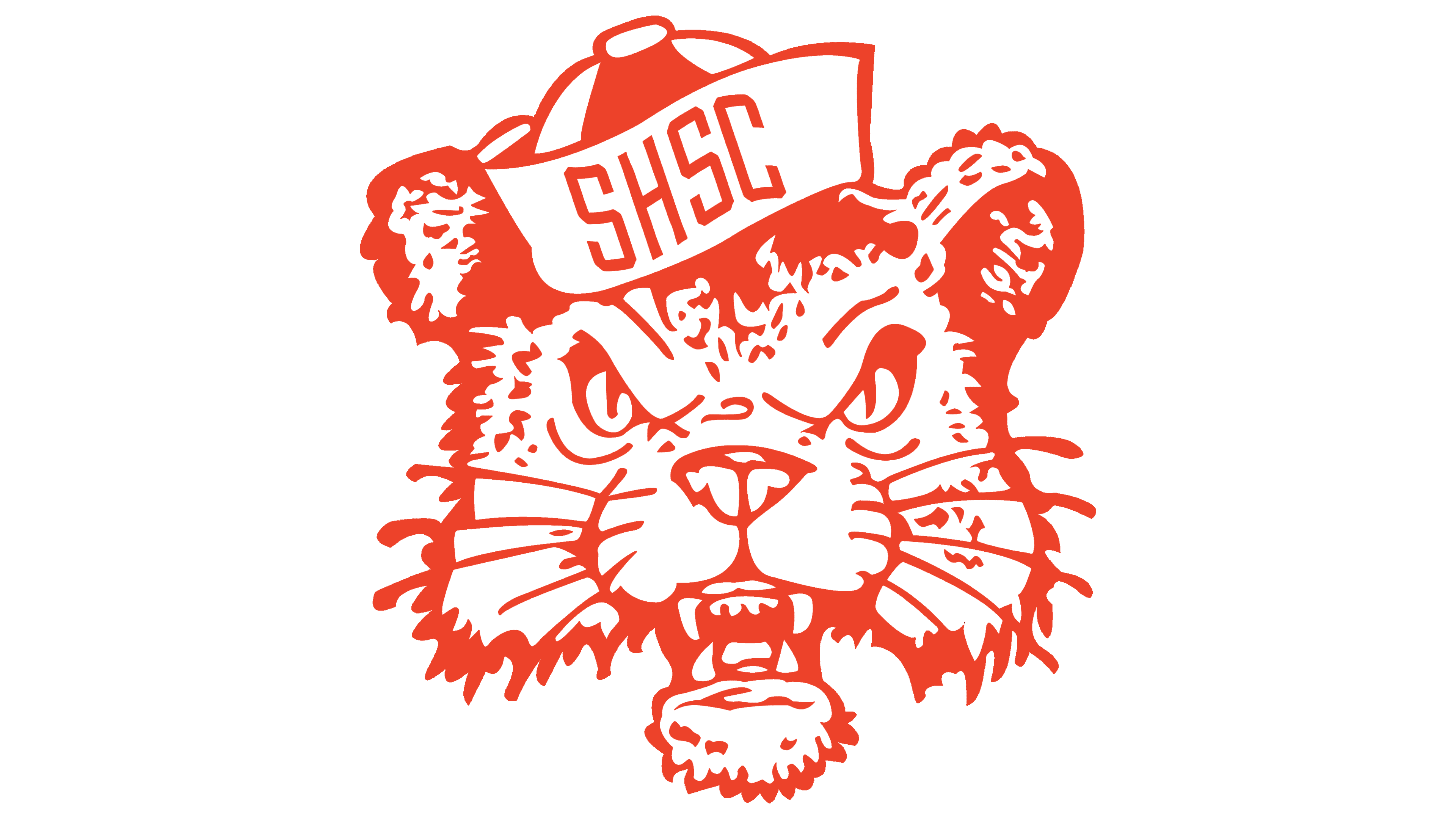
The Sam Houston State Bearkats logo, which appeared after the university was renamed Sam Houston State College, consists solely of the animal’s head. Along with the new name, the abbreviation on the mascot’s cap also changed to SHSC.
The mascot looks stern and aggressive. Wide-open eyes, a slightly open mouth, and sharp fangs create an impression of hostility and readiness for competition. The fur is drawn with short strokes that emphasize texture and liveliness. The animal’s focused gaze enhances the atmosphere of confrontation and athletic challenge.
The character wears a student-style cap with the abbreviation SHSC. The inscription is rendered in a solid block typeface that harmonizes with the overall drawing style. The main university colors are preserved, combining a bright orange outline with a white background.
The emblem debuted in 1959, the same year the costumed mascot, Sammy Bearkat, was introduced. Instead of a humorous cartoon figure, the new logo gave the team an image that inspired pride and expressed athletic spirit.
1978 – 1985
The next version of the Sam Houston State Bearkats logo is distinguished by simplicity and emotional impact. The design features the head of an animal resembling a wildcat or lynx, facing forward. The style remains energetic and aggressive.
The animal’s face is shown with ferocity. The wide-open mouth, sharp teeth, narrowed eyes, and furrowed brows convey readiness for competition and confrontation.
The color palette consists of orange and white. Bright orange serves as the main color for contours and fill, while white highlights the eyes, teeth, and certain elements of the drawing, creating the necessary contrast.
In this version, the designers removed the additional elements typical of earlier versions, such as university caps with abbreviations, focusing attention on the mascot itself.
Contrasting shading adds depth, emphasizing the muzzle folds and fur texture. The combination of orange and white tones makes the logo appear three-dimensional and expressive.
1985 – 2001
In this version, the Sam Houston State Bearkats logo is vibrant and expressive, emphasizing the university’s regional identity. The main element is the head of an animal resembling a wildcat with an aggressive attitude. The head remains unchanged from the previous period. The open mouth, sharp teeth, furrowed brows, and whiskers create an image associated with strength and competition.
A new design detail is the outline of Texas behind the head, indicating the university’s regional affiliation. The outline is rendered in a deep orange, serving as the image’s foundation and enhancing the mascot’s presence.
Compared to earlier cartoon-style versions, this emblem looked more serious and contemporary.
2001 – 2020
In 2001, the teams began using an updated logo that reflected the Bearkats’ style and athletic identity. The central part of the composition features the large university initials S and H. The letters are bold and colored in bright orange, with a triple outline in blue, white, and gray. This design adds depth and dimension.
A paw print is placed over the initials. The print consists of four toes and a large pad at the base. Its style and colors match the emblem’s overall design, creating a cohesive composition and reinforcing the connection to the Bearkats’ nickname. The font used for the initials features serifs.
2020 – today
In April 2020, the university introduced a new logo for the Bearkats teams. The redesign process took about two years, and SME Branding, part of Learfield/IMG College, led it. Students, faculty, and alumni participated in the development process, taking into account the university’s symbol history and the athletic community’s preferences.
The new emblem is built on the university initials S and H, set in a large, bold typeface with thick lines and slight angles. Between the letters is a simplified paw print, minimalistic in style and free of complex elements. It includes four toe pads and a rounded central pad.
The logo uses the university’s orange. The monochrome graphic keeps the image bright and distinctive, making it suitable for athletic uniforms, fan merchandise, and various university materials.
The new logo is paired with Gotham. This font is used for team names and text applications, harmonizing with the main emblem and maintaining a unified athletic style. Along with the logo update, the mascot, Walking Sammy, was refreshed and adapted to modern conditions while preserving recognizable elements from previous versions.
Beginning with the 2020–2021 season, all Sam Houston State University athletic teams officially adopted the new emblem. The update affected not only the primary symbol but also the entire set of visual elements, including typography and the application of the university color.