The VTech logo is smooth and streamlined. The emblem creates tactile associations, as one needs to touch the company’s gadgets to appreciate them. Order and logic can be seen in the symbol, aiming for the intellectual development of users.
VTech: Brand overview
| Founded: | October 1976 |
| Founder: | Allan Wong (Chi-Yun) and Stephen Leung |
| Headquarters: | Tai Po, Hong Kong, China |
| Website: | vtech.com |
VTech is a Taiwanese brand of interactive toys, various educational electronics, tablets, and computers, founded in 1976 by Allan Wong and Stephen Leung. The company owns six factories employing 40,000 people. The corporation’s total revenue amounts to around $2.5 billion. The headquarters is located in Hong Kong.
Meaning and History
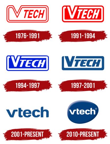
The brand logo has changed several times. However, a constant element is a frame around the name, which demonstrates a calculator, tablet, phone, game, or computer screen. In the emblems, there is a constant struggle between blue and red colors. The company could not decide which better represents its essence: developmental gadgets or information technology. However, after expanding the product range to computers and tablets, the blue color became predominant. A distinctive feature of the identity is the various modifications of the letter V. In each logo, the symbol undergoes a change, highlighting the visualization technologies for learning.
What is VTech?
The company is a leader in sales of developmental electronic toys and learning devices. It sells products in 100 countries, but the main consumers live in China, the USA, Canada, and several European countries. In addition to the main brand, it offers LeapFrog, Snom, and ErisTerminal lines.
1976 – 1991
The first logo consists of the brand name with a modified V, which has become part of the rectangular border.
The name is derived from the combination of the initial letters of two words: Video and Technology. The choice indicates the main approaches used in creating interactive educational gadgets.
The V from the word “video” forms a screen, the main device for displaying information. The technique emphasizes the compound name and directly reflects the company’s direction.
The tilt of the word Tech demonstrates the pursuit of modern discoveries and the use of the latest developments in toys. The red color adds brightness to the logo, showing an interest in novelties and striving for leadership—the desire to please the consumer.
1991 – 1994
1994 – 1997
1997 – 2001
2001 – today
2010 – today
In 2010, VTech acquired Snom Technology AG and expanded its product range by adding telephony. Changes and successes in the field of toys marked the change of the logo. The emblem resembles a blue drop with a white name inside.
The droplet represents:
- A mouse. In 2010, the children’s computer-tablet InnoTab was released. Starting with the production of toys and calculators, VTech expanded its product range to include children’s computers. Therefore, the mouse points to this direction of work.
- A button on a toy or joystick. The choice personifies control. The main learning process using developmental gadgets is associated with button operation. Therefore, the image perfectly reflects the essence of the company’s work.
- An inflatable balloon. Symbolizes lightness, targeting a children’s audience. It signifies data transfer and information exchange with the user.
- An egg. The blue color, as a shade of technology and artificial intelligence, and the white name on it indicate the birth of new gadgets and ideas related to IT.
The letter V is made in the form of a mathematical root sign, hinting at learning—logical tasks for children.
Font and Colors
Dark blue and white are the main colors of the logo. The blue shade is very technological. It speaks of stability, engineering, and computerization. It gives the consumer a sense of reliability and constancy. It is associated with logic and intelligence.
White represents novelties and modern developments. The process of educating young users. Development and knowledge from scratch.
The inscription font is unique due to the modification of the letter V. One of its glyphs, as if passing under the t, forms its bar.
VTech color codes
| Safety Blue | Hex color: | #013e7d |
|---|---|---|
| RGB: | 1 62 125 | |
| CMYK: | 99 50 0 51 | |
| Pantone: | PMS 654 C |
