The Western Digital logo delights with a combination of rigor and power with pleasant colorful accents, bringing the manufacturer closer to the consumer. The emblem represents a diverse and evolving company with an individual style.
Western Digital: Brand overview
| Founded: | April 23, 1970 |
| Founder: | Alvin B. Phillips |
| Headquarters: | San Jose, California, U.S. |
| Website: | westerndigital.com |
Western Digital is an American leader in the production of digital information carriers, with a turnover of $18 billion. The main products are hard drives and SSDs. The headquarters is in San Jose. The company sells products in 50 countries, 20 of which have offices and factories employing 63,000 people.
Meaning and History
Western Digital regularly changed its visual sign. However, in each, it preferred verbal identity. Slender, massive letters have always personified data packets saved using the company’s technologies. Additional elements were used to visualize the idea of information transmission but rarely stayed for long. Western Digital emblems stand out with colorful accents that enliven compositions.
What is Western Digital?
A manufacturer that produces network storage, memory chips for mobile devices, and hard drives. The share in the world market is 20%. Headquarters are located in California.
1971 – 1991
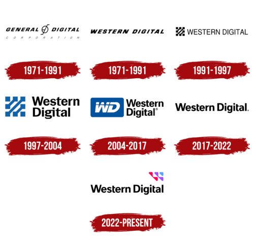
The company did not immediately find itself. Therefore, the first name given at the time of the foundation was General Digital. The name indicated a general digital direction. The product that the company produced was MOS crystals, which are necessary for any electronics.
In the logo, an unusual construction is located between the words, resembling a circle with a radius and an axis crossing it. The image could represent:
- The Earth with a magnetic center, indicating the desire to cover the inhabitants of the Earth with their products.
- Modification of the initials of the creators P (Phillips) and J (Johnson).
- Crystals – oxide-coated formations with metal contacts.
All the symbols of the logo had a strong slant to the right, showing the desire to grow and develop quickly.
For crystals, this logo remained constant until 1991.
1971 – 1991
Just a few months after registration, the founders decided on the direction of their work and switched to the production of hard drives. Therefore, the company’s name was changed to Western Digital, which indicated the location within the country (San Jose).
The principle of logo construction remained the same – the name with a strong slant of letters. However, the symbol between the words was removed.
1991 – 1997
1997 – 2004
2004 – 2017
2017 – 2022
2022 – today
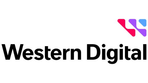
In 2022, a new company logo appeared. The emblem was created for the 52nd anniversary of the company’s foundation. The logo consists of the name written in a straight, even black font. In the upper right corner, there is a row of connected triangles. Two red, two purple, and one blue. They form a structure that also resembles a triangle.
The figures represent:
- A segmented letter W – the first in the name. Its appearance from various colored figures indicates the production of various data storage devices, from disks to flash drives.
- Cells for storing information. All drives have a special structure in which data is recorded.
- Product marking. To divide hard drives into groups, the company uses five colors: blue for universal, red for powerful systems working around the clock, and purple for video surveillance systems.
Even letters without slants demonstrate the stability of the manufacturer and the preservation of the positions achieved.
Font and Colors
The main tone of the logo is set by black color. It represents a well-established strong empire playing a significant role in the market. The color scheme is complemented by the following:
- red – as the color of leadership and active development,
- purple – a shade of wisdom and creative beginnings,
- blue – the color of information and technology.
The font of the inscription Unitext Bold, with concise glyphs, demonstrates the compactness, archiving, and clear structure of the company’s products.
Western Digital color codes
| Radical Red | Hex color: | #ff0057 |
|---|---|---|
| RGB: | 255 0 87 | |
| CMYK: | 0 100 66 0 | |
| Pantone: | PMS 1925 C |
| Lavender Indigo | Hex color: | #a34eff |
|---|---|---|
| RGB: | 163 78 255 | |
| CMYK: | 36 69 0 0 | |
| Pantone: | PMS 266 C |
| Ruddy Blue | Hex color: | #54a5ff |
|---|---|---|
| RGB: | 84 165 255 | |
| CMYK: | 67 35 0 0 | |
| Pantone: | PMS 279 C |
| Black | Hex color: | #000000 |
|---|---|---|
| RGB: | 0 0 0 | |
| CMYK: | 0 0 0 100 | |
| Pantone: | PMS Process Black C |


