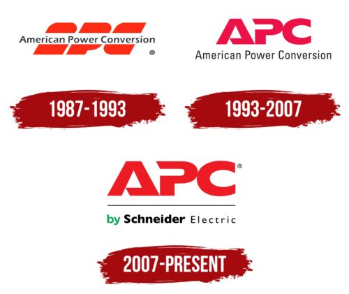
The APC logo is lively and fiery. It demonstrates the flow of energy and the connection and disconnection of an electrical circuit, which is controlled by the brand’s gadgets—all elements of the emblem point to the power storage devices necessary for an uninterrupted power supply.
APC: Brand overview
| Founded: | 1981 |
| Headquarters: | West Kingston, Rhode Island, United States |
| Website: | apc.com |
APC is a major American company that manufactures batteries to support computer operations during power outages. It is based in Rhode Island and has been owned by Schneider Electric since 2007. It had ten factories in the United States, China, Brazil, India, and the Philippines. In 2011, it was completely absorbed and now exists only as a brand.
Meaning and History
The company’s logo has always had a similar concept in the form of the letters APC. Various transformations mainly concerned the change of font and writing style. All emblems demonstrate dynamism, alternating accumulation, and release of current. Despite the absence of drawings and diagrams, the emblems vividly tell about situations where APC equipment will be an excellent solution.
What is APC?
A technology company that operated in the field of data processing centers, uninterruptible power supplies, software, cables, and monitors. Since 2011, it has been a brand of products, and its working divisions became part of Schneider Electric’s computer department.
1987 – 1993
The first logo was not entirely clear. It consisted of three red letters leaning to the right. However, the inscription executed over them did not allow us to decipher the exact symbols depicted. Inside the white stripe, the company’s full name, American Power Conversion, was placed. The words, like a news ticker, crossed the abbreviation.
The approach embodied the movement of current, wires, and electricity. It showed that thanks to APC, the equipment is protected. The company’s technology will not allow the voltage to get out of control—no surges or departures from the established boundaries.
At the same time, the white color inside the stripe limited the safe area, and the red color conveyed violations.
The intrusion of the full name into the red symbols also denotes intervention when electricity stops being supplied. It is APC equipment that helps to work during this period.
1993 – 2007
2007 – today
In 2007, the company was acquired by Schneider Electric and changed its brand name to APC by Schneider Electric. In connection with this, the logo was updated.
The modern company emblem consists of three large red letters, the first of which are slightly transformed to convey information about the brand’s field of activity. The modification of the symbols also made the emblem more recognizable.
- The “A” is designed as an open triangle, resembling an electrical circuit that closes when the power is turned off and begins to power the computer. The letter also resembles a storage device that accumulates charge.
- The letter R does not have an upper part of the main glyph, making the circle open. The image forms a bend, showing a bypass route and additional options provided to APC equipment owners.
The incompleteness of the symbols gives the impression of ongoing work on the logo. This approach tells of the company’s constant dynamic development and transformation from year to year. The firm does not plan to rest on its laurels. Now, in addition to uninterrupted power supply, APC offers software and data centers.
The gaps also indicate the cessation of the electricity supply. It is at this moment that APC gadgets are needed.
The abbreviation is underlined by a thin black line, below which there is a small message stating that the brand belongs to Schneider Electric. The inscription is made in green and black colors.
The two-level arrangement makes the sign more interesting, and the use of different colors lifts the mood with its brightness. The compactness allows the symbol to be placed on various surfaces. The image of the rectangle created by the inscription hints at the technical field of work and the silhouettes of equipment produced under this brand.
Font and Color
The main color present in all company logos is red. It symbolizes electric current, reminiscent of energy and power that drives electronics. The shade represents the speed of electron propagation. The color also speaks of a leading position since APC is one of the leading companies in the industry in the US.
The logos also use black and green colors. Adding a green shade to the “by” part is a way to show that APC’s acquisition by Schneider Electric has given the manufacturer-new life and will contribute to its development.
Black for Schneider Electric signifies power and dominance – a sign of the largest corporation that owns other subsidiaries.
The font of the inscription is unique due to the transformation of the first two letters of the abbreviation.
APC color codes
| Pigment Red | Hex color: | #ee1c24 |
|---|---|---|
| RGB: | 228 28 36 | |
| CMYK: | 0 88 85 7 | |
| Pantone: | PMS Bright Red C |
| Pigment Green | Hex color: | #04a551 |
|---|---|---|
| RGB: | 4 165 81 | |
| CMYK: | 98 0 51 35 | |
| Pantone: | PMS 354 C |
| Black | Hex color: | #000000 |
|---|---|---|
| RGB: | 0 0 0 | |
| CMYK: | 0 0 0 100 | |
| Pantone: | PMS Process Black C |


