The Aubade logo acts as a subtle accent. The emblem highlights that the brand’s lingerie adds a touch of charm to women, becoming an important element of their look. The logo demonstrates the sets’ fine, almost weightless lines, which fashion enthusiasts will appreciate.
Aubade: Brand overview
The history of Aubade began in 1875 when Dr. Bernard established a modest corset manufacturing business in Paris. At the time, corsets were necessary for women’s wardrobes, making manufacturing them a lucrative industry. Dr. Bernard’s business makes exquisite corsets renowned for their grace and usefulness.
In the 1940s, the corporation began adjusting to shifting post-war fashion trends. As rigid corsets became less popular, the business experimented with different shapes and materials to create more comfortable lingerie.
A significant development in the brand’s history occurred in 1958 when the business rebranded as Aubade. The French term “aubade” means “morning serenade,” which perfectly captures the brand’s sensual and romantic essence. With this shift, the business entered a new chapter, concentrating on producing elegant and alluring undergarments.
The brand rapidly expanded its product portfolio in the 1960s. The company launched the first padded bras, which were revolutionary then. These models gained popularity quickly among stylish women.
The firm continued innovating in underwear design throughout the 1970s. In 1976, the company released the first quarter-cup bra, which quickly became popular and one of the company’s icons. Another feature of this era is the brand’s global profile growth.
The company launched its well-known “Lessons in Seduction” ad campaigns in the 1980s. These commercials, which blend sophistication, sensuality, and humor, establish the brand as a trademark and raise brand awareness. Each campaign features a sequence of black-and-white images with clever captions that teach the art of seduction.
The business kept broadening its product line throughout the 1990s. The firm introduced a swimwear collection, which quickly became well-known because of its exquisite style and superior materials. The brand opened new outlets around Europe during this period, solidifying its presence in the global market.
In the 2000s, the company commemorated its 50th anniversary under the Aubade moniker. A unique anniversary collection that showcases the company’s development and history was unveiled to commemorate this milestone. The brand also actively expanded its online presence at this time, opening an online store and stepping up its digital marketing initiatives.
The Swiss company Calida acquired the business in 2005, creating additional avenues for the brand’s growth and development. Even after the ownership change, the firm maintains its distinct identity and produces lovely underwear in the purest French style.
In the 2010s, the company kept pushing the boundaries of lingerie design and production technology. The brand debuts new collections that fuse contemporary materials with age-old workmanship. Ethical production and sustainable development are also receiving more attention during this time.
Between 2020 and 2022, the firm adjusts to shifting consumer demands. The business keeps its distinctively exquisite look while growing its product range to include more relaxed everyday wear. The company interacts with a younger customer base by bolstering its social media presence.
The brand has continued growing in 2023, emphasizing sustainability and innovation. The company has introduced a new line of organic and recycled underwear that is environmentally friendly. This line answers the growing need for eco-friendly products by fusing the firm’s classic elegance with a contemporary production methodology.
The company is extending its digital approach this year by introducing a cutting-edge virtual showroom. Thanks to this, customers worldwide may now engage with the brand’s collections in augmented reality, which is especially important given the rise in online shopping.
Meaning and History
What is Aubade?
It is a famous French luxury lingerie brand created by Charles Pasquier in Paris. The company specializes in designing and manufacturing luxury lingerie, including bras, panties, corsets, and other intimate apparel for women. Known for its exquisite designs, exceptional quality, and attention to detail, it has established itself as a leader in the luxury lingerie market. The brand is known for its approach to lingerie design, often incorporating artistic elements and embodying sensuality in its collections. The products are created from premium materials and embellished with intricate lace, embroidery, and delicate fabrics.
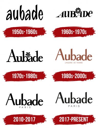
1950s – 1960s
The first logo stands out with an unusually sharp script that is written in a fit of passion. The brand’s name is a love serenade sung at dawn by a lover to his beloved. The name is associated with beauty, seductive charm, and intense emotions, which the French brand brings to a couple. The bold, dynamic features of women from the 1950s inspired the style of the script.
1960s – 1970s
The brand’s collection shows a trend towards seasonal changes and a variety of shades. Hence, the capital letters and the hint of a color wheel are depicted as a flower above the inscription.
A woman becomes a bright, seductive flower in the brand’s lingerie. The collections include sets to suit every taste. The thin glyphs and the strong slant of the letters “A” with wide serifs at the bottom hint at long-legged beauties and model proportions.
1970s – 1980s
Slim, vertical, and compact letters emphasize the ideal of feminine beauty. A neat little flower in the middle resembles the clasp on a bra, which the brand placed in the front in the 70s. The logo speaks to the petite forms of the lingerie and the women it is made for.
1980s – 2000s
The logo changes the emblem’s color from black to crimson gold for the first time. The brand’s lingerie has become the standard in its niche. The brand has celebrated over 30 years in the seductive, intimate apparel market. Over the years, the company has introduced innovative solutions that have become part of the gold standard—thongs, strapless bras, and front-closure bras.
The ends of the glyphs in the new font are slanted, hinting at a slim figure and presenting the brand’s products as a provocative aspect of the look.
2010 – 2017
Keeping the font, the company returned to black for the inscription, emphasizing versatility and intimacy. The word “Paris” under the brand name hints at the traditions of French fashion, valuing refinement and grace.
2017 – today
The brand’s logo has evolved, reflecting fashion trends and consumer preferences changes. The modern version of the trademark is a synthesis of the first two emblems, maintaining the brand’s traditions while giving it a contemporary look.
The new Aubade logo features an elegant inscription of the brand’s name in a modern and refined font. The main word, “Aubade,” is written in large font, with the word “Paris” in small font beneath it, emphasizing the brand’s origin and its connection to the fashion capital of the world.
The emblem symbolizes elegance, femininity, and luxury. The choice of font and the arrangement of elements reflect the sophistication and high quality of the brand’s products. The “Paris” inscription adds a touch of exclusivity and prestige.
The logo underscores the brand’s philosophy of creating exquisite lingerie for women. It conveys the grace and refinement inherent in the company’s products and highlights the brand’s French origin.
The chosen font is characterized by lightness and freedom, with increased spacing between the letters. The font is transformed at the bottom to create a more solid and stable base, giving the logo a modern and elegant appearance. The letters have soft, rounded shapes, adding visual lightness and appeal.
The logo is rendered in black, symbolizing classic style and elegance. Black is also associated with luxury and quality, perfectly aligning with the image of the Aubade brand.


