The Carrier logo exudes perfection and style. Its ideal proportions and lines represent a company creating comfortable living conditions. The emblem encodes the giant’s core values related to human health and the right to proper conditions.
Carrier: Brand overview
| Founded: | June 26, 1915 |
| Founder: | Willis Carrier |
| Headquarters: | Florida, United States |
| Website: | corporate.carrier.com |
Carrier is an American manufacturer of climate control, cooling, and fire safety systems with a turnover of 20 billion dollars. Products are supplied to Africa, Asia, America, Europe, and the Middle East. The company employs 58,000 workers. The corporation belonged to United Technologies until 2020.
Meaning and History
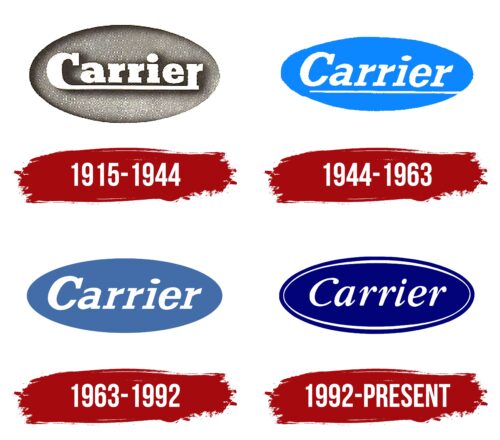
Over the past 100 years, Carrier’s company logos have been characterized by stability. Changes in texture, color, and font did not affect the basic structure of the oval and inscription. The configuration reflects the pursuit of harmony and the ideal climate.
Interestingly, the first logo appeared in 1915, although Carrier began working on air conditioners in 1902. By 1915, the product was already being exported abroad and was known in the USA. The formation took place under the wing of the Buffalo Forge company and under its emblem. The Carrier logo only appeared after the complete separation of the Carrier Engineering Corporation.
What is Carrier?
The company specializes in producing air conditioning equipment, fire safety systems, and refrigeration units for businesses and private residential premises. It owns around 30 brands, including Arcoaire, Aritech, Onity, Kidde, Sensitech, and others.
1915 – 1944
The first manufacturer’s logo consisted of an oval base, on top of which the word Carrier was written in white paint. The name came from the surname of the inventor and the company’s main inspiration, engineer Willis Carrier.
Interestingly, the company was founded by five engineers, but they chose the name of just one. This is because Willis was the one who invented the logarithmic scale for calculating air humidity, developed the engine, and came up with the first air conditioner.
The oval base resembles burlap. Perhaps this is a memory of the first attempts to create a device that reduces air humidity. For this, the engineer used coarse fabric and calcium chloride. Eventually, Carrier invented another mechanism, but it was the experiments with burlap that were the first. The fabric also reminds us of the material used in the design of home air conditioners.
The oval shape is a symbol of harmony. It indicates the optimal, comfortable temperature and humidity of the air. The inscription seems to hover above the background, casting a shadow. This technique symbolizes the wind and air currents passing through the device. Carrier’s first air conditioner was called the “Apparatus for Treating Air.”
The lower hook of the letter C is extended to the end of the word, connecting with the “r” and forming an underline. The line emphasizes: Carrier is the best. In the brand’s systems, everything is thought out from beginning to end, and the devices work flawlessly. The inscription demonstrates that every element of the devices is developed by a single talented inventor.
1944 – 1963
1963 – 1992
1992 – today
Carrier, as part of United Technologies, underwent a major reorganization with the closure of some factories. Among the changes of the 90s was a logo change. The new emblem is stylish and profound. The dark blue color of the oval symbolizes experience, scope, and serious research programs. The white outline line demonstrates inventions and innovations that the giant regularly delights with. The refined white inscription looks great on the dark background. Its slant to the right symbolizes the drive toward the future.
Font and Colors
The main colors of the logo are blue and white, present in most variations of the visual symbol.
- Blue – symbolizes air and breath. Water, which all the company’s devices are associated with. The shade testifies to well-being, indicating experience and creativity.
- White – embodies inventions, innovation, air purification, and freshness. It implies the color of cold and ice, related to refrigeration systems.
The font of the inscription is GHEA Aragast SemiBold. At the ends of the letters, there are dot-like thickenings reminiscent of water droplets and indicating condensation.
Carrier color codes
| Navy Blue | Hex color: | #030379 |
|---|---|---|
| RGB: | 3 3 121 | |
| CMYK: | 98 98 0 53 | |
| Pantone: | PMS 2738 C |


