![]() ECHL Logo PNG
ECHL Logo PNG
The ECHL hockey league logo symbolizes professionalism and the competition’s regional significance. Its graphic style emphasizes the league’s clubs’ athletic identity, reliability, and competitiveness.
The ECHL was established in 1988, initially uniting five hockey clubs from the eastern United States through the efforts of oilman Henry Brabham of Virginia. The league quickly gained popularity due to its aggressive and exciting play. The first champions were the Johnstown Chiefs, winners of the Riley Cup.
Initially, the ECHL operated independently of the NHL; however, partnerships with NHL teams began to form in the 1990s. Over time, the league expanded westward, including Alaska, prompting a shortening of its name to ECHL. A major event was the addition of teams from the defunct Central Hockey League in 2014.
Today, the ECHL consists of 29 teams in the United States and Canada and regularly adds new franchises, such as the Tahoe Knight Monsters and Bloomington Bison. The 2025 Kelly Cup Finals feature the Toledo Walleye and the Trois-Rivières Lions. The Kelly Cup is the league’s main trophy, awarded annually to the champion.
ECHL remains an important stepping stone for players aiming for the NHL.
Meaning and History
![]()
What is ECHL?
It is a professional hockey league, ranking third in North America’s sports hierarchy. The league includes 28 teams from southern U.S. states to northern Canadian regions. It serves as an entry point for young players aiming for elite hockey and as a place for veterans to continue their careers. Games are known for physical play, emotional atmosphere, and rivalries between nearby teams.
1988 – 1995
![]()
The introduction of its first logo accompanied the launch of the East Coast Hockey League in 1988. At that time, the design task was to reflect the specifics of a hockey championship and highlight the energy of the new project using simple, recognizable forms.
The composition is based on a horizontal rectangle with a vibrant red background at its center, surrounded by a blue block. On the red field appears the abbreviation “ECHL,” executed in a volumetric style using a combination of blue and white. The typeface is composed of bold, sans-serif glyphs arranged tightly, featuring prominently emphasized internal spaces.
The right side features an element composed of seven golden hockey sticks arranged closely together in a vertical fan, creating a visual “wall.” The simplicity of this form, combined with a slight tilt, gives the structure dynamism. At the bottom, on the blue field, are four white five-pointed stars outlined in red, arranged in a horizontal row.
The color scheme includes four primary tones: red, blue, white, and gold. Red and blue form a bright contrast, emphasizing the typographic block; white functions as a separator and highlight, and gold, used for the hockey sticks, suggests achievements and awards.
Symbolically, the hockey sticks represent defense and teamwork, and their visual “wall” supports the idea of player unity on the ice.
1995 – 2003
![]()
Starting from the 1995 season, the league unveiled an updated logo, transitioning from the previous rectangular design to an oval shape with a diagonal composition. The oval is visually divided into two parts: the upper portion features blue stars, and the lower portion contains the remaining elements in red. This visual shift added more dynamism and visual energy, aligning with the spirit of hockey games.
Inside the oval, the abbreviation “ECHL” occupies a dominant position, presented at an angle. The glyphs are bold and sans-serif, featuring heavy vertical strokes and short horizontal lines, which create a solid impression. Above the letters are three five-pointed stars with gold outlines. At the same time, the lower portion features a stylized puck element with three lines indicating its trajectory.
The palette remained traditional for the league: red, white, and blue. Red dominates the lower segment of the oval, blue occupies the upper area, and white highlights the typographic block and puck motion lines. The golden tone appears only in the outlines of the stars, providing an accent of prestige.
Encircling the oval is the league’s full name, “East Coast Hockey League,” arranged around the perimeter. The upper half of the text appears in blue. In contrast, the lower half is red, creating symmetrical balance with the main interior composition.
The symbolic meaning of the elements relates directly to sports: the oval with diagonal text and a flying puck conveys speed and direction, while the stars may symbolize status, achievements, or core organizational principles.
2003 – 2017
![]()
On May 19, 2003, the league officially dropped the full name “East Coast Hockey League” and adopted the shortened form “ECHL” as its brand name. This name change was accompanied by an updated logo that retained the familiar oval shape from the previous period while incorporating several adjustments.
The composition still featured the abbreviation placed diagonally within the oval, but the angle of inclination became slightly smaller. By removing the text previously surrounding the oval, the internal space expanded visually, giving the logo a more balanced appearance. The upper section remained blue but became darker, featuring three white five-pointed stars outlined in gold. The lower section became slightly brighter, preserving the puck and three parallel lines symbolizing trajectory and speed. The external text displaying the league’s name around the oval was eliminated.
The typography followed a geometric style similar to popular typefaces such as Handel Gothic. The letters had bold shapes, shortened horizontal strokes, and balanced internal spacing, enhancing recognition and associating the brand with technology and professional sports.
The color scheme featured deeper blues and brighter reds, complemented by white and gold accents. The contrast between the upper and lower sections of the oval emphasized the division between thematic areas. At the same time, the retained diagonal structure continued conveying dynamism.
This logo symbolized a new stage in the league’s development, reflecting its expanded national presence and the integration of seven West Coast teams that had joined from the WCHL that same year. The composition combined established recognition with a more restrained shape and vibrant palette, retaining key sports symbols such as stars and a flying puck.
2017 – 2018
![]()
On July 4, 2017, the ECHL introduced a special anniversary logo created for the season marking the league’s 30th anniversary. The design was developed by Royer Designs from Toledo, Ohio, with creative direction by Dan Royer, creative director for the Toledo Walleye and Toledo Mud Hens clubs. His approach emphasized three key elements: the number “30,” the abbreviation “ECHL,” and the years placed on either side of it. Early development stages tested various compositions and color schemes, including concepts with bronze elements reminiscent of trophies.
The composition was based on a shield-shaped form with a solid blue interior background. Prominently at the center was a large white “30” with gray embossed outlines creating a three-dimensional illusion. Below that was the bold abbreviation “ECHL,” also in white, underlined by a red stripe. Flanking these central elements were the years “1988” and “2018.”
The lower section of the emblem featured a semicircle of five red five-pointed stars, referencing the five founding teams from the 1988–89 season. At the center of this semicircle was a stylized puck with three gray lines extending outward on each side, resembling a chevron and adding dynamism to the design. These elements were redesigned for greater symmetry and depth.
The palette consisted of rich blue, white, red, and light gray, with gray used to create shadows and depth effects. The contrast between the blue background and white elements enhanced readability, while red accents structured the composition’s lower portion.
This anniversary logo was used exclusively during the 2017–18 season, integrated into media, official materials, and event branding related to the ECHL’s 30th anniversary.
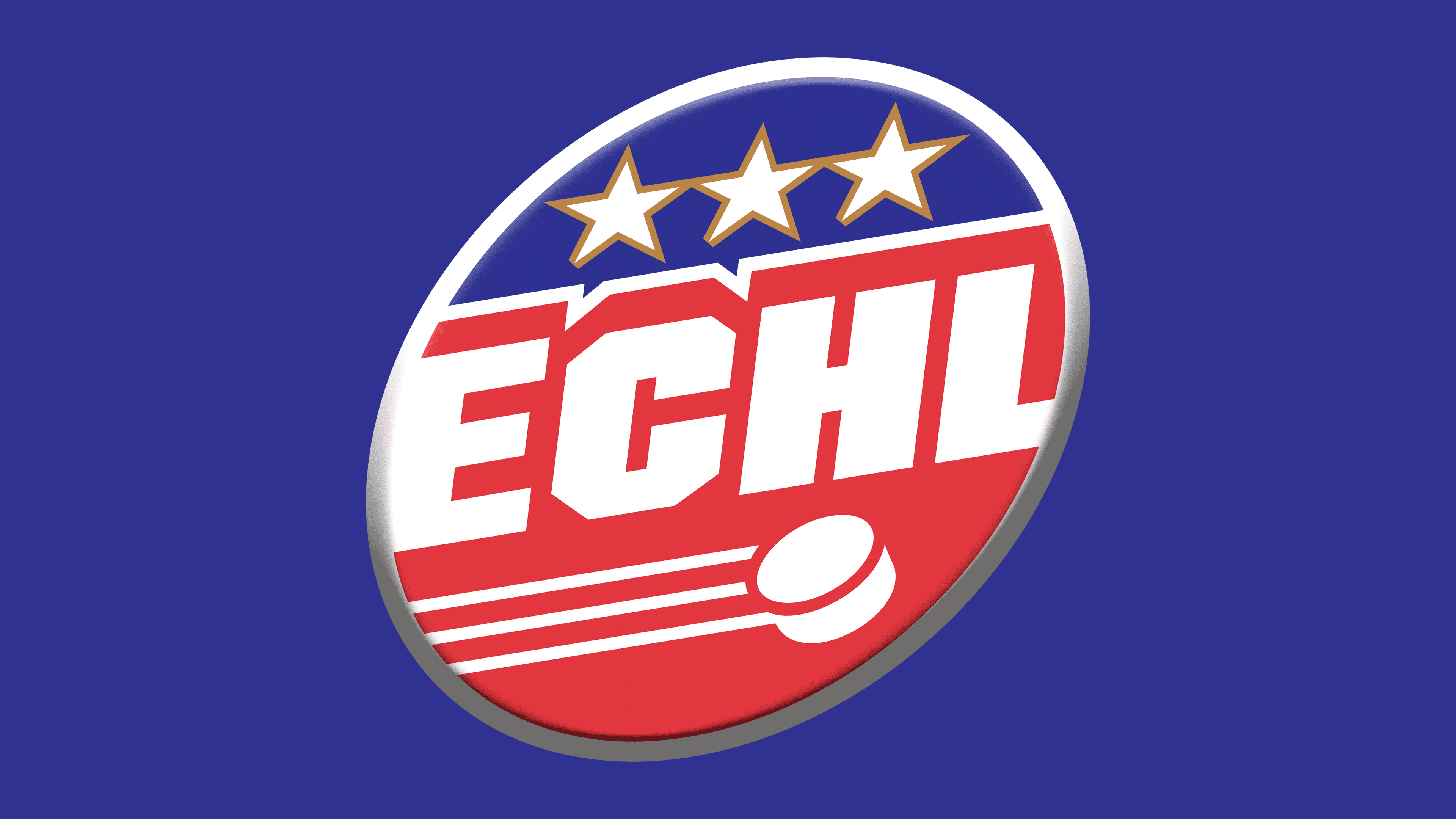
2018 – today
![]()
After concluding the anniversary campaign, the league reverted to its primary logo, which had been used from 2003 to 2017, introducing only minimal adjustments. The objective was to maintain the recognizable and consistent corporate identity while slightly refreshing the visual appearance.
The composition remained unchanged: a diagonal abbreviation “ECHL” inside an oval featuring a blue upper segment, a red lower segment, three white stars in the upper zone, and a stylized puck with three motion lines below. Changes primarily involved precision in outlines: contours became cleaner, lines slightly sharper, and the geometry of certain elements adjusted for a more contemporary appearance.
The color scheme repeats the model of the previous version, preserving the balance between deep blue, vivid red, and white elements. Color adjustments are subtle but provide more consistent reproduction across different media, including digital platforms.
Returning to a proven design emphasized the league’s commitment to its history, dating back to the mid-1990s redesign, and allowed it to leverage accumulated visual brand equity. The logo retained its sporty dynamism and patriotic symbolism, remaining versatile for media formats and merchandise.
This version has been in use since 2018, demonstrating that longevity and recognition can be as valuable as innovative visual updates.