 Toledo Mud Hens Logo PNG
The Toledo Mud Hens logo symbolizes a baseball team seamlessly integrated into the city’s daily life. The club became an integral part of the local community, regularly playing games without flashy victories but with consistent support.
Professional baseball in Toledo began in 1883 with the Toledo Blue Stockings. Moses and Welday Walker played for the club, becoming the first Black players in professional baseball during an era of racial segregation. The Mud Hens name appeared in 1896, taken from marsh birds living near the team’s ballpark. What began as a local nickname became the club’s lasting identity.
The franchise spent decades moving between cities, leagues, and affiliations within Minor League Baseball. It returned to Toledo permanently in 1965 and initially worked with the New York Yankees. In 1987, the club became affiliated with the Detroit Tigers. The partnership endured, aided by the short distance between Toledo and Detroit.
In 2002, the Mud Hens moved to Fifth Third Field in downtown Toledo. The new stadium formed part of a broader redevelopment project for the city’s business and cultural center and brought higher attendance. Its downtown location also made the team part of Toledo’s daily life. The team then won consecutive International League championships in 2005 and 2006 despite regular player movement between the farm club and its parent organization.
The Mud Hens gained national exposure through the television series MAS*H, whose character Klinger frequently mentioned the team and wore its merchandise. After the 2021 reorganization of the minor leagues, Toledo joined Triple-A East and later competed in its renamed successor. The club won a division title during the reorganized era.
Meaning and History
What is Toledo Mud Hens?
It is a baseball team from Ohio playing at the highest level of minor leagues in the United States. The club’s name refers to the region’s swampy terrain and the birds that inhabit it. Home games are held in a modern stadium offering comfortable conditions for spectators. The team gained wide popularity through a famous television series. Entertainment events and fireworks after games make it an appealing destination for family leisure.
1970 – 2005
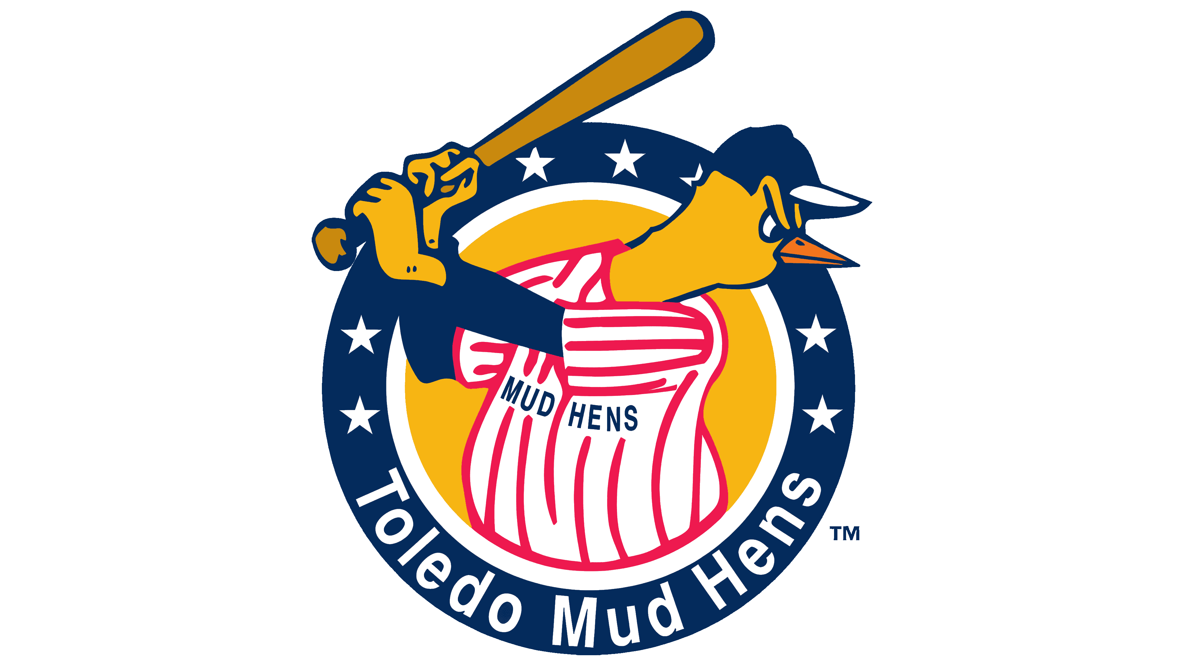
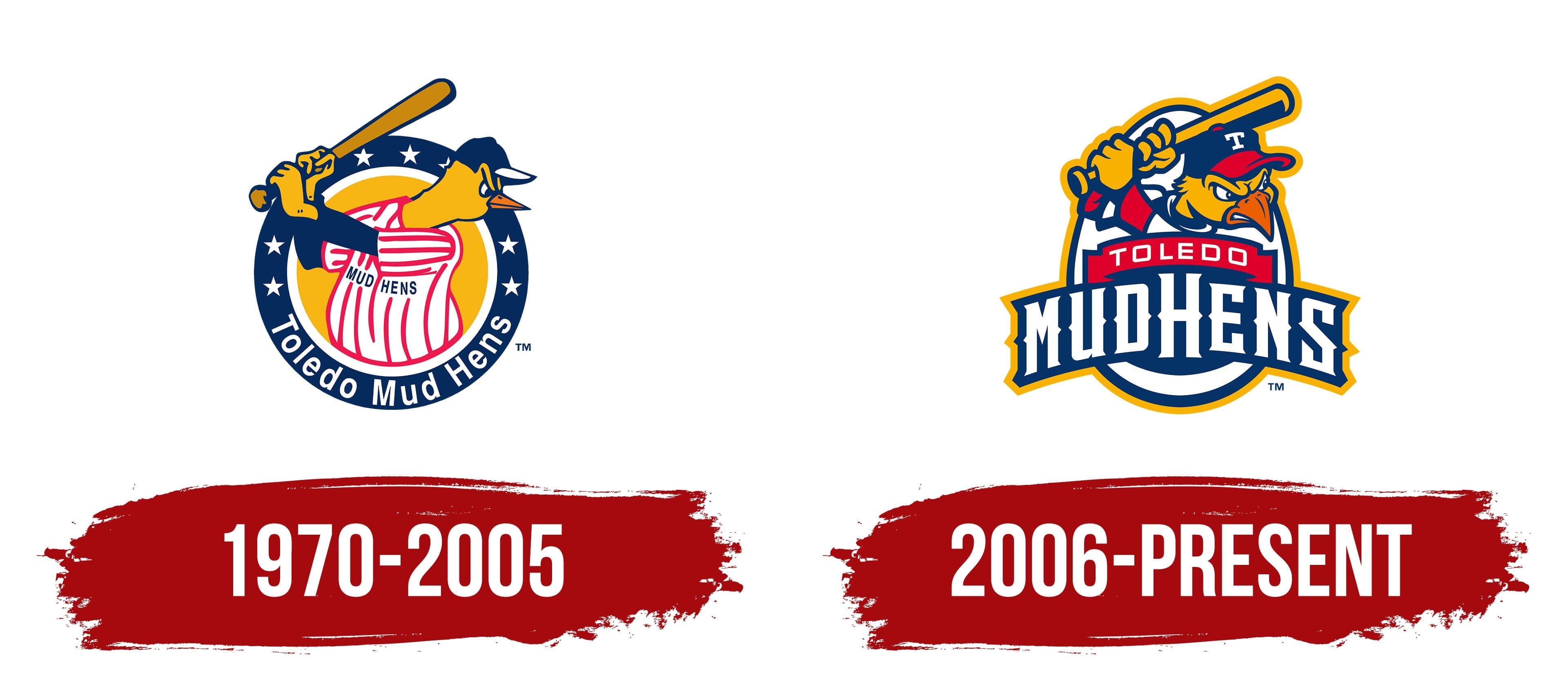
The Toledo Mud Hens logo features a yellow chicken in a baseball uniform, directly referencing the team’s name, which the real marsh bird, the mud hen, inspires. The emblem was playful yet distinctly baseball-related.
The chicken appeared in a batting stance, holding a baseball bat and wearing a striped uniform with the words “Mud Hens.” The color palette featured dark blue, red, white, and yellow, traditional team colors that reflected the American baseball spirit.
The character was encircled by a dark blue ring with white stars, representing regional pride and the team’s athletic ambitions. The team’s name was written in a simple sans-serif font, common in late-20th-century sports logos.
This logo was used for 35 years, establishing the chicken as the official mascot and iconic symbol for the minor-league baseball club.
2006 – today
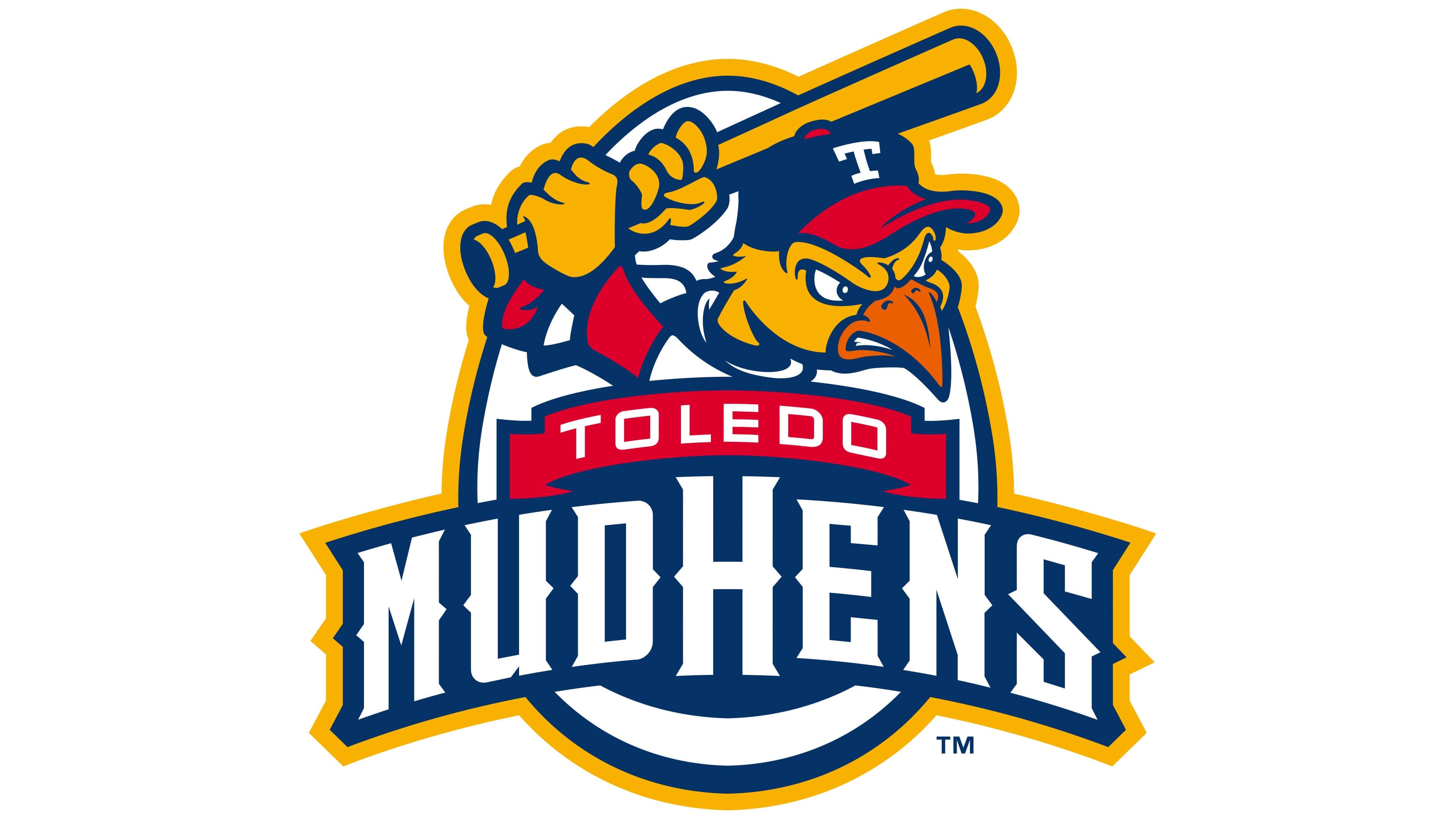
After the Toledo Mud Hens logo update in 2006, the team received a symbol that was completely different in spirit and now much more accurately reflects the club’s competitive mindset. Replacing the previous, rather neutral bird was an aggressive character with a clear challenge in its eyes. The bird holds a bat raised for a powerful swing, and the image’s sharp lines and details emphasize the team’s fighting spirit.
The background features an egg-shaped shape, which connects to the club’s name. This symbol is drawn with a double border: a thin blue inner line and a wide yellow outer line. It highlights the character and gives the image a sense of completeness.
The name “MUDHENS” is rendered in heavy white serif letters on a dark blue background, echoing the style of Varsity and Jersey M54 typefaces. The lettering follows an arc, adding volume to the mark. Above the main name is the city name “TOLEDO”, set in a simple sans-serif typeface on a red ribbon.
Despite the major changes, the team retained its familiar colors: dark blue, red, white, and yellow. They have long been an integral part of the club’s visual culture. The cohesive, bold logo style shows that the Toledo Mud Hens are ready for tough, uncompromising play on the field.