


![]() Kansas City Royals (KC Royals) Logo PNG
Kansas City Royals (KC Royals) Logo PNG
Professional baseball players always emphasize their noble heritage. The Kansas City Royals logo reflects the royal spirit and imperial grandeur through a medieval flag bearing a crown. The noble palette of gold and dark blue also conveys a sense of high prestige.
The history of the Kansas City Royals dates back to 1969, when the franchise was created following the Kansas City Athletics’ departure in 1967. For the first time since 1883, the city had no major league team, which led to political pressure on the league to restore a franchise.
Ewing Kauffman, a pharmaceutical entrepreneur, secured the rights and organized a naming contest that drew over 17,000 entries. The chosen name, Royals, referred to the long-running livestock and horse show held in Kansas City since 1899, rather than any royal theme.
Kauffman focused on shaping a distinct identity. He worked with Hallmark Cards, but early concepts relied heavily on cattle imagery, which he rejected. A design competition among selected artists followed, and Shannon Manning’s minimalist concept was chosen.
The original logo combined a shield with the letters “KC” and a crown above it. Unlike many sports marks of that period, it avoided complex illustration and relied on a restrained composition, which required only minor updates over time.
After Kauffman died in 1993, the franchise was managed by the Greater Kansas City Community Foundation. In 2000, David Glass became the sole owner after purchasing the team for $96 million, stabilizing ownership after a transition period.
Across later decades, the visual identity remained consistent. The light blue shield, white lettering, and gold crown remained central, with only subtle refinements, preserving the structure established at the club’s creation.
Meaning and History
![]()
The Kansas City Royals are a baseball team that, from the very beginning of their franchise, has been completely satisfied with their logo. Over half a century of its existence, it has hardly changed, making only minor adjustments that have not affected its shape or elements. The successful variation was developed by the Hallmark Cards studio, particularly by artist Shannon Manning. His concept proved to be winning, although unusual for the late 60s of the last century.
What is Kansas City Royals?
The Kansas City Royals are a baseball team that was formed as an American League franchise in the late 1960s and began play in 1971. It has participated in the World Series four times, showing excellent results, winning two “Commissioner’s Trophies.” In 1994, the club moved to the AL Central.
1969 – 1978
![]()
The original logo belongs to Hallmark Cards, which was founded in Kansas City in 1910. Variants of the emblem were presented by 15 artists, each of whom developed a unique concept for the logo to appear on uniforms, jackets, and promotional products. The winning emblem was proposed by Shannon Manning, a fan of the “Chicago White Sox.” The image was simple and understandable, and very reminiscent of the style popular in the 1960s. It featured a blue shield topped with a minimalist golden crown. Inside the blue shield was a large, ultra-white capital letter “R” and the initials “KC” in gold. The full name “Royals” was located under the main logo. Manning’s modern, minimalist work served as an excellent prototype for subsequent franchise emblems.
1979 – 1985
![]()
In 1979, the “Kansas City Royals” made minor changes to the emblem. The word “Royals” at the bottom was highlighted in a font, underlined, and written in lowercase. The emblem’s color was changed from gold to blue.
1986 – 1992
![]()
In the 1986 version, the word “Royals” became larger compared to the shield, which, conversely, became smaller. These changes gave the Kansas City Royals emblem a more expressive and memorable look.
1993 – 2001
![]()
The “Kansas City Royals” team made another minor change to its emblem. This time, they changed the bright yellow color to a brighter golden color.
2002 – 2018
![]()
In 2002, the capital letter “R” on the shield was removed, and the focus shifted to the initials “KC,” written in white. The inscription “Royals” at the bottom of the logo remained the same.
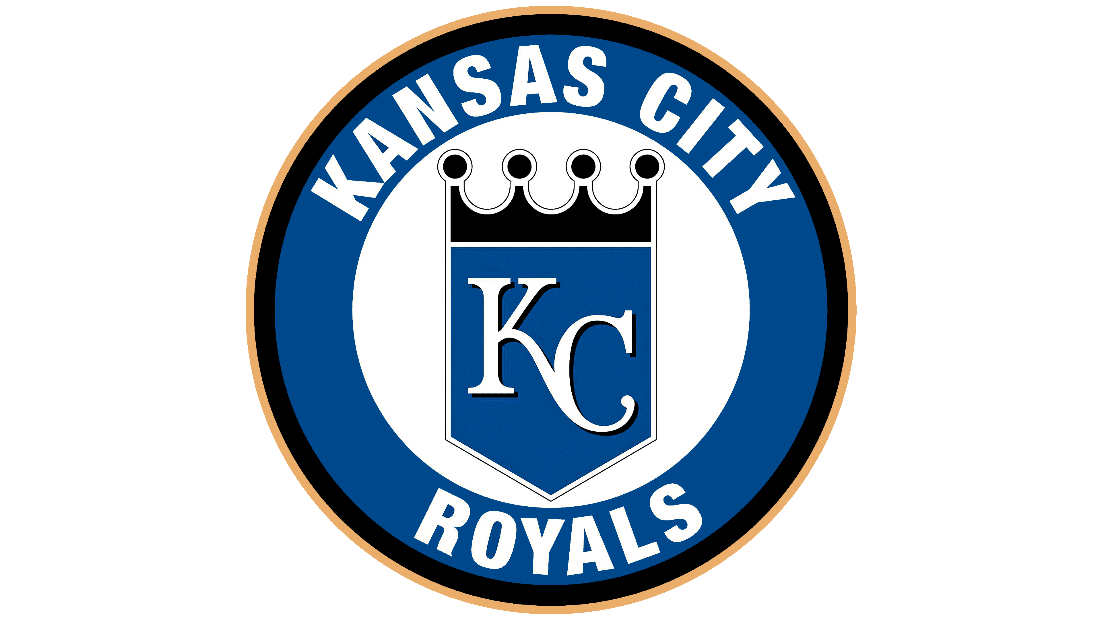
2019 – today
![]()
The modern version remains the same as at the dawn of the team’s history, in 1969. The only change was replacing the letter “R” with “KS.” Also, a couple of minor details were corrected, but the scheme remained unchanged. Now, the emblem resembles a knight’s flag or shield, with the franchise’s name abbreviation written in white on a blue background. At the top is the main monarchical attribute, indicating noble beginnings.
The figure has strict geometric lines and consists of five straight sides, forming a sharp angle at the bottom. The golden crown is slightly removed and has four rounded peaks, resembling baseballs.
Font and Colors
In the debut version, the knight’s flag featured all the letters of the club’s name: in the center was a large letter “R” with a curved leg protruding forward, and above it on the right, “KS.” They meant the words “Royals” and “Kansas City”. The royal symbol was bright yellow, and beneath it was the second part of the team’s name, executed in a strict style. Later, priorities shifted, and the inscription became handwritten with rounded letters. Its placement also changed: previously, the word was strictly horizontal, but later it became vertical, shifted upward.

In the earliest version of the logo, a classic geometric font is used, with minimal inter-letter spacing and distinct serifs at the ends. It was then transformed into handwritten text with a dense set of characters, except for “R”: the capital letter is set in a round cap and separated from the lowercase letters, so it stands apart. “S” has no upper clearance.
The official team palette consists of royal blue #004687, powder blue #7AB2DD, golden #C09A5B, and white #FFFFFF. Of these, only blue is absent from the emblem.
FAQ
What does the “Kansas City Royals” emblem represent?
The “Kansas City Royals” emblem is renowned for its stability. Over half a century, it has hardly changed: the current version, like the very first, contains a quadrangular heraldic shield with a pointed base. This product uses royal blue. Inside is a monogram of white handwritten letters, KC, and a dark gold crown at the top.
Why is Kansas City the Royals?
Contrary to tradition, the Kansas City team is called the “Royals,” not because of its connection to the royal family. It’s a tribute to the local event, American Royal, which has been held in the city since 1899. It features rodeo, barbecue competitions, horse shows, and other domestic livestock exhibitions. The name of the baseball club was chosen in 1968 from 17,000 entries submitted to a contest.
Are the Royals in Kansas or Missouri?
The “Kansas City Royals” are based in Kansas City, Missouri. The club has been based there since 1969 and has never moved, unlike its predecessors. Note that Kansas City and Kansas State are not the same. These two terms should not be confused, as they refer to different territories.
Where did the Kansas City Royals come from?
The Kansas City Royals are based in the state’s largest city. It appeared after its predecessor, the Kansas City Athletics team, moved to Oakland and became known as the Oakland Athletics.