The pirate spirit is evident in everything, from the block glyph form to the sharp design. Thus, the team demonstrates its professionalism and roots – where it comes from. Therefore, the Pittsburgh Pirates logo is minimalist but understandable, as it’s the first letter of the team’s name.
Pittsburgh Pirates: Brand overview
| Founded: | 1882 |
| Founder: | Bob Nutting |
| Headquarters: | Pittsburgh, U.S. |
| Website: | mlb.com |
The Pittsburgh Pirates are an American professional baseball team that emerged in 1882. The club has been part of MLB since 2000 and represents the NL Central Division. Until 1886, it was part of the American Association. The club is located in Pittsburgh, Pennsylvania.
The club’s foundation was laid a year before its official registration – on October 15, 1881, with the emergence of the “Allegheny” franchise. At that time, Allegheny City was a separate settlement, so initially, the group of baseball players was named in its honor – as the center for conducting games. After joining the National League, the team received the name Pittsburgh Alleghenys. This happened in 1887, during Denny McKnight’s last term.
Today’s name appeared a little later and is related to the dissolution of the Players League in the 1890s. That year, Pittsburgh’s management signed a contract with Lou Bierbauer, a club member. According to one of the sports commentators, the franchise captured him piratically. Thus, it was nicknamed “pirates.” Over time, the nickname turned into the brand name – Pirates. This occurred under William A. Nimick, who owned the sports group until 1891.
Then came two owners – William Kerr and Phil Auten. In 1900, they were replaced by Barney Dreyfuss. After 32 years, the club passed to William Benswanger and then (in 1946) to John W. Galbreath. Eventually, he faced financial difficulties, and in 1985, the team was owned by a local organization – Pittsburgh Associates. It reached Robert Nutting, the current owner, in 2007 from Kevin McClatchy.
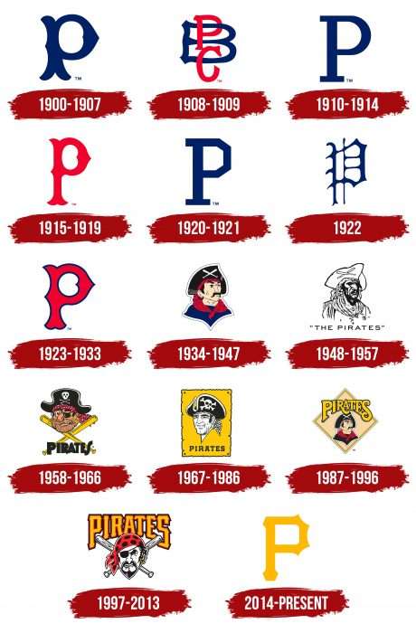
Over nearly 140 years, the club has used 18 diverse logos. The constant shift towards the “P” proved to be beneficial. Today, this symbol is well-recognized and patented by the team. The boom of various versions of the letter occurred from 1900 to 1935. During this time, the franchise managed to change eight logo modifications.
Meaning and History
The Pittsburgh Pirates’ commitment to lettering is astounding: for over a century, half of the club’s emblems were based on the single sign “P.” The sign is used in various versions, from classic to Old English, and there is also a multi-letter version. Similarly, the depiction of a pirate is portrayed in different styles.
What is Pittsburgh Pirates?
The “Pittsburgh Pirates,” formerly known as “Allegheny” and “Pittsburgh Allegheny,” began their activity as an American Association franchise in 1881, but six years later moved to the National League. Thanks to numerous victories, the team plays in NL Central and is considered one of the best. PNC Park became the “Pirates'” home stadium in 2001.
1900 – 1907
The first logo of the “Pirates” appeared in 1900. It’s a blue Old English letter “P,” which simultaneously signifies Pittsburgh and the team’s name – “Pirates.”
1908 – 1909
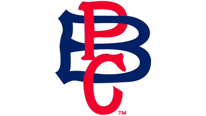
In 1908, the club first used a logo consisting of three letters. Over the red-printed letter “B,” blue letters “P” and “C” were placed. The monogram “PBC” stands for “Pittsburgh Baseball Club.”
1910 – 1914
The fourth club logo is almost a return to the original variant, where the emblem represents a blue printed letter “P,” signifying the words “Pittsburgh” and “Pirates.”
1915 – 1919
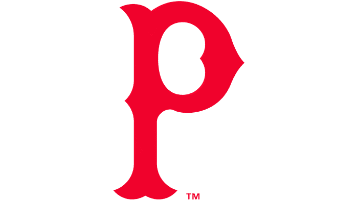
The “Pirates” changed the team’s primary color from blue to red again. The letter “P” now has a more streamlined shape.
1920 – 1921
In 1920, a return to the classic red printed letter “P,” denoting the team’s name.
1922
In 1922, the “Pirates” completely changed the style of the letter “P.” It’s done in Old English font, adorned with details and hooks.
1923 – 1933
The club has a new design for the letter “P,” signifying the city of Pittsburgh. The message is executed in red in a streamlined style with the addition of a thin dark blue outline.
1934 – 1947
A logo appeared without the letter for the first time in the club’s history. It depicted a cartoonish pirate portrait in a black hat with crossed white baseball bats. The pirate’s neck is adorned with a red bandana, and in front, a gold earring is visible in his ear. The “Pirates'” logo hero is also dressed in a blue shirt.
1948 – 1957
1958 – 1966
Again, the “Pirates” logo is an animated pirate with stubble in a black pirate hat and an eye patch. The character has two gold earrings in both ears and under the hat, a red bandana is visible. Below the pirate’s head are two crossed yellow bats and the word “Pirates” written in black. Pittsburgh Press artist Jack Berger Sr drew this emblem.
1967 – 1986
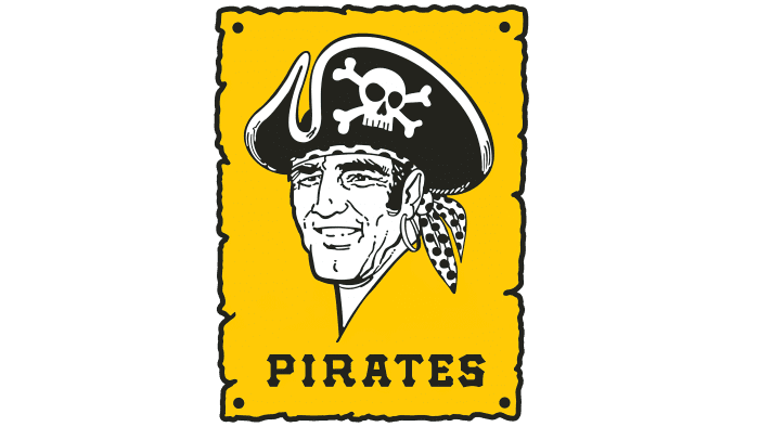
This illustration was created by Bob Gessner, who also created the emblem for one of the NHL’s “Pittsburgh” teams. The new pirate is depicted against a background of yellow papyrus. He looks friendlier, still wearing a black pirate hat. Below is the word “Pirates” in black.
1987 – 1996
The Pirates brand was refreshed in 1987. At its core is a yellow diamond, and inside is a cartoonish portrait of a pirate in a black hat and black doublet. The team name is in yellow, with the addition of a black outline.
1997 – 2013
The penultimate club logo featured a large yellow “Pirates” inscription, below which was the head of a pirate. The character’s head is adorned with a red and black bandana, a black patch over the right eye, and an earring in the left ear. Behind him are two crossed baseball bats.
2014 – today
The management decided to revert to the emblem approved at the beginning of the baseball players’ careers—a single “P.” For this, the developers used the Old English alphabet, making the symbol as modern as possible. The yellow letter has four spike-like crests at the top, an elongated leg, a rectangular space, parallel lines, and serifs.
This logo first appeared in 1900 and returned in 2014, preserving the stylish sign of visual identity. It refers directly to two words from the franchise’s name: “Pittsburgh” (the location) and “Pirates” (the baseball players’ nickname).
Pittsburgh Pirates: Interesting Facts
The Pittsburgh Pirates are a famous baseball team with a lot of history and pretty cool stories.
- How They Started: The Pirates began in 1887, first called the Pittsburgh Alleghenys. They got the name Pirates in 1891 because they aggressively got players from other teams.
- First Big Win: In 1909, they won their first World Series by beating the Detroit Tigers, with star players like Honus Wagner and Ty Cobb.
- Famous Players: They’ve had some amazing players like Honus Wagner, Roberto Clemente, and Willie Stargell, all remembered as some of the best in baseball.
- Roberto Clemente: Clemente is a hero both on and off the field. He played all 18 years of his career with the Pirates and sadly died in a plane crash while helping earthquake victims in 1972. Baseball now gives an award in his name every year.
- 1971 World Series: They won this series against the Baltimore Orioles, and Game 7 was historic because it was the first time a World Series lineup was all Black and Latino players.
- 1979 “We Are Family”: The 1979 team, led by Willie Stargell, was known for its team spirit and the song “We Are Family.” That year, it came from behind to win the World Series.
- PNC Park: Since 2001, PNC Park’s stadium has been loved for its great views of Pittsburgh and fan-friendly design.
- A Big Scandal: In the early 1980s, some Pirates players were involved in a big drug scandal, which led to changes in how baseball handles drug use.
- Pitching Feats: Dock Ellis once pitched a no-hitter in 1970, and he said he did it while on LSD. John Candelaria threw the only perfect game in the team’s history in 1976.
- The Homestead Grays: The Pirates have a connection to the Homestead Grays, a successful Negro Leagues team. The Pirates honor them by wearing their uniforms sometimes.
The Pirates’ story includes big wins, amazing players, and important moments that have made a big mark on baseball.
Font and Colors
The club’s symbolism is divided into two large categories: with the letter and with a pirate. The first version was initially used, where the sign was played in the most different styles. This continued until 1934 when a pirate’s image appeared on the logo.
He also repeatedly changed and was redrawn. He was outlined, monochrome, realistic, cartoonish, funny, and serious. In addition, the image of the Corsair was always accompanied by text. From 1934 to 1997, the pirate was drawn in a cocked hat and later – in a bandana. Some versions also contained crossed baseball bats.
The Pittsburgh Pirates team’s font was created from scratch and named MLB Pirates. The developers suggested large glyphs with a black-and-white outline for the full inscription. In the modern emblem, only two official colors are used: gold (letters) and white (background). Black is present in the extended club name, sometimes accompanied by a symbol.
Pittsburgh Pirates color codes
| Black | Hex color: | #000000 |
|---|---|---|
| RGB: | 0 0 0 | |
| CMYK: | 0 0 0 100 | |
| Pantone: | PMS Process Black C |
| Gold | Hex color: | #fdb827 |
|---|---|---|
| RGB: | 253 183 36 | |
| CMYK: | 0 24 94 0 | |
| Pantone: | PMS 123 C |
FAQ
What does the “Pittsburgh Pirates” emblem represent?
A large orange letter P was adopted as the Pittsburgh Pirates logo 2015. It symbolizes the club’s official nickname and the city where it’s based. The rounded letter P is adorned with four spikes, resembling a knuckle duster and triangular serifs at the top and bottom. Such a design demonstrates the baseball team’s readiness for a fierce fight with opponents.
What does the letter “C” on Pittsburgh Pirates hats signify?
In sports, the letter “C” is usually depicted on the captain’s headwear so he can be easily distinguished from other players on the field. And speaking of the emblem that was depicted on the hats of the “Pittsburgh Pirates” in the late 1800s, the letter “C” denoted the word “Club.”
Which NFL team has a pirate logo?
None of the NFL teams currently have a classic pirate logo. The Las Vegas Raiders’ emblem features a stylized raider in a football helmet and an eye patch. The Tampa Bay Buccaneers have a pirate flag with a skull, sabers, and a ball.
Why are the “Pittsburgh Pirates” called “Pirates”?
The “Pittsburgh Alleghenys” began luring foreign players and signing contracts with them. Representatives of the American Association condemned its actions, comparing the club’s workers to pirates. This nickname stuck, and in 1891, it was adopted as the official name of the “Pittsburgh Pirates.”

