![]() Brazil Logo PNG
Brazil Logo PNG
Like the Brazilian Football Confederation emblem, the Brazil logo symbolizes loyalty to long-standing traditions and embodies the team’s cultural heritage. Its elements reflect the game’s dynamism and energy, and its colors convey pride in the home country.
The Seleção Brasileira de Futebol, also known as Brazil, debuted in 1915. Shortly before that, in 1914, the organization Federação Brasileira de Sports was created, which has since been called the Confederação Brasileira de Futebol. It took over the team’s management and control over its visual identity. Under its management, the athletes won several Olympic medals, received many FIFA cups, and became world champions five times.
Since their first match in 1914, the Brazilian national football team, or the Seleção, has been on a mission to reach the pinnacle of football. After a tough 3-0 defeat to Argentina, they didn’t let it slow them down. Instead, they rose quickly, hinting at the start of their legendary status in the football world.
Pelé, just 17 years old at the 1958 World Cup, led Brazil to a historic win, introducing “jogo bonito,” the beautiful game, to the world. This wasn’t just a win but the start of Brazil’s reign over world football. The 1962 World Cup saw them defend their title, proving their excellence wasn’t a one-time event. The 1970 World Cup is often seen as their crowning achievement, with a team that played football so beautifully it captivated the entire world.
Despite a tough period, Brazil returned strong in 1994 with stars like Romário and Bebeto, and again in 2002, led by Ronaldo, Ronaldinho, and Rivaldo, securing their fifth World Cup win. These victories, nine Copa America titles, and four Confederations Cups show Brazil’s dominance in the sport.
The best in the game have worn the yellow and green jersey: Pelé, Garrincha, Zico, Socrates, Romário, Ronaldo, and Neymar. Each has left a mark, contributing to the Seleção’s rich history. Even the heartbreaking 7-1 loss to Germany in the 2014 World Cup couldn’t tarnish Brazil’s legacy. Instead, it reminded everyone of the highs and lows in the pursuit of greatness.
Brazilian football represents more than just a team; it celebrates skill, creativity, and an undying spirit. The Seleção is admired for its achievements and the joy and beauty it brings to football, inspiring fans worldwide.
Meaning and History
![]()
Most of the Confederação Brasileira de Futebol logos have a uniform design, differing only in the number of stars, as the Brazilian team won the World Cup. In the 1980s, the era of sports marketing began when emblems became a means of communication with fans. The visual sign of the CBF was slightly stylized but still retained traditional elements: a shield, a Maltese cross, and an inscription.
What is Brazil?
Brazil is the short name for Seleção Brasileira de Futebol. It is a team that represents Brazil in international FIFA and CONMEBOL competitions. It has won several World Cups, FIFA Confederations Cups, and Copa América. Its governing body is the Brazilian Football Confederation.
1914 – 1916
![]()
The governing body of Brazilian soccer was established in 1914 as the Federação Brasileira de Sports, so the logo from that time features the blue letters “FBS.” The abbreviation is inside a pointed shield, trimmed by two inverted arcs at the top. All glyphs are uppercase and written in the same font with triangular serifs, but they differ in size: “B” is much taller than “F” and “S.” This makes the center of the emblem appear convex. The inner part of the shield is painted white, with a thin blue stripe along the edge.
1916 – 1917
![]()
When the confederation changed its name to Federação Brasileira de Futebol, the center of its logo featured the black abbreviation “FBF.” The letters are in uppercase, serifed, and set inside a yellow stripe running through the middle of a green shield with a fancy shape. The bottom of the base remains pointed, but the top now has two rectangular protrusions with smooth curves on the sides. The shield is outlined by two lines: white and black.
1917 – 1938
![]()
The emblem acquired a more streamlined shape, with rounded corners; only the shield’s narrowing bottom remained pointed. At the top, a rounded elevation appeared, which has since been present in most of the Brazilian Football Confederation’s logos. In the center is a white Maltese cross consisting of four trapezoids. It contains the abbreviation “CBD,” formed from the new name of the sports association: Confederação Brasileira de Desportos. The rest of the logo’s space is painted blue and divided into four parts by green perpendicular stripes with yellow edging. The shield has a wide white frame outlined by a thin blue contour.
1938 – 1950
![]()
Designers enlarged the Maltese cross and stretched the letters vertically to make the blue inscription more noticeable. They removed the logo’s outer frame.
1950 – 1954
![]()
In this version, the shield’s side protrusions have sharp angles, and the “CBD” abbreviation is even larger. A barely noticeable silver stripe runs along the edge of the emblem.
1954 – 1958
![]()
The logo creators outlined bright orange and changed the Maltese cross, reducing the gaps between its protrusions. They also refined the font, aligning the side parts of “C” and “D” vertically.
1958 – 1962
![]()
The shield’s design changed slightly: the curves at the bottom became more pronounced. The line running along the outside of the emblem is now thin and yellow.
1962 – 1966
![]()
The top part was a regular arc without sharp height variations. The Maltese cross was moved slightly higher, and the inscription was reduced.
1966 – 1968
![]()
Designers again changed the top of the shield, making smooth indentations along the edges. They also rounded the corners of the eight-pointed cross and aligned its protruding parts.
1968 – 1971
![]()
The version from 1954-1958 returned, where the shield has a noticeable orange outline. The only difference is in the shape of the letters: they are now smaller, and the left side of “C,” which was previously aligned vertically, acquired a smooth curve.
1971 – 1976
![]()
The logo was vertically elongated, outlined with a wide yellow stripe and a thin orange edging. Pronounced indentations appeared on the sides, making the shield more elegant. The gaps between the four parts of the Maltese cross became smaller, resembling a square with notches at the corners. Three five-pointed green stars are depicted at the top. They represent the Seleção Brasileira de Futebol’s victories at three World Cups: Sweden (1958), Chile (1962), and Mexico (1970).
1976 – 1980
![]()
Orange was used instead of yellow, and a dark green line was drawn along the shield’s edge. The indentations of the eight-pointed cross were again enlarged.
1980 – 1985
![]()
The shield is completely blue and set in a white-blue two-stripe frame. Inside is an image of the golden Jules Rimet Trophy, a circle with the Café do Brasil brand emblem (sponsor of Seleção), and three coffee beans under green leaves. The logo also features two inscriptions: the white abbreviation “CBF” (derived from the new name of the sports association, Confederação Brasileira de Futebol), and the green word “Brasil.”
1985 – 1991
![]()
Fans were outraged that the shield featured the Café do Brasil mark, so FIFA President Joao Havelange forced CBF to remove the circle with the coffee beans.
1991 – 1994
![]()
The traditional shield design with yellow and green stripes returned. In the center, as usual, is a Maltese cross, now bearing the inscription “CBF” and shaped like two crossed spools of thread.
1994 – 1999
![]()
In 1994, a fourth star was added to the logo, representing Seleção’s victory in the World Cup Championship held in the USA. The corners of the central cross are cut off. Also, the lower word “Brasil” changed font: the letters became slightly thinner and wider.
1999 – 2002
![]()
Designers restored the corners of the Maltese cross but rounded the sharp edges of the heraldic shield and widened its blue outline. The font used in the 1991 emblem was brought back.
2002 – 2010
![]()
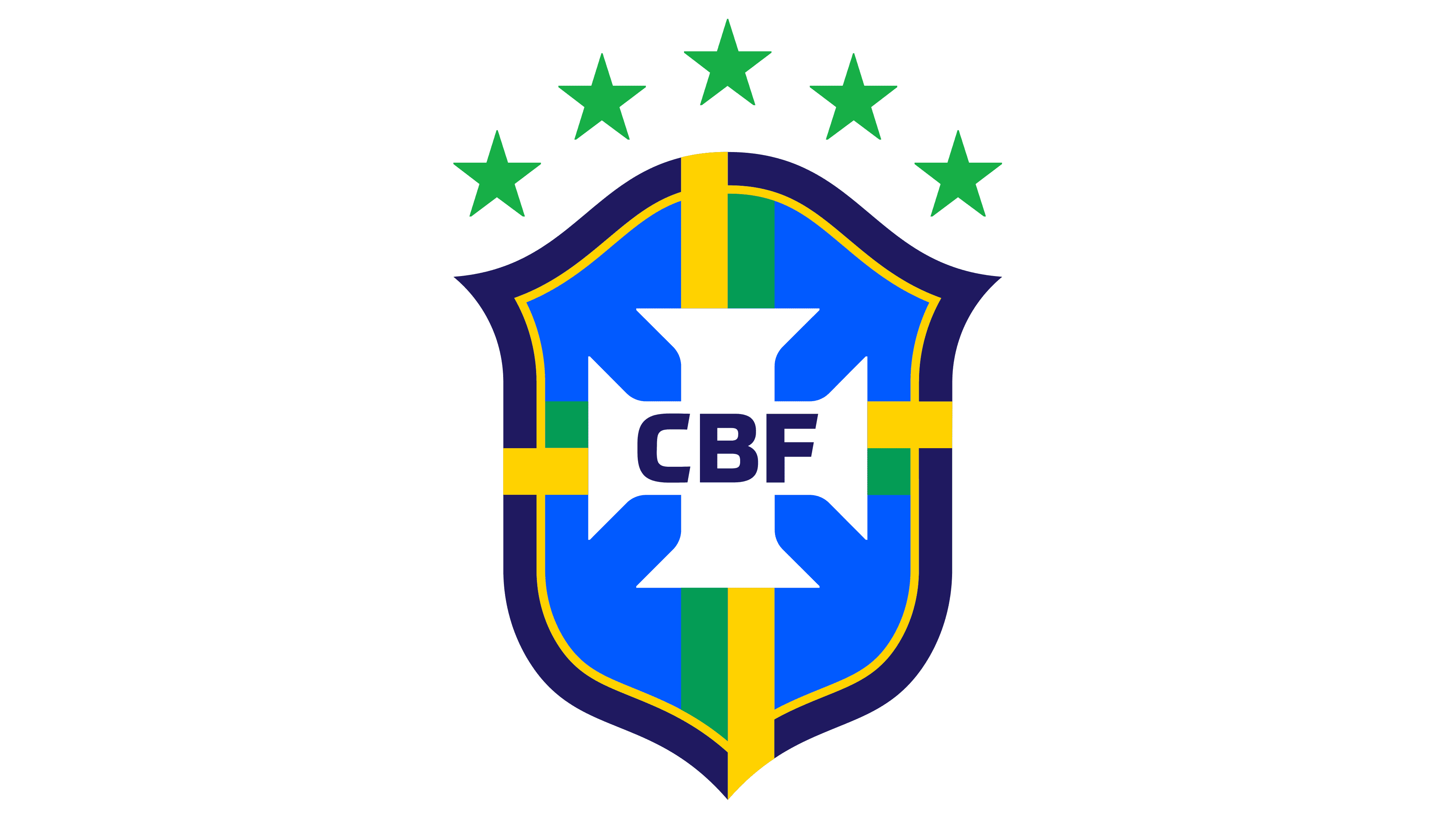
In 2002, the Seleção won the World Cup in Japan/Korea, so the governing body of Brazilian football proudly added a fifth star to its logo. Meanwhile, the blue line drawn along the shield’s edge again acquired sharp angles.
2010 – 2014
![]()
The emblem gained an additional contour in dark gold. The green word “Brasil” was enlarged to visually balance the arc of stars.
2014 – 2016
![]()
Designers removed the outer contour of the shield, eliminated the lower inscription, and repainted the yellow elements in dark gold.
2016 – 2019
![]()
In 2016, the 2010 logo was reintroduced, but without the dark gold outlining.
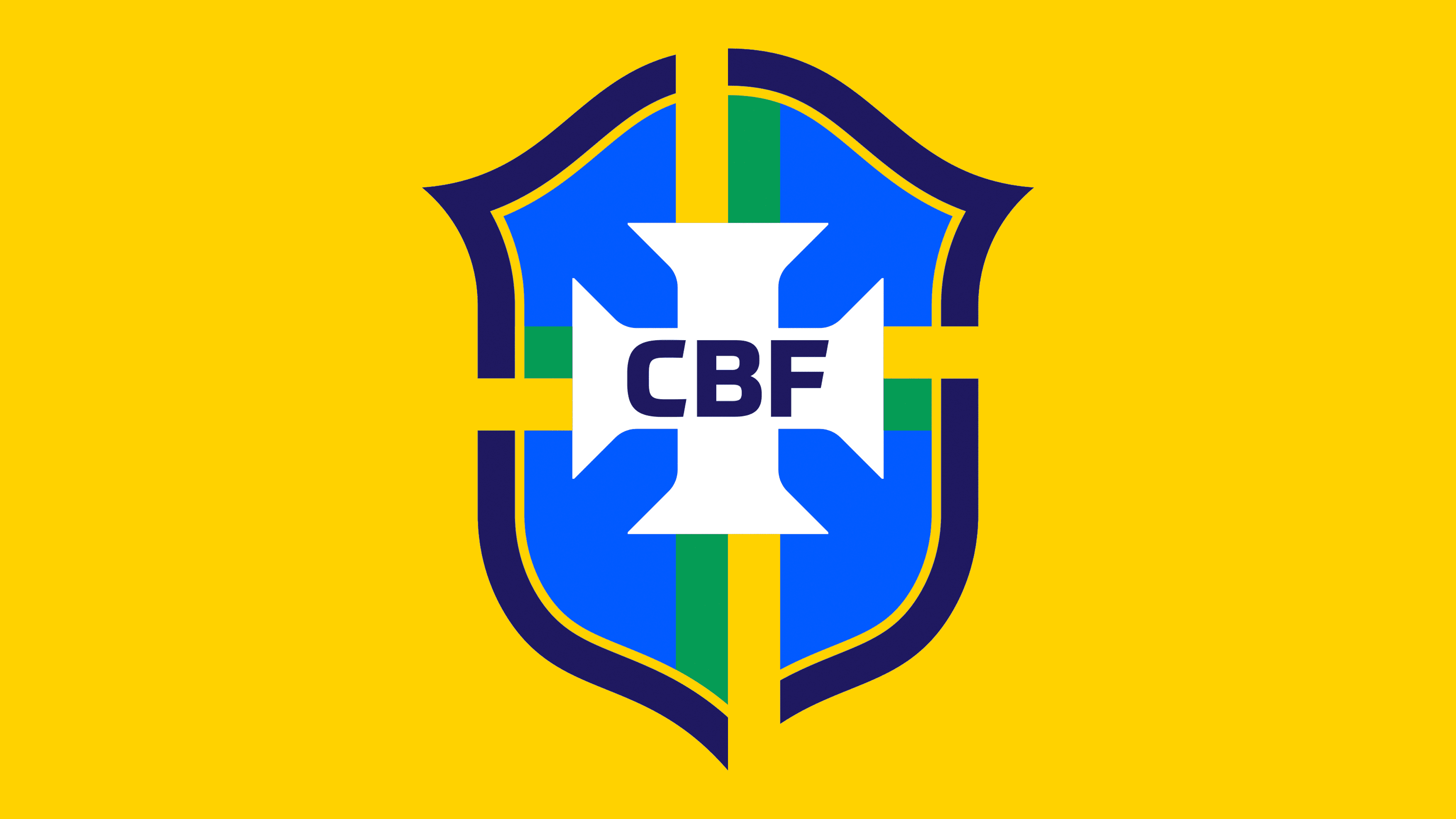
2019 – today
![]()
In April 2019, the Brazilian Football Confederation unveiled a new identity. The agency Dalton Maag reworked the emblem, preserving the main elements: shield, stars, white Maltese cross, and inscriptions. The font became more harmonious and soft, and the colors acquired brighter, richer shades. The shield is still divided into four parts by perpendicular stripes, but now they are doubled: yellow and green. The yellow fragments stretch to the very edge, overlapping the outer contour of the logo.
Font and Colors
The country’s name and the abbreviation “CBF” are written in a bold sans-serif font created by the typographic studio Dalton Maag. The ends of some letters are cut at a sharp angle.
The logo’s colors correspond to the palette of the Brazilian national flag: white (#FFFFFF), dark blue (#193375), yellow (#FFDC02), and green (#19AE47). However, the designers added another shade of blue (#0C87D1), lighter and brighter.