IEI Logo

IEI LogoIEI Logo PNG

The IEI logo expresses simplicity and clarity. Its shape conveys confidence and reliability, creating an image of professionalism and technological expertise. All design elements demonstrate attention to detail and adherence to high standards.

IEI: Brand overview

IEI, short for Industrial and Enterprise Internet, is a tech company based in China known for its expertise in industrial embedded computing and automation products. The company was established in 1995 and headquartered in Taipei, Taiwan.

IEI offers products catering to various industries, such as automation, transportation, and smart cities. Its product lineup encompasses industrial motherboards, computers, servers, panels, and IoT gateways. The primary sectors the company targets include Transportation, Factory Automation, IoT, and Machine Vision.

The firm serves vertical markets spanning factory automation, intelligent transportation, smart grid, gaming, medical, and digital signage. Its reputation is firmly established, being recognized as one of the top three manufacturers of industrial motherboards globally.

IEI operates research, development, and manufacturing facilities in Taiwan, Shanghai, and Houston. The company collaborates with leading firms like Intel, NVIDIA, Advantech, and Cisco as part of its partner ecosystem. Intel has previously bestowed awards upon IEI, recognizing it as a leading supplier of embedded boards and systems.

The company boasts a 20% global market share in industrial motherboards. As of 2018, IEI’s annual revenue was estimated at around $200 million, showcasing its significant presence in the industrial technology sector.

Meaning and History

IEI Logo History

What is IEI?

This Taiwanese manufacturer of industrial computers and components focused on developing reliable solutions for embedded systems and industrial automation. The product range includes servers, industrial motherboards, panel PCs, storage systems, and specialized devices for medical equipment. The company designs equipment capable of operating in challenging conditions such as dust, vibration, and high temperatures. The product line also includes systems used in the transportation sector, including surveillance systems and onboard computers.

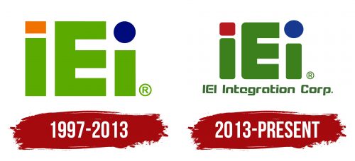
1997 – 2013

IEI Logo 1997

2013 – today

IEI Logo

The logo of IEI Integration Corp. features a text-based abbreviation designed concisely and expressively. The main inscription, “IEI,” is rendered in a deep green shade. At the center of the composition is a large letter “E,” flanked on both sides by smaller “i” characters. This arrangement creates a sense of harmony and balance in the composition.

Above the left “i” is a red geometric shape of a square with softly rounded corners. Above the right “i” is a blue circle. The different shapes of these two elements bring liveliness and variety to the design, creating a sense of motion and development. The rounded outlines of the letters and shapes give the entire logo a unified and modern look.

Below the main abbreviation is the full company name — “IEI Integration Corp.” The text is set in a sans-serif typeface with a slight forward slant, visually associated with forward direction and progress. A distinctive feature of the font is the presence of small breaks in the letter contours, resembling engineering stencils and industrial aesthetics. The green color emphasizes the company’s focus on growth and technology.

The red square adds energy and brightness to the logo, while the blue circle conveys stability and calm. The contrasting colors and shapes reflect the innovative spirit of the company. The green text is logically connected with the progressive nature of the brand’s activities and technological development.

The logo successfully combines the individuality of each element with a cohesive overall impression. The full company name completes the composition, reinforcing the unified and confident image of the IEI Integration Corp. brand.