The Le Coq Sportif logo is stylish, fashionable, and legendary. It is associated with the bird, a symbol of France, and embodies its reliability, as, under any circumstances, the proud Gallic rooster will sing its morning song and awaken everyone. To ensure customers feel energetic and are charged with positivity and good spirits, the company offers sportswear and other accessories for an active lifestyle.
Le Coq Sportif: Brand overview
| Founded: | 1882 |
| Founder: | Émile Camuset |
| Headquarters: | Entzheim, France |
| Website: | lecoqsportif.com |
Meaning and History
The initiative to create the company’s logo was taken by Roland Camuset, who was Émile’s grandson. He chose a stylized Gallic rooster as the central image, referring to the company’s name and the unofficial symbol of France.
Initially, the emblem with the bird adorned the collars. It was then moved to the chest so that athletes could wear the Le Coq Sportif logo proudly. The design has changed multiple times under various circumstances, but this has not affected the overall concept.
What is Le Coq Sportif?
Le Coq Sportif is a French brand of sportswear and footwear whose history began in 1882. Its products combine functionality and stylish design. The company is an official supplier of equipment for many prestigious competitions, including the Olympic Games and the Le Tour de France cycling race. In recent years, the company has expanded its range of everyday clothing to broaden its customer base.
1948 – 1950
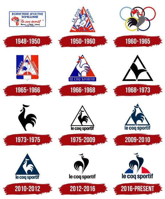
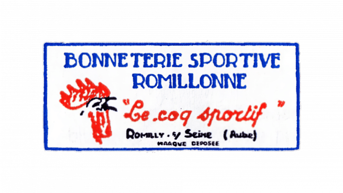
The first emblem looked like a classic label and was embroidered on all types of clothing. Inside the white rectangle were several horizontal inscriptions:
- “Bonneterie Sportive Romillonne” (top)
- “Le Coq Sportif” (middle)
- “Romilly sur Seine” (bottom).
The last phrase was the name of the factory. On the left was a rooster’s head, drawn by Roland Camuset himself.
1950 – 1960
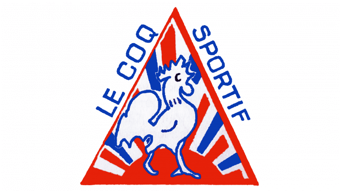
In 1950, the manufacturer registered the Le Coq Sportif trademark. Simultaneously, it modernized the corporate graphic symbol, giving it a triangular shape. The geometric figure represents the family triumvirate at the company’s helm: the daughter, son, and grandson of Émile Camuset. Inside is a full-length rooster against the backdrop of the rising sun. White and blue stripes form the rays. Outside, along the slanted sides of the triangle, the brand name is written, divided into two parts.
1960 – 1965
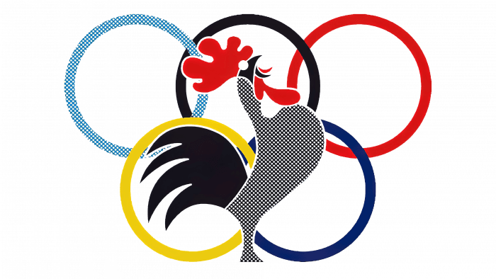
To celebrate the partnership with the French team during the XVII Olympics in Rome, the company released a new emblem. Behind the rooster hides the Olympic flag: five multicolored rings interconnected. This is the brand’s first colorful logo. The palette includes black, red, blue, yellow, light blue, and white.
1965 – 1966
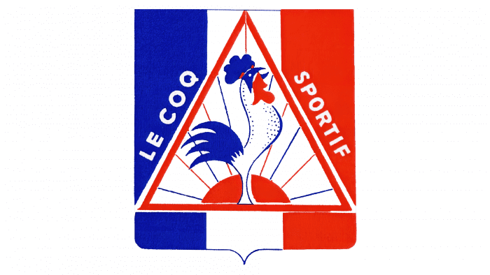
The new graphic is similar to the 1950 version. The proud rooster stands inside the triangle. The background is a rectangular shield with a pointed base and three vertical lines in white and blue.
1966 – 1968
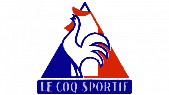
In 1966, the designers removed many details, leaving only the triangle, the brand name, and the bird’s silhouette without legs and head. They also turned the rooster to the left and changed the inscription’s placement. Now, “Le Coq Sportif” is inside a blue rectangle at the bottom of the logo.
1968 – 1973
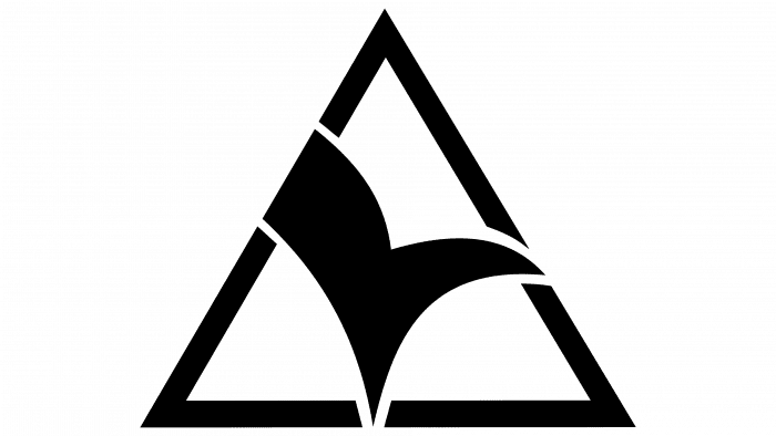
The clothing of the French team participating in the XX Olympics in Munich in 1972 was adorned with an emblem without the usual bird. An abstract figure was drawn in a triangle with a broad blue outline. The bold “tick,” according to the authors’ idea, symbolized the rooster.
1973 – 1975
The designers created a new label specifically for the tennis clothing line. It featured a silhouette of the bird without the classic triangular frame and brand name. But this minimalist variant lasted only two years.
1975 – 2009
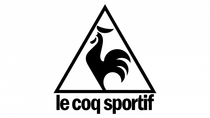
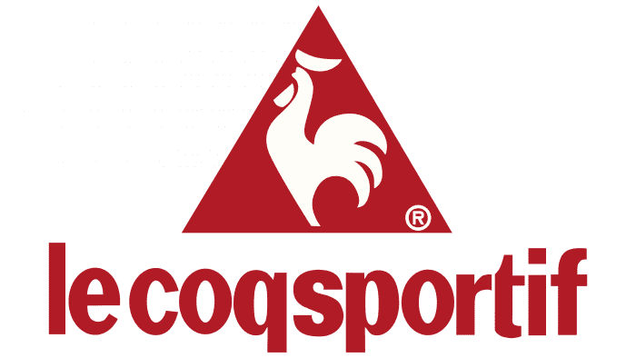
In the 1975 logo, the rooster is in the center of the triangle. The registered trademark is in the right corner. Below the geometric figure is the phrase “Le Coq Sportif.” All letters are lowercase, and the font is typographic.
2009 – 2010
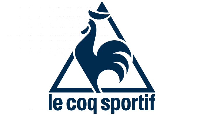
In 2009, the developers enlarged the rooster so much that it no longer fit in the triangle. They also removed the “®” letter, made the contours thicker, and slightly changed the inscription’s shape. The spacing between letters increased, making the symbols easily readable and not merging as before.
2010 – 2012
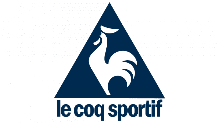
The logo did not undergo significant changes. The only alteration was the background color. Now, it’s dark, and the bird itself is executed on a white background.
2012 – 2016
Ron Arad designed a modern logo. He tried to convey style and dynamism – foundational principles the sports goods manufacturer adheres to.
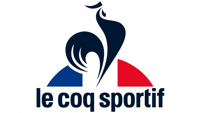
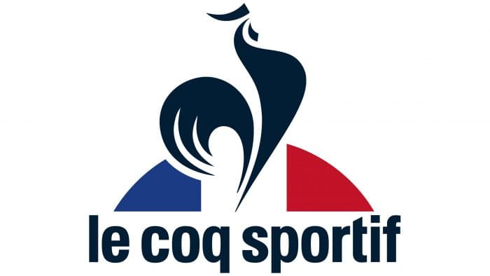
The rooster looks to the right, as it did on logos before 1968. Below is a semicircular figure consisting of three parts. Its fragments are colored in three colors (blue, white, and red), reminiscent of the French flag. The tricolor has long been considered an allegory of freedom. It reflects Le Coq Sportif’s patriotism and indicates the birthplace of the branded products.
2016 – today
To achieve relevance, the logo developers took the previous version and, without changing the drawing style, supplemented it with several elements. They added colors and logic to the image, as the rooster now crows against the backdrop of the rising sun. It’s depicted as a semicircle and consists of the colors of the French flag – blue, white, and red. The designers also adjusted the color of the bird: they removed black and replaced it with dark blue. The build and posture of the Gallic rooster were kept the same, so the symbol perfectly matched the brand name.
Le Coq Sportif: Interesting Facts
Le Coq Sportif is a famous sports brand from France with a long history. It started in 1882 when Émile Camuset opened a small store. The name means “The Athletic Rooster” and is inspired by a French symbol because the brand is proud to be from France.
- How It Began: Émile Camuset started the company over a century ago in France. The rooster in its name is a big deal in France, showing the brand’s strong French roots.
- Famous For This brand has been part of big sports events and teams, making gear for soccer, rugby, cycling, and tennis.
- Big Partnerships: They’re known for sponsoring the Tour de France, a major bike race. They honor the leading racer with a yellow jersey.
- More Than Sports: They also make stylish and sporty clothes, which many people like, not just athletes.
- Eco-Friendly: Le Coq Sportif works hard to be good to the environment, making products that don’t harm our planet.
- Around the World: The brand is in France and many places worldwide, mixing different cultures into its designs.
- Comeback Story: After some tough times, the brand became popular again in the 2000s by making new products and working with other cool brands.
- Beyond Sports: The brand has influenced music, art, and fashion, becoming a favorite in many scenes.
- Team-ups: They’ve made special items by working with artists and other brands, creating unique stuff people want.
Le Coq Sportif’s story is about staying strong, being creative, and always being proud of your origins.
Font and Colors
This brand has an incredible number of logos, each with its individuality. But they have common features: these can be traced throughout the entire evolution of the corporate style. Firstly, it’s the depiction of the main French talisman – the Gallic rooster. Secondly, the traditional combination of blue, black, and white was periodically supplemented with red. Now, the emblem is the most complete, as it contains all the attributes of French national pride.
The emblem uses a font very similar to Helvetica Neue Condensed Bold and Black with some modifications. The inscription is in lowercase and executed with smooth, chiseled letters. The logo’s color filling constantly changed: it was either monochrome or full-color. However, several shades of blue, white, red, and black predominate in the palette. They reflect the hues of the French national flag.
Le Coq Sportif color codes
| Squid Ink | Hex color: | #021e34 |
|---|---|---|
| RGB: | 2 30 52 | |
| CMYK: | 96 42 0 80 | |
| Pantone: | PMS 2965 C |
| Fire Engine Red | Hex color: | #c31328 |
|---|---|---|
| RGB: | 227 212 173 | |
| CMYK: | 0 4 20 7 | |
| Pantone: | PMS 185 C |
| Air Force Blue | Hex color: | #1b3b84 |
|---|---|---|
| RGB: | 27 59 132 | |
| CMYK: | 80 55 0 48 | |
| Pantone: | PMS 288 C |
