Lexmark: Brand overview
| Founded: | March 27, 1991 |
| Headquarters: | Lexington, Kentucky, United States |
| Website: | lexmark.com |
Lexmark International Inc. took its initial steps as an independent organization in 1991, originating from IBM’s microelectronics and printer units, with its headquarters stationed in Lexington, Kentucky. This year also saw the birth of Lexmark’s first range of laser printers, taking advantage of IBM’s advanced printer technologies.
As the decade of the 1990s rolled on, Lexmark carved a niche for itself as a major player in the printer industry, and it did so by regularly launching trailblazing models such as the Optra series of laser printers. Part of Lexmark’s growth strategy during this time involved acquiring other printer-focused companies, like Research Inc., in 1996 and, a year later, the inkjet business segment of Compaq to extend its market footprint and boost its capabilities.
1996 was a notable year for Lexmark as it ventured into the multifunction printer market with its OfficeAll-in-One series. Fast forward to 1999, and Lexmark broke new ground again by introducing the Pinnacle brand’s wireless and cableless inkjet printers, an industry-first.
The dawn of the new millennium saw Lexmark shift its attention toward enterprise content and business process management software. In 2012, Lexmark opted to leave the inkjet printer market behind to concentrate exclusively on laser printers and imaging software. The company then launched its first-ever 4.3″ touchscreen printer powered by Android the following year.
Continuing with its aggressive expansion plan, Lexmark secured the acquisitions of Kofax and ReadSoft in 2015, fortifying its enterprise software offerings. However, in a significant turn of events in 2016, a consortium of Chinese companies, Apex Technology and PAG Asia Capital, purchased Lexmark. Despite this change in ownership, Lexmark has continued its operations, focusing on delivering enterprise-grade laser printers, sophisticated imaging software, and a range of managed print services.
Kyocera’s renowned brand names include, among others, AVX, Elco, Intrepid, Kyoto Ceramic, Noritake, and Kyocera Document Solutions. The company has established strategic alliances with other key industry players like Qualcomm, Boeing, Panasonic, and NTT Docomo to foster technological advancements and growth.
Meaning and History
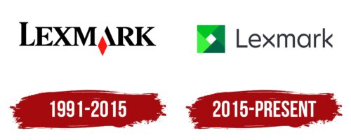
1991 – 2015
2015 – today
Lexmark color codes
| Squid Ink | Hex color: | #32323c |
|---|---|---|
| RGB: | 50 50 60 | |
| CMYK: | 17 17 0 76 | |
| Pantone: | PMS 433 C |
| Erin | Hex color: | #3af23b |
|---|---|---|
| RGB: | 58 242 59 | |
| CMYK: | 76 0 76 6 | |
| Pantone: | PMS 802 C |
| Dark Pastel Green | Hex color: | #00c424 |
|---|---|---|
| RGB: | 0 196 36 | |
| CMYK: | 100 0 82 23 | |
| Pantone: | PMS 354 C |
| Spanish Green | Hex color: | #008a44 |
|---|---|---|
| RGB: | 0 138 68 | |
| CMYK: | 100 0 51 46 | |
| Pantone: | PMS 355 C |
| Bottle Green | Hex color: | #036446 |
|---|---|---|
| RGB: | 3 100 70 | |
| CMYK: | 97 0 30 61 | |
| Pantone: | PMS 3415 C |


