


![]()
Monarch, a company focused on helping people improve their financial well-being, has introduced a refreshed brand identity, complete with a new logo and updated visual style. The rebrand reflects Monarch’s growth over the past four years, evolving alongside its expanding web, iOS, and Android platform features. The updated look supports its mission to simplify money management and help people build habits that lead to lasting, positive change.
The butterfly remains a key symbol, which has been part of the brand’s identity from the start. It represents transformation—mirroring the personal growth people experience when they gain better control over their finances. While the butterfly is still front and center, the design has been refined to reflect the company’s evolution and forward-looking vision.
![]()
The new logo features a softer, more fluid design, with two graceful lines forming butterfly wings. The visual represents harmony—between people and their financial goals and the habits and tools that help them get there. The updated lines have a natural flow, replacing the rigid symmetry of the old design with something that feels more dynamic and alive. The shift highlights the platform’s focus on creating a user-centered experience that grows and adapts with its community.
The wordmark keeps its serif style with subtle changes to improve readability and give it a more modern feel. The new typeface features softer curves and balanced proportions, with delicate serifs that add a touch of sophistication while remaining clear and accessible. The result is a design that feels both contemporary and timeless—grounded in tradition yet fresh and forward-looking.
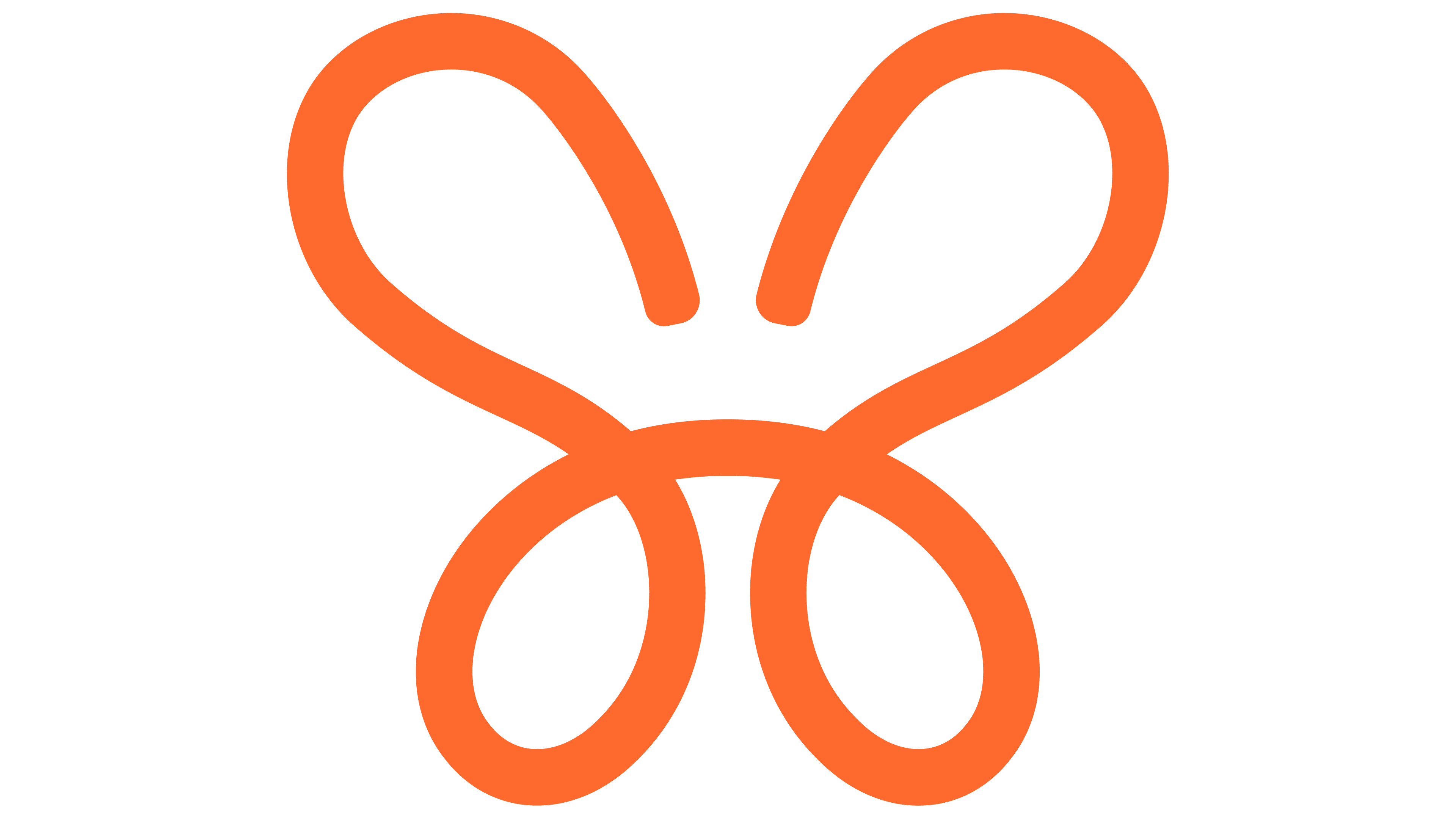
The color palette has been reimagined to create a warmer, more inviting feel. The original coral has been replaced with a deeper, richer orange that conveys energy, optimism, and growth. The new color brings the logo to life, reinforcing the brand’s mission to inspire confidence and a sense of progress.
The updated visual identity extends beyond the logo to the app’s user interface and product design. Improvements to color contrast, layout, and overall usability make the platform easier to navigate and more visually engaging. These changes are part of a broader effort to create an intuitive, supportive environment that helps people easily manage their finances.
![]()
The new design language carries through to the company’s digital presence, where minimalist layouts and plenty of white space let the refreshed logo and bold colors shine. The simple, clean design reflects the focus on clarity and functionality, while subtle graphic details inspired by butterfly wings create a sense of continuity and connection.
One thoughtful detail in the new logo is how the intersecting lines represent collaboration. They reflect the partnership between users and their financial advisors, coaches, or even family members—reinforcing the belief in the power of shared goals and mutual support. This highlights Monarch’s role as a trusted partner in each person’s financial journey.