


 Most Famous Swimming Logos PNG
Swimming is one of the most popular disciplines on the planet. Millions of people worldwide regularly visit pools or choose open waters to improve their health and challenge themselves. The history of this sport dates back to ancient civilizations, when water served as an arena for competitions and physical development.
The modern era of swimming began after British swimmer Matthew Webb crossed the English Channel, inspiring numerous athletes to push past new boundaries in the water. Since then, races over various distances and styles have become official competitions, and they have been included in the Olympic Games program since the end of the nineteenth century. Over the years, swimming has gained incredible popularity, creating a galaxy of champions whose names are known throughout the sporting world.
For many years, swimming associations and federations have created symbols that reflect their unique histories and character. Organization emblems appear on swimmers’ caps and suits, as well as at numerous competitions worldwide. Each symbol carries meaning connected with national traditions, historical achievements, or the inspiration behind its creation.
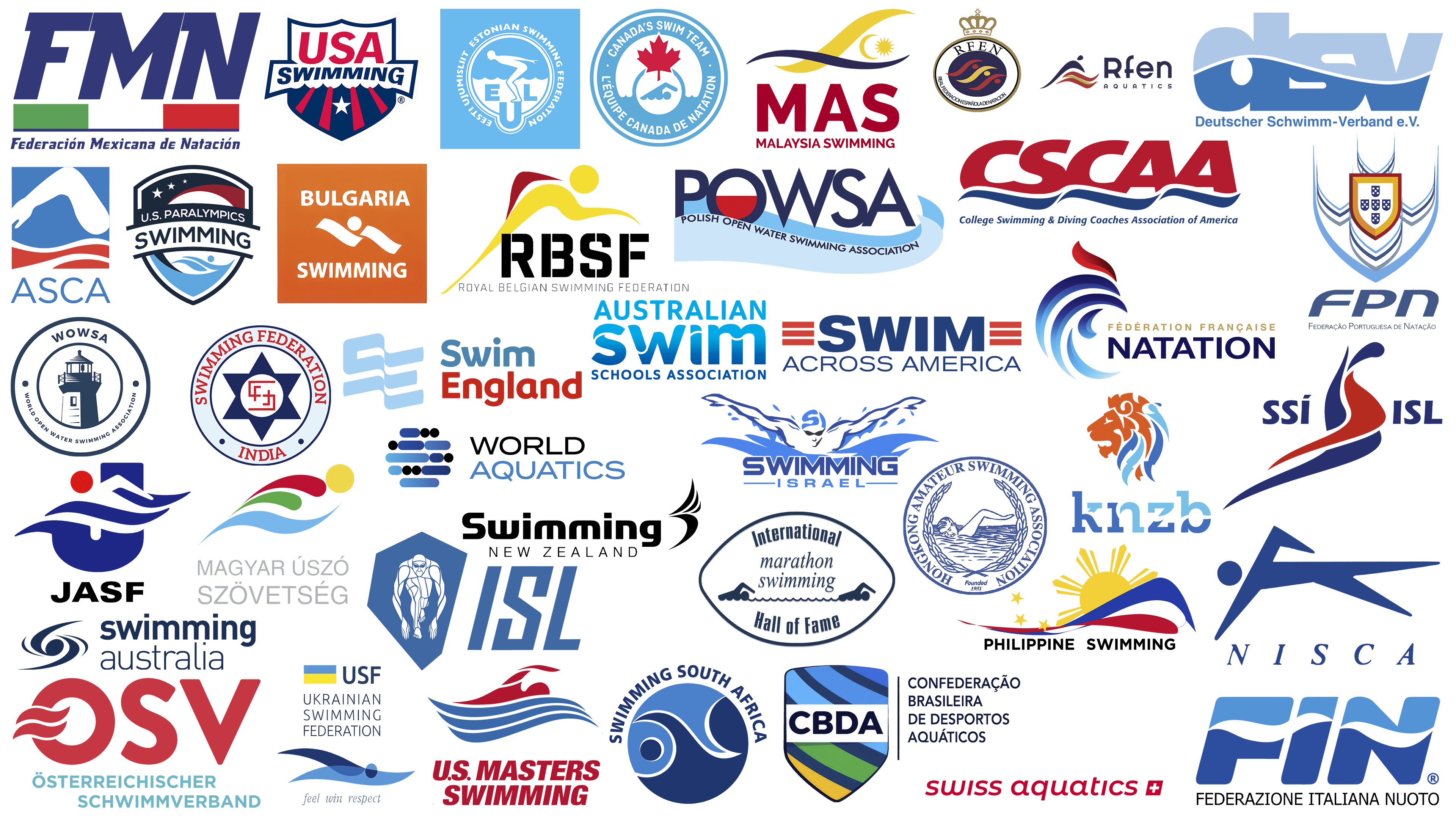
In our selection, you’ll discover the most popular logos of the largest swimming associations. They tell about their creators more expressively than words ever could, allowing you to feel the atmosphere of sports rivalry and historical victories.
Malaysia Swimming Federation (MAS)
![]()
The Malaysian Swimming Federation’s logo is perceived as colorful. It imaginatively combines elements of the national flag and swimming. A wave resembling a swimmer’s arm movement line is decorated with the national symbol, a crescent and a star borrowed from the Malaysian flag.
Malaysian swimmers compete in the Asian Games and international tournaments, achieving unexpected results. The federation is unafraid to experiment with training methods, organizing competitions in open water and pools under equal conditions. The emblem emphasizes the distinctiveness of the Malaysian approach to sports, reflecting local athletes’ ambition to remain distinctive from other teams and federations.
Icelandic Swimming Federation (SSÍ)
![]()
The Icelandic Swimming Federation logo reflects the island’s harsh beauty and the strength of the national character. The red and blue symbol resembles a flowing stream, with a swimmer demonstrating flexibility and strength. The colors echo the colors of the Icelandic flag, highlighting national identity and pride. The clear and decisive letters SSÍ and ISL convey athletic confidence, reflecting Iceland’s ambition to achieve high results in international competitions.
Estonian Swimming Federation (ESF)
![]()
The Estonian Swimming Federation’s logo looks expressive. The central part features an athlete poised to take the platform, highlighting the federation’s competitive spirit. Waves beneath the swimmer convey the nature of the sport, reminiscent of the Baltic Sea that surrounds the country and gives rise to national swimming traditions. Inscriptions in Estonian and English frame the emblem, completing the composition and reflecting the organization’s international activities. Blue is associated with purity and Estonia’s cold waters, while white letters add contrast and recognizability. The federation regularly organizes national championships, sends athletes to international tournaments, and maintains youth interest in swimming.
Portuguese Swimming Federation
![]()
The emblem of the Portuguese Swimming Federation is executed in heraldic style. The central shield is borrowed from the country’s historical coat of arms, reflecting the organization’s national character. The shield is surrounded by multilayered blue contours resembling waves, visually suggesting an aquatic environment. The shield contains five smaller shields with white dots symbolizing ancient Portuguese provinces. Under the image, the abbreviation “FPN” is written in flowing, softly shaped letters, emphasizing the federation’s sporting focus. Portuguese swimmers regularly participate in major competitions, and the emblem accompanies their performances, symbolizing pride in their national heritage.
Swimming Federation of India
![]()
The logo of the Swimming Federation of India looks solemn. At the center of the composition is a blue six-pointed star symbolizing strength. Inside is a white circle with the federation’s bright red initials, “SFI,” reminiscent of ancient Indian seals. Around it is a ring with red letters forming the organization’s full name: “Swimming Federation India.” Two small circles at the lower part of the ring add symmetry and order. The emblem conveys an atmosphere of respect and historical continuity of the federation, which has guided Indian athletes to victories for decades.
Japan Swimming Federation
![]()
The Japan Swimming Federation created an expressive and patriotic logo. Its basis is the letter “J,” crossed by wave lines and a swimmer’s silhouette. The swimmer’s head is depicted as a red circle, referencing Japan’s national flag and adding national character to the emblem. Smooth lines and neat curves are associated with the technical skill of Japanese swimmers, renowned for their expertise in international arenas. The abbreviation “JASF,” shown below, is set in simple, strict letters, stabilizing the composition and emphasizing the organization’s official status. The federation regularly hosts major competitions, shaping the country’s reputation as a sporting powerhouse, and the symbol accompanies it at tournaments.
International Marathon Swimming Hall of Fame (IMSHOF)
![]()
The International Marathon Swimming Hall of Fame’s logo appears symbolic. Its shape resembles an eye, with figures of swimmers moving toward each other inside. Between them is the text “marathon swimming,” executed in a light font, and above and below in a semicircle is the name “International Hall of Fame,” in strict letters. This well-known organization preserves the histories of great swimmers who have conquered incredible open-water distances, including the English Channel and legendary routes worldwide. The identity emphasizes the endurance and willpower of athletes who expended enormous effort to overcome extreme distances.
Swiss Swimming Federation
![]()
The Swiss Swimming Federation created a minimalist logo using a national symbol. The organization’s name is slightly inclined in lowercase red letters, giving a sense of fluidity. To the right of the name is a small white cross on a red background, borrowed from the Swiss flag, underscoring the federation’s national identity. Switzerland is known for its high level of athlete training and regularly wins medals at international tournaments. The identity reflects neatness and order, which are associated with the Swiss character, and avoids unnecessary complexity and pretension.
Swimming Canada
![]()
The emblem of Swimming Canada has a distinct national character. It is designed as a seal containing the famous red maple leaf, a symbol of the country. Below is a stylized silhouette of a swimmer diving into turquoise water. A double inscription, in English and French, surrounding the central image creates an atmosphere of unity between Canada’s two cultures. The colorful, friendly design conveys the organization’s openness and pride in its sporting achievements. The logo demonstrates the spirit of Canadian swimming, emphasizing national identity and team solidarity.
Italian Swimming Federation (FIN)
![]()
The Italian Swimming Federation (FIN) logo embodies the elegance of Italian style through concise, flowing lines. The letters “FIN” are filled with water: wavy white stripes intersect deep blue symbols, emphasizing the federation’s aquatic focus. The visual image appears athletic due to its dynamic forms that resemble water movement. The full name in Italian highlights the organization’s national identity and adds a strict accent to the design. FIN conveys the harmony inherent in the Italian perception of beauty.
Swim England
![]()
The emblem of Swim England represents an original solution, combining simplicity and freshness in design. The primary symbol is a wavy monogram “SE,” reflecting the organization’s abbreviation, styled as water streams. The airy blue color conveys a sense of lightness, while the textual element “Swim England,” divided into two colors, blue and red, enhances the striking contrast. The design feels friendly and open, demonstrating the federation’s readiness to welcome new athletes. The overall composition of the emblem conveys an atmosphere of sports celebration and healthy living in Great Britain.
Swimming New Zealand
![]()
The Swimming New Zealand logo is strict and refined. The black color conveys authority, and a minimalist wave on the right recalls New Zealand’s famous swimming traditions. The federation organizes competitions and cultivates a new generation of champions. The emphasis on conciseness underscores the seriousness of the tasks facing New Zealand swimmers and coaches as they aim to improve sporting results on the world stage.
National Interscholastic Swimming Coaches Association (NISCA)
![]()
The National Interscholastic Swimming Coaches Association (NISCA) logo is designed with elegance and simplicity, conveying the ease and speed of school swimming competitions. The stylized blue swimmer is stretched horizontally, resembling the moment of a swift stroke. The abbreviation NISCA, written in thin, italicized letters, conveys a sense of grace and professionalism. The entire composition reflects the association’s commitment to developing young talents and maintaining high standards in scholastic swimming.
Swim Across America (SAA)
![]()
The Swim Across America logo stands out for its energy. Its design reflects the influence of sports emblems from American universities and colleges. The organization’s name is presented in large capital letters, with the word “SWIM” centered. Red lines appear on both sides of the text, visually hinting at American flag symbolism. This emphasizes participants’ patriotism and unity across the country.
Swimming Australia
![]()
The Australian Swimming Federation uses a logo with a futuristic emphasis. It resembles a cosmic image of a galaxy with a vortex, evoking associations with the athletes’ strength and speed. The composition has no direct references to swimmers or water, but the graphic captivates with its dynamism. The minimalist text font contrasts with the vivid graphics. Australia is a swimming powerhouse with a strong champion-training system, including Olympic legends. The federation regularly hosts major tournaments involving top-level athletes, and the logo symbolizes its global reputation and Australians’ ambition to excel in sports.
College Swimming & Diving Coaches Association of America (CSCAA)
![]()
The College Swimming & Diving Coaches Association of America introduced an energetic emblem reflecting collegiate sports culture. Its foundation is the abbreviation CSCAA, underlined by a blue wave symbolizing the water’s surface. The association was created to support coaches and university teams across the U.S., focusing on developing collegiate sports, talent scouting, and organizing national competitions. The association annually hosts prestigious championships showcasing the best young swimmers and divers. The logo unites coaches and students, symbolizing the solidarity of the U.S. collegiate sports community.
French Swimming Federation
![]()
The French Swimming Federation unveiled an elegant logo that embodies national traditions. The organization’s symbol is a rooster composed of smooth arcs resembling streams of water. Blue lines convey the pool’s depth, and a single red curl recalls the national flag and French pride. The emblem appears three-dimensional through fluid curves, highlighting the nation’s swimmers’ dynamic grace and athletic skill. The inscription “Fédération Française Natation” is set in a strict font in gold and dark blue, emphasizing the federation’s status. French athletes regularly win medals at European Championships and the Olympics, and the roster frequently appears on podiums, glorifying the national swimming tradition internationally.
Australian Swimmers Association
![]()
The Australian Swimmers Association presents a typography-based logo. The keyword of the composition, “Swim,” is central to the entire emblem. Its letters feature wave-like shapes that create the illusion of moving water, reflecting the organization’s specific details. Smooth transitions in blue from dark to light illustrate the ocean’s depth surrounding Australia. The upper part contains the word “Australian” in a lighter shade, emphasizing the association’s origin. In comparison, the lower inscription “Schools Association,” in a darker shade, highlights the organization’s educational direction. The association does not limit itself to professional competitions; it actively promotes swimming among students and youth.
Israeli Swimming Association
![]()
The emblem of the Israeli Swimming Association looks dynamic. At the center is a swimmer depicted in shades of blue, arms spread wide in a butterfly stroke. On the swimmer’s cap is the letter “S,” the first in the word “Swimming.” Around the swimmer, splashes of water emphasize the swimmer’s expressiveness. At the bottom is the clear inscription “Swimming Israel” in blue, balancing the composition. The logo reflects the sporting charisma of Israeli swimmers and their ambition to be first in the pool and in international competitions.
Royal Belgian Swimming Federation (RBSF)
![]()
The logo of the Royal Belgian Swimming Federation (RBSF) is bold and energetic, conveying competitive spirit. The graphic shows a swimmer paused mid-dive, poised to start. The red-and-yellow palette repeats Belgium’s national colors, emphasizing its sporting traditions. Below, the abbreviation RBSF is prominently displayed in bold, black letters, with a solid, strict font, beneath which the full organization name appears. The modern design reflects Belgium’s sporting ambitions in aquatic disciplines.
World Open Water Swimming Association (WOWSA)
![]()
The WOWSA logo features an original lighthouse symbolizing open-water spaces and athletes’ orientation. The stylized lighthouse image is rendered in dark blue. Around the graphic is the inscription “WORLD OPEN WATER SWIMMING ASSOCIATION,” with “WOWSA” prominently placed above. The organization is known for supporting and promoting long-distance swimming in natural waters. The identity conveys the organization’s essence, which is associated with safety and adventure.
Ukrainian Swimming Federation (USF)
![]()
The Ukrainian Swimming Federation’s logo is minimalist. A symbol of flowing waves and a swimmer’s figure is presented in shades of blue, reflecting the colors of swimming pool water and the Black Sea. At the top are the national flag and inscriptions indicating the organization’s full name and the abbreviation USF. Below is the slogan “feel win respect,” highlighting the federation’s ambition for international victories and respect. The Ukrainian swimming school has produced champions recognized worldwide, and its emblem symbolizes the country’s sporting traditions while upholding high standards of athlete preparation.
Philippine Swimming
![]()
The Philippine Swimming Federation chose a logo with national character. The design incorporates silhouettes from the Philippine flag, the sun and stars, complemented by a wave in the national colors. The sun symbol is positioned at the top, highlighting the Philippines’ hot climate. The federation seeks to increase its athletes’ global presence by organizing competitions and training across the archipelago. The emblem reflects the vibrancy of national culture and Filipino swimmers’ desire to stand out among other teams.
German Swimming Federation
![]()
The German Swimming Federation’s logo stands out. Visually, it appears solid due to the ultra-wide letters “DSV,” intertwined into a unified composition. The abbreviation is divided by a wavy line, enhancing the aquatic imagery associated with swimming. Using two shades of blue emphasizes the interaction of water and air during competitions. A simple inscription “Deutscher Schwimm-Verband” is placed below in a darker tone, adding an official style. The federation is known for strict athlete training standards and rigorous discipline, regularly leading its swimmers to international victories. The emblem reflects the spirit of German swimming: strict and functional, without unnecessary decoration.
Spanish Swimming Federation (RFEN)
![]()
The Spanish Swimming Federation has a logo with a royal character. A heraldic shield topped with a crown recalls the Spanish monarch’s patronage of the federation. Inside the oval are wavy lines in the national colors red and gold, as well as in the colors of the Spanish flag. These abstract lines resemble swimmers moving along pool lanes. An alternative logo version stylishly depicts a swimmer’s silhouette above a wave, harmoniously using national colors. Spain is one of Europe’s leading countries in aquatic sports, known for its successes in synchronized swimming, diving, and water polo. The federation organizes numerous tournaments, and its logo accompanies athletes at major international competitions.
U.S. Paralympics Swimming
![]()
The U.S. Paralympics Swimming team uses a heroic logo. It looks solid, shaped as a shield with national stars at the top and blue waves at the bottom. The red, white, and blue color scheme references U.S. symbolism, emphasizing unity among Paralympians and their ambition to bring glory to the country through victories. American Paralympic swimmers are among the most decorated internationally, earning medals at competitions. The emblem accompanies athletes at championships, emphasizing their strength of character and determination to overcome all obstacles on the path to victory.
Mexican Swimming Federation (FMN)
![]()
Due to its expressive lettering and national palette, the Mexican Swimming Federation (FMN) logo appears ambitious. The large, bold letters “FMN” are rendered in deep blue, emphasizing the federation’s importance. Below runs a stripe in Mexico’s national colors, green, white, and red, reminding of homeland and national pride. The organization’s full name is written in a simple yet stylish font, enhancing the emblem’s perception. The federation modestly yet vividly declares its sporting ambitions, emphasizing the connection between sport and patriotism.
China Swimming Association
![]()
The China Swimming Association emblem is traditionally executed. The circular seal features an image of a swimmer, surrounded by a laurel wreath. Blue outlines highlight the organization’s official status and reference China’s proud sporting achievements. The wreath symbolizes honor and victory, as well as aspirations for international leadership. Established in the mid-20th century, the association continually contributes to the development and popularity of swimming nationwide. Its representatives have repeatedly won Olympic medals and set world records. The inscription around the image is in uppercase serif letters, lending the logo a sense of solidity. Since its founding, the association has maintained a strict symbolic style, respecting national sporting traditions and highlighting its role in global sports history.
International Swimming League (ISL)
![]()
The ISL logo has an aggressive design. At its center is an athlete poised to start, muscles highlighted by lines. The image is enclosed within a blue shield, creating a sporty mood. Large letters “ISL” placed to the right of the symbol complement the brand’s style. The ISL emerged recently, changing swimming competition traditions with its club format and short distances. The emblem reflects the league’s competitive spirit and the professionalism of its participants.
American Swimming Coaches Association (ASCA)
![]()
The American Swimming Coaches Association introduced an energetic logo. The main element is a swimmer’s arm in motion, illustrating the sport’s dynamism and strength. A blue background symbolizes water, a crucial factor for life and sports in the U.S. Red wavy lines add expressiveness, creating a vivid image. Below the graphic is the abbreviation ASCA, in a concise font that emphasizes the organization’s professional nature. The association focuses on coach education to help American swimmers achieve top international results.
The organization hosts open-water swims, supports research, and helps cancer patients. These events involve amateurs and famous athletes united by a noble goal. Thousands cross bays, rivers, and lakes annually across various U.S. cities, demonstrating high preparation and motivation. The emblem accompanies these events, serving as their defining feature and uniting people eager to help others through sports and activities.
Hungarian Swimming Federation (Magyar Úszó Szövetség)
![]()
The emblem of the Hungarian Swimming Federation stands out with a vivid, colorful style that reflects Hungarian identity. The swimmer’s image is composed of flowing lines in national colors: red, green, and blue, with a yellow circle symbolizing the sun and life energy. The optimistic visual style is associated with the successes of Hungarian swimmers, who regularly excel at world championships. The name “Magyar Úszó Szövetség” at the bottom is rendered in a restrained grey, complementing the bright image with neutrality and strict contrast.
Dutch Swimming Federation
![]()
The emblem of the Dutch Swimming Federation is expressive. The lion’s profile in the center represents the country and national unity. Its contours are carefully drawn in segments reminiscent of water currents, emphasizing the federation’s affiliation with swimming sports. Orange symbolizes the royal traditions of the Netherlands, while blue lines represent water. The color palette reflects state symbolism and highlights the organization’s sporting character. The textual part of the logo features the lowercase abbreviation “KNZB,” stylized to appear woven from wavy lines. The federation is renowned for athletes who have won international competitions, and its symbolism reflects Dutch pride in their achievements.
Brazilian Confederation of Aquatic Sports (CBDA)
![]()
The Brazilian Confederation of Aquatic Sports (CBDA) emblem is filled with contrasts, embodying the vividness of the national character. The shield, painted in diagonal stripes of green and blue, recalls the Brazilian flag, combining jungle and water that symbolize the country’s natural wealth. The abbreviation “CBDA” is placed on a white stripe to contrast with the letters. The organization’s name on the right appears strict and authoritative, emphasizing its official status. The logo conveys Brazilian temperament through restrained, professional design.
Swimming South Africa (SSA)
![]()
The logo of Swimming South Africa combines the forms of a wave and a swimmer, unusually, creating an impression of infinity and depth. At first glance, the symbol may resemble not just a swimmer, but ocean currents and whirlpools familiar to anyone who has swum in South African waters. Dark shades of blue add expressiveness, reflecting the region’s nature.
South African athletes are known for their strength and endurance, winning in challenging conditions and long distances. The federation consistently prepares athletes for world-class competitions, helping them set records and demonstrate unique swimming techniques. The emblem is a seal of quality for swimmer training, symbolizing the nation’s determination to overcome natural and circumstantial challenges.
USA Swimming
![]()
The USA Swimming Federation uses a heroic logo resembling a sports team badge. It is designed as a crest with the large inscription “USA” positioned above a banner reading “Swimming.” At the bottom, stripes and a white star appear, symbolizing the American flag and the organization’s connection to national ideals. The upper edge of the crest is stylized as a water surface, reflecting the sport’s specifics. American swimmers are considered among the strongest in the world, and the symbol regularly appears at international competitions, representing the team’s confidence. The bold visual style emphasizes the federation’s sporting character and reminds viewers of numerous victories by American athletes.
Bulgarian Swimming Federation
![]()
The Bulgarian Swimming Federation logo is minimalist, and its simplicity enhances the perception of sporting strength. An orange square serves as a vivid base, with a white silhouette of a swimmer performing a stroke. The inscription “Bulgaria Swimming,” centered in two lines in white letters, concisely indicates the athletes’ affiliation. In Bulgarian symbolism, orange symbolizes endurance, underscoring the team’s international sporting resilience.
Austrian Swimming Federation (OSV)
![]()
The Austrian Swimming Federation chose a logo with an avant-garde accent. The central element is the letter “O,” depicted as red waves crossing space, reminiscent of aquatic competitions. Together with the other letters “SV,” it looks sporty, highlighting the organization’s national character through the Austrian flag’s color scheme. A blue inscription below balances and complements the composition. The federation regularly participates in European championships; though Austria is not considered a swimming powerhouse, its athletes have consistently performed internationally. The identity emphasizes Austrian swimmers’ determination and aims to develop aquatic sports nationwide, including in alpine lakes.
Polish Open Water Swimming Association (POWSA)
![]()
The Polish Open Water Swimming Association logo is a vibrant embodiment of sport and patriotism. At the center is the abbreviation “POWSA,” with the letter “O” containing a scarlet disk resembling the sunrise over the horizon. This enhances perception and creates a feeling of open space. Beneath the letters, a blue wavy ribbon with the organization’s full name reflects the aquatic environment of competitions. The association’s symbolism combines Poland’s national colors with the theme of open-water swimming, giving it a festive character.
U.S. Masters Swimming
![]()
The U.S. Masters Swimming logo looks energetic. It features a red silhouette of a swimmer mid-race, seemingly breaking through waves. Beneath the swimmer, several blue wave lines express the energy of the water. Below is the inscription “U.S. Masters Swimming,” in large red sans-serif letters, emphasizing the organization’s authority. The emblem conveys the determination and passion of older-generation American athletes, united by their love of competition and water sports.
World Aquatics
![]()
The World Aquatics logo appears modern. It consists of blue and black ovals arranged in lines, resembling a swimmer in water. The combination of ovals conveys flexibility and fluidity. Next is the inscription “WORLD AQUATICS,” with “AQUATICS” highlighted in a saturated blue shade, reinforcing the brand’s connection to water. World Aquatics organizes swimming world championships and unites athletes, making the emblem relevant.
Conclusion
Logos of leading swimming associations and federations vividly convey their identities, histories, and achievements in aquatic sports. They convey national spirit, athleticism, and the energy of swimming through stylized images of waves, swimmers, and national symbols. The emblems are unique in color schemes, typography, and other design solutions. They help spectators and athletes feel connected to major events, serving as visual landmarks at major competitions. Through these images, swimming fans find inspiration for new achievements, and athletes feel a sense of unity and support. The success of swimming logos lies in their ability to convey federation messages, make sports more accessible, and inspire new athletic records and victories.