


Volleyball originated thanks to the American instructor William Morgan, who invented a game with a net and a ball for his students. The initial version of the game was unusual: an inflated animal bladder served as the ball, and the net was hung low enough to easily throw it over. Soon, the game gained attention beyond America. Gradually, it appeared in China and Japan, and shortly thereafter, it was enthusiastically adopted by European countries. The new sport quickly gained popularity on all continents due to its simple rules.
Today in the United States, volleyball ranks among the most popular sports, particularly among women’s teams. This is due to America’s distinctive approach to school sports. American educational institutions have specifically allocated several disciplines in which female participation is substantial to balance men’s and women’s sports. Volleyball became the best candidate for this role, so American schoolgirls have mastered this discipline for many decades. Young athletes get opportunities to enter prestigious colleges, receive athletic scholarships, or begin professional careers.
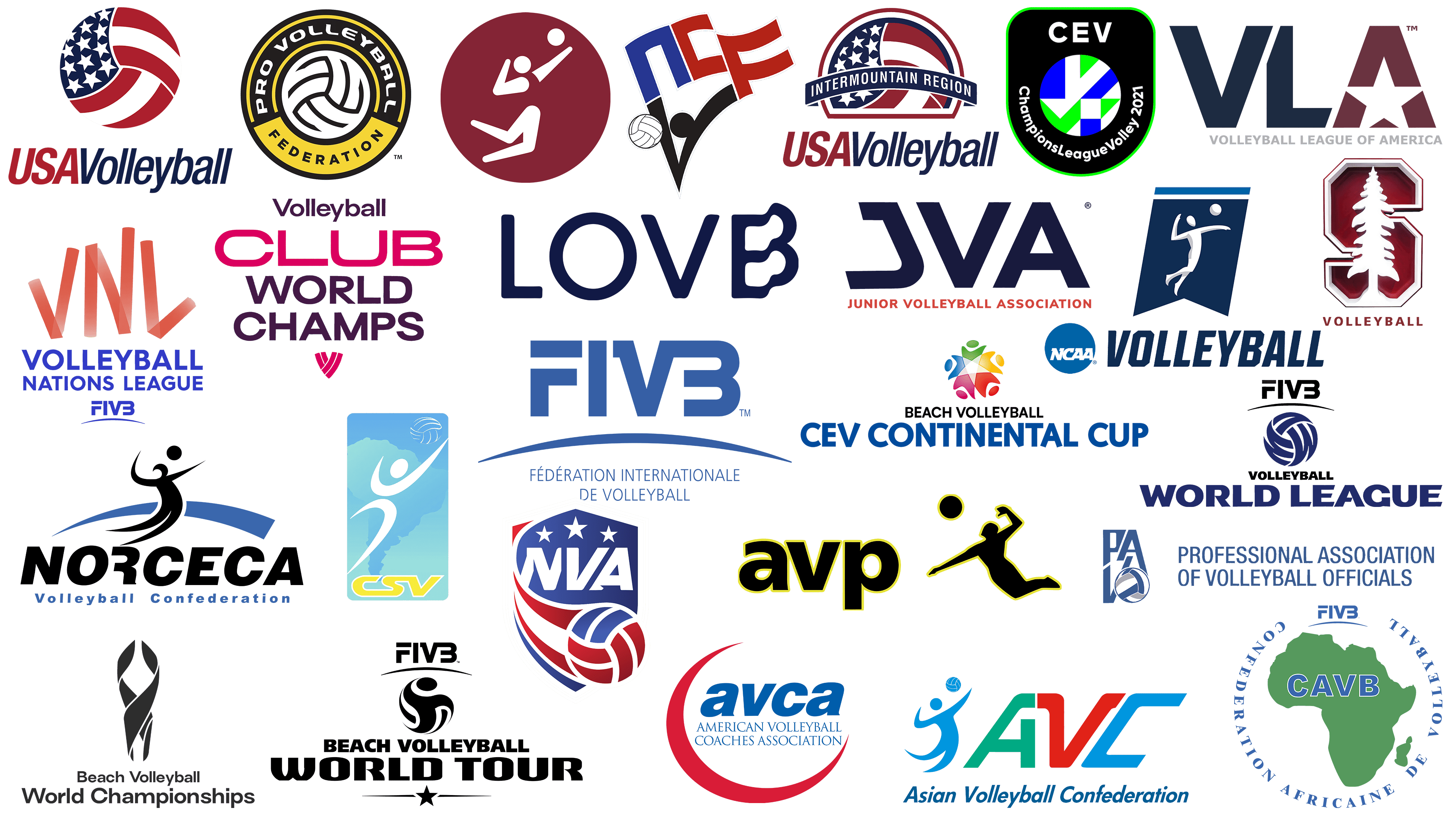
Today, the volleyball industry in the US is an extensive network of federations, professional associations, regional clubs, and national championships. Each organization takes pride in its history, traditions, and vibrant visual style. Volleyball organizations’ logos have integrated into American sports culture, showcasing the sport’s dynamism and style of play.
Among these are vivid designs using patriotic colors of the national flag, minimalist player figures, inscriptions, and stylized volleyballs. Each symbol conveys a message: some emblems reflect regional traditions, others emphasize movement and rapid decision-making. One aspect unites these images: they highlight volleyball as a spectacular sport accessible to everyone.
We have prepared a selection of the most famous and recognizable volleyball logos, each with an interesting history and facts behind it, illustrating how volleyball has changed lives and united generations.
American Volleyball Coaches Association
![]()
The American Volleyball Coaches Association embodies an exemplary style of sports coaching. The association’s logo is energetic. At its center is the abbreviation “avca,” written in blue and italicized to add dynamism to the composition. The organization’s full name appears in a classic serif font, emphasizing its prestigious status. A bright red crescent at the bottom of the composition symbolizes unity and support inherent in the coaching profession. The colors and shapes convey the association’s confidence in professional coach training and volleyball development.
American Volleyball League
![]()
The American Volleyball League uses a logo emphasizing the sport’s energy. The central symbol is the abbreviation VLA, highlighted in two bold colors. The first letters, “V” and “L,” appear in a dark blue shade, expressing reliability. The final letter “A” is rendered in dark red, with its internal space forming a star. The star symbolizes ambition and leadership, reflecting the league’s competitive spirit. The organization’s name is in restrained gray letters below, highlighting its formal structure.
FIVB Volleyball World League
![]()
The FIVB Volleyball World League has a dynamic logo that reflects the competition’s international scale. At the center of the composition is a ball symbol stylized with wavy blue lines, creating a sense of motion. Above the ball, the International Volleyball Federation FIVB acronym is concisely written. At the bottom, the phrase “WORLD LEAGUE” appears in bold blue, providing a solid impression. The color scheme and design emphasize the league’s global reach and the unity of participating teams, who compete intensely for the championship title annually.
Junior Volleyball Association
![]()
The Junior Volleyball Association showcases a strict style with the large abbreviation “JVA” at the center of its logo. The letters are geometrically arranged, emphasizing the organization’s stability. The central “V” creates a slight tilt, suggesting movement. Below is the full association name, written in all caps in red, adding liveliness. The association is known for organizing tournaments and training for young athletes, and the concise style highlights its reputation as a reliable organizer.
NCAA Volleyball
![]()
The NCAA Volleyball logo appears fresh due to its combination of white and blue, colors associated with collegiate sports traditions. The design is shaped like a dark blue pennant, featuring a white silhouette of a volleyball player preparing to strike the ball. At the top of the pennant are two white and blue stripes. In the lower-left corner is the round NCAA symbol, and on the right, the word “VOLLEYBALL” in bold letters conveys the strength and seriousness of the competition. The NCAA is known for hosting the largest collegiate volleyball tournaments in the USA.
National Collegiate Volleyball Federation
![]()
The National Collegiate Volleyball Federation presented a dynamic emblem combining sporting passion and patriotism. Stylized letters “NCVF” form the basis, shaping the image of a flag. The upper part is the blue letter “N,” while the red letters “C” and “F” resemble waving stripes, and the black letter “V” suggests a volleyball player reaching for a ball to the left. A white ball emphasizes the volleyball theme. The red, white, and blue color palette ties the emblem to the USA’s national symbols. The federation supports collegiate volleyball development across the country.
Olympic Volleyball Tournament
![]()
The Olympic Volleyball Tournament emblem impresses with its simplicity. A round maroon background frames the image of a white volleyball player, captured mid-jump toward the ball. The depiction is simple and clear, with geometric elements defining the athlete’s figure. The composition lacks text, focusing entirely on the sport. The emblem’s restraint reflects the universal character of Olympic competitions, highlighting participant achievement and skill.
Pro Volleyball Federation
![]()
The Pro Volleyball Federation presents a bold emblem based on contrasts. A yellow-black border surrounds the central symbol, a volleyball. Above the ball, the organization’s name appears in white letters on a black background, emphasizing professional status. The lower part of the circle features a bright yellow background with the black word “FEDERATION.” This recently established organization is the USA’s first professional women’s volleyball league. The colors and shape underline the competitive spirit and seriousness of the league’s ambitions.
Stanford Volleyball
![]()
The Stanford Volleyball logo organically blends university traditions. The central image is the team’s emblem, a maroon letter “S” with geometric outlines, containing a white silhouette of a tall tree. The tree symbolizes the wooded area where Stanford University is located, representing student growth and prosperity. Below is the neat inscription “VOLLEYBALL,” written in the same maroon color. Stanford Volleyball is renowned for its strong collegiate sports traditions, regularly participating in national tournaments and producing many famous volleyball players.
US National Team of Volleyball
![]()
The emblem of the USA Volleyball National Team is executed in a patriotic style. The central symbol is a volleyball designed like the American flag: on the left, a dark blue sector with white stars, on the right, red and white stripes. The lower part of the composition includes the two-colored inscription “USAVolleyball,” divided into two segments: “USA” in red and “Volleyball” in blue. The font is slightly italicized, reflecting the team’s sporty spirit. The team is a leader in global volleyball, repeatedly winning international awards and Olympic championship titles.
CAVB African Club Championship
![]()
The African Club Volleyball Championship (CAVB) uses an emblem highlighting African identity. At the center is a green outline of the continent, inside which the abbreviation “CAVB” appears in blue. Surrounding the map, the federation’s French name, “Confederation Africaine de Volleyball”, is written in a circle in blue letters. At the top is the logo of the International Volleyball Federation (FIVB), emphasizing the tournament’s authority and international status. The championship promotes volleyball in African countries by organizing regular competitions across the continent.
National Volleyball Association
![]()
The National Volleyball Association (NVA) introduced a shield-shaped logo that reflects determination in sports. At the top, three white stars emphasize the organization’s level and ambitions. Inside the shield, the white capital letters “NVA” create a clear emphasis. At the bottom of the shield is a volleyball with stripes in American colors red, blue, and white. The association continues to grow, attracting audiences to professional volleyball matches in the USA and creating a high-level league for the country’s top players.
CSV South American Club Championship
![]()
The CSV South American Club Championship emblem stands out with its brightness. Its basis is a vertical rectangle with a smooth gradient of blue shades, from light to intense. Against this background is the silhouette of South America, overlaid by a stylized white figure of a volleyball player jumping toward a ball. In the upper corner is a white volleyball, symbolizing play and skill. At the bottom of the badge, the abbreviation “CSV” is written in yellow letters. Yellow was deliberately chosen as a symbol of the cheerfulness characteristic of Latin American culture. CSV supports club volleyball in the region by hosting tournaments for teams from across South America.
FIVB Beach Volleyball World Championships
![]()
The FIVB Beach Volleyball World Championships logo has a strict style. At the center is an abstract trophy composed of smooth lines that form a volleyball. The figure is executed in black, creating a sense of seriousness. The championship name is written below in a sans-serif font to emphasize formality. This is the premier tournament in beach volleyball, regularly bringing together the best pairs of athletes at famous beach venues worldwide.
Intermountain Volleyball Association
![]()
The Intermountain Volleyball Association logo combines regional symbolism. The emblem is a semicircle featuring elements of the American flag inside: a blue field with white stars on top and red and white stripes at the bottom. Over this is a blue ribbon bearing the name “INTERMOUNTAIN REGION,” written in white letters. Below this sign appears the inscription “USAVolleyball,” executed in a patriotic palette, with the word “USA” in red and “Volleyball” in blue. The association is known for promoting volleyball among various age groups and clubs within the region, organizing tournaments and educational events, and strengthening sports ties among the mountain states of the USA.
FIVB Volleyball Nations League
![]()
The FIVB Volleyball Nations League logo is striking, creating a sense of energy. The abbreviation “VNL” is designed with red ribbons featuring a transparent effect, emphasizing lightness. Beneath it, the tournament name “VOLLEYBALL NATIONS LEAGUE” is written in blue, contrasting prominently against the background. The inscription “FIVB” appears in a simple font below, indicating the league’s official affiliation. The Volleyball Nations League is a leading international tournament uniting men’s and women’s national teams in a single format, emphasizing sporting equality.
FIVB Beach Volleyball Continental Cup
![]()
The FIVB Beach Volleyball Continental Cup emblem is vibrant, symbolizing unity among players worldwide. At the center are five multicolored human figures forming a circle, representing a volleyball. Each color corresponds to the diversity of continents and cultures. The tournament name is written below in large blue font, highlighting its importance. The Continental Cup is an Olympic qualifying tournament under FIVB’s patronage, contributing to beach volleyball’s development worldwide.
CEV Champions League
![]()
The CEV Champions League logo is modern, reflecting the competition’s prestige. The emblem is based on a black shield with a thin green outline. A round abstract symbol, divided into green, blue, and white segments, is at the center, referencing a volleyball. Around this central circle, the full league name “Champions League Volley” is written in white font. The CEV Champions League is Europe’s most important club competition, bringing together the continent’s top clubs and attracting intense competition and audience interest.
NORCECA Champions Cup
![]()
The NORCECA Champions Cup emblem emphasizes the athleticism of volleyball. At the center is a figure of an athlete jumping to strike the ball. Below the figure, a wide blue arc symbolizes the unity of North America, Central America, and the Caribbean regions. The inscription “NORCECA” is in bold black font. Beneath it, the blue text “Volleyball Confederation” completes the design. NORCECA, the Confederation of North, Central, and Caribbean America, organizes major volleyball tournaments in the Americas, promoting the sport among member countries and contributing to its development.
Professional Association of Volleyball Officials
![]()
The emblem of the Professional Association of Volleyball Officials (PAVO) maintains a strict style. The vertical abbreviation “PAVO” on the left is accompanied by a volleyball symbol, emphasizing the profession’s essence. The blue inscription “Professional Association of Volleyball Officials” on the right indicates the association’s professional status. Recognized in the USA, the association prepares international-level referees, offers training programs, and regularly officiates prestigious tournaments.
Association of Volleyball Professionals
![]()
The Association of Volleyball Professionals (AVP) logo is dynamic and vivid. The abbreviation “avp” is in black with a contrasting yellow outline. Next to it is a silhouette of a volleyball player in a dynamic pose, striking the ball. The yellow outline around the figure and ball creates a bright contrast. The association was founded as a professional beach volleyball league and continues to develop, hosting tournaments on American beaches and attracting spectators with its exciting gameplay.
FIVB Club World Championship
![]()
The FIVB Club World Championship logo appears contemporary. At the top, the word “Volleyball” is presented in a calm, dark sans-serif font. Below, the large word “CLUB” in bright pink highlights the championship’s club format. Underneath, the phrase “WORLD CHAMPS” in purple emphasizes its international status. At the bottom, a small tournament symbol, a stylized volleyball made of abstract lines in pink shades, is depicted. The combination of pink and purple lends the logo style, expressing the tournament’s youthful character and underscoring its significance among clubs.
FIVB Beach Volleyball World Tour
![]()
The FIVB Beach Volleyball World Tour logo is presented strictly. At the top, the federation’s name, FIVB, is displayed in geometric letters. Below, “BEACH VOLLEYBALL” appears in compact font, followed by the dominant phrase “WORLD TOUR,” in bold black letters. At the bottom, a black star completes the overall style, adding authority and prestige. The logo, entirely in black, features a universal design that reflects the competition’s global nature and high status.
FIVB (Fédération Internationale de Volleyball)
![]()
The logo of the International Volleyball Federation (FIVB) is strict. At the top, the abbreviation FIVB is presented in large blue geometric lettering with clear angles and straight lines. Below, the full name in French is written in a thinner blue font, adding solidity. Between them runs a thin curve reminiscent of a flying ball or volleyball net, subtly connecting the design elements. The blue color is associated with reliability and authority, fitting the status of the organization responsible for the world’s major volleyball events.
Asian Volleyball Confederation (AVC)
![]()
The Asian Volleyball Confederation logo is vibrant and cheerful, expressing the sporting spirit of Asia through a light color palette. The abbreviation “AVC” is executed in a large sans-serif font, each letter colored differently: “A” in green, “V” in red, and “C” in blue. The bright palette conveys the diversity and cultural richness of the region. To the left, a blue silhouette of a player jumping upward toward a volleyball symbolizes the competitive spirit of Asian athletes. At the bottom is the full name of the confederation, written in dark blue italic script, creating additional contrast and visual depth.
League One Volleyball (LOVB)
![]()
League One Volleyball has a minimalist logo with an original design. The strict dark-blue letters “LOVB” have clean, straight lines, while the last letter “B” includes the outline of the number “1” built into the letter itself, subtly referring to the league’s name, League One. This lends the logo intellectual undertones and signals an aspiration for leadership. The design is characterized by simplicity, reflecting the modern nature of the new volleyball league, which unites thousands of players and clubs across the United States.
Conclusion
Volleyball logos reflect the spirit of teams, tournaments, and the game’s history. They become recognizable symbols uniting players and fans worldwide. Each logo embodies uniqueness and character through minimalist designs or complex, richly detailed compositions. These emblems accompany teams over many years, becoming part of their identity and heritage.